| Create a Custom style for your rotated list |
|---|
Example:
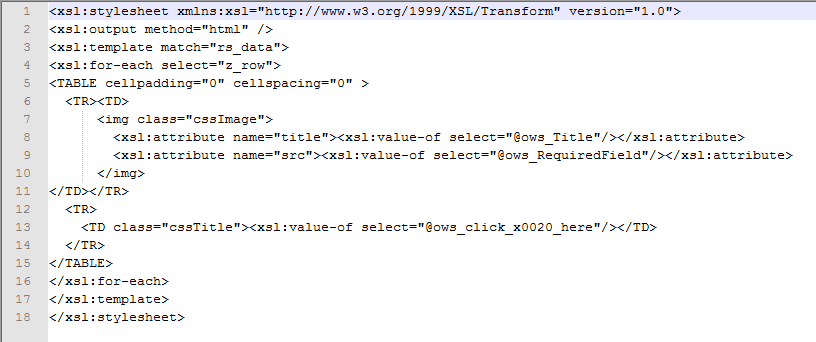
 The example explained here rotates images from a SharePoint Picture Library. Below the image, a hyperlink column is displayed that end users can click on to go to a page that provides more information about the image.
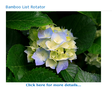
The Picture Library view that is rotated is shown below. Notice the column called click here is included in the view called for Rotating. It is a column of type hyperlink.
How to configure this custom layout:
| Step | Action | Result |
|---|---|---|
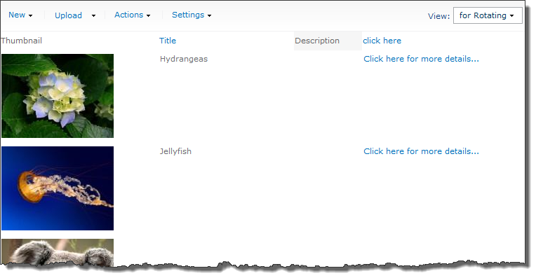
| 1. | Edit the web part and select Custom as the Style. |  The buttons in that section will become enabled. The buttons in that section will become enabled. |
| 2. | Click Edit Source | The default layout will appear in the List Rotator text editor. If desired, copy the contents to your text editor of choice.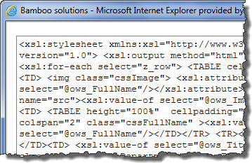 |
| 3. | Delete the code highlighted in yellow below.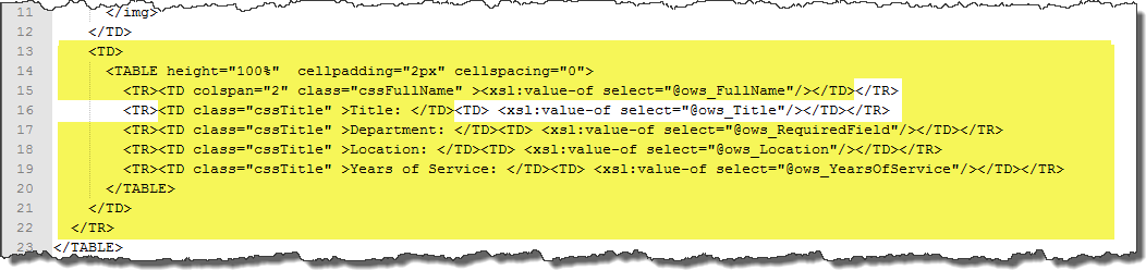 |
|
| 4. |
Replace this code with this The resulting code should look like this: |
|
| 5. | We want to center the hyperlink below the image, so we need to modify the cssTitle class.
Click the CSS Edit button in the Select Style section of the web part tool pane. |
The default CSS code appears in the List Rotator text editor. Change this to this click Save to save your changes. |
| 6. | Make any other changes to the web part configuration (i.e., speed of rotation). When ready click Apply and then OK at the bottom of the tool pane to save and apply your changes. | |