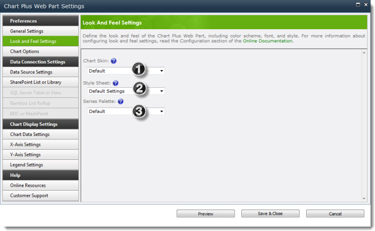
 The color scheme and style of your chart are based on selections in the Look and Feel Settings. You have control over the look and feel of your charts by modifying the following three areas:
Below is just a quick snapshot of each setting; more details can be found on separate topics for each section of this web part setting.
| Setting | Description | Quick View |
| Chart Skin | Chart Skin determines the overall color scheme of the Chart Plus Web Part. Use it in combination with the Series Palette options to create a unique color scheme for your chart. | 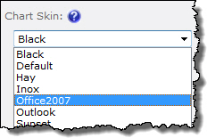 |
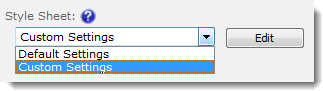
| Style Sheet |
If you can’t find something you like in the pre-defined Chart Skins, you can create your own CSS using the Style Sheet tool. Select Custom Settings and click the Edit button to create a custom style sheet. For more information about customizing the CSS, see Customizing the Chart Style Sheet. Tip: To customize an existing Chart Skin, select the skin first. When you click the Edit button, the settings for that skin are pre-populated in the edit screen. If you create a custom CSS and then select a new Chart Skin later, your CSS will be overwritten with the new skin.
|
 |
| Series Palette | The Series Palette determines the colors of series bars, lines, pie chart areas, etc. Use it in combination with the Chart Skin. If you want to define specific colors for series items, use the Chart Data Settings instead. | 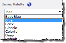 |
See also: