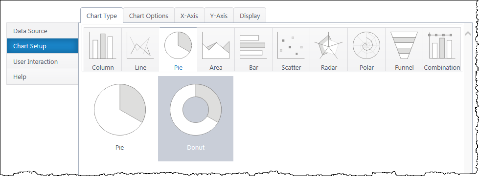
Set Up a Combination Chart
Back to Create a New Chart
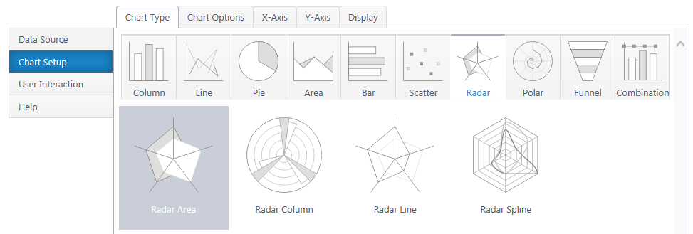
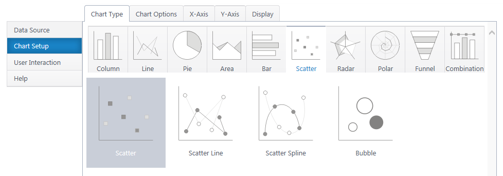
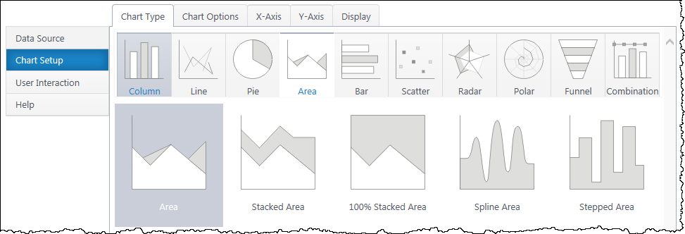
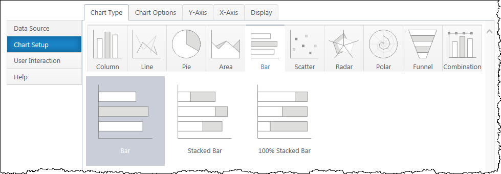
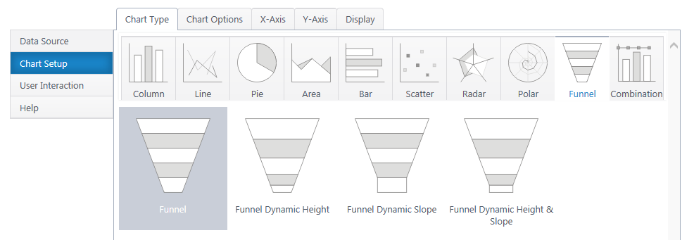
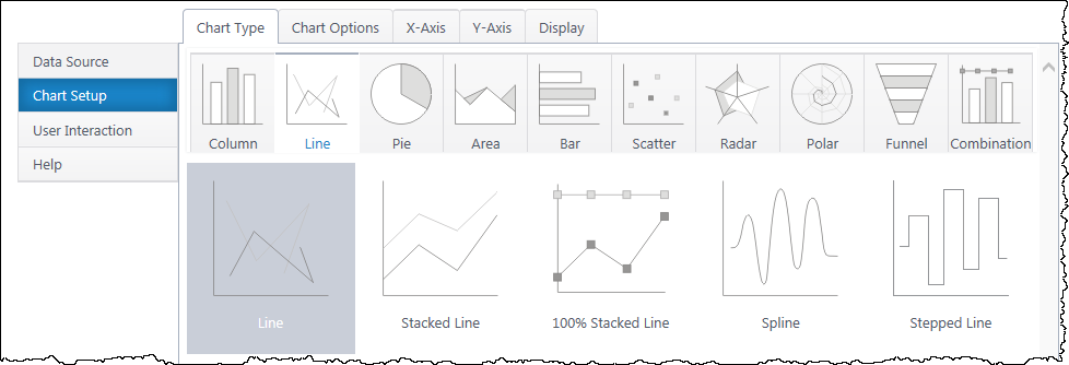
Combination charts allow you to plot multiple chart types for an x-axis. Combination charts require one x-axis and at least one y-axis. All of the column, line, or area charts are available, with the exception of stepped & spline versions.
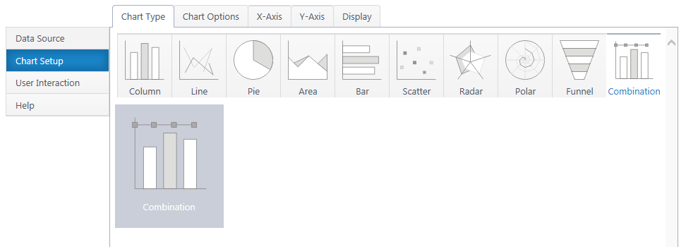
Additional y-axis series add another graph type to the canvas. You can configure many graphs, but only two axes. Putting two Y series with radically different scales on the same axis will result in a poor chart visual.
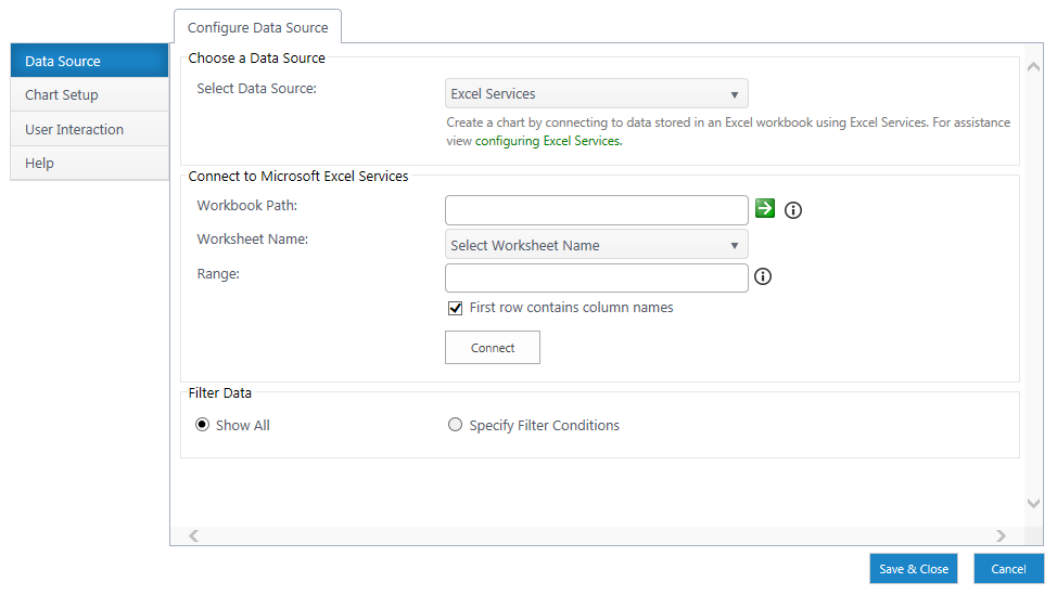
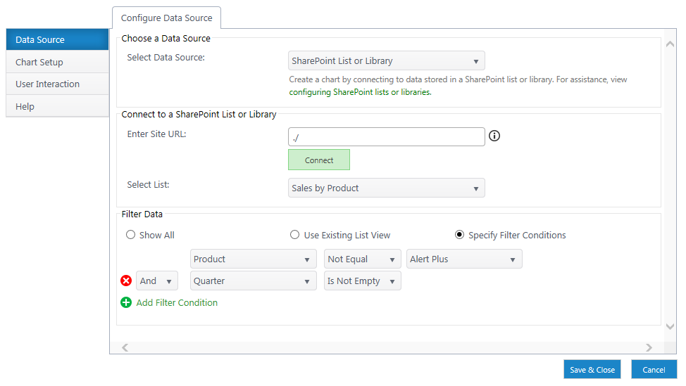
If you haven’t yet, select a data source.
As you’re building your chart, use the Preview button in the upper right to check your work in progress.
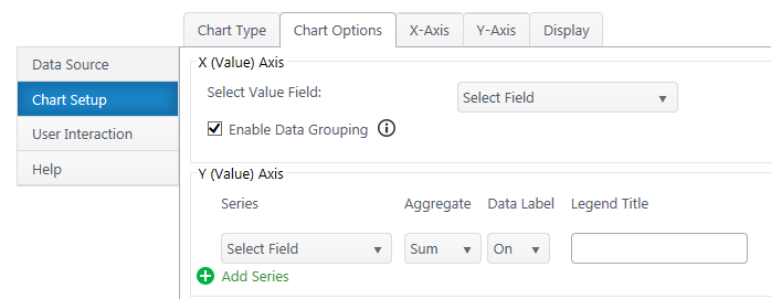
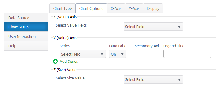
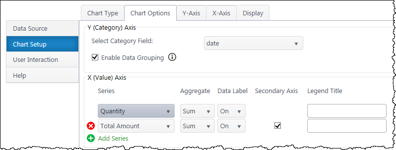
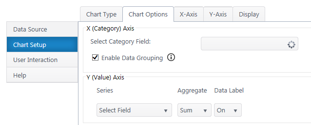
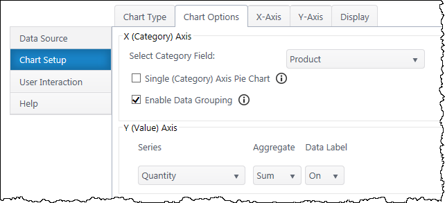
Chart Options (Choose X & Y Axis)
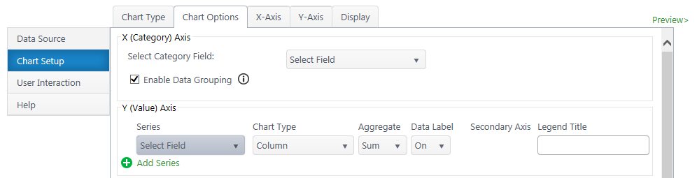
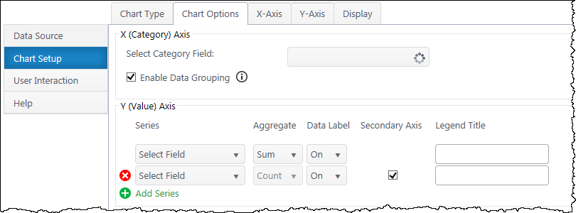
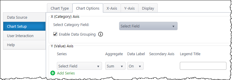
X (Category) Axis
Select Category Axis – Select which column of categories you would like to compare. The dropdown list will auto-populate with columns from your data source.
Enable Data Grouping – Group x values of the same category. Typically, you want grouping enabled. If off, each individual data point will be separate.
Y (Value) Axis
Series – Specify what value you would like to compare between the categories. You may only select quantitative columns. Add additional y-axis series if desired.
Chart Type – Choose a chart type for each Y series.
Aggregate – If you have enabled grouping on the x-axis, aggregate the y-axis data you are comparing (sum, first, min, max, average, count). By default, chart plus compares the sum of y values.
Data Label – Toggle data labels for each Y series.
Secondary Axis – If using more than one Y series, you can add a secondary axis on the right side of the chart. The secondary axis will automatically adjust it’s range to include the maximum Y value from the series mapped to it.
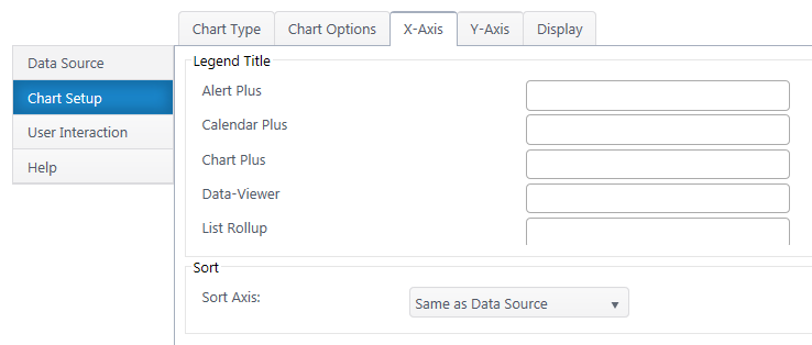
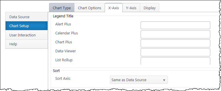
Legend Title – Customize legend titles for each y-axis series.
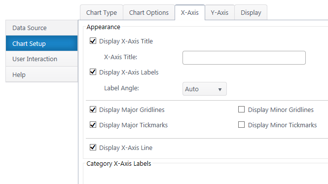
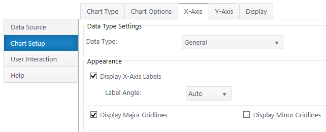
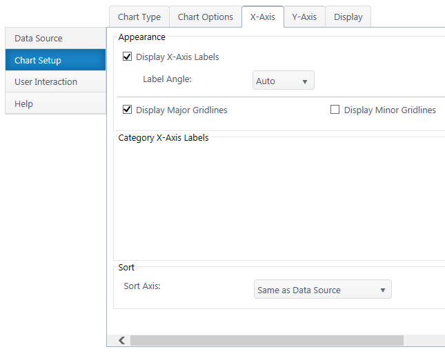
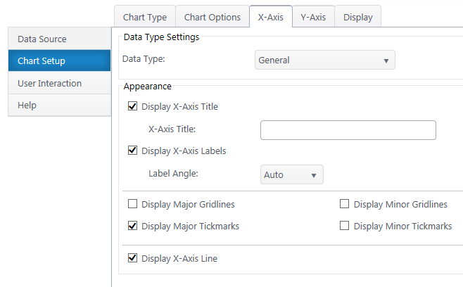
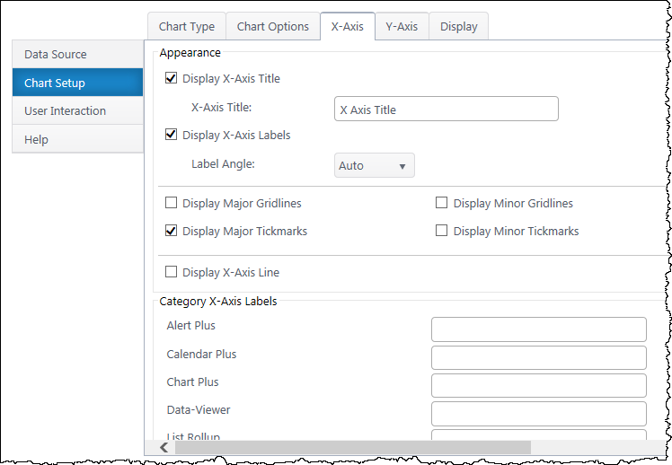
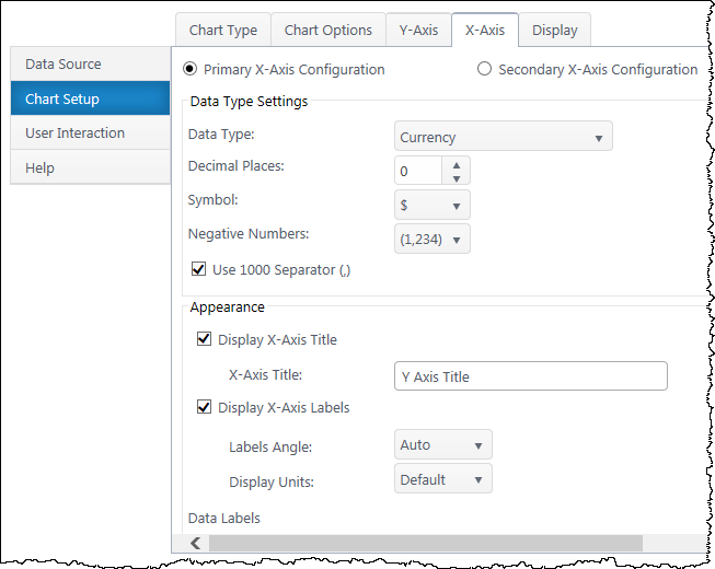
X-Axis Configuration
Data Type Settings – Appears if you select a Date/Time value for the x-axis. Configure how date categories display (date or time) and the scale of the x-axis. “Automatic” sizes the x-axis according to the scale of your dataset.
Appearance
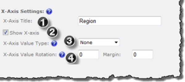
X Axis Title – Toggle title display at top of chart and customize title text.
X-Axis Labels – Toggle x-axis labels & their display angle.
Gridlines & Tickmarks – Customize which gridlines and tickmarks display along the x-axis.
Display X-Axis Line – Toggle the x-axis line that runs along the bottom of the chart between the canvas and x-axis labels.
Category X-Axis labels – Customize category names that appear on the x-axis.
Sort
Sort Axis – Specify an ascending or descending sort order for how categories display on the x-axis.
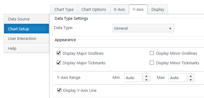
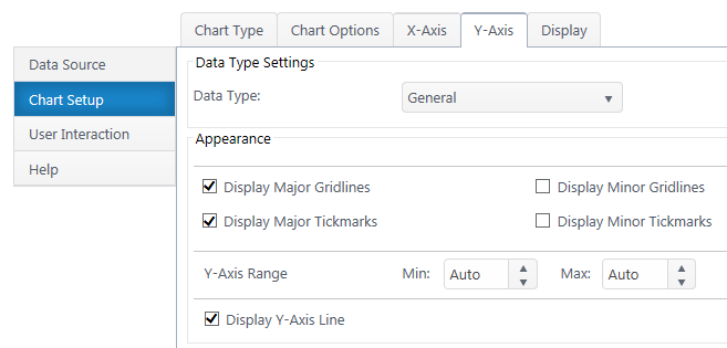
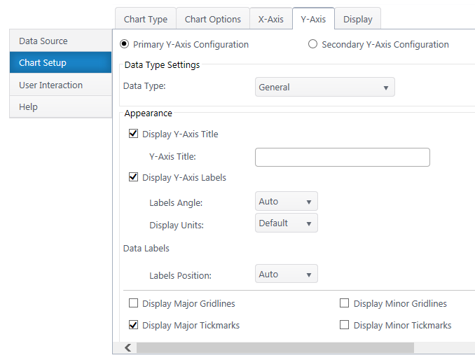
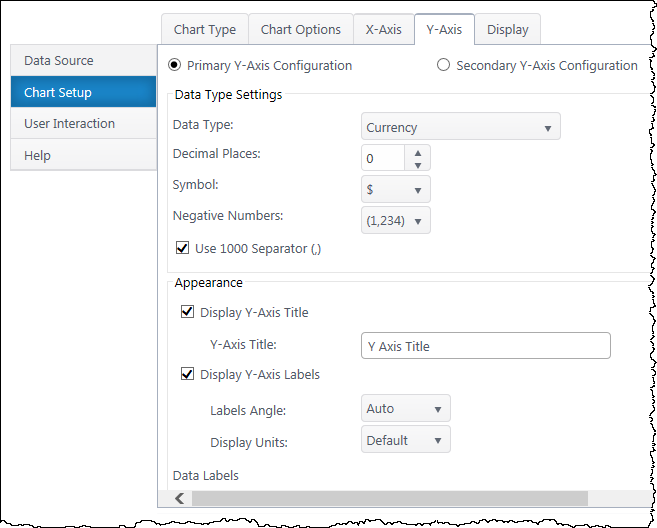
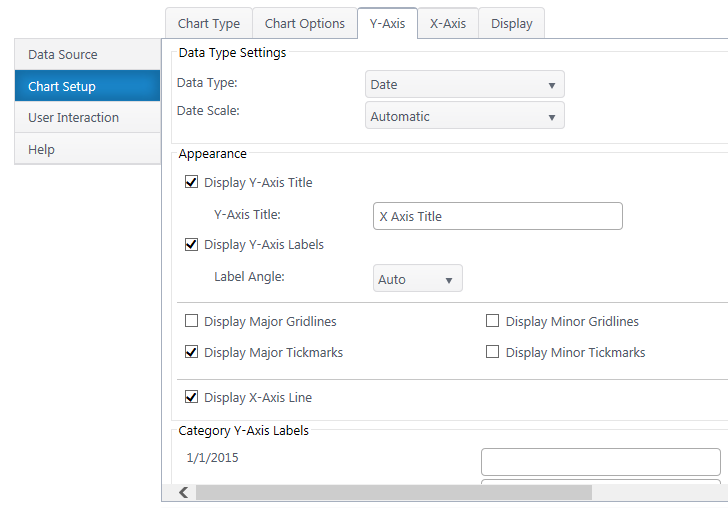
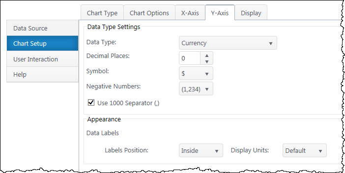
Y-Axis Configuration
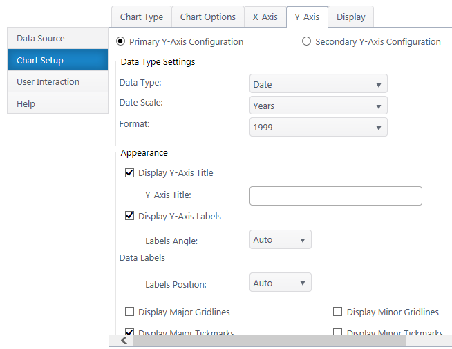

Secondary Axis – If you have a secondary y-axis, use the buttons at the top of the Y-Axis tab to switch between axis settings.
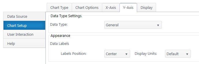
Data Type Settings
Data Type – Select a data type for y values (general, number, currency, date, time, percentage, scientific).
Format – Configure details on how Y values will display on the axis and labels. Date types also require you to select the date scale for the y-axis.
Appearance
Y-Axis Title – Toggle title display at top of chart and customize title text.
Y-Axis Labels – Toggle y-axis labels and their display angle & position.
Gridlines & Tickmarks – Customize which gridlines and tickmarks display along the y-axis.
Y-Axis Range – Configure the minimum and maximum values visible on the y-axis. These default to “auto” and adjust to the range of your dataset. Not available for “Date” & “Time” data types or 100% chart types.
Display Y-Axis Line – Toggle the y-axis line between the y-axis scale and the chart canvas.
Next: Configure the Chart Display Settings
 The following settings are available to customize the format of the X-axis.
 IMPORTANT: The new Telerik assemblies are deployed from Bamboo.Framework.wsp. Some Bamboo component products may error if there are older and/or newer versions of Telerik assemblies in the SharePoint environment.
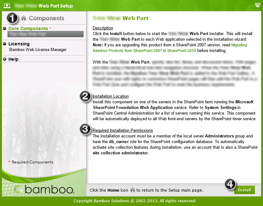
 Select the first product component in the Components section in the Setup program. When a component is selected, information specific to it is displayed on the right side of the interface. Verify the
 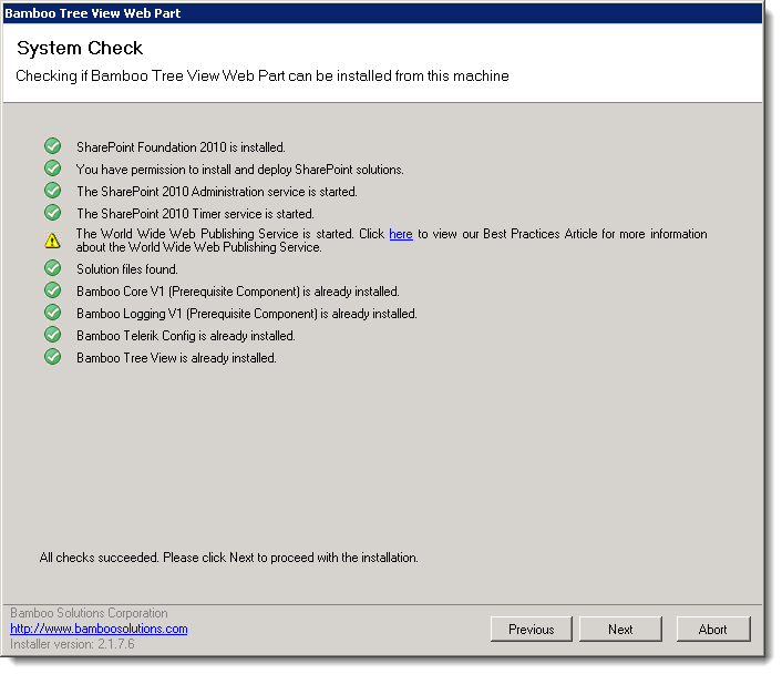 Click Next to begin the upgrade. Verify that the system checks pass successfully and click Next. If the system checks do not pass, you will not be able to proceed.
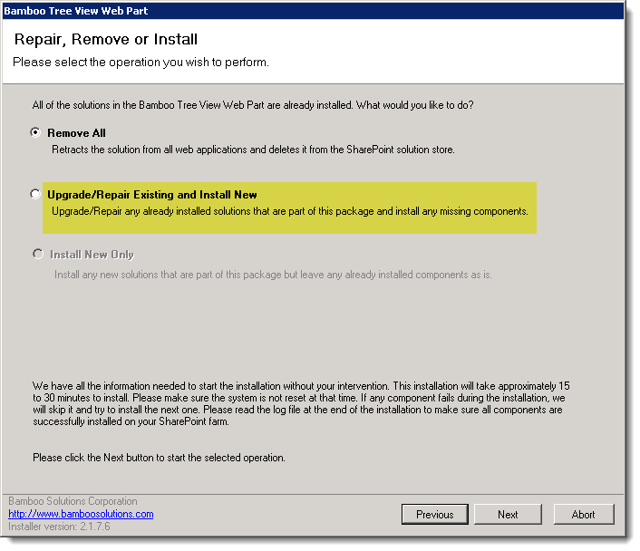 In the Repair, Remove or Install screen, select the Upgrade/Repair Existing and Install New option and click Next.
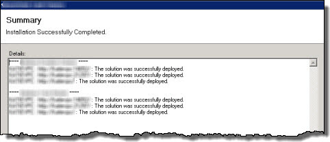 When the upgrade is complete, click Next to review the Summary screen and confirm that the product upgrade was successful. You may need to scroll up to review the entire summary. When satisfied, click Close.

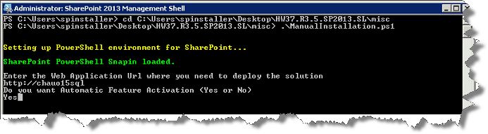
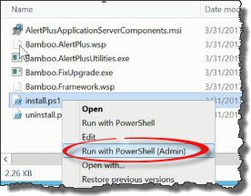 Run the Install.ps1 from a WFE server in PowerShell as an admin.
 The install.ps1 script is used to install a new product or uppgrade an existing product.
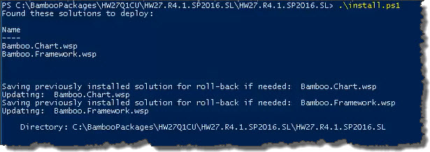 The script will look for WSPs in the install folder and list those found.
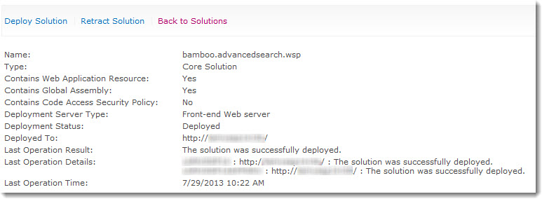
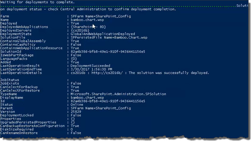 When the deployment completes, deployment status information will be displayed for each solution.
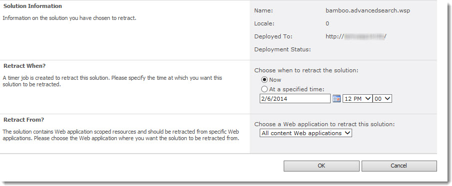
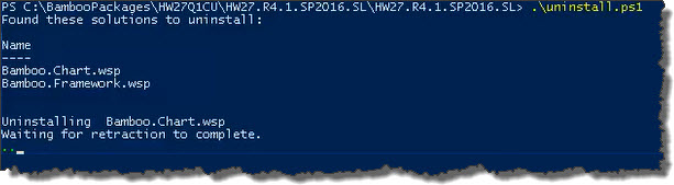 The script will look for WSPs in the install folder and list those found. It will uninstall them in alpha order.


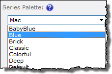 The Series Palette determines the colors of series bars, lines, pie chart areas, etc.
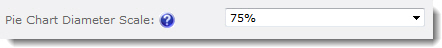 To resize the pie chart in relation to the chart area, select a scale percentage.
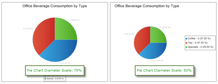
 ) at the top of the components list to return to the Setup main page.

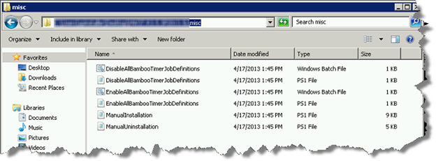
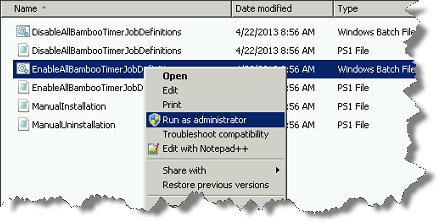
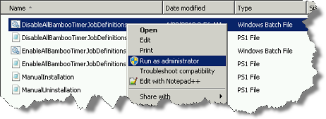 Right-click on the file DisableAllBambooTimerJobDefinitions.bat and choose Run as administrator. This script stops the timer job services for all Bamboo products installed on the farm, helping to put the farm in a quiescent state for the install.
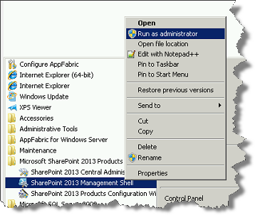 On the WFE where you extracted the product folders, right-click on the PowerShell application in the Start menu and choose Run as administrator. You can use Windows PowerShell or SharePoint 2013 Management Shell.
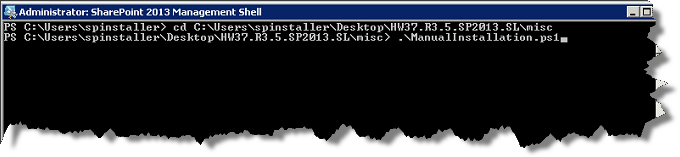
 Return to the misc folder. Right-click on EnableAllBambooTimerJobDefinitions.bat and choose Run as administrator. This enables all Bamboo timer job services.