Chart Data Settings
 Configure options for chart data, including chart type, grouping options, and data value display options within this section of Chart Plus.
| Series Colors |
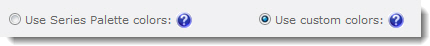
| Series colors options define the colors for series bars, lines, pie chart areas, etc. A default Series Palette can be defined in the Look and Feel Settings. To ignore the Series Palette choices and select your own colors for each series in the chart: |
| Step |
Action |
Result |
| 1. |
Select the option Use custom colors. |
 |
| 2. |
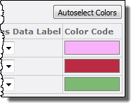
In the Chart Configuration table, click the Color Code block next to the series you want to customize. |
 |
| 3. |
To change a color for a series item, pick a new color in the Color Picker. If the series is a Choice column, you can select a color for each choice. To automatically select colors for all series, click the Autoselect Colors button. If you don’t like the colors that are assigned, you can click the button again to assign a different set of colors. |
NOTE: The Autoselect Colors feature will only work for the first 100 series. If your chart has more than 100 series (including Choice column option), you will have to manually assign colors for series item #101 and higher.
|
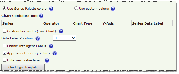
| Chart Configuration |
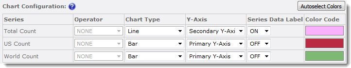 |
| The Chart Data Configuration table allows you to configure the following options for each series in the chart: |
| Operator |
If you selected Enable Grouping when selecting the Y-axes to display in the settings for the chart data source, you can select an operator to use to group series data. Available operators include SUM, COUNT, AVERAGE, PERCENT, and SUM_PERCENT. |
| Chart Type |
Select a chart type to use to display that series on the Y-axis. Use this option if you want to display one series as a bar chart and another as a line chart, for example. Some chart type combinations work better than others, so use the Preview button to see the results before saving your settings. For samples of chart types, click the Chart Type Template button below the Chart Data Configuration table. |
| Y-Axis |
Select which Y-axis to use (primary or secondary) to display series data. |
| Series Data Label |
If you want to display the value for each data point, select ON. To display only the chart element (bar, line, etc.) and not the value, select OFF. |
| Color Code |
Click the color block to assign custom colors for series items. See Series Colors above for more information. |
|
| Other Chart Data Settings |
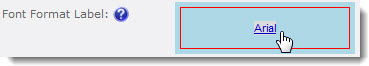
| Font Format Label |
To change the format for the labels, including font, size, style, color, and other options, click the Font Format box. |
 |
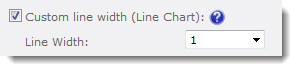
| Custom line width (Line Chart) |
For line charts, you can customize the line width by checking this option and entering a specific width from 1 to 10. |
 |
| Data Label Rotation |
To change the orientation of data labels on the chart, select a rotation percentage. |
A value of “0” will display data labels horizontally, no matter the chart orientation.
|
| Enable Intelligent Labels |
In charts that have many data points or data points with values close to one another, labels can overlap and make readability a problem. Enable Intelligent Labels to automatically align labels so that each value can be seen clearly. |
If the chart contains more than 100 data points, chart performance may be slowed when this option is enabled.
|
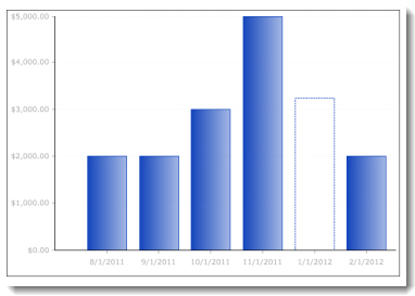
| Approximate empty values |
When checked, data points with empty (non-zero) values will be approximated and displayed as a dotted line. When unchecked, a value of “0” is used for the data point. |
 |
| Hide zero value labels |
Check this box to hide series items with a value of zero. |
| Chart Type Template |
Click to see a selection of available chart types. |