Scatter charts are great for displaying the relationship between two numerical variables in a dataset. Scatter charts require a value x-axis and value y-axis. Both axes must be numerical and you cannot use categories in a scatter chart.
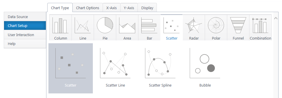
Multiple y-axis series will add an additional legend entry and another color of dots on the canvas. The scatter line/spline will connect points of the same color.
Bubble charts include an additional Z axis, which represents the z variable with the size of the bubble.
If you haven’t yet, select a data source.
As you’re building your chart, use the Preview button in the upper right to check your work in progress.
Chart Options (Choose X & Y Axis)
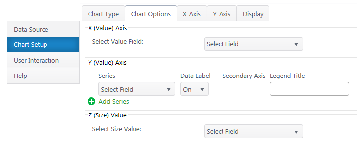
X (Value) Axis
Select Value Axis – Select the numerical variable to measure on the x-axis. The dropdown list will auto-populate with only number & date/time columns from your dataset.
Enable Data Grouping – Group data points with the same X value. We do NOT recommend grouping in scatter plots, as typically you’re seeking trends between all data points, not sums of data points.
Y (Value) Axis
Series – Specify what numerical value you would like to measure on the y-axis. Add additional y-axis series to compare.
Aggregate – If you have enabled grouping on the x-axis, aggregate the y-axis data you are comparing (sum, first, min, max, average, count). By default, chart plus compares the sum of y values.
Data Label – Toggle data labels for each Y series.
Secondary Axis – If using more than one Y series, you can add a secondary axis on the right side of the chart. The secondary axis will plot a second set of data points with the same X value, but Y values from the second Y series.
Legend Title – Customize legend titles for each y-axis series.
Z (Size) Value – Available for bubble charts. Choose a third value series to display as bubble size.
X-Axis Configuration
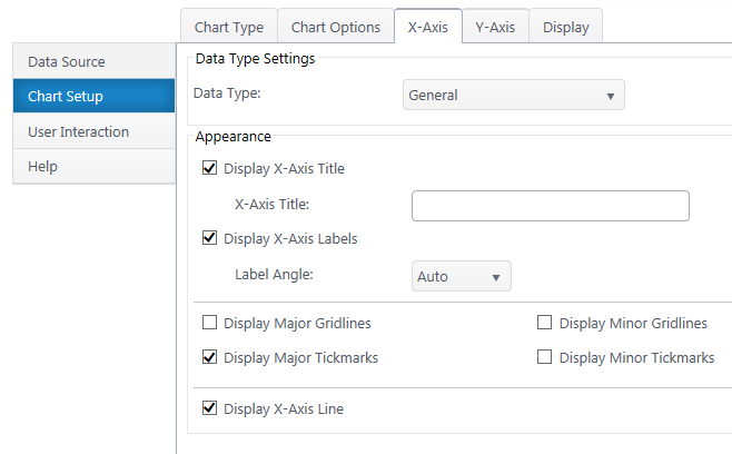
Data Type Settings – Configure the number type & format. If a date, configure the axis scale.
Appearance
X Axis Title – Toggle title display at top of chart and customize title text.
X-Axis Labels – Toggle x-axis labels & their display angle. Configure numerical units display.
Gridlines & Tickmarks – Customize which gridlines and tickmarks display along the x-axis.
X-Axis Range – Configure the minimum and maximum values visible on the y-axis. These default to “auto” and adjust to the range of your dataset. Not available for “Date” & “Time” data types.
Display X-Axis Line – Toggle the x-axis line that runs along the bottom of the chart between the bars and x-axis labels.
Y-Axis Configuration
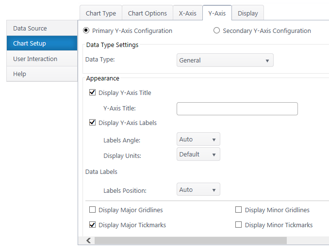
Secondary Axis – If you have a secondary y-axis, use the buttons at the top of the Y-Axis tab to switch between axis settings.
Data Type Settings
Data Type – Select a data type for y values (general, number, currency, date, time, percentage, scientific).
Format – Configure details on how Y values will display on the axis and labels. Date types also require you to select the date scale for the y-axis.
Appearance
Y-Axis Title – Toggle title display at top of chart and customize title text.
Y-Axis Labels – Toggle y-axis labels and adjust their display angle & position.
Gridlines & Tickmarks – Customize which gridlines and tickmarks display along the y-axis.
Y-Axis Range – Configure the minimum and maximum values visible on the y-axis. These default to “auto” and adjust to the range of your dataset. Not available for “Date” & “Time” data types.
Display Y-Axis Line – Toggle the y-axis line between the y-axis scale and the chart canvas.