Customize Search Criteria Layout
It is possible to modify the Layout of the search criteria displayed and also the Styles. This article gives examples of ways to modify the default Layout. If you are interested in keeping the default layout and just changing the Styles, please see Customize Search Criteria Styles.
To customize the layout of the search criteria:
| Step |
Action |
Result |
| 1. |
On the Look and Feel Settings page accessed from the Preferences section of the Web Part Settings, click the radio button for Custom search criteria layout |
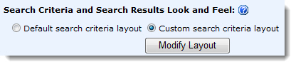 |
| 2. |
Click Modify Layout button |
| 3. |
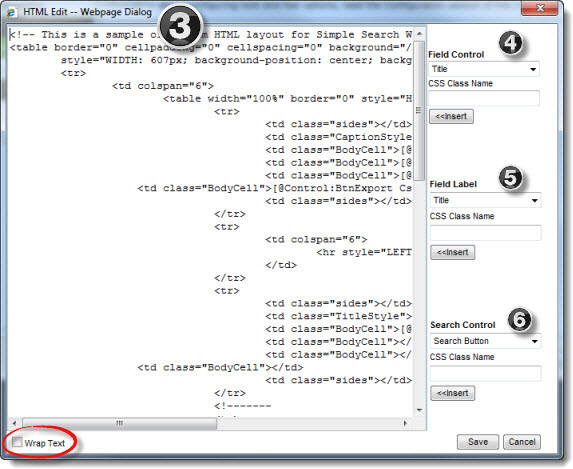
The HTML Editor window displays.
 IMPORTANT: The HTML provided in the HTML Editor window is a sample only and must be replaced by your custom HTML. If you find the content in the editor hard to read and you need to scroll back and forth, click the Wrap Text button at the bottom of the window. IMPORTANT: The HTML provided in the HTML Editor window is a sample only and must be replaced by your custom HTML. If you find the content in the editor hard to read and you need to scroll back and forth, click the Wrap Text button at the bottom of the window.
|
NOTE: By default, search criteria are listed vertically in the web part, one per line, in the order defined in the Search Columns list in the Configure Search Criteria page.
|
| The options on the right side of the HTML Edit window are available to help you construct the HTML code: |
| 4. |
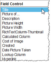 |
Field Control contains a list of the search columns defined in the Search Criteria Configuration page. Add a Field Control so users can search on a column. Select a column to insert and provide a CSS class name that can be used later to define the style for the column (optional).
IMPORTANT: Don’t manually add any fields that you didn’t specifically include in the search during the Search Criteria Configuration. They will not appear.
Place your cursor in the HTML Editor where you want to insert the column and click the <<Insert button. The following text will be inserted:
[@Field:InternalFieldName CSSClass=”ClassName”]
Where:
- @Field defines the type of control (i.e., text box, radio button, selection list) added to the page. The field control is based on the column type.
- InternalFieldName is the internal name of the search column. An internal name of a column is also the original column name when the column is created. When a column is first created in a list, the internal/original name and display name match. When the column is renamed, the display name updates to the new name but the internal/original name remains the same.
- CSSClass= is an optional parameter that allows you to define a unique CSS style to the Field Control.
- ClassName is the name of the class to apply to the control.
IMPORTANT: If you want to include the Search in all columns for search criteria box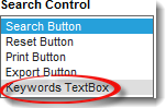 , you will find it in the Search Control list (see Step 6 below). It is not a Field Control. Adding it to your layout adds the following text: , you will find it in the Search Control list (see Step 6 below). It is not a Field Control. Adding it to your layout adds the following text:
[@Control:TxtKeywords CssClass="TextBoxSearchKeyWord"]
|
| 5. |
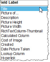 |
Field Label also lists search columns defined in the Search Criteria Configuration page. Use a Field Label as a label for a Field Control you added in Step 4.
 : If you don’t want to use the Display Name of the column as the label, you can add regular text to your layout, rather than a Field Label. Adding a Field Label is optional. : If you don’t want to use the Display Name of the column as the label, you can add regular text to your layout, rather than a Field Label. Adding a Field Label is optional.
Select a column, define a CSS class name (optional), and click <<Insert to add the label of the search column into the HTML Editor. The following text will be inserted:
[@DisplayName:InternalFieldName CSSClass=”ClassName”]
Where:
- @DisplayName defines the type of control added to the page. Field labels are typically text.
- InternalFieldName is the internal name of the search column. An internal name of a column is also the original column name when the column is created. When a column is first created in a list, the internal/original name and display name matches. When the column is renamed, the display name updates to the new name but the internal/original name remains the same.
- CSSClass= is an optional parameter that allows you to define a unique CSS style to the Field Control.
- ClassName is the name of the class to apply to the control.
|
| 6. |
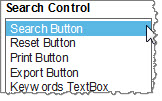 |
Search Control lists control buttons and fields that can be inserted in the Web Part. Select a Search Control and enter a CSS class name (if desired). Put the cursor in the HTML Editor where you want the control to be displayed and click Insert. The following text will be inserted:
[@Control:BtnControlName CssClass="ClassName"]
Where:
Available controls include:
- Search Button will invoke the search request.
- Reset Button will clear the search results and search criteria from the Web Part.
- Print Button will provide the user the ability to print the search results from a printer-friendly window.
- Export Button will provide the user the ability to export search results to Microsoft Excel.
- Keywords TextBox will allow the user to Search in all Columns for results.
|
| 7. |
When you are finished constructing your custom HTML, including all fields and controls you want to include on the search page, click the Save button in the HTML Editor to save the new layout and return to the Look and Feel Settings page. |
| 8. |
Click Save & Close in the Web Part Settings window, and then click Apply and then OK in the web part tool pane to view the new layout. |
 Check this video to see an example.