Combination charts allow you to plot multiple chart types for an x-axis. Combination charts require one x-axis and at least one y-axis. All of the column, line, or area charts are available, with the exception of stepped & spline versions.
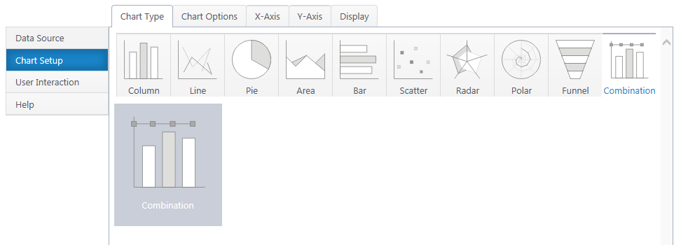
Additional y-axis series add another graph type to the canvas. You can configure many graphs, but only two axes. Putting two Y series with radically different scales on the same axis will result in a poor chart visual.
If you haven’t yet, select a data source.
As you’re building your chart, use the Preview button in the upper right to check your work in progress.
Chart Options (Choose X & Y Axis)
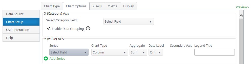
X (Category) Axis
Select Category Axis – Select which column of categories you would like to compare. The dropdown list will auto-populate with columns from your data source.
Enable Data Grouping – Group x values of the same category. Typically, you want grouping enabled. If off, each individual data point will be separate.
Y (Value) Axis
Series – Specify what value you would like to compare between the categories. You may only select quantitative columns. Add additional y-axis series if desired.
Chart Type – Choose a chart type for each Y series.
Aggregate – If you have enabled grouping on the x-axis, aggregate the y-axis data you are comparing (sum, first, min, max, average, count). By default, chart plus compares the sum of y values.
Data Label – Toggle data labels for each Y series.
Secondary Axis – If using more than one Y series, you can add a secondary axis on the right side of the chart. The secondary axis will automatically adjust it’s range to include the maximum Y value from the series mapped to it.
Legend Title – Customize legend titles for each y-axis series.
X-Axis Configuration
Data Type Settings – Appears if you select a Date/Time value for the x-axis. Configure how date categories display (date or time) and the scale of the x-axis. “Automatic” sizes the x-axis according to the scale of your dataset.
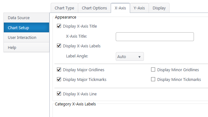
Appearance
X Axis Title – Toggle title display at top of chart and customize title text.
X-Axis Labels – Toggle x-axis labels & their display angle.
Gridlines & Tickmarks – Customize which gridlines and tickmarks display along the x-axis.
Display X-Axis Line – Toggle the x-axis line that runs along the bottom of the chart between the canvas and x-axis labels.
Category X-Axis labels – Customize category names that appear on the x-axis.
Sort
Sort Axis – Specify an ascending or descending sort order for how categories display on the x-axis.
Y-Axis Configuration
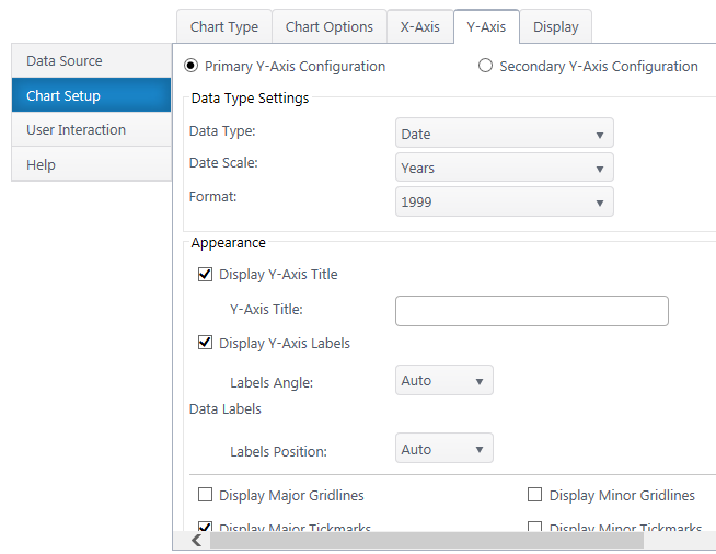

Secondary Axis – If you have a secondary y-axis, use the buttons at the top of the Y-Axis tab to switch between axis settings.
Data Type Settings
Data Type – Select a data type for y values (general, number, currency, date, time, percentage, scientific).
Format – Configure details on how Y values will display on the axis and labels. Date types also require you to select the date scale for the y-axis.
Appearance
Y-Axis Title – Toggle title display at top of chart and customize title text.
Y-Axis Labels – Toggle y-axis labels and their display angle & position.
Gridlines & Tickmarks – Customize which gridlines and tickmarks display along the y-axis.
Y-Axis Range – Configure the minimum and maximum values visible on the y-axis. These default to “auto” and adjust to the range of your dataset. Not available for “Date” & “Time” data types or 100% chart types.
Display Y-Axis Line – Toggle the y-axis line between the y-axis scale and the chart canvas.