 Charts can help your audience compare data and understand trends at a glance. With Chart Plus 3.0 and higher, fine tuning the appearance of your charts presentation is easier than ever. Not only are there more configuration options available; the changes can be made directly from the Chart Plus screens.
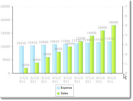
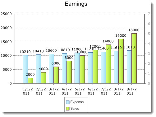
When creating a chart there are only three pieces of information that must be provided:
- the chart Data Source **
- the Series to display
- and the Chart Type
With the above settings configured, and nothing else, a multi-series bar chart looks like the image above.
From here, you can begin to customize the appearance of your chart. This will help to communicate the data in your chart more effectively.
Note: Frequent use of the Preview button during the fine tuning process will allow you to monitor the results of your changes and help you to better understand the design elements of the settings window.
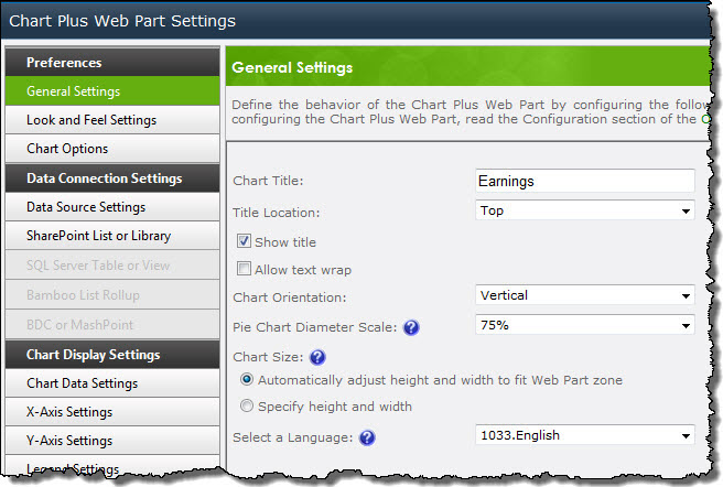
Enter a Chart Title on the General Settings screen and use the Title Location drop down list to select the desired location in the chart area. If you are working with a pie chart you will be able to easily manipulate the pie size using the Pie Chart Diameter Scale choices. You can also modify the Chart Orientation and configure the Chart Size.
| Step | Action | Result |
| 1. | From the Look and Feel Settings screen you can select one of the 24 available Chart Skins to alter the appearance of the chart. If you do not wish to use the default blue and green color scheme, pick another Series Palette from the drop-down list, or wait and select Custom Colors from the Chart Data Settings screen. | 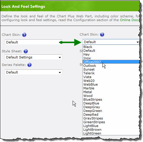
|
| 2. | On the Chart Data Settings screen, you can use the radio buttons at the top of the main area to use a Series Palette or your own Custom colors. With Font Format Label, you have the ability to format the series labels, including font, size, style, color, and other options by clicking on the Font Format box. You can change the default Data Label Rotation using the drop-down list. Select Enable Intelligent Labels to prevent the data labels from overlapping, or, alternatively, turn OFF labels using the Series Data Label drop-down list. | 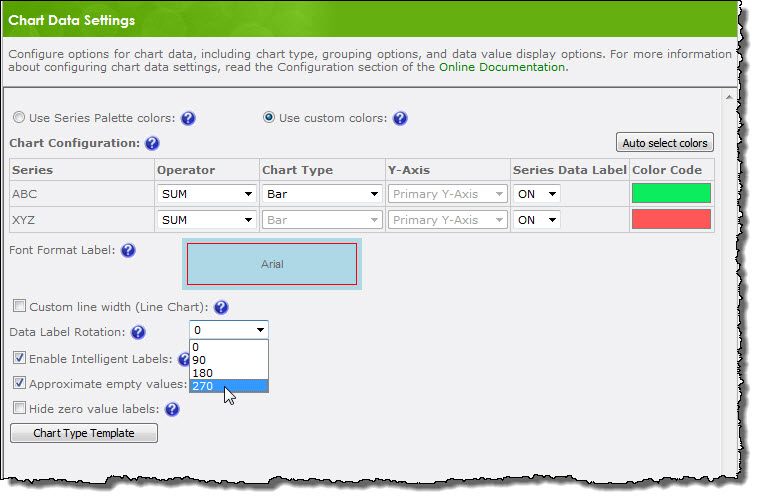 |
| 3. | The X-Axis Settings and Y-Axis Settings screens allow you to label the axes, select a format for the labels from the Axis Value Type drop-down lists, rotate the axis labels, or hide an axis altogether. You can also modify the default value range of the Y-Axis. | 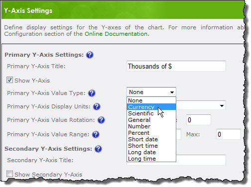 |
| 4. | With modifications to the Axes and Chart Data Settings the chart now looks like this: | 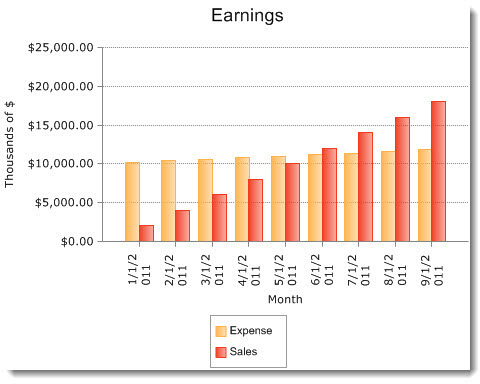 |
| 5. | The appearance of the charts legend can be modified on the Legend Settings screen. Select where the legend will be placed in the chart area using the Legend Location drop-down list, the desired label font, and whether the legend should be presented in the default column, or a row. | 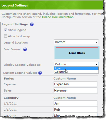 |
| 6. |
Series titles and Axis labels are, by default, taken directly from the data source, but using Custom Names will allow you to provide your intended audience with more intuitive labeling. With these final configuration changes applied the chart now looks like this: |
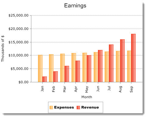 |
Using these customization options will help communicate the desired message much more effectively than the original chart.