| Return to Customize Search Criteria Styles |
|---|
Modifying the default Styles for Dates
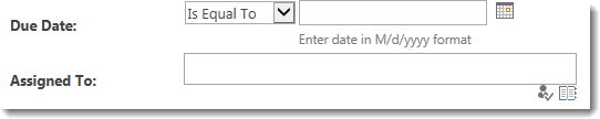
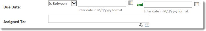
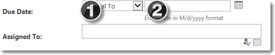
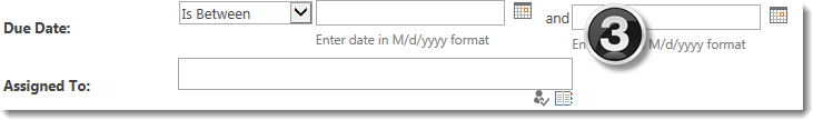
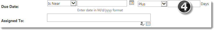
A default Date display is shown below associated with the column Due Date. If the Is Between operator (see #1 below) is selected, the display changes slightly to reveal the word and and a second text box control (see #3 below). Assigned To is a Person or Group type column and is shown for comparison.
Different classes are associated with each control included with the Date column search criteria:
| Class | Default | |
|---|---|---|
| 1. | The .DropDownListControlsDateTime class is used to control the display of the drop down menu that lists the possible operators (i.e., Is Equal To, Is Less Than). |
|
| 2. | Unfortunately, in the current version of List Search Simple, there is no available class for controlling the style of the Date picker control. | |
| 3. | The .LabelControlsDateTime class is used for the word and that appears between the two date-pickers when the operator Is Between is selected. |
|
| 4. | The .TextBoxControlsDateTime class is used for the box displayed when the operator Is Near is selected. |
|
The table below shows examples of common changes possible for Date columns. Additional examples may also be possible.
| Change | Example |
|---|---|
| To shorten the control where you select the search operator (i.e., Is Equal To), change the min-width value of the .DropDownListControlsDateTime class. |
For example, make this change: The result looks like this: |
| Change the font weight and color of the word and that appears when the user chooses the operation In Between. The .LabelControlsDateTime class controls the display of this word. |
Change the text to bold and green: The result looks like this: |
| Change the display of the Label. The label is the text that appears to the left of the operator selection drop down. | All labels have the same class, regardless of the type of column. See this article for examples of how to change them. |