| Return to Customize Search Criteria Styles |
|---|
Modifying the default Styles for Multi-line Text Boxes
The .MultiTextAreaControls class is used for the box where search criteria for columns of type multiple lines of text is entered. The default setting for the MultiTextAreaControls is
.MultiTextAreaControls
{
min-height:50px;
min-width:350px;
}
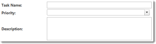
The default display looks like the box to the right of the Description: label shown below. Priority is a choice type column and is shown for comparison. The Task Name column is also shown for comparison.
The table below shows an example of a common change possible to the Text Box. Other examples may also be possible.
| Change | Example |
|---|---|
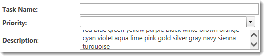
| To make the control taller so users can more easily enter lots of text, change the min-height to something larger than 50px |
Change to: The result looks like this:
|