| Return to Customize Search Criteria Styles |
|---|
Modifying the default Styles for Buttons
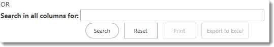
There are several buttons displayed in the List Search Simple user interface, depending on how you configure the web part. Each has its own class to control the style. By default, the available buttons look like this:
NOTE: If the search is not configured to display results and criteria on the same page, the Print, Export to Excel, and Back buttons will appear on the results page.
The associated classes and default values are shown in the table below:
| Button | Class |
|---|---|
| Search |
.SearchButtonStyle The default setting is: |
| Reset |
.ResetButtonStyle The default setting is: |
|
.PrintButtonStyle The default setting is: |
|
| Export to Excel |
.ExportButtonStyle The default setting is: |
Back
|
.BackButtonStyle The default setting is: |
The table below shows examples of common changes possible to buttons. Examples not included may also be possible.
| Change | Example |
|---|---|
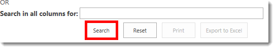
| To add a border around a button, add a border property |
Change to: The result looks like this:
|
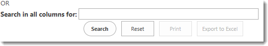
| To round the corners of the button, add a border-bottom-left-radius property along with the properties for the other corners. |
For example, change to: The result looks like this: |
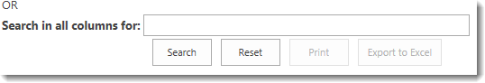
| To bold the font of the button text, add a font-weight property. |
For example, change to: The result looks like this: |