| Return to Customize Search Criteria Styles |
|---|
Modifying the default Styles for Choice and Lookup Selections
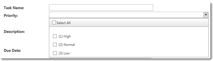
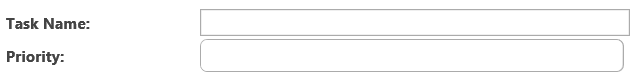
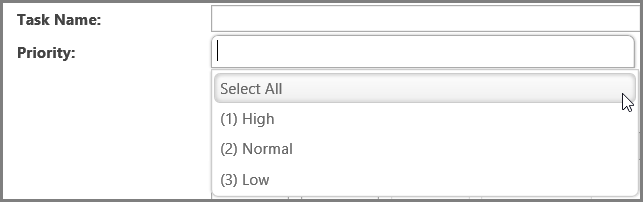
A default Choice Selection display is shown below associated with the column Priority. Task Name is a single line of text type column and is shown for comparison. The second image shows the expanded choice selection list.
The table below shows examples of common changes possible for Choice and Lookup columns. Additional examples may also be possible.
| Change | Example |
|---|---|
| The .BambooComboBox class controls the display of the Choice and Lookup Selection list. To lengthen it, change the width value. |
The default configuration for the control is: To lengthen the control, make this change: The result looks like this: |
| Change the display of the Label. The label is the text that appears to the left of the operator selection drop down. | All labels have the same class, regardless of the type of column. See this article for examples of how to change them. |