| Return to Customize Search Criteria Styles |
|---|
Modifying the default Styles for Text Boxes
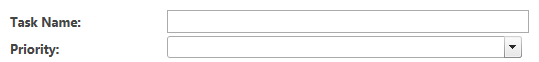
The .TextBoxControls class is used for the box where search criteria for columns of type single line of text is entered. The default setting for the TextBoxControls is
.TextBoxControls
{
min-width:350px;
}
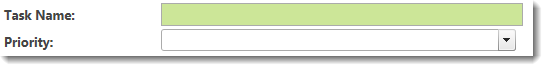
The default display looks like the box to the right of the Task Name: label shown below. Priority is a choice type column and is shown for comparison.
The table below shows examples of common changes possible to the Text Box. Examples not included may also be possible.
| Change | Example |
|---|---|
| To make the control longer so users can more easily enter lots of text, change the min-width to something larger than 350px |
Change to: The result looks like this:
|
| To change the background color of the control, add a background-color property. |
Change to: The result looks like this:
|
| Change the display of the Label. The label is the text that appears to the left of the text box. | All labels have the same class, regardless of the type of column. See this article for examples of how to change them. |