 There are several ways to change the visual appearance and style of the Calendar Plus Web Part. By default, Calendar Plus renders the user interface using a default calendar skin. However, the look and feel of the Web Part can be further customized by editing the custom CSS file in the tool pane of the Web Part.
If you need to change the color of the text shown for a calendar event and you are color-coding the events, you don’t need to create a custom CSS. Please see Configuring the Optional data source settings for Calendar Plus for more information.
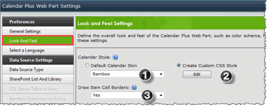
You have two options for styling the web part; follow the steps below to pick a skin or you can create custom CSS:
| Step | Action | Result |
| 1. | To use a default style calendar skin, select Default Calendar Skin. | 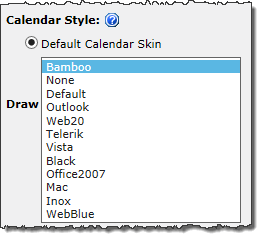 Select a skin from the available skins in the drop down selector. |
| 2. | To customize the style of the Web Part, select Create Custom CSS and click the Edit button. | 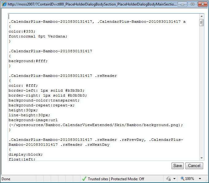 The text editor opens and displays the default CSS styles. Make any changes to the applicable the style selectors. |
| 3. | Select ‘yes’ or ‘no’ from the drop-down box to Draw Item Cell Borders. | Click Save and confirm the prompt to save your changes. |
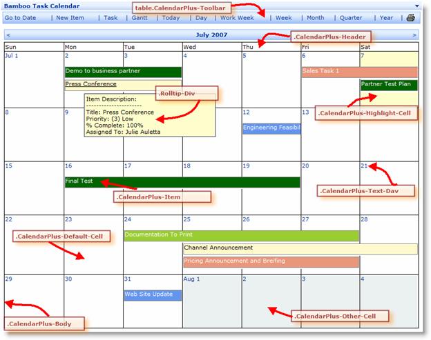 The Calendar Plus Web Part uses the following class selectors to define each elements of the calendar.
IMPORTANT: Notice that the CSS class names have a number attached to them (see highlighted number in the example below). This is to uniquely identify a CSS Class for a particular instance of the Web Part. It is strongly recommended that you do not change this number.
Example: CalendarPlus-Bamboo-2010830131417
For additional reference and example of CSS, see http://www.w3schools.com/css/css_reference.asp.