The Drag & Drop Menu Editor lets users easily build and customize mega menus and tabs strips. The browser-based designer allows adding and editing text, hyperlinks, and images with a simple drag and drop interface.
To get started, you need to begin by Configuring the List and List View for the Navigator Web Part.
NOTE: The Drag & Drop Menu Editor is only available for the Navigators Menu and Navigators TabStrip Web Parts. Show Mega Menu or Show Mega Content options must be selected in the Display and Navigation Web Part Settings to enable the editor.
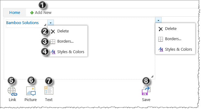
Below is a screen shot of the editor that will appear after you select Edit Web Part to open the configuration tool pane. Each option is described below to help make sense of what you see in the editor to create menus.
| No. | Option | Description |
| 1. | Add New | Select the Add New button to add menu tabs. |
| 2. | Delete | Remove an item by selecting Delete from the drop-down arrow menu. To remove all items under a tab, select the Delete button from the tab container’s drop-down menu. |
| 3. | Borders | Select Borders from the drop-down arrow menu to customize an item or tab container’s border properties. For additional information, see Configuring Border Options. |
| 4. | Styles & Colors |
Select Styles & Colors from the drop-down arrow menu to customize a Link or Text element’s font attributes. To apply styles to all items under a tab, select the Styles & Color option from the tab container’s drop-down menu. For additional information, see Configuring Styles & Colors Options. |
| 5. | Link | Drag & drop or select the Link button to insert a hyperlink. Enter an absolute or relative URL address and the display text. |
| 6. | Picture | Drag & drop or select the Picture button to insert an image. Enter an absolute or relative URL of the image location. |
| 7. | Text | Drag & drop or select the Text button to insert text elements. |
| 8. | Save | Select the Save button to save all changes. |
Border Options Top
 |
No. | Option | Description |
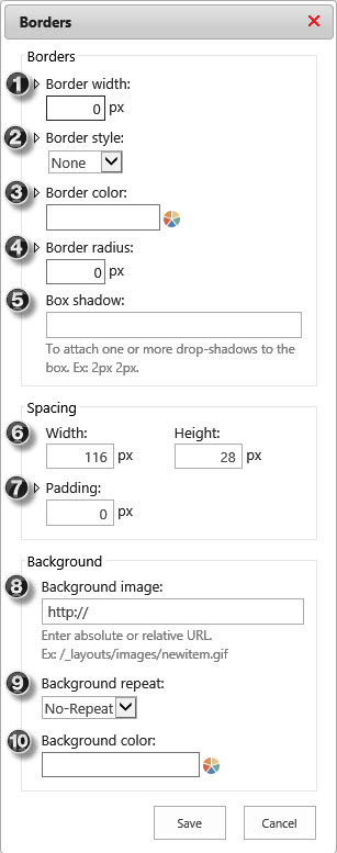
| 1. | Border Width |
Border Width sets the width of an items four borders. Expand this section to individually set the width for each border. | |
| 2. | Border Style |
Border Style sets the style of an items four borders. Expand this section to individually style each border. Available options: Dotted, Dashed, Solid, Double, Groove, Ridge, Inset, Outset. |
|
| 3. | Border Color |
Enter a color value or select from the color-piker to set the Border Color of an items four borders. Expand this section to individually color each border. | |
| 4. | Border Radius |
Border Radius allows you to add rounded edges to an items four border corners. Expand this section to individually set a radius for each corner. | |
| 5. | Box Shadow |
Box Shadow adds one or more shadows to an item. Specify each shadow, in pixels, separated by space key. | |
| 6. | Width & Height |
This option allows you to set the Width and Height of an items or tabs container. Additionally, you can resize containers using drag and drop. | |
| 7. | Padding | Padding allows you to set the space between the border and the items or tab containers content. Expand this section to individually add padding for each border. | |
| 8. | Background Image |
This option sets a Background Image for an item or a tab container. The image size will adjust to fit the containers size and padding. | |
| 9. | Background Repeat |
Background Repeat sets how a background image is repeated. By default, a background image will not be repeated (No-Repeat). Available options: No-Repeat, Repeat (repeats both vertically and horizontally), Repeat-X (repeats only horizontally), or Repeat-Y (repeats only vertically). |
|
| 10. | Background Color |
Enter a color value or select from the color-piker to set the Background Color for an item or a tab container. | |
Styles & Color Options Top
 |
No. | Option | Description |
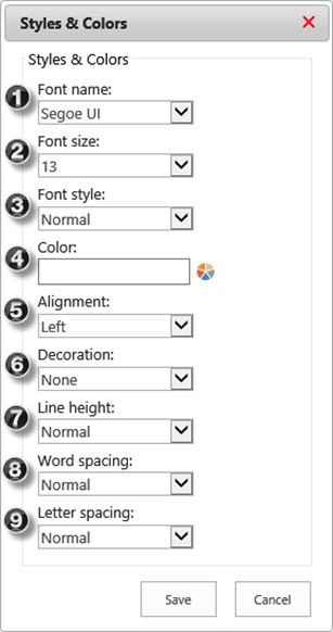
| 1. | Font Name |
Select a Font Name to specify the font for an item. To apply the same font to all items under a tab, specify the font from the tab container’s drop-down menu. Available Options: Arial, Calibri, Comic Sans, Courier, Garamond, Georgia, Impact, Lucida Console, Palatino Linotype, Segoe UI (Default), Tahoma, Times New Roman, Trebuchet MS, Verdana. |
|
| 2. | Font Size |
Select the Font Size to set the size of the font. To apply the same font size to all items under a tab, specify the font size from the tab container’s drop-down menu. | |
| 3. | Font Style |
Select a Font Style to specify the style for your text. To apply the same font style to all items under a tab, specify the font style from the tab container’s drop-down menu. Available Options: Normal, Italic, Bold, Bold Italic. |
|
| 4. | Color | Specify Color by entering a color value or selecting from the color-piker to set the font color. To apply the same font color to all items under a tab, specify the color from the tab container’s drop-down menu. | |
| 5. | Alignment | Select the horizontal Alignment for your text. To apply the same alignment to all items under a tab, specify alignment from the tab container’s drop-down menu. Available Options: Left (aligns text to the left), Right (aligns text to the right), Center (center aligns text ), Justify (stretches text to fit line width). |
|
| 6. | Decoration | Specify the Decoration to add to the text. To apply the same decoration to all text elements under a tab, specify decoration from the tab container’s drop-down menu. Available Options: None (Default), Underline, Overline, Line-Through. |
|
| 7. | Line Height |
Select the Line Height options to specify the amount of space above and below inline elements. To apply the same line height to all text elements under a tab, specify line height from the tab container’s drop-down menu. Available Options: Normal (Default), Number (multiplied by the item’s font size), Length (fixed height, in pixels), % (percent of the item’s font size). |
|
| 8. | Word Spacing |
Specify the Word Spacing to adjust the space between words. To apply the same spacing to all text elements under a tab, specify spacing from the tab container’s drop-down menu. Available Options: Normal (Default), Length (define the space, in pixels). |
|
| 9. | Letter Spacing |
Specify the Letter Spacing to adjust the space between letters. To apply the same spacing to all text elements under a tab, specify spacing from the tab container’s drop-down menu. Available Options: Normal (Default), Length (define the space, in pixels). |
|
Also see: