| Configuration Infographic | Overview of Configuration Screens |
|---|
 Use Data-Viewer’s Look and Feel Settings configuration screen to modify the default appearance of the Web Part.
You can change:
- the color scheme and style
- the size of the web part
- the font of the text in the header row
- or, hide the column headers
NOTE: Look and Feel Settings are optional. If you don’t configure anything your Data-Viewer will have the default Look and Feel.
To change Data-Viewer’s look and feel:
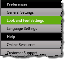 1. Click the Look and Feel Settings button under the Preferences header in the Data-Viewer configuration screen.
NOTE:
This step requires you to have accessed the Data-Viewer Settings screens by clicking the Data Viewer Web Part Settings button in the web parts configuration tool pane.
2. Select from the configuration options below:
| Option | Description |
|---|---|
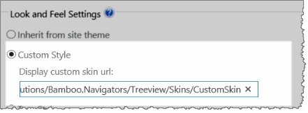
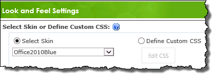
| Select Skin or Define Custom CSS |
|
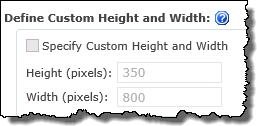
| Define Custom Height and Width |
Using a custom height and width for the web part lets you control the space that the web part will consume on the page.
|
| Define Column Header |
|
 By default, the Data-Viewer will fill the available space in the web part zone or the wiki page where you put it.
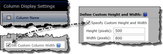
 If you specify a height (in pixels) that is less than needed to display a whole Data-Viewer page, a vertical scroll bar will be displayed. As end users scroll, the header bar remains stationary.
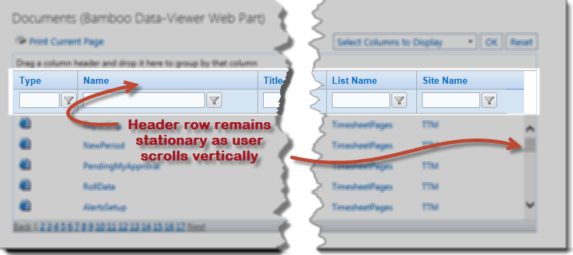
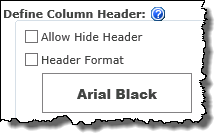 Determine whether the column headers will be visible in the display, or define special formatting for the column headers.
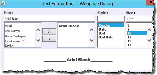
| Configuration Infographic | Overview of Configuration Screens |
|---|