Radar charts display multivariate data across three or more quantitative variables. Radar charts require an X Category axis, which determines the names of the chart arms. The Y-axis determines the observations that get plotted across each category arm.
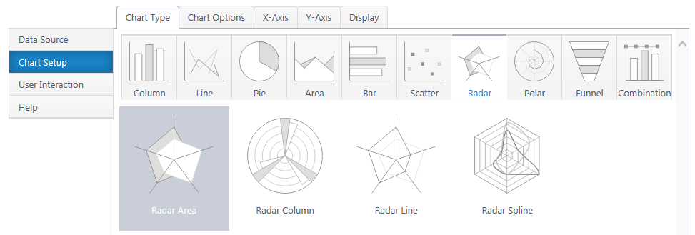
Radar Column, Line, and Spline plot the same radar chart with different visual approaches.
If you haven’t yet, select a data source.
As you’re building your chart, use the Preview button in the upper right to check your work in progress.
Chart Options (Choose X & Y Axis)
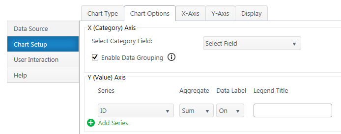
X (Category) Axis
Select Category Axis – Select which column of categories you would like to compare. These will be the arms/axes of the chart. The dropdown list will auto-populate with columns from your data source.
Enable Data Grouping – Group x values of the same category. If off, each individual data point will be a separate column.
Y (Value) Axis
Series – Specify what numerical value you would like to measure on the each axis. An additional y-series will plot an additional, separate radar shape on the graph.
Aggregate – If you have enabled grouping on the x-axis, aggregate the y-axis data you are comparing (sum, first, min, max, average, count). By default, chart plus compares the sum of y values.
Data Label – Toggle data labels for each Y series.
Legend Title – Customize legend titles for each y-axis series.
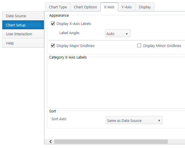
X-Axis Configuration
Data Type Settings – Available if you selected a quantitative x-axis series. Configure the type and format of the number.
Appearance
X-Axis Labels – Toggle x-axis labels & their display angle. Configure numerical units display if number.
Gridlines – Customize which gridlines and display along the x-axis.
Category X-Axis labels – Customize category names that appear on the x-axis.
Sort Axis – Specify an ascending or descending sort order for how categories display on the x-axis.
Y-Axis Configuration
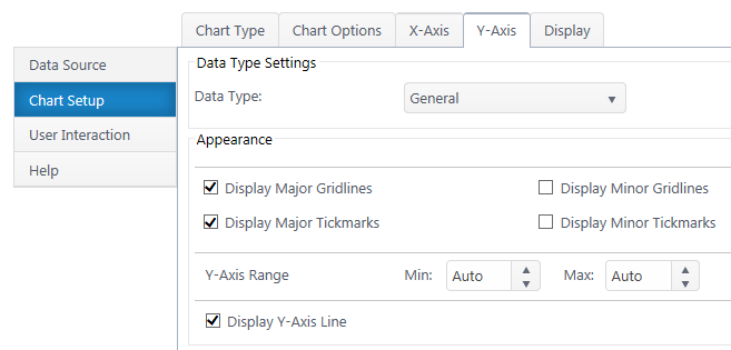
Data Type Settings
Data Type – Select a data type for y values (general, number, currency, date, time, percentage, scientific).
Format – Configure details on how Y values will display on the axis and labels. Date types also require you to select the date scale for the y-axis.
Appearance
Gridlines & Tickmarks – Customize which gridlines and tickmarks display along the y-axis.
Y-Axis Range – Configure the minimum and maximum values visible on the y-axis. These default to “auto” and adjust to the range of your dataset. Not available for “Date” & “Time” data types.
Display Y-Axis Line – Toggle the y-axis line between the y-axis scale and the chart canvas.