Configure Data-Viewer to support Interactive user options
 Data-Viewer can be configured to allow users to update and modify the appearance of the data set in run-time. When working with the Interactive Options keep in mind:
 IMPORTANT: All changes made in run-time will be lost when the user leaves the page and the default configuration will be restored.
- For information on how users can take advantage of these interactive options click here
To configure Data-Viewer to support interactive options:
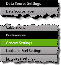 1. Click the General Settings button under Preferences.
NOTE:
To see this screen you need to have accessed the Data-Viewer Settings screens by clicking the Data Viewer Web Part Settings button in the web parts configuration tool pane.
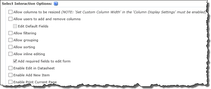
2. Select from the available interactive options, shown below.
| Function |
 . . |
|
Allow Columns to be resized
- Allows users to adjust the column width at runtime by hovering over the column divider, clicking, and dragging the mouse until the column is the desired width.
NOTE: This option is only available if the Set Custom Column Width box is checked in the parent list’s Columns Display Settings window.
|
|
Allow users to add or remove columns
-
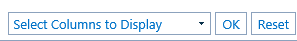 Allows users to customize the column view using a drop-down menu located in the Data-Viewer Web Part. Allows users to customize the column view using a drop-down menu located in the Data-Viewer Web Part.
-
Added columns will be displayed on the right side of the grid in alphabetical order.
-
See How to Dynamically Add or Remove Columns to Display for usage information.
|
|
Edit Default Fields
-
This option is only available if Allow users to add or remove columns has been selected.
-
When checked, all columns configured for default display in the web part will be available in Inline Edit or Datasheet modes for editing, even if the column was removed from the users run-time display.
Edit Default Fields feature added in Data-Viewer 3.7
|
|
Allow filtering
- Allows users to filter items displayed in the Data-Viewer Web Part by entering values in the filter text boxes.
|
|
Allow grouping
|
|
Allow sorting
-
When checked users can click a column heading to dynamically sort displayed items
-
Clicking the column heading cycles sort order between ascending, descending, and no sort.
|
|
Allow inline editing
-
When checked an Inline Edit icon ( ) is added to each row of data. ) is added to each row of data.
The Inline Edit icon changed in Data-Viewer 3.7
-
By default, the following columns will be available for edit in the inline edit form-
- Editable columns that are included in the display
- Columns that are required in the form.
-
See How to Use Inline Editing for additional information.
NOTES:
1. If using a SQL data-source the referenced database must be defined with a primary key
2. This option is not supported for BCS data-sources.
|
|
Add required fields to edit form
- When inline editing is enabled, this option is turned on by default, and adds any required data source fields to the inline edit form, even if they are not normally displayed in the Data-Viewer grid.
|
|
Enable Edit in Datasheet

-
When selected the Edit in Datasheet link will be displayed in the upper left corner of the Web Part.
-
When users click this button, the default Data-Viewer Web Part view is replaced with a grid view similar to SharePoint Datasheet mode. This allows users to make multiple edits quickly. For information about using this feature see How to Edit in Datasheet View.
|
|
Enable Add New Item

- Click to display the Add New Item link in the upper left corner of the Web Part.
|
|
Enable Print Current Page

|