Normal choice and lookup column data can be configured to be displayed as a colored bar, which works well when displaying status, department, or any other kind of label. But in a long SharePoint list, a red, green, or yellow Visual Indicator is often more simple to see on a page rather the words “late”, “delayed”, or “on track”. Visual Indicator Column can be set so to use any hex color value and can be configured for a long, complex choice column with a large number of possible values.

An example of a Color Visual Indicator Column is shown here.
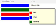 When you hover over a color, Visual Indicator Column displays a legend showing the possible values and their corresponding colors as a tooltip. This makes it easy for users to understand what labels mean even in a complex column.
An example of this kind of tooltip is shown here.
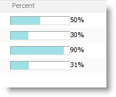 The value in a Percentage column, which is restricted to values between 0% and 100%, can be displayed as a Percentage Bar, which is filled depending on the value of the percentage. Since percentage bars include actual percentage value, they are an easy way to display easy-to-read progress of a task or project without losing any specifics.