| Overview of Calendar Plus Configuration settings |
|---|
 The Calendar Plus General Settings screen defines the general behavior of the web part.
NOTE: Unless otherwise stated the images in the Settings column represent the default configuration settings. In the table below, we provide some icons to help you quickly find a setting. You will not find them in the web part; they are provided here simply to help guide you to the appropriate setting as a visual guide.
| Visual Guides | Description | Function |
|---|---|---|
|
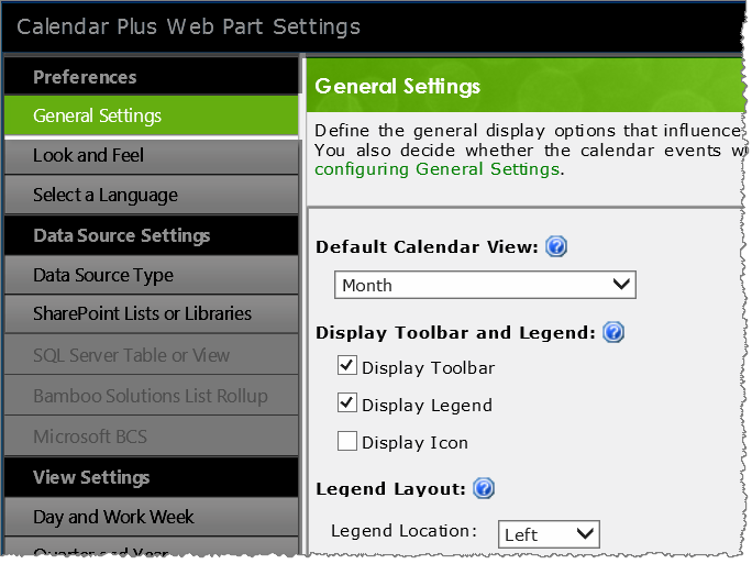
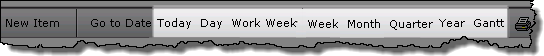
 By default you see a Month view, but this can be changed using the drop down selector. |
Select the Default Calendar View that will be displayed when users access the page. |
|
 |
|
|
|
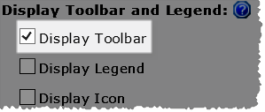
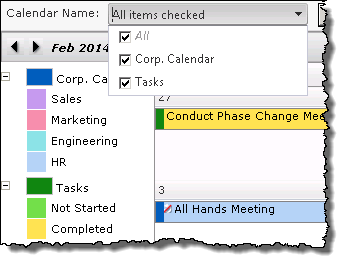
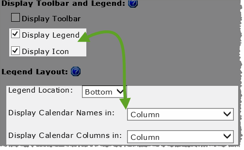
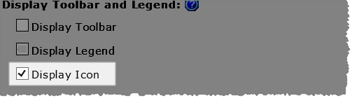
When you check Display Legend and maintain the default Bottom legend location, you will be given the choice of displaying the legend values as a Column or Row.  If you select Left or Right as the legend locations the legend values will be displayed in a column. |
|
If the data source was configured with a Column to identify by Icons the values (or icons) associated with that column will be visible in the legend when Display Icon is selected.
|
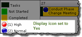 Image showing the data source’s legend, with icons, when Display Icon is set to yes. |
|
Tooltip Display Delay option added in Calendar Plus 4.6 | The default value is 0 to make the tooltip appear instantly. Set the length of delay, in milliseconds, before displaying the tooltip popup. |
|
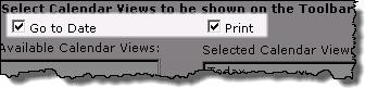 |
 The Go To Date and Print buttons cannot be moved in the toolbar. |
|
  IMPORTANT: Calendar Plus must be configured to Base the Calendar on… an Interval (Start Date and End Date) at the bottom of the General Settings screen to display a Gantt view. IMPORTANT: Calendar Plus must be configured to Base the Calendar on… an Interval (Start Date and End Date) at the bottom of the General Settings screen to display a Gantt view. |
|
|
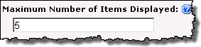 |
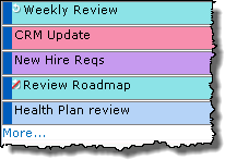 Identifies the Maximum Number of Items to Display in the Month, Quarter and Year views. Identifies the Maximum Number of Items to Display in the Month, Quarter and Year views.
If there are additional items a More… link will be displayed. |
|
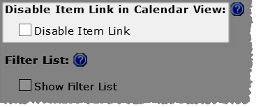 |
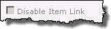
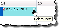
Select the Disable Item Link check box to prevent users from being able to click the item from the calendar and access the Edit form.
|
|
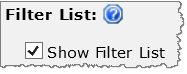 Filter Lists feature added in Calendar Plus 4.5 |
 When Show Filter Lists is checked, users will be able to filter the calendar display by the lists and libraries selected for display in the SharePoint List and Library data source configuration at runtime. When Show Filter Lists is checked, users will be able to filter the calendar display by the lists and libraries selected for display in the SharePoint List and Library data source configuration at runtime.
|
|
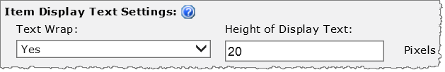 |
When Text Wrap is set to yes, enter the desired Height of Display Text to show multiple lines of text from the Display column selected when configuring the data source. This setting will apply to all item cells. 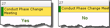 |
|
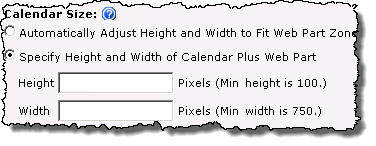 By default the size of the web part will Automatically Adjust…to fit the Web part zone |
Keep in mind:
|
|
 |
|
|
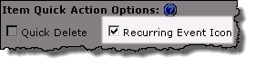 |
 By default Recurring items are identified by a icon in the upper left corner of the item cell. If an item in the recurring series was edited, it will be indicated with a red slash through the icon. |
|
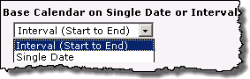 |
Determine whether you want to Base Calendar on a Single Start Date or Interval
|


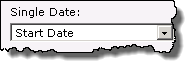 Selecting Single Date will change the data source settings so you can only select one date column.
| Overview of Calendar Plus Configuration settings |
|---|