| Overview of Calendar Plus Configuration settings |
|---|
The following steps require you to have accessed the Calendar Plus Settings screens by clicking the Calendar Plus Web Part Settings button in the web parts configuration tool pane.
| Step | Action | Result |
|---|---|---|
| 1. |
Complete the Required Steps associated with selected data source. |
The Settings pop up window for the selected data source is divided into two sections:
|
| 2. | Select columns that will be displayed in a tool tip by moving Available columns into the Selected Columns list box using the arrow buttons. 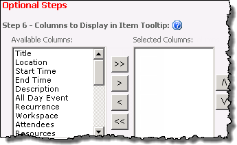
|
Users will see the tool tip when they mouse over an item in the calendar 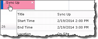
|
| 3. | Select a column that provides a Description for the item.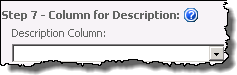
|
Description text will appear under the Display column in the Day and Work Week views.
|
| 4. |
|
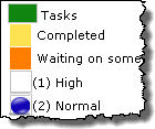
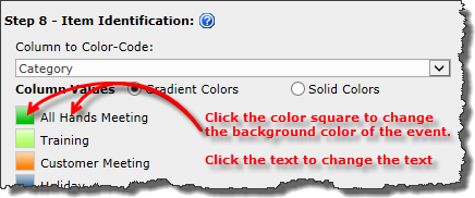
Keep in mind: 1. Choice, Lookup, and Person or Group columns types are supported for color coding. 2. If using Bamboo List Rollup as the calendar’s data source, any special columns included in the rollup will be available. 3. Gradient colors are not shown in the Settings screen, but will display in the Web part. |
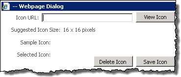
| 5. |
|
2. Icon images need to have been uploaded to a Library within the site collection. 3. The recommended image size is 16×16 pixels 4. If an icon is not associated with a column value, and you have elected to Display Icons |
 Use CTRL+click or SHIFT+click to select multiple columns.
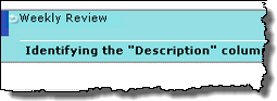