| Return to Customize Search Criteria Styles |
|---|
Modifying the default Styles for Numbers
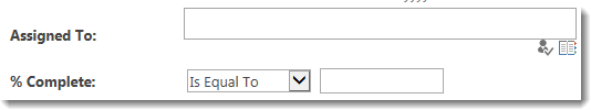
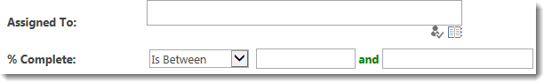
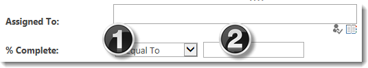
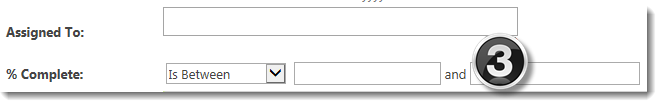
A default Number display is shown below associated with the column % Complete. If the Is Between operator (designated #1 below) is selected, the display changes slightly to reveal the word and and a second text box control (see #3 below). Task Status is a choice type column and is shown for comparison.
Different classes are associated with each control included with the Number column search criteria:
| Class | Default | |
|---|---|---|
| 1. | The .DropDownListControlsNumber class is used to control the display of the drop down menu that lists the possible operators (i.e., Is Equal To, Is Less Than). |
|
| 2. |
The .TextBoxControlsNumber class is used for the box where search criteria for columns of type number is entered.
|
|
| 3. | The .LabelControlsNumber class is used for the word and that appears between the two text boxes when the operator Is Between is selected. |
|
 IMPORTANT: When the operator In Between is selected, a second box appears. This class does not control that second box. There is no class available in the current version to control that box.
The table below shows examples of common changes possible for Number columns. Additional examples may also be possible.
| Change | Example |
|---|---|
|
To shorten the control where you enter the currency value, change the min-width value of the .TextBoxControlsNumber class. To shorten the control where you select the search operator (i.e., Is Equal To), change the min-width value of the .DropDownListControlsNumber class. |
For example, make these changes: The result looks like this: |
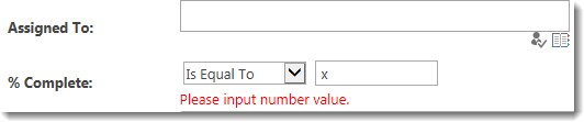
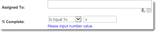
| When a user enters invalid text into the search area for a currency column, an error is displayed. The .LabelControlsNumberError class controls the display of the message. |
The default error message appears like this: The result looks like this: |
| Change the font weight and color of the word and that appears when the user chooses the operation In Between. The .LabelControlsNumber class controls the display of this word. |
Change the text to bold and green: The result looks like this: |
| Change the display of the Label. The label is the text that appears to the left of the operator selection drop down. | All labels have the same class, regardless of the type of column. See this article for examples of how to change them. |