NOTES:
1. The availability of the options shown below will vary based on the Web parts configuration.
2. When the links below take you to a new page the Overview of Calendar Plus user display link on that page will return to you this topic.
|
|
Function |
| 1. |
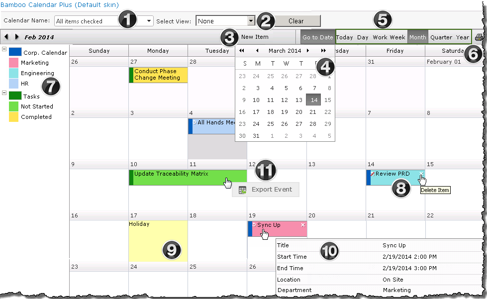
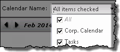 The Calendar Name drop down identifies the SharePoint List and libraries associated with the calendar, allowing you to filter the display by list. The Calendar Name drop down identifies the SharePoint List and libraries associated with the calendar, allowing you to filter the display by list.
NOTE: This feature is only available when using SharePoint Lists and Libraries as the Calendar Plus data source, and when Filter Lists is selected in General Settings. It is not enabled by default.
Filter by Calendar List Name feature added in Calendar Plus 4.5 |
| 2. |
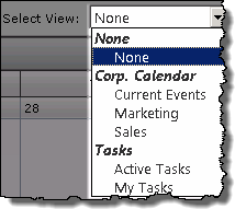
- The drop down menu will display list views, grouped by list, that are available for filtering the contents of the calendar display.
- The default Select View is None
NOTE: This feature is only available when using SharePoint Lists and Libraries as the Calendar Plus data source, and Runtime Filtering was selected when configuring the list or library. It is not enabled by default.
Filter by views associated with multiple lists added in Calendar Plus 4.5 |
| 3. |
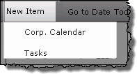
- Items can be added to SharePoint Lists and Libraries using the New Item link in the toolbar.
- If multiple list and libraries are configured to Allow users to add items, a drop down menu will be shown.
- Upon selection a new form of the selected list or library will open
NOTE: This feature is only available when using Calendar Plus is configured to use SharePoint Lists and Libraries as the data source.
|
| 4. |
- Move your mouse over the Go To Date button to select a date from the calendar that appears.
- Use the arrow keys to move a month forward or backward
- Use the double arrows to move forward or backward 3 or 6months, based on the Quarter and Year configuration settings.
- The Day view will be displayed for the selected date.
|
| 5. |
Click the Today, Day, Work Week, Month, Quarter, Year and Gantt buttons in the toolbar to change the calendar view. |
| 6. |
Use the Print icon in the upper right corner of the display to print the current view |
| 7. |
- When using SharePoint Lists and Libraries as the data source the legend can be configured to show color coding for items based on a specified column, and will visually identify the source list or library.
- The legend will dynamically adjust to reflect the items displayed in the view.
|
| 8. |
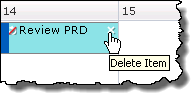
- The presence of a white ‘x’ in the upper left of an item cell will allow you to delete the item from the calendar display.
- A circular arrow in the upper right indicated the item is part of a recurring series.
- A circular arrow with a red slash indicates a change was made to the item that was not applied to the recurring series.
- Click the item display text to view details for the item by opening the form
|
| 9. |
Calendar Plus can be configured to show holiday information. |
| 10 |
- If the data source was configured for Tool Tips you will see additional information about the item.
- The columns displayed are defined when configuring the data source for Calendar Plus.
- If using SharePoint List and Libraries as the data source each list can display a different set of columns in the Tool Tip.
Right-Click on an event to Export Event in iCalendar format and save locally on your hard drive in .ics format.
NOTE: Recurring events may not be recognized when importing into your mail applications, including Outlook Calendar and Google Calendar.
|