Configure List Search Results

Configure List Search Results

Overview of the Simple Search Configuration Tool Pane

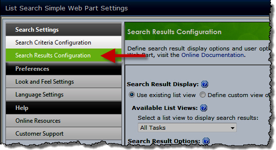
hw11a_SettingsResultsConfig.jpg The Search Results Configuration settings define how search results are displayed in the List Search Simple Web Part. These settings provide you a way to customize what you prefer your users within your environment can see and interact with when they use List Search Simple. Listed in the table below are the sections of the web part settings that you can control to optimize search results for your organization.

Define the columns and view options for the search results grid:

Section Description Display
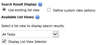
Use existing list view

When this option is checked, the columns displayed in the search results, number of items displayed, and the item sort order will match the settings configured for the list view selected in the Available List Views drop-down list.

Additionally, checking Display List View Selector will allow end users to select an existing list view to determine which columns are shown in the search results.

hw11a_ResultsDisplay2.png

NOTE: Changing the list view configuration in the SharePoint list will affect the search results display in List Search Simple.

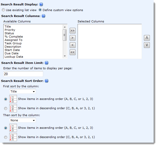
Define custom view options

If you are worried about someone changing your selected list view without letting you know, you can configure the search results display options specifically for this instance of your List Search Simple. Choose this option.

Select the columns to be displayed by highlighting the column in the Available Columns list and clicking the > button to move it into the Selected Columns list.

Control the number of items to display per results page as well as the item sort order.

hw11a_ResultsDisplayCustom.jpg

Icon-Tip Highlight several columns at once by holding the CTRL key while selecting the next column in the Available Columns list.

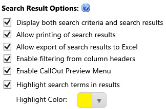
Search Result Options

hw11a_2010_ResultsOptions2.jpg

  • Display both search criteria and search results: When this option is checked, search results will be displayed below the search criteria. When the option is unchecked, the search criteria will be replaced by search results.
  • Allow printing of search results: When this option is checked, the Print button is available on the search results screen.
  • Allow export of search results to Excel: When this option is checked, the Export to Excel button is available on the search results screen.
  • Enable filtering from column headers: When this option is checked, users can filter and sort search results using the column headers as filter and sort values to narrow and sort their search respectively.
  • Enable CallOut Preview Menu (Availble for Document Libraries in SharePoint 2013 Only): When this option is enabled, classic context menu will be replaced with SharePoint 2013 callout menu that display the preview of the document as well as other properties to manage document.
  • Highlight search terms in results: When this option is enabled, search queries and terms are highlighted in the result set.

Configure Search Criteria

Configure Search Criteria

Top
Overview of the Simple Search Configuration Tool Pane

hw11a_SettingsCriteriaConfig.jpg Each instance of the List Search Simple Web Part can search one SharePoint list or library.

In the Search Criteria Configuration settings page, identify the list or library to search and define search criteria.

Top

Select a List or Library to Search

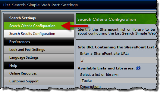
hw11a_CriteriaConfigURL.jpg Click Search Criteria Configuration in the Search Settings section of the List Search Simple Web Part Settings page.

Step Action
1.

In the Enter a SharePoint site URL box, type the path to the SharePoint site that contains the list or library to search. The site can be part of any site collection in the Web application. Site URLs can be absolute (http://servername/site) or relative (./site).

Icon-Tip Bamboo recommends using a relative URL, especially if the Web application has multiple access points using Alternative Access Mappings (AAM) or if the Web Part will be saved as part of a site template.

2. Click the Button-ViewLIstsLIbraries button to populate the Available Lists and Libraries.
3. In the Select a list or library drop-down list, select the list or library to use as the source for your search.

Top

Search Columns

hw11a_CriteriaConfigColumns.jpg Select the list or library columns you want users to be able to search.

NOTE: If you do not select any columns, List Search Simple will only display a single column to search all columns (if that option is enabled).

  • To make a column searchable, select it in the Available Columns list on the left and click the > button to add it to the Selected Columns list on the right.

    Icon-Tip Hold down the SHIFT or CTRL key to select and move more than one column at a time.

  • To add all columns to the searchable columns list, click the >> button.
  • To remove a column from the list of displayed columns, select the column or columns to remove and click the < button.
  • To remove all columns, click the << button.
  • The order that the columns are listed will be the order that they appear to end users. To reorder the displayed columns, select a column in the Selected Columns list and click the up or down arrow to move the selected column one position.

Top

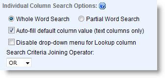
Individual Column Search Options

HW11A_IndividualColumnSearchOptions.jpg

  • Whole Word Search/Partial Word Search: Select the method to use for matching search terms in item text. Whole Word Search will only find a match when the string in the search field matches the entire word in the item text. For example, if the search value is Test, only items containing the exact word Test will be returned, not items containing Testing or Tests. Partial Word Search will match the search string anywhere it occurs. For example, the search string Test would match Test, Tests, or Testing.
  • Auto-fill default column value: For any SharePoint Single line of text column in the list or library that has a default value configured, the List Search Simple Web Part will display the default value as the default search term when this option is checked.

    NOTE: This option currently applies to Single line of text columns only.

  • Disable drop-down menu for Lookup columns: Check this option to display the search box for SharePoint Lookup columns as a text box instead of a drop-down list of choices.

Icon-Warning IMPORTANT: Bamboo recommends disabling Lookup fields if the lookup list has more than 200 items. Populating the drop-down list for large Lookup columns can slow the performance of the List Search Simple Web Part.

  • Search Criteria Joining Operator: If search terms are entered in more than one column, the Search Criteria Joining Operator selection determines how a match is found by joining each individual column criteria.

    • Select the OR operator to display items that match any search term.
    • Select the AND operator to display items only if they match all search terms.

      Icon-Tip End users can add additional Boolean operators to their search criteria. See Search String Tips and Tricks for more information.

      Top

All-Inclusive Search Options

Sometimes users aren’t sure what column to search in. When this is the case, the List Search Simple Web Part can leverage the SharePoint Search service to allow searching in all list or library columns using a single search field.
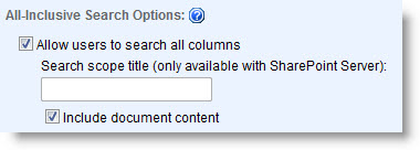
HW11A_AllInclusiveSearchOptions.jpgCheck the option Allow users to search in all columns to add an additional field (highlighted below) to the search criteria list called Search in all columns for. Users will be able to enter search criteria in this column if they aren’t sure which specific column to search in.

If this option is not checked, only the columns selected in the Search Columns configuration section will be displayed.

Icon-WarningIMPORTANT:

  1. SharePoint Search must be enabled and configured in your SharePoint farm and the list/library content must be indexed for searching in order to use the all-inclusive search option.
  2. End users choose to search in all columns (all-inclusive) OR search in specific columns, regardless of the Search Criteria Joining Operator. It is not possible to search by entering criteria in both places.

search in all columns for.png

When the Allow users to search in all columns option is checked, the following additional features define search behavior:

  • Search scope title: To improve search performance, enter the smallest SharePoint Search scope that includes the list data you want to search.

    NOTE: Search scopes are only configurable in MOSS 2007 or SharePoint Server 2010. In SharePoint 2013 they are called Result Sources.

  • Include document content: Check this option to also search the text in list item attachments and document library items.

    NOTE: Only document types that are indexed for SharePoint Search can be searched with the List Search Simple Web Part. For more information about searching documents, consult the documentation for your SharePoint version.

To display only the Search in all columns for field, remove all other columns from the Search Columns list.

Icon-Tip In order for results to be found using the Search in all columns for field, the configured list must be included in the SharePoint Search configuration. If searches using the List Search Simple don’t return the expected results, be sure the list contents are indexed and can be found using the out-of-the-box SharePoint Search.

Top
Customize Search Criteria Layout

Customize Search Criteria Layout

Overview of List Search Criteria Customization

It is possible to modify the Layout of the search criteria displayed and also the Styles. This article gives examples of ways to modify the default Layout. If you are interested in keeping the default layout and just changing the Styles, please see Customize Search Criteria Styles.

To customize the layout of the search criteria:

Step Action Result
1. On the Look and Feel Settings page accessed from the Preferences section of the Web Part Settings, click the radio button for Custom search criteria layout hw11a_LookFeelLayout.jpg
2. Click Modify Layout button
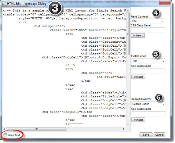
3. The HTML Editor window displays.

Icon-WarningIMPORTANT: The HTML provided in the HTML Editor window is a sample only and must be replaced by your custom HTML. If you find the content in the editor hard to read and you need to scroll back and forth, click the Wrap Text button at the bottom of the window.

hw11a_LookFeelHTMLEditor.jpg

NOTE: By default, search criteria are listed vertically in the web part, one per line, in the order defined in the Search Columns list in the Configure Search Criteria page.

The options on the right side of the HTML Edit window are available to help you construct the HTML code:
4. FieldControl.jpg

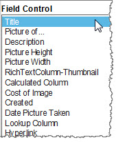
Field Control contains a list of the search columns defined in the Search Criteria Configuration page. Add a Field Control so users can search on a column. Select a column to insert and provide a CSS class name that can be used later to define the style for the column (optional).

Icon-WarningIMPORTANT: Don’t manually add any fields that you didn’t specifically include in the search during the Search Criteria Configuration. They will not appear.

Place your cursor in the HTML Editor where you want to insert the column and click the <<Insert button. The following text will be inserted:

[@Field:InternalFieldName CSSClass=”ClassName”] 


Where:

  • @Field defines the type of control (i.e., text box, radio button, selection list) added to the page. The field control is based on the column type.
  • InternalFieldName is the internal name of the search column. An internal name of a column is also the original column name when the column is created. When a column is first created in a list, the internal/original name and display name match. When the column is renamed, the display name updates to the new name but the internal/original name remains the same.
  • CSSClass= is an optional parameter that allows you to define a unique CSS style to the Field Control.
  • ClassName is the name of the class to apply to the control.

Icon-WarningIMPORTANT: If you want to include the Search in all columns for search criteria boxkeywords control.png, you will find it in the Search Control list (see Step 6 below). It is not a Field Control. Adding it to your layout adds the following text:
[@Control:TxtKeywords CssClass="TextBoxSearchKeyWord"]

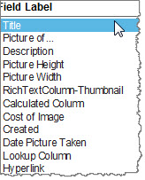
5. FieldLabel.jpg

Field Label also lists search columns defined in the Search Criteria Configuration page. Use a Field Label as a label for a Field Control you added in Step 4.

Icon-Tip: If you don’t want to use the Display Name of the column as the label, you can add regular text to your layout, rather than a Field Label. Adding a Field Label is optional.

Select a column, define a CSS class name (optional), and click <<Insert to add the label of the search column into the HTML Editor. The following text will be inserted:

[@DisplayName:InternalFieldName CSSClass=”ClassName”]


Where:

  • @DisplayName defines the type of control added to the page. Field labels are typically text.
  • InternalFieldName is the internal name of the search column. An internal name of a column is also the original column name when the column is created. When a column is first created in a list, the internal/original name and display name matches. When the column is renamed, the display name updates to the new name but the internal/original name remains the same.
  • CSSClass= is an optional parameter that allows you to define a unique CSS style to the Field Control.
  • ClassName is the name of the class to apply to the control.
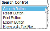
6. SearchControl.jpg

Search Control lists control buttons and fields that can be inserted in the Web Part. Select a Search Control and enter a CSS class name (if desired). Put the cursor in the HTML Editor where you want the control to be displayed and click Insert. The following text will be inserted:

[@Control:BtnControlName CssClass="ClassName"]   


Where:

  • @Control defines the type of control (i.e., BtnSearch, BtnReset) added to the page.
  • BtnControlName is the name of the button. Available buttons are: BtnSearch, BtnReset, BtnPrint, and BtnExport. The last control in the list (TxtKeyWords) is not a button, but the control used to enter search text for the Search in all columns for box.
  • CSSClass= is an optional parameter that allows you to define a unique CSS style to the Field Control.

    NOTE: In the current version, there is no available class for the txtKeyWords control

  • ClassName is the name of the class to apply to the control.

Available controls include:

  • Search Button will invoke the search request.
  • Reset Button will clear the search results and search criteria from the Web Part.
  • Print Button will provide the user the ability to print the search results from a printer-friendly window.
  • Export Button will provide the user the ability to export search results to Microsoft Excel.
  • Keywords TextBox will allow the user to Search in all Columns for results.
7. When you are finished constructing your custom HTML, including all fields and controls you want to include on the search page, click the Save button in the HTML Editor to save the new layout and return to the Look and Feel Settings page.
8. Click Save & Close in the Web Part Settings window, and then click Apply and then OK in the web part tool pane to view the new layout.

icon-video1 Check this video to see an example.

Example of Customized Styles in Search Criteria

Example of Customized Styles in Search Criteria

Return to Customize Search Criteria Styles

Modifying several styles in Search Criteria

The table below shows an example of a modification to the Search Criteria Styles while keeping the default layout. Changes were made to all the TextBox classes.

Default Custom

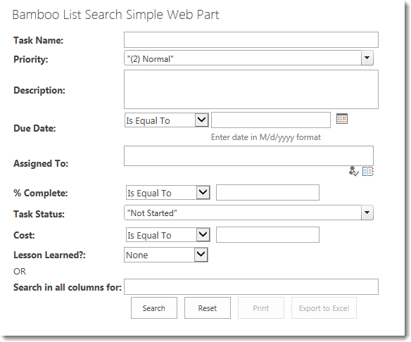
Default simple search styles.png

The default values of the classes changed for the custom display are shown below.

.TextBoxSearchKeyWord
{
min-width:350px;
}
.TextBoxControls
{
min-width:350px;
}
.MultiTextAreaControls
{
min-height:50px;
min-width:350px;
}
.TextBoxControlsCurrency
{
width:135px;
}
.TextBoxControlsNumber
{
width:135px;
}
.TextBoxControlsDateTime
{
width:135px;
}

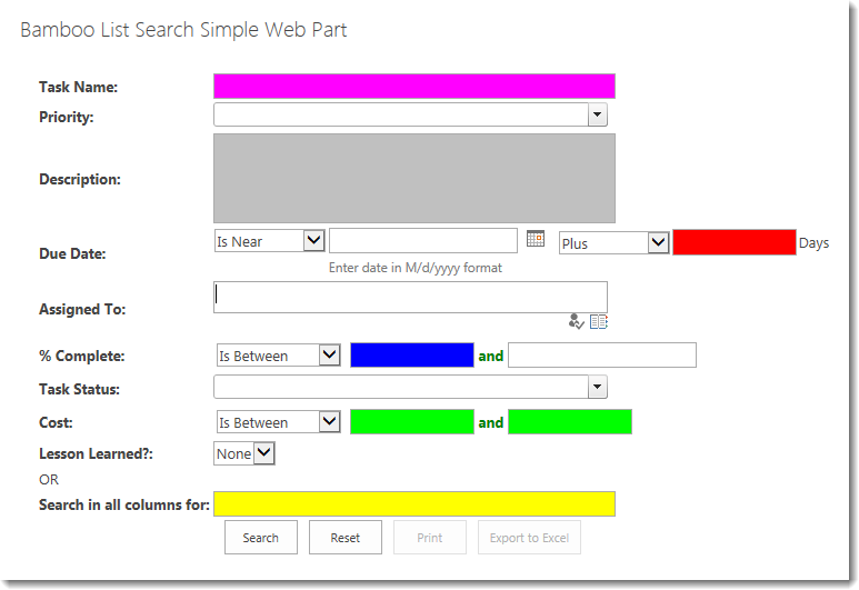
result with colorful text boxes.png

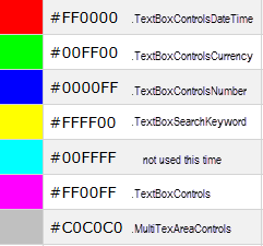
The changes made to the CSS for the above display were the addition of the background-color parameters shown below:

.TextBoxSearchKeyWord
{
min-width:350px;
background-color: #FFFF00 !important;
}
.TextBoxControls
{
min-width:350px;
background-color: #FF00FF !important;
}
.MultiTextAreaControls
{
min-height:75px;
min-width:350px;
background-color: #C0C0C0 !important;
}
.TextBoxControlsCurrency
{
background-color: #00FF00 !important;
width:100px;
}
.TextBoxControlsNumber
{
width:100px;
background-color: #0000FF !important;
}
.TextBoxControlsDateTime
{
width:100px !important;
background-color: #FF0000 !important;
}

colorkey with class names.pngColor Key:

Customize Search Criteria Styles

Customize Search Criteria Styles

Overview of List Search Criteria Customization

Modifying the default Styles of the Search Criteria

It is possible to modify the Layout of the search criteria and also the Styles used. You can keep the default layout and just change the styles. Styles are stored in a Cascading Style Sheet (CSS) file. If you are interested in changing the Layout, please see
Customize Search Criteria Layout.

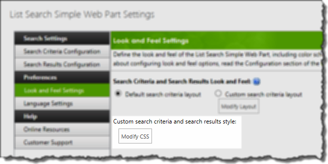
click to modify styles.pngOn the Look and Feel Settings page accessed from the Preferences section of the Web Part Settings, click Modify CSS to access the style sheet for this instance of the web part.
Icon-Tip It’s a good idea to save contents of the default style sheet to your local PC before making any changes. Once you make changes, there isn’t a reset button.

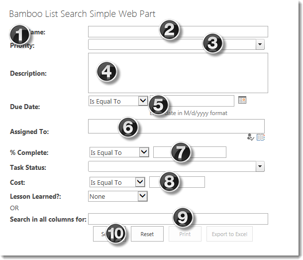
For specific information about the different types of search criteria you may want to style, see the sample search below.
default simple search UI with nums.png

  1. Column Labels
  2. Text Box Controls
  3. Choice & Lookup Columns
  4. Multi-line Text Controls
  5. Date Columns
  6. Person or Group Columns
  7. Number Columns
  8. Currency Columns
  9. Search in all columns for Control
  10. Buttons

    icon-video1 Check this video

To modify the overall style of the default search criteria table (i.e., borders, padding, background color), see Customize the Overall Style for the Search Criteria.

To see some examples, check these:
Example of Customized Styles in Search Criteria

Video:Change the Style of the Search Results in Simple Search Web Part

Customizing CSS for List Search

Customizing CSS for List Search

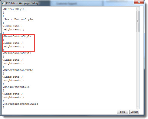
hw11a_LookFeelCSSEditor.jpg Each CSS element is listed in the CSS Editor, along with any styles currently defined for it. Add CSS style attributes as desired to customize how elements are displayed in the Web Part.
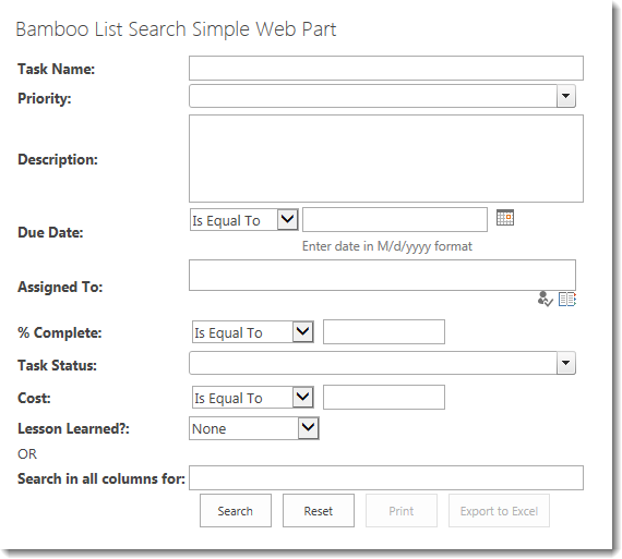
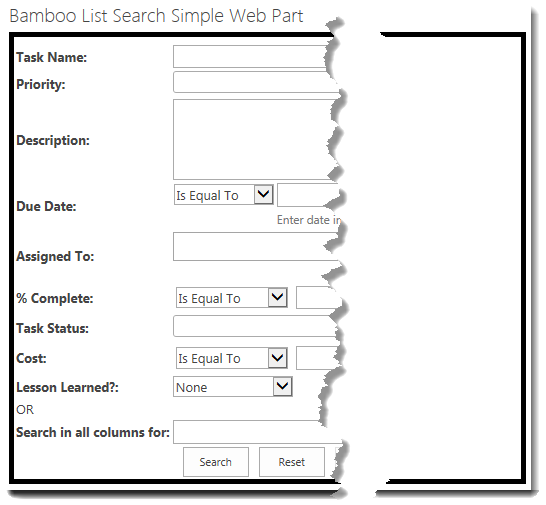
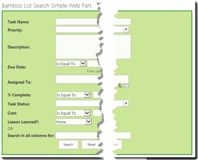
As an example, should you choose to modify the attributes of the search button for your user interface, you can do that within the style “.SearchButtonStyle” changing the width and height from auto to your selection in pixels.

Icon-Warning IMPORTANT: If unique CSS class names are defined in the layout HTML Editor, they should be added to the CSS class definitions in the CSS Edit window.

Below is a list of the default CSS classes defined for the List Search Simple Web Part:

Style Description
SearchButtonStyle, ResetButtonStyle, PrintButtonStyle, ExportButtonStyle, and BackButtonStyle

Define the look and feel of the Search, Reset, Print, Export, and Back buttons.

NOTE: If the option Keep Search Criteria with Search Result Page is not checked, the Print Preview and Back buttons are not customizable in the Search Results view.

TextBoxSearchKeyWord Defines the look and feel of the Search in all columns for: text box.
LabelControls Defines the look and feel of the Field Label controls.
TextBoxControls Defines the look and feel of the Field Controls that are text boxes.
TextAreaControls Defines the look and feel of the Field Controls that are text areas.
ListBoxControls Defines the look and feel of the Field Controls that are list boxes.
DropDownListControls Defines the look and feel of the Field Controls that are drop down menus.
CheckBoxControls Defines the look and feel of the Field Controls that are check boxes.
RadioButtonControls Defines the look and feel of the Field Controls that are radio buttons.
ResultTableStyle Defines the general style of the search results table. Settings can include border style, background style and alignment.
ResultTableHeaderStyle Defines the background color for the column headers of the search results table.
ResultNormalItemStyle Defines the background color for the odd number search result rows (rows 1, 3, 5, …).
ResultAlternatingItemStyle Defines the background color for the even number search result rows (rows 2, 4, 6, …).

Customize the Overall Style for the Search Criteria

Customize the Overall Style for the Search Criteria

Return to Customize Search Criteria Styles

Modifying the Style for the default table layout

A default Search Criteria style display is shown below.

table format default.png

.LayoutTableStyle is the classes associated with the overall layout. The default setting for that class is:

.LayoutTableStyle
{
width:100% ;
height:auto ;
}

The table below shows examples of common changes possible for Currency columns. Additional examples may also be possible.

Change Example
To add a border around the search criteria, add a border property.

For example, make these changes:

.LayoutTableStyle
{
border: 5px solid black;
width:100% ;
height:auto ;
}

The result looks like this:

table format with black border cropped.png

NOTE: Search results displayed on the same page will appear outside the border.

Add a border, background color, and some padding around the search criteria.

Make these changes:

.LayoutTableStyle
{
border: 2px solid green;
padding: 15px;
background-color: #CCE698 !important;
width:100% ;
height:auto ;
}

The result looks like this:

table format with background padding and border.png

NOTE: Search results displayed on the same page will appear outside the border.

Customize Text Box Display Styles in Search Criteria

Customize Text Box Display Styles in Search Criteria

Return to Customize Search Criteria Styles

Modifying the default Styles for Text Boxes

The .TextBoxControls class is used for the box where search criteria for columns of type single line of text is entered. The default setting for the TextBoxControls is

.TextBoxControls
{
min-width:350px;
}

The default display looks like the box to the right of the Task Name: label shown below. Priority is a choice type column and is shown for comparison.

text box length before1.png

The table below shows examples of common changes possible to the Text Box. Examples not included may also be possible.

Change Example
To make the control longer so users can more easily enter lots of text, change the min-width to something larger than 350px

Change to:

.TextBoxControls
{
min-width:550px;
}

The result looks like this:

text box length after2.png

NOTE: This control impacts just columns of type single line of text. Notice that the length of the Priority column selection has not changed. Priority is a choice type column.

To change the background color of the control, add a background-color property.

Change to:

.TextBoxControls
{
min-width:550px;
background-color: #CCE698 !important;
}

The result looks like this:

background color2.png

NOTE: If you don’t add !important, the color will not appear.

Change the display of the Label. The label is the text that appears to the left of the text box. All labels have the same class, regardless of the type of column. See this article for examples of how to change them.

Customize Search Results Styles

Customize Search Results Styles

Overview of the Simple Search Configuration Tool Pane

Modifying the default Styles for Search Results

click to modify styles.pngOn the Look and Feel Settings page accessed from the Preferences section of the Web Part Settings, click Modify CSS to access the style sheet for this instance of the web part.

Icon-Tip Save the default style sheet to your local PC before making any changes.

Default Search Results display styles are shown below. They do not inherit the styles of the site, so it may be necessary to modify the styles in your implementation.

default search results with nums.png

Different classes are associated with each area of the results display:

Class Default

.ResultTableStyle

This class defines the general style of the results table.

.ResultTableStyle
{
border-style:none ;
width:100% ;
height:auto ;
}
1

.ResultTableHeaderStyle

This class controls the style for Header row of the results list.

.ResultTableHeaderStyle
{
width:auto ;
height:auto ;
}
2

.ResultAlternatingItemStyle

This class controls the style for the even numbered rows in the results list.

.ResultAlternatingItemStyle
{
 background: none repeat scroll 0 0 #F2F2F2 !important;
}
.ResultAlternatingItemStyle a
{
color:#0072BC !important;
}
3

.ResultNormalItemStyle

This class controls the style for the odd numbered rows in the results list. These rows have a white background by default.

.ResultNormalItemStyle
{
}
.ResultNormalItemStyle td a
{
color:#0072BC !important;
}
4

.ResultTableFooterStyle

This class controls the style for the footer row of the results list. This is the row that shows that page navigation.

.ResultTableFooterStyle
{
}

The table below shows examples of common changes possible for Search Results. Additional examples may also be possible.

Change Example
Change the color scheme from blue to green.

icon-video1 Check this Video

Make these changes:

.ResultTableHeaderStyle
{
background: none repeat scroll 0 0 #CCE698!important;
font-weight: bold !important;
width:auto ;
height:auto ;
}
.ResultAlternatingItemStyle
{
 background: none repeat scroll 0 0 #D6EBAD!important;
}
.ResultAlternatingItemStyle a
{
}
.ResultNormalItemStyle
{
 background: none repeat scroll 0 0 #EAF5D6!important;
}
.ResultNormalItemStyle td a
{
}
.ResultTableFooterStyle
{
background: none repeat scroll 0 0 #CCE698!important;
}
.ResultTableStyle
{
border-style:none ;
width:80% ;
height:auto ;
}

The result looks like this:

results formatted.png

Icon-Tip Check this video to see a change being made.

Customize Search In All Columns Text Box Display Style in Search Criteria

Customize Search In All Columns Text Box Display Style in Search Criteria

Return to Customize Search Criteria Styles

Modifying the default Style for Search in all columns Text Box

The .TextBoxSearchKeyWord class is used for styling the box where search criteria for searching in all columns is entered. The default setting for the TextBoxSearchKeyWord is

.TextBoxSearchKeyWord
{
min-width:350px;
}

The default display looks like the box to the right of the Task Name: label shown below. Priority is a choice type column and is shown for comparison.

search in all columns for1.png

The table below shows examples of common changes possible to the Text Box. Examples not included may also be possible.

Change Example
To make the control longer so users can more easily enter lots of text, change the min-width to something larger than 350px

Change to:

.TextBoxControls
{
min-width:550px;
}

The result looks like this:

search in all columns for - longer.png

Customize Number Display Styles in Simple Search

Customize Number Display Styles in Simple Search

Return to Customize Search Criteria Styles

Modifying the default Styles for Numbers

A default Number display is shown below associated with the column % Complete. If the Is Between operator (designated #1 below) is selected, the display changes slightly to reveal the word and and a second text box control (see #3 below). Task Status is a choice type column and is shown for comparison.

number before1 with num.png
number before2 with num.png

Different classes are associated with each control included with the Number column search criteria:

Class Default
1. The .DropDownListControlsNumber class is used to control the display of the drop down menu that lists the possible operators (i.e., Is Equal To, Is Less Than).
.DropDownListControlsNumber
{
min-width:120px ;
}
2.

The .TextBoxControlsNumber class is used for the box where search criteria for columns of type number is entered.

Icon-WarningIMPORTANT: When the operator In Between is selected, a second box appears. This class does not control that second box. There is no class available in the current version to control that box.

.TextBoxControlsNumber
{
min-width:135px;
}
3. The .LabelControlsNumber class is used for the word and that appears between the two text boxes when the operator Is Between is selected.
.LabelControlsNumber
{
width:auto ;
float: right !important;
}

The table below shows examples of common changes possible for Number columns. Additional examples may also be possible.

Change Example

To shorten the control where you enter the currency value, change the min-width value of the .TextBoxControlsNumber class.

To shorten the control where you select the search operator (i.e., Is Equal To), change the min-width value of the .DropDownListControlsNumber class.

For example, make these changes:

.TextBoxControlsNumber
{
min-width:100px;
}

.DropDownListControlsNumber
{
min-width:100px;
}

The result looks like this:

number after 1.png

When a user enters invalid text into the search area for a currency column, an error is displayed. The .LabelControlsNumberError class controls the display of the message.

The default error message appears like this:

number error before.png
Change the text to blue:

.LabelControlsNumberError
{
color: #0000FF;
width:auto ;
}

The result looks like this:

number error after.png

Change the font weight and color of the word and that appears when the user chooses the operation In Between. The .LabelControlsNumber class controls the display of this word.

Change the text to bold and green:

.LabelControlsNumber
{
color: #FF0000;
width:auto ;
font-weight: bold;
color: #008000;
}

The result looks like this:

number after 2.png

Change the display of the Label. The label is the text that appears to the left of the operator selection drop down. All labels have the same class, regardless of the type of column. See this article for examples of how to change them.

Customize Multi-line Text Box Display Styles in Search Criteria

Customize Multi-line Text Box Display Styles in Search Criteria

Return to Customize Search Criteria Styles

Modifying the default Styles for Multi-line Text Boxes

The .MultiTextAreaControls class is used for the box where search criteria for columns of type multiple lines of text is entered. The default setting for the MultiTextAreaControls is

.MultiTextAreaControls
{
min-height:50px;
min-width:350px;
}

The default display looks like the box to the right of the Description: label shown below. Priority is a choice type column and is shown for comparison. The Task Name column is also shown for comparison.

multiline before.png

The table below shows an example of a common change possible to the Text Box. Other examples may also be possible.

Change Example
To make the control taller so users can more easily enter lots of text, change the min-height to something larger than 50px

Change to:

.MultiTextAreaControls
{
min-height:75px;
min-width:350px;
}

The result looks like this:

multiline after75.png

NOTE: This control impacts just columns of type multiple lines of text. Notice that the height of the Priority and Task Name columns have not changed.

Also, the multi-line text control will display vertical scroll if a lot of text is entered. You will not be able to set the min-height to something less than what is needed to display the scroll bar.
multiline with scroll showing.png

Customize List Search Results

Customize List Search Results

Overview of the Simple Search Configuration Tool Pane

Each CSS element is listed in the CSS Editor, along with any styles currently defined for it. Add CSS style attributes as desired to customize how elements are displayed in the Web Part. Watch our video to see how you can change the list search results

Below is a list of the default CSS classes defined for the List Search Simple Web Part:

Style Description
WebPartStyle defines the styling of the Search Criteria table and Search Results table. Here you can define general format, such as alignment, border, and font styles.
SearchButtonStyle, ResetButtonStyle, PrintButtonStyle, ExportButtonStyle, and BackButtonStyle

define the look and feel of the Search, Reset, Print, Export, and Back buttons.

NOTE: If the option Keep Search Criteria with Search Result Page is not checked, the Print Preview and Back buttons are not customizable in the Search Results view.

TextBoxSearchKeyWord defines the look and feel of the Search in all columns for: text box.
LabelControls defines the look and feel of the Field Label controls.
TextBoxControls defines the look and feel of the Field Controls that are text boxes.
TextAreaControls defines the look and feel of the Field Controls that are text areas.
ListBoxControls defines the look and feel of the Field Controls that are list boxes.
DropDownListControls defines the look and feel of the Field Controls that are drop down menus.
k-multiselect defines the look and feel of the Choice and Lookup Controls that are drop down menus.
CheckBoxControls defines the look and feel of the Field Controls that are check boxes.
RadioButtonControls defines the look and feel of the Field Controls that are radio buttons.
ResultTableStyle defines the general style of the search results table. Settings can include border style, background style and alignment.
ResultTableHeaderStyle defines the background color for the column headers of the search results table.
ResultNormalItemStyle defines the background color for the odd number search result rows (rows 1, 3, 5, …).
ResultAlternatingItemStyle defines the background color for the even number search result rows (rows 2, 4, 6, …).

If unique CSS class names are defined in the layout HTML Editor, they should be added to the CSS class definitions in the CSS Editor window.

For example, if you would like the background color on all odd rows of your search results list to be light yellow, you can change the style as follows:

   ResultNormalItemStyle="yellow"

See also:

Customize Label Display Styles in Search Criteria

Customize Label Display Styles in Search Criteria

Return to Customize Search Criteria Styles

Modifying the default Styles for Labels

The .LabelControls class is used for labels. The default setting for the LabelControls is

.LabelControls
{
width:auto;
}

The default display looks like the labels shown below.

text box length before2.png

Icon-WarningIMPORTANT: The .LabelControls class does NOT control the label for the Search in all columns for text box. There is currently no default class available to control that label.

The table below shows examples of common changes possible to Labels. Examples not included may also be possible.

Change Example

To right justify the labels, add a float property.

NOTE: Use float instead of text-align when using the default layout. In the default layout, the .LabelControls class is inside a <b> tag, so Text-align will not affect it.

Change to:

.LabelControls
{
width:auto ;
float: right !important;
}

The result looks like this:

right justify labels.png

NOTE: If you don’t add !important, the altered alignment will not appear.

To change the text color of the labels, add a background-color property.

Change to:

.LabelControls
{
width:auto ;
float: right !important;
color:#008000;
}

The result looks like this:

label style after.png

To change the font for the labels, add a font-family property.

Change to:

.LabelControls
{
width:auto ;
float: right !important;
color:#008000;
font-family: Times;
}

The result looks like this:

set the font family.png

Customize Date Display Styles in Search Criteria

Customize Date Display Styles in Search Criteria

Return to Customize Search Criteria Styles

Modifying the default Styles for Dates

A default Date display is shown below associated with the column Due Date. If the Is Between operator (see #1 below) is selected, the display changes slightly to reveal the word and and a second text box control (see #3 below). Assigned To is a Person or Group type column and is shown for comparison.

Date before 1 with num.png
Date before 2 with num.png
date with is NEar1.png

Different classes are associated with each control included with the Date column search criteria:

Class Default
1. The .DropDownListControlsDateTime class is used to control the display of the drop down menu that lists the possible operators (i.e., Is Equal To, Is Less Than).
.DropDownListControlsDateTime
{
min-width:120px ;
}
2. Unfortunately, in the current version of List Search Simple, there is no available class for controlling the style of the Date picker control.
3. The .LabelControlsDateTime class is used for the word and that appears between the two date-pickers when the operator Is Between is selected.
.LabelControlsCurrency
{
width:auto ;
float: right !important;
}
4. The .TextBoxControlsDateTime class is used for the box displayed when the operator Is Near is selected.
.TextBoxControlsDateTime
{
min-width:135px;
}

The table below shows examples of common changes possible for Date columns. Additional examples may also be possible.

Change Example
To shorten the control where you select the search operator (i.e., Is Equal To), change the min-width value of the .DropDownListControlsDateTime class.

For example, make this change:

.DropDownListControlsDateTime
{
min-width:100px;
}

The result looks like this:

date after 1a.png

Change the font weight and color of the word and that appears when the user chooses the operation In Between. The .LabelControlsDateTime class controls the display of this word.

Change the text to bold and green:

.LabelControlsDateTime
{
color: #FF0000;
width:auto ;
font-weight: bold;
color: #008000;
}

The result looks like this:

date after 2a.png

Change the display of the Label. The label is the text that appears to the left of the operator selection drop down. All labels have the same class, regardless of the type of column. See this article for examples of how to change them.

Customize Currency Display Styles in Search Criteria

Customize Currency Display Styles in Search Criteria

Return to Customize Search Criteria Styles

Modifying the default Styles for Currency

A default Currency display is shown below associated with the column Cost. If the Is Between operator (designated #1 below) is selected, the display changes slightly to reveal the word and and a second text box control (see #3 below). Task Status is a choice type column and is shown for comparison.

cost control before.png
cost control before1.png

Different classes are associated with each control included with the Cost column search criteria:

Class Default
1. The .DropDownListControlsCurrency class is used to control the display of the drop down menu that lists the possible operators (i.e., Is Equal To, Is Less Than).
.DropDownListControlsCurrency
{
min-width:120px ;
}
2.

The .TextBoxControlsCurrency class is used for the box where search criteria for columns of type currency is entered. When the operator In Between is selected, a second box appears. It is controlled by the same class.

Icon-WarningNOTE: When the operator In Between is selected, a second box appears. This class also controls that second box.

.TextBoxControlsCurrency
{
min-width:135px;
}
3. The .LabelControlsCurrency class is used for the word and that appears between the two text boxes when the operator Is Between is selected.
.LabelControlsCurrency
{
width:auto ;
float: right !important;
}

The table below shows examples of common changes possible for Currency columns. Additional examples may also be possible.

Change Example

To shorten the control where you enter the currency value, change the min-width value of the .TextBoxControlsCurrency class.

To shorten the control where you select the search operator (i.e., Is Equal To), change the min-width value of the .DropDownListControlsCurrency class.

For example, make these changes:

.TextBoxControlsCurrency
{
min-width:100px;
}

.DropDownListControlsCurrency
{
min-width:100px;
}

The result looks like this:

currency after changes.png

When a user enters invalid text into the search area for a currency column, an error is displayed. The .LabelControlsCurrencyError class controls the display of the message.

The default error display is:
currency error before.png
Change the text to blue:

.LabelControlsCurrencyError
{
color: #0000FF;
width:auto ;
}

The result looks like this:

currency error after.png

Change the font weight and color of the word and that appears when the user chooses the operation In Between. The .LabelControlsCurrency class controls the display of this word.

Change the text to bold and green:

.LabelControlsCurrency
{
color: #FF0000;
width:auto ;
font-weight: bold;
color: #008000;
}

The result looks like this:

cost in between after.png

Change the display of the Label. The label is the text that appears to the left of the operator selection drop down. All labels have the same class, regardless of the type of column. See this article for examples of how to change them.

Overview of List Search Criteria Customization

Overview of List Search Criteria Customization

Overview of the Simple Search Configuration Tool Pane

Default simple search styles.pngBy default, search criteria are listed vertically in the Web Part, one per line, in the order defined in the Search Columns list in the Search Criteria Configuration page. The styles used in the display are inherited from the site theme. An example is shown here.

It is possible to modify the layout, the styles, or both to get a display very different than the default.

For more information about each, please see:

Customize Choice and Lookup Selection Display Styles in Search Criteria

Customize Choice and Lookup Selection Display Styles in Search Criteria

Return to Customize Search Criteria Styles

Modifying the default Styles for Choice and Lookup Selections

A default Choice Selection display is shown below associated with the column Priority. Task Name is a single line of text type column and is shown for comparison. The second image shows the expanded choice selection list.

choice default1a.png
choice default2 -shows dd2.png

The table below shows examples of common changes possible for Choice and Lookup columns. Additional examples may also be possible.

Change Example
The .BambooComboBox class controls the display of the Choice and Lookup Selection list. To lengthen it, change the width value.

The default configuration for the control is:

.BambooComboBox
{
width:355px !important;
}

To lengthen the control, make this change:

.BambooComboBox
{
width:555px !important;
}

The result looks like this:

choice after1.png
and
choice after2.png

Change the display of the Label. The label is the text that appears to the left of the operator selection drop down. All labels have the same class, regardless of the type of column. See this article for examples of how to change them.

Customize Button Display Styles in Search Criteria

Customize Button Display Styles in Search Criteria

Return to Customize Search Criteria Styles

Modifying the default Styles for Buttons

There are several buttons displayed in the List Search Simple user interface, depending on how you configure the web part. Each has its own class to control the style. By default, the available buttons look like this:

search in all columns for1.png

NOTE: If the search is not configured to display results and criteria on the same page, the Print, Export to Excel, and Back buttons will appear on the results page.

The associated classes and default values are shown in the table below:

Button Class
Search

.SearchButtonStyle

The default setting is:

.SearchButtonStyle
{
width:auto ;
height:auto ;
}
Reset

.ResetButtonStyle

The default setting is:

.ResetButtonStyle
{
width:auto ;
height:auto ;
}
Print

.PrintButtonStyle

The default setting is:

.PrintButtonStyle
{
width:auto ;
height:auto ;
}
Export to Excel

.ExportButtonStyle

The default setting is:

.ExportButtonStyle
{
width:auto ;
height:auto ;
}
Back

NOTE: This button appears on the Search Results page if the web part is not configured to show results and criteria on the same page.

.BackButtonStyle

The default setting is:

.BackButtonStyle
{
width:auto ;
height:auto ;
}

The table below shows examples of common changes possible to buttons. Examples not included may also be possible.

Change Example
To add a border around a button, add a border property

Change to:

.SearchButtonStyle
{
width:auto ;
height:auto ;
border: 5px solid red;
}

The result looks like this:

button after border change.png

NOTE: The default layout of the List Search Simple has some formatting configured associated with the hover event. The border color and the background will change to a color inherited from the site theme. If you add the above change with the !important qualifier, the inherited hover behavior may be overruled.

To round the corners of the button, add a border-bottom-left-radius property along with the properties for the other corners.

For example, change to:

.SearchButtonStyle
{
width:auto ;
height:auto ;
border-bottom-left-radius: 2em;
border-bottom-right-radius: 2em;
border-top-left-radius: 2em;
}

The result looks like this:

round button corners.png

To bold the font of the button text, add a font-weight property.

For example, change to:

.SearchButtonStyle
{
width:auto ;
height:auto ;
border-bottom-left-radius: 2em;
border-bottom-right-radius: 2em;
border-top-left-radius: 2em;
font-weight: bold;
}

The result looks like this:

bold font.png