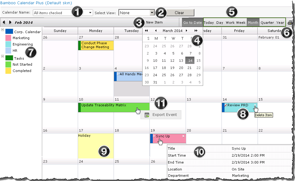
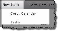
Work with Calendar Plus views
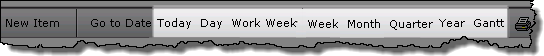
A variety of calendar views are available from the Calendar Plus toolbar.
When working with Calendar Plus views keep in mind:
| View |
Display |
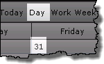
| Today |
- Will take you into the Day view for the current date.
|
| Day |
-
This view of calendar items for a specific day can be accessed from the toolbar, or by clicking a date in the Month, Week or Work Week views.
-
Only the working hours identified in the Day and Work Week configuration settings will be displayed by default.
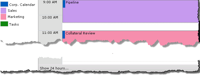
-
To see items that are outside of working hours, click Show 24 hours at the bottom left of the display.
-
From the extended view click Show Business Hours to return to the default display.
|
| Work Week |
-
The default work week is 8:00AM – 5:00PM Monday – Friday.
-
This default work week can be modified in the Day and Work Week configuration screen.
-
To see items that are outside the defined working hours, click Show 24 Hours at the bottom left of the view. 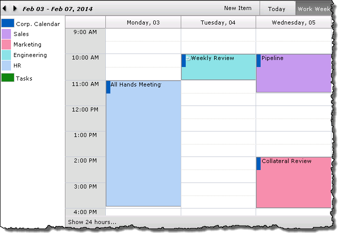
|
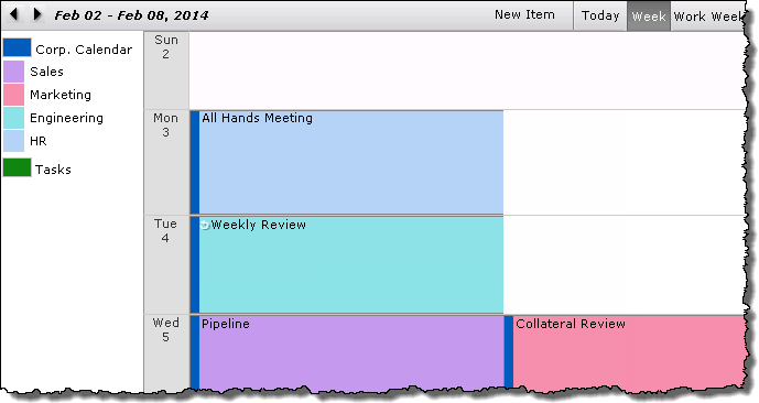
| Week |
|
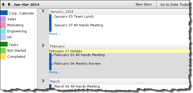
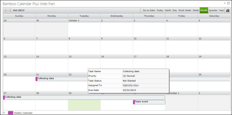
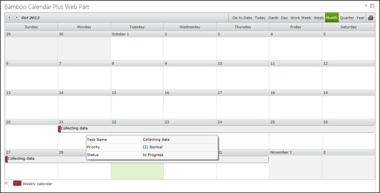
| Month |
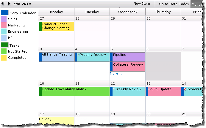
-
Displays calendar items over the course of a month.
-
Click a date in a calendar cell to view the Day view for that date.
-
By default up to 5 items will be displayed in a cell. This can be adjusted in the web parts General Settings
-
If there are More… items clicking the link will take you to the Day view.
|
| Quarter |
-
This view will display events in 3 or 6 month intervals based on the settings of the Quarter and Year configuration settings
-
The default start month for the view is January. This can be modified in the Quarter and Year configuration settings.
-
Clicking More… will take you to the Month view.
-
Use the arrows to move to the next set of months in the Quarter interval.
|
| Year |
-
Displays calendar items over the course of a year.
-
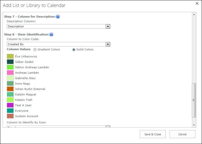
The Year view (and the Quarter view) can be configured to show items with or without color coding and icons.
-
Clicking More… will take you to the Month view.
-
Click a number (1, 2,…) in the left column to see the months in that row displayed in the Quarter view.
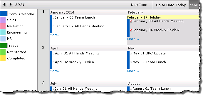
NOTE: The Starting Month and the option to color code items in the Quarter and Year views is jointly configured
|
| Gantt |
-
The interval shown in the Gantt chart is defined in the Gantt and Task configuration settings.
-
Dynamically sort items in the Gantt view by clicking the column header. Sort feature added in Calendar Plus 4.5
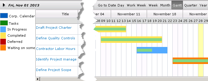
Note: If SharePoint List And Library is the calendar data source, you can only show one list or library in the Gantt and Task view.
|
Run time filtering options in Calendar Plus
Top
 When Calendar Plus is configured to use SharePoint List and Libraries as the data source, the display can be configured to allow users to filter by lists or by list views.
Keep in mind:
-
The Show Filter Lists must be checked in Calendar Plus General Settings for the Calendar Name drop down to be shown in the toolbar.
-
The option to filter by a Selected view at run time is configured individually for each SharePoint list or library
and only selected views will be available
Top
1. Filter display content by lists
| Step |
Action |
Result |
| 1. |
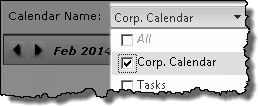
Click the Calendar Display Name drop down
Filter by Calendar List Name feature added in Calendar Plus 4.5 |
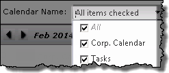 The drop down menu will list all SharePoint Lists and Libraries displayed in Calendar Plus. By default All Items will be checked. The drop down menu will list all SharePoint Lists and Libraries displayed in Calendar Plus. By default All Items will be checked. |
| 2. |
Uncheck boxes so only the desired list is selected. |
 |
| 3. |
Click on the page to apply the change |
The page will refresh to show the filtered display 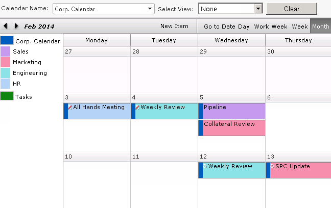 |
| 4. |
To return to a display of all list items select All in the Calendar Name drop down.
All calendar items for the time period will be displayed in the calendar view |
|
Top
2. Filter display content by views
| Step |
Action |
Result |
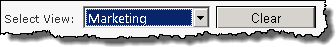
| 1. |
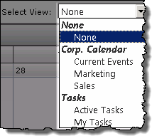
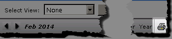
Click the Select View drop down |
The drop down menu will display list views selected for runtime filtering when the SharePoint list or library was configured. The default Select View is None.
 |
| 2. |
Select the desired view from the available options
 Filter by views associated with multiple lists added in Calendar Plus 4.5 Filter by views associated with multiple lists added in Calendar Plus 4.5 |
The page will refresh and display the appropriate content.
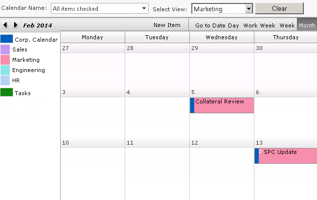 |
| 3. |
Click Clear to revert to the original settings
All calendar items for the time period will be displayed in the calendar view |
|
Top
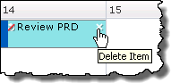
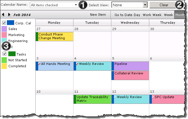
3. Filter display content by lists (Legend)
| Step |
Action |
Description |
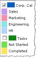
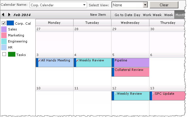
| 1. |
Uncheck boxes in the Legend so only the desired list is selected.
Filter by Calendar List using the Legend feature added in Calendar Plus 4.6 |
The Legend will list all SharePoint Lists and Libraries displayed in the current view of the Calendar Plus interface. By default All Items will be checked.
 |
| 2. |
The page will refresh to show the filtered display. |
 |
| 3. |
To return to a display of all list items select All in the Calendar DisplayName drop down from the toolbar or re-select checkboxes from the legend display.
All calendar items for the time period will be displayed in the calendar view. |
|
Top
Color printing of a Calendar Plus view
 If Calendar Plus has been configured to allow printing, the print icon will be visible in the upper right corner of the Calendar Plus display.
Clicking the print icon opens an HTML browser, and printing capabilities are dependent your browser and desktop OS.
Bamboo supports Microsoft Internet Explorer or higher on Windows for SharePoint 2007, and Microsoft Internet Explorer 8 or higher on Windows for SharePoint 2010 and 2013.
Enable Internet Explorer to print background color:
Internet Explorer 9 or higher
| Step |
Action |
Result |
| 1. |
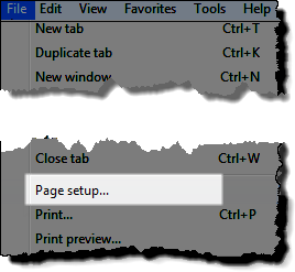
Before printing, click File (Alt+f) in the IE toolbar and click Page Setup… |
 |
| 2. |
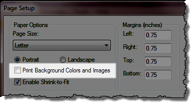
Check the box to Print Background Colors and Images
Keep in Mind:
- Printing changes within Internet Explorer are temporary.
|
|
Internet Explorer 8
| Step |
Action |
Result |
| 1. |
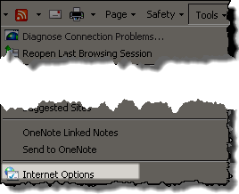
From the Internet Explorer toolbar select Tools > Internet Options |
 |
| 2. |
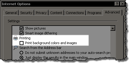
Click the Advanced tab and scroll to the Printing section and select the Print Background colors and images checkbox
NOTE: Internet Explorer may need to be closed and re-opened before this change takes effect
|
 |
How to Use Calendar Plus with Web Part Connections
Calendar Plus can be connected to other SharePoint lists if the data source for Calendar Plus is a list or List Rollup.
This feature is available for a single list as a source.
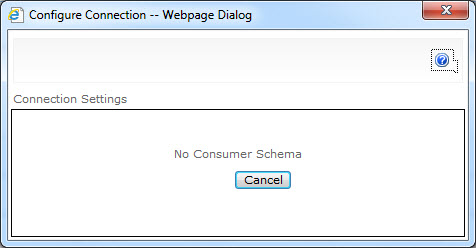
Note: If the user has multiple lists as source, Web Part Connections cannot be used. In this case, when attempting to use Web Part Connections for filtering, after selecting Consume Filter From, the following pop-up window will be displayed.
Filter Using Web Part Connection for a Single List as a Source
| Step |
Action |
Result |
| 1. |
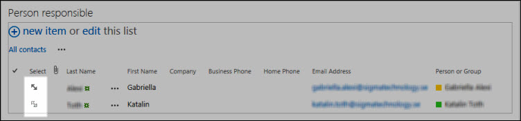
Create a standard SharePoint list containing team members responsible for various tasks. |
| 2. |
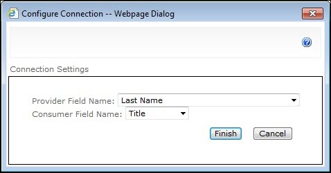
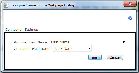
Open the web part menu and select Connections > Send Row of Data To |
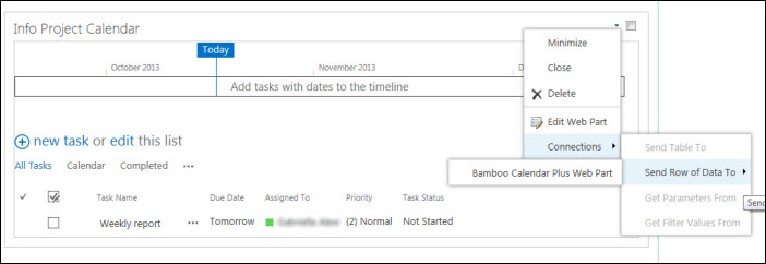
Select the column that contains the Provider Field Name and Consumer Field Name.
|
| 3. |
Alternatively, you can make the connection from Calendar Plus, via Connections > Consume Filter From > Person responsible. |
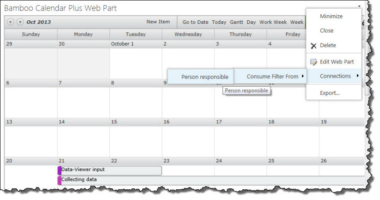
|
| 4. |
Once your List View Web Part (in this example, Person responsible) is added to the page, you can filter based on a selected view.
* Select an item (in this case, one of the persons set in List View) for filtering calendar data by clicking on the arrow next to the specific item.
* When a view is selected in the list, the arrow will change to bold.
* To deselect an item, click on another view.
Note: Web Part Connections is a good option if you want to filter on a specific data. If you want to view all items, or have multiple lists, use the Runtime Filter option.
|
 |
| 5. |
The following example shows the Calendar displaying the assigned tasks for both persons set in Person responsible List View. |
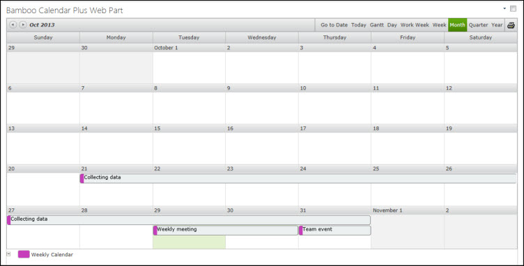
NOTE:If you filter on one of the item of the List View when using Web Part Connection (described in step 3), only assigned tasks related to that specific person are displayed in the Calendar.
|
|
How to Filter Data Using the List Filter Web Part
Filter Data Using List Filter Web Part
Calendar Plus allows the user to filter calendar data via the List Filter Web Part in case of a single list.
Note: If the calendar is set up to display multiple lists, it is not possible to connect to a List Filter Web Part and you will receive the following notification.

To connect and configure a List Filter Web Part, follow the procedures described below after you add the List Filter web part to the page.
Connecting the List Filter Web Part to Calendar Plus
| Step |
Action |
Result |
| 1. |
From the List Filter Web Part’s Edit menu, Select Connections > Provide filter value to > Bamboo *Calendar Plus. |
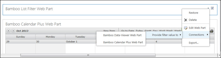
NOTE: You can also connect by editing Calendar Plus and selecting Connections > Consume Filter From > Bamboo List Filter Web Part.
|
|
Filtering via the List Filter Web Part
| Step |
Action |
Result |
| 1. |
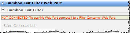
The List Filter Web Part must be connected to a SharePoint List Web Part before it can be configured. Otherwise, you’ll see this message in the tool pane when you attempt to configure the web part. |
 |
| 2. |
If you haven’t already done so, add the Web Part that should receive filtered data to the current page. |
| 3. |
From the Site Actions page, select Edit Page. |
| 4. |
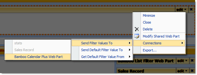
From the List Filter Web Part’s Edit menu, select Connections > Send Filter Values To > (your destination Web Part).
NOTE: You can also do this from the destination Web Part, by selecting Connections > Consume Filter From > Bamboo List Filter Web Part.
|
| 5. |
Once you have established the connection between the Calendar Plus and the List Filter Web Parts, you can filter calendar data by configuring the List Filter Web Part and entering filter value. |
 |
| 6. |
When you add the List Filter Web Part to the page, it will indicate that it needs to be configured, as shown here. |
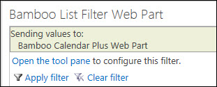 |
| 7. |
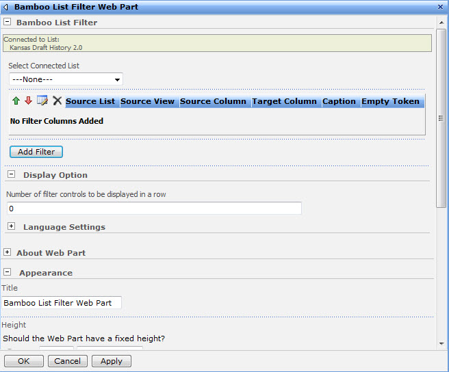
To configure the Web Part, either click the link, or, from the menu located in the top right corner of the web part, select Modify Shared Web Part. Either way, the tool pane will open. |
The settings are pictured below.
 |
| 8. |
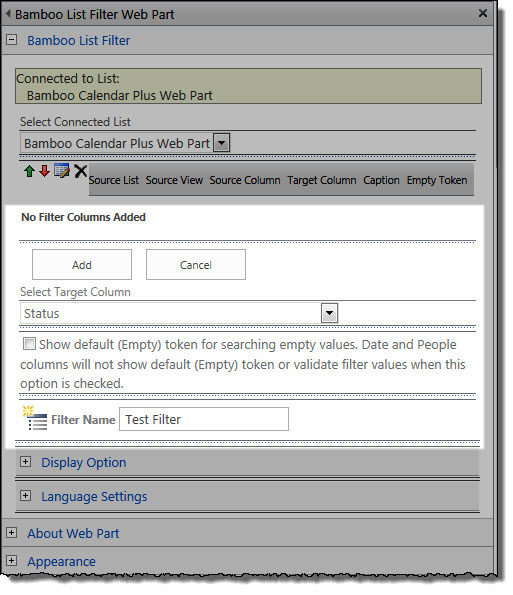
Select Calendar Plus from the drop-down menu under Select Connected List. |
NOTE: No filter columns are displayed by default.
|
| 9. |
To add a filter column, click the Add Filter button and the following controls will display. |
 |
| 10. |
First, select the target column from the drop-down menu. This is the column that the filter will be matched against. In the example below calendar data will be filtered based on Status.
NOTE: Some of the available options in the tool pane may change depending on the type of the column selected.
|
| 11. |
To make the default filter value “(Empty)”, select the corresponding checkbox located below the Select Target Column option. |
| 12. |
Enter a name for your filter column. Click Add and then OK. |
Note: You can add multiple filters and can further adjust their settings or change the order in which they are displayed for the users.
|
| 13. |
You can edit the filter columns by moving columns up and down, or delete them by clicking the corresponding control. When editing is done, click the Save/Update filter icon to apply your changes. |
| 14. |
To activate the filter, enter filter values into one or more of the listed filter columns and click Apply Filter. To remove the filter and display all data, click Clear Filter. |
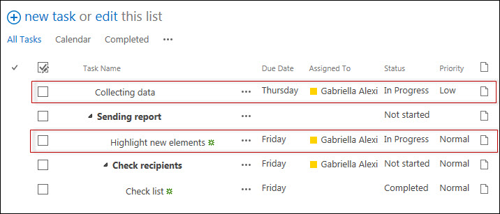
This example shows the Calendar displaying tasks for all statuses set in Weekly report List View.
NOTE: If you apply the filter In Progress when connecting to the List Filter Web Part, only tasks with this specific status are displayed in the Calendar.
|