Using the Holiday List in Calendar Plus

Using the Holiday List in Calendar Plus

Overview of Calendar Plus Configuration settings

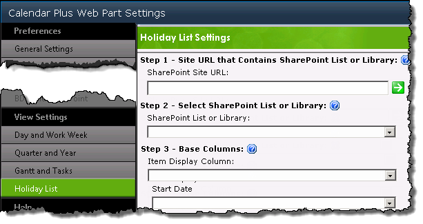
Holiday View Settings configuration screen

The Holiday list settings screen allows you to point to an existing SharePoint list that identifies holidays.

When Calendar Plus is configured to reference a Holiday List, items from the list will be displayed in all Calendar Plus views

Step Action Result
1.

Enter the Site URL to the site containing the Holiday List you want to show in the calendar then click the green arrow button.

Both absolute paths (http :// server name/site ) or relative paths(./Site/) can be used for the site URL. Bamboo recommends using relative paths if:

  • Multiple Alternative Access Mappings are being used
  • The Web part will be included in a site template
Site URL field
The available lists and libraries on that site will be listed in SharePoint List or Library drop-down menu.
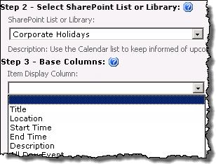
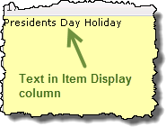
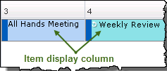
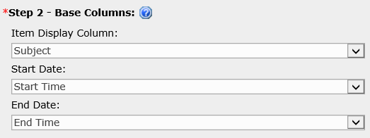
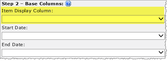
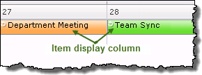
2. Select the desired list or library, then select the column that contains the values you want to display in the item cell from the Item Display Column drop down.SharePoint List and Item Display drop down menus Item display column text in holiday cell

Icon-Tip To display the contents of more than one column in the item cell, create a Calculated column in the list or library and build a string formula that includes each column you want to display.

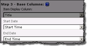
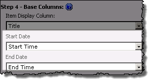
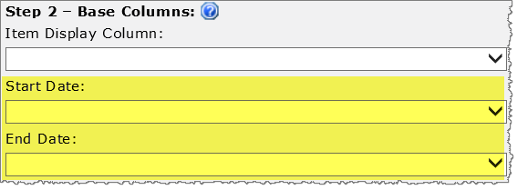
3. Select the Date and Time column(s) in the list or library that will be displayed in the calendar. Enter the desired start and end date fields from the drop-down menus If you based the calendar on an Interval (Start to End) in the General Settings, then you must enter date columns that represent a start and end date for the items. If you based the calendar on a Single Date select just one date column
.
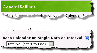
Image of the Base Calendar on Single Date or Interval drop down selector found on the general settings screen.
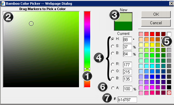
4. Click Select Color to change the color that will be used to identify Holiday list items in the calendar display Click the Select Color box to change holiday item color The Bamboo Color Picker will pop up on the screen.
5. Select Yes from the Holiday Text Wrap drop-down item text displayed in the calendar, then enter the maximum size (in pixels) allowed for the the wrapped text. Keep in mind:
If enabled, this setting is applied to all item cells in the calendar.

Using the Bamboo Color Picker

Using the Bamboo Color Picker

A number of Bamboo components give you the ability to modify the presentation of the display through color.

Drop down selector

Offers a selection of predefined colors

Bamboo Color Picker

Color_Picker.png

Change an items color using one or more of the following options:

1. Move the slider along the vertical color spectrum

2. Click in the color box to select the desired color. All values in the input fields will adjust based on the selection.

3. The New and Current (original) colors will be displayed in color rectangles. Clicking the Current color rectangle will revert all values back to the original settings.

4. Edit the HSB (Hue, Saturation, Brightness), RBG (Red, Blue, Green) fields. These edit boxes will show the HSB and RGB values for the color in the New color rectangle

5. CMYK colors are available on the right of the screen. All values in the color picker will adjust based on the selection

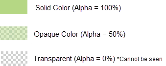
6. If an Alpha value (transparency) should be applied, enter this as a percentage. The Alpha (A) % is indicated by the cross hatching and color in the color swatch.
Color_Picker_AlphaRange.png

7. Enter a hex value

Add a SharePoint list or library as the Calendar Plus data source

Add a SharePoint list or library as the Calendar Plus data source

Overview of Calendar Plus Configuration settings

SharePoint Lists and Libraries are the default Data Source Type for Calendar Plus.
Data Source Settings screen with the default SharePoint List and Library radio button selected
When working with SharePoint Lists and Libraries keep in mind:

  • Each SharePoint list or library referenced as a data source must contain at least one SharePoint Date and Time column.

  • Up to 10 SharePoint Lists and Libraries can be displayed in a single calendar instance.

    NOTE: If you want to use more than 10 lists or libraries, Bamboo recommends using Bamboo List Rollup as the data source. This allows you to connect to rollups of multiple lists or libraries.

The following steps require you to have accessed the Calendar Plus Settings screens by clicking the Calendar Plus Web Part Settings button in the web parts configuration tool pane.

Action Result
1.

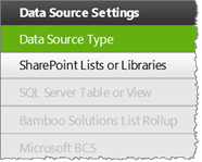
Click the SharePoint List and Library button under Data Source Settings in the navigation tool pane. Image of the Navigation Pane with the SharePoint list and library button available. All other data source buttons are grayed out

You will only be able to select this button if SharePoint Lists and Libraries is selected as the Data Source Type

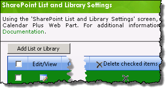
Image of the default SharePoint List and Library Settings screen

From the SharePoint List and Library Settings screen you can do the following:

  • Add a new list or library to the display

  • Modify an existing library by clicking the Edit/View icon Edit button

  • Remove an existing list or library by selecting the check box associated with the list you want to delete, then click the ‘x’ at the end of the row. To delete all lists, click the top check box, then click Delete checked items in the toolbar. A confirmation pop-up window will appear.

NOTE: Earlier releases of Calendar Plus will display a Remove Selected Items button instead of the ‘x’.

2. Click the Add List or Library button
SharePoint List and Library Settings screen with the add new list button highlighted

The Add List or Library to Calendar pop up window will appear that contains the settings to configure the list or library. It divided into two sections:

  • Required Steps: the minimum configuration settings which must be defined to include the list or library in Calendar Plus

    NOTE: Only the required steps are discussed in this topic

  • Optional Steps: Modify the display options associated with the list or library

3.

Complete the General Descriptions section to define how the list or library will be identified in Calendar Plus General Descriptions area of the SharePoint List and Library settings screen

  • The Calendar Display Name will be used in the legend

  • The identifying Color for SharePoint list or library will be found on the left side of each cell of the calendar.

  • The Allow users to add new items to this list features requires users to have the appropriate permissions to the list or library

  • If you Allow users to add new items.. you can elect to show any Content Types associated with the list or library.

The Calendar Name and color entered will be used in the calendar display to identify the source list
Image of calendar display showing color identification of list in the legend and item cell

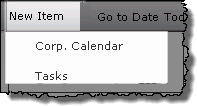
If Allow users to add new items… is checked, users can hover over the New Item button on the toolbar see the lists to which they can add a New Item
The new item button is found on the left of calendar features and views in the toolbar
4.

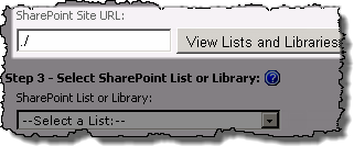
Enter the URL to the site that contains the list or library to be displayed in Calendar Plus, then click the View lists and Libraries button.

Both absolute paths (http:// server name/site ) or relative paths(./Site/) can be used for the site URL. Bamboo recommends using relative paths if:

  • Multiple Alternative Access Mappings are being used
  • The Web part will be included in a site template

Image of relative URL in the SharePoint Site URL field and the View lists and libraries button

The available lists and libraries on that site will be listed in SharePoint List or Library drop-down menu.

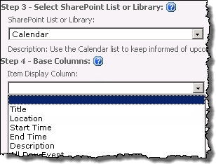
5. Select the desired list or library, then select the column that contains the values you want to display in the item cell from the Item Display Column drop down.
SharePoint list or library drop down ,and Item Display Column drop down
Image of the Item Display Column in the item cell

Icon-Tip To display the contents of more than one column in the item cell, create a Calculated column in the list or library and build a string formula that includes each column you want to display.

6. Select the Date and Time column(s) in the list or library that will be displayed in the calendar. Enter the desired start and end date fields from the drop-down menus Whether you see Start Date and End Date fields or a Single Date field will depend on the selection made on the General Settings screen to Base the Calendar on a Single Date or Interval.
Image of the Base Calendar on Single Date or Interval drop down selector found on the general settings screen.
7.

Apply a filter for the list or library by selecting from the following options:

  • Show All Items: Displays all items in the list or library.

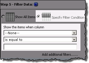
  • Specify Filter Conditions: Select the column that you want to filter on, the comparison type and the value that you are comparing.
    To Specify Filter Conditions select the radio button and set filter conditions in the 3 fields provided

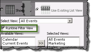
  • Use Existing List View: Uses an existing view from the list or library filter the display items. If you check Runtime Filter View checkbox you will be able to see the Available Views and use the arrows to move views to the Selected Views pane.
    Runtime filtering view

Keep in mind:
1. Calendar Plus supports the two SharePoint variables; [ME] representing the currently logged in user, and [Today], representing today’s date, that can be used to specify filter conditions

2. Use the Add Filters link if you want to add another specified filter condition using AND/OR Boolean operators.

3. Data can be filtered dynamically at run time based on views using the Runtime Filter View. Users select the view they want to filter by from a drop down menu in the toolbar

4. Web part connections can be used to filter the contents of the calendar display but are not configured in the Calendar Plus web part settings. When using a SharePoint List or Library as the data source, the web part supports web part connections for the Display, Start Date and End Date columns.

8.

Stay in the configuration screen and complete the Optional Steps

OR

Click Save and Close

Clicking Save and Close to return you to the SharePoint List and Libraries Settings screen, where you will see the newly added List or Library in the grid display.
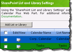
SharePoint list and libraries settings screen
9.

Use the left navigation pane and configure View Settings for the Calendar Plus web part

OR

Click Save and Close a second time

Clicking Save and Close will exit the Calendar Plus Web Part settings screen

Overview of Calendar Plus Configuration settings

Use SQL Server Table or View as the Calendar Plus data source

Use SQL Server Table or View as the Calendar Plus data source

Overview of Calendar Plus Configuration settings

SQL Server Table or View is one of the four available data sources for Calendar Plus.
Data Source Settings screen with the SQL Server Table or View radio button selected
When working with SQL Table or View as the data source keep in mind:

  • Icon-Warning
    SQL Server must use Mixed Authentication mode. Additional information on Mixed Authentication mode is available here

The following steps require you to have accessed the Calendar Plus Settings screens by clicking the Calendar Plus Web Part Settings button in the web parts configuration tool pane.

Step Action Result
1.

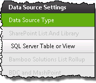
Click the SQL Server Table or View button under Data Source Settings in the navigation tool pane. Image of the Navigation Pane with the SQL Server Table or view button available. All other data source buttons are grayed out

You will only be able to select this button if SQL Table or View is selected as the Data Source Type

The SQL Server Table or View Settings will be visible on the right side of the configuration screen and is divided into two sections:

  • Required Steps: the configuration settings which must be defined to add the table or view to the Calendar Plus display

    NOTE: Only the required steps are discussed in this topic

  • Optional Steps: Modify the display options
    associated with the data source

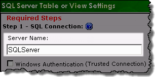
2. Enter the Server Name of the SQL server to which you want to connect credentials

Keep in mind:
Client applications connect to an instance of Microsoft SQL server. If you used the Default Instance when creating the SQL Server, you only need to know the server name.

To connect to a Named Instance you will need to specify both the server and instance name in the Server Name field.

Enter Server name
3.

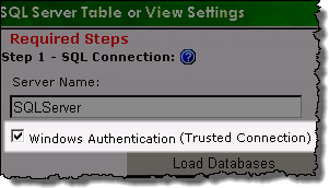
If you are connecting to a database that resides on the same server as SharePoint, check the Trusted Connection box.

This will allow you to bypass the requirement to enter authentication information as Trusted Connections utilize the current logged in SharePoint account to access the defined SQL server.

NOTE: This method is only supported on single server SharePoint Farm deployments.

Trusted connections check box
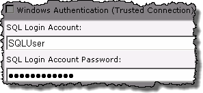
4. Enter the SQL Login Account and Password credentials if you are not using a Trusted Connection.
Icon-WarningImportant:
1. The SQL Login Account must have at least db_datareader access to the desired table or view that resides on the database specified in the Server Name field.
2. The SQL server must be configured for Mixed Authentication mode.
3. Domain Users accounts are not supported
Enter SQL credentials in the provided fields
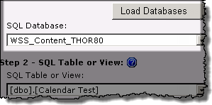
5. Click the Load Databases button to populate the Database drop-down box, then select the desired SQL Database from the available options. Select the SQL database from the drop down selector
6. Select the SQL Table or View to display, the choose the display column from the Item Display Column drop down menu.
Calendar_SPList_Req3.png
Calendar_SPList_itemDisplay.png
7. Select the Date and Time column(s) in the list or library that will be displayed in the calendar. Enter the desired start and end date fields from the drop-down selectors Whether you see Start Date and End Datefields or Single Date field will depend on the selection made on the General Settings screen to use a …Single Date or Interval.
Image of the Base Calendar on Single Date or Interval drop down selector found on the general settings screen.
8.

Apply a filter for the content by selecting from the following options:

  • Show All Items

  • Specify Filter Conditions To Specify Filter Conditions select the radio button and set filter conditions in the 3 fields provided

Keep in mind:
1. Calendar Plus supports the two SharePoint variables; [ME] representing the currently logged in user, and [Today], representing today’s date. that can be used to specify filter conditions

2. Use the Add Filters link if you want to add another specified filter condition using AND/OR boolean operators.

3. Web part connections can be used to filter the contents of the calendar display but are not configured in the Calendar Plus web part settings. Information on using web connections is available here

9.

Stay in the SQL Server Table or View Settings screen and configure the Optional Steps associated with the data source]

OR

Use the left navigation pane and configure View Settings for the Calendar Plus web part.

Clicking Save and Close will exit the Calendar Plus Web Part settings screen

Overview of Calendar Plus Configuration settings

Use Exchange as the Calendar Plus data source

Use Exchange as the Calendar Plus data source

Overview of Calendar Plus Configuration Settings

The Microsoft Exchange data source can be combined with any other data source for Calendar Plus.
Microsoft Exchange Calendar feature added in Calendar Plus 4.7

When working with Microsoft Exchange keep in mind:

  • The Exchange Web Services (EWS) Managed API must be installed on your SharePoint farm. See the Overview of the Installation/Setup Program for additional information.

  • When Calendar Plus Web Part is connected to an Exchange calendar, a hidden SharePoint cache list is created on the SharePoint site. This hidden SharePoint list is used to temporarily cache the Exchange calendar events for that calendar instance.

  • When Calendar Plus is connected to an Exchange calendar, a hidden BambooCalendarConfigList is created (if it does not exist already) on the root site collection. This hidden SharePoint list is used to store the configuration information for all Exchange calendars connected to Calendar Plus web part. The Calendar Sync Data Exchange Timer Job references this list to update the individual the Exchange cache lists (The Timer Job runs every 30 minutes by default).

    IMPORTANT: Do not edit the calendar configuration list form unless specifically instructed to do so.

The following steps require you to have accessed the Calendar Plus Settings screens by clicking the Calendar Plus Web Part Settings button in the web parts configuration tool pane.

Step Action Result
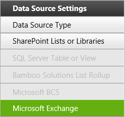
1. Click the Microsoft Exchange button under Data Source Settings in the navigation tool pane.
HW20-Exchange-Button.png

The Microsoft Exchange Settings will be visible on the right side of the configuration screen and is divided into two sections:

  • Required Steps: the configuration settings which must be defined to add the data view or schema to the Calendar Plus display

NOTE: Only the required steps are discussed in this topic

2.

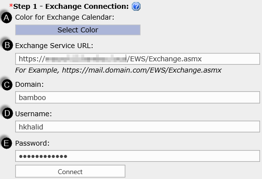
Complete the Exchange Connection section to define which Exchange calendar will be overlayed onto Calendar Plus exchange_step1.png

    1. The identifying Color for Exchange Calendar will be found on the left side of each cell of the calendar.
    2. Enter the Exchange Web Service URL for Exchange Server or Exchange Online.
    3. Enter the Domain name for the Exchange account.
    4. Enter the Username of the Exchange account. This users calendar will be overlayed onto Calendar Plus.
    5. Enter the Password for the Exchange account.
The Exchange Calendar and color entered will be used in the calendar display to identify the source list
Image of calendar display showing color identification of list in the legend and item cell
3. Select the column that contains the values you want to display in the item cell from the Item Display Column drop down.
Item Display Column drop down
Image of the Item Display Column in the item cell
4. Select the Date and Time column(s) in the Exchange Calendar that will be displayed in the calendar. Enter the desired start and end date fields from the drop-down menus Whether you see Start Date and End Date fields or a Single Date field will depend on the selection made on the General Settings screen to Base the Calendar on a Single Date or Interval.
Image of the Base Calendar on Single Date or Interval drop down selector found on the general settings screen.
5.

Stay in the configuration screen and complete the Optional Steps

OR

Click Save and Close

Clicking Save and Close will exit the Calendar Plus Web Part settings screen
6.

Use the left navigation pane and configure View Settings for the Calendar Plus web part

OR

Click Save and Close a second time

Clicking Save and Close will exit the Calendar Plus Web Part settings screen

Overview of Calendar Plus Configuration settings

Use BCS as the Calendar Plus data source

Use BCS as the Calendar Plus data source

Overview of Calendar Plus Configuration settings

Microsoft Business Connectivity Services is one of the four available data sources for Calendar Plus.
Data Source Settings screen with the Microsoft Business Connectivity Services radio button selected
When working with Microsoft Business Connectivity Services as the data source keep in mind:

  • BDC and BCS are used interchangeably in the configuration screens

  • To use MashPoint you must first install the extensions which are available on the Bamboo storefront, and then install the runtime components, which are available from the Setup Program for Calendar Plus.

The following steps require you to have accessed the Calendar Plus Settings screens by clicking the Calendar Plus Web Part Settings button in the web parts configuration tool pane.

Step Action Result
1.

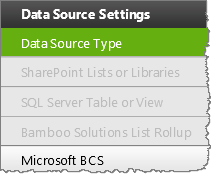
Click the Microsoft BCS button under Data Source Settings in the navigation tool pane. under Data Source Settings in the navigation tool pane. Image of the Navigation Pane with the BDC and MashPoint button available. All other data source buttons are grayed out

You will only be able to select this button if Microsoft Business Connectivity Services is selected as the Data Source Type

The Microsoft Business Connectivity Services will be visible on the right side of the configuration screen and is divided into two sections:

  • Required Steps: the configuration settings which must be defined to add the table or view to the Calendar Plus display

    NOTE: Only the required steps are discussed in this topic

  • Optional Steps: Modify the display options
    associated with the data source

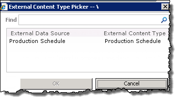
2. Enter the BDC or MashPoint application name
Calendar_BDC_Req2.png
Image of the  External Content Type Picker Screen
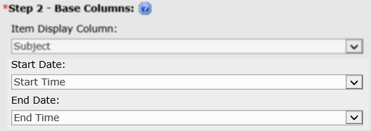
3. Select the display column from the Item Display Column drop down menu.
Calendar_BDC_Req3a.png
4. Select the Date and Time column(s) in the list or library that will be displayed in the calendar. Enter the desired start and end date fields from the drop-down selectors Whether you see Start Date and End Date or Single Date fields will depend on the selection made on the General Settings screen to use a …Single Date or Interval.
Image of the Base Calendar on Single Date or Interval drop down selector found on the general settings screen.
5.

Apply a filter for the content by selecting from the following options:

  • Show All Items

  • Specify Filter Conditions To Specify Filter Conditions select the radio button and set filter conditions in the 3 fields provided

Keep in mind:
1. Calendar Plus supports the two SharePoint variables; [ME] representing the currently logged in user, and [Today], representing today’s date. that can be used to specify filter conditions

2. Use the Add Filters link if you want to add another specified filter condition using AND/OR boolean operators.

3. Web part connections can be used to filter the contents of the calendar display but are not configured in the Calendar Plus web part settings. Information on using web connections is available here.

6.

Stay in the Microsoft Business Connectivity Services screen and configure the Optional Steps associated with the data source

OR

Use the left navigation pane and configure View Settings for the Calendar Plus web part.

Clicking Save and Close will exit the Calendar Plus Web Part settings screen

Overview of Calendar Plus Configuration settings

Overview of Calendar Plus Configuration Settings

Overview of Calendar Plus Configuration Settings

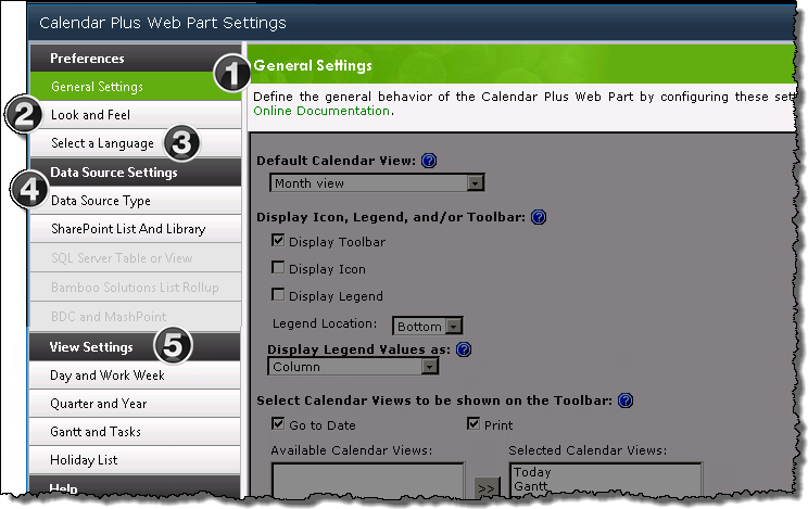
Screen shot of the Calendar Plus Configuration Settings screen.  Highlighted areas are discussed in the table below
Calendar Plus is configured in the Web Part Settings
pop up window accessed from the Web part’s
configuration tool pane when you click the Calendar Plus Web Part Settings button.

NOTE: When the links below take you to a new page, the Overview of Calendar Plus Configuration Settings link on that page will return to you this topic.

Function
1. General Settings: From the General Settings screen you define the general display options that influence the appearance of the web part and how users will interact with the content. You also decide whether the calendar events will be based on a single date or an interval.
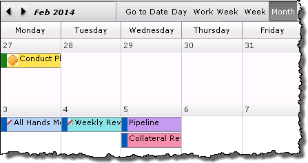
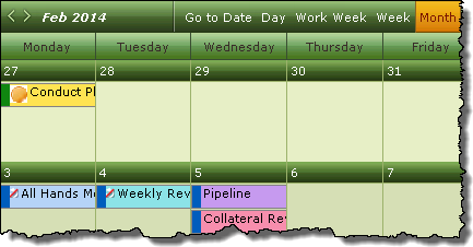
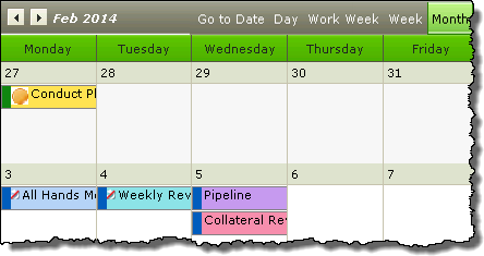
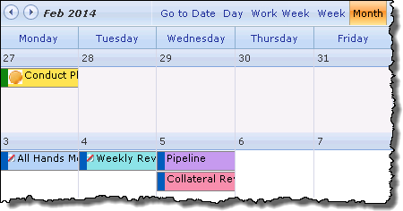
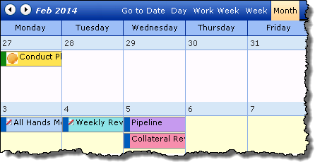
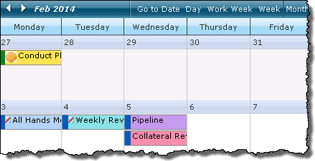
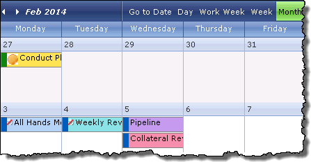
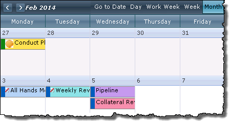
2. Look and Feel: Image of the Look and Feel Settings screen The appearance of the web part can be modified from this screen via skin selections and/ or by creating Custom CSS.

Cell borders are displayed by default, but can be easily removed.

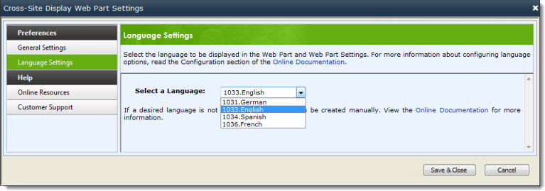
3. Select a Language: Customize the language setting to match the site of regional language setting.

image of the Language Settings screen

4.

Data Source Type: Configuration of a data source is required
to use Calendar Plus.
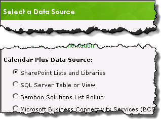
Click Data Source Type and from the settings page select the data source for calendar content from ONE of the following
options:
Edited image of Data source settings screen

  • SharePoint List and Library – This option, selected by default, allows up to 10 SharePoint Lists and libraries with date/time columns to be
    displayed in a single instance of Calendar Plus.

  • SQL Server Table or View – Display a SQL Server 2005 or 2008 Table or View within the Calendar Plus Web part.

  • Bamboo Solutions List Rollup – lets you display content aggregated from multiple lists with List Rollup in the calendar

  • BCS or MashPoint – Integrate external application in to Calendar Plus with a Microsoft Business Connectivity Services (BCS) application.

  • Microsoft Exchange – Overlay and display calendar events from a single Exchange calendar onto Calendar Plus Web Part (can be combined with any Data Source).
    Microsoft Exchange Calendar feature added in Calendar Plus 4.7

The button associated with the selected data source will be available on the left navigation pane, allowing you to access the data source’s configuration screen.

5.

View Settings: Configuration of the following settings is optional, but will allow you to modify the default values Calendar Plus uses to display calendar items in the various views.

Configuring the Style

Configuring the Style

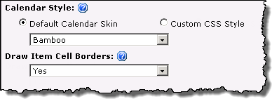
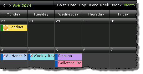
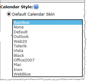
There are several ways to change the visual appearance and style of the Calendar Plus Web Part. By default, Calendar Plus renders the user interface using a default calendar skin. However, the look and feel of the Web Part can be further customized by editing the custom CSS file in the tool pane of the Web Part.

  1. Do one of the following:
    • To use a default style calendar skin, select Default Calendar Skin and select a skin.
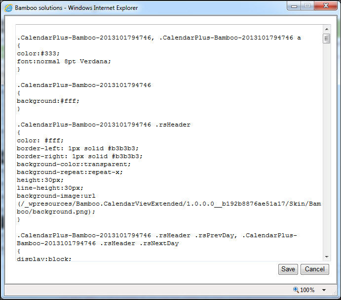
    • To customize the style of the Web Part, select Create Custom CSS and click the Edit button. The text editor opens and displays the default CSS styles. Make any changes to the applicable the style selectors.
      HW20_2013_EditCSS.jpg
  1. Select ‘yes’ or ‘no’ from the drop-down box to Draw Item Cell Borders.
  2. Click Save and confirm the prompt to save your changes.

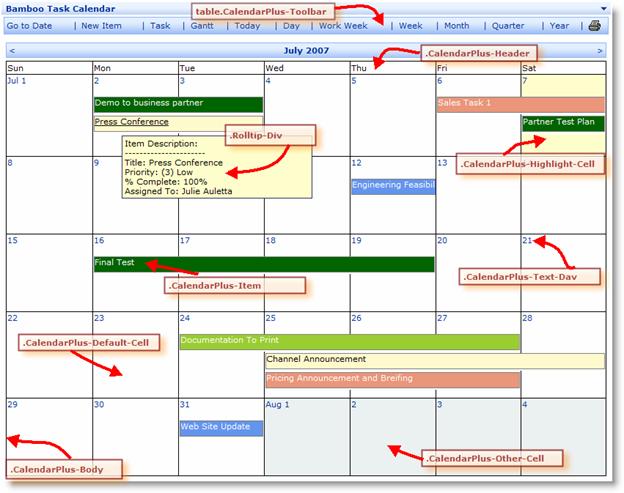
    The Calendar Plus Web Part uses the following class selectors to define each elements of the calendar.

    WARNING: Notice that the CSS class names have a number attached to them (see highlighted number in the example below). This is to uniquely identify a CSS Class for a particular instance of the Web Part. It is strongly recommended that you do not change this number.

Example: CalendarPlus-Bamboo-2010830131417

hw20058.jpg

The default CSS style for the Calendar Plus Web Part is listed here.

Note: Please see the Knowledge Base section on our web site for additional hints and tips on how to use the CSS style sheet with the Calendar Plus Web Part. For additional reference, see an example of CSS.

Configuring the Quarter and Year views in Calendar Plus

Configuring the Quarter and Year views in Calendar Plus

Overview of Calendar Plus Configuration settings

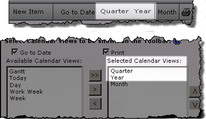
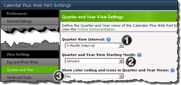
Image of Quarter and Year views in the calendar toolbarThe Quarter and Week View Settings configuration screen defines the display seen when users access the Quarter and Year views via the toolbar.
NOTE: The availability of the calendar views in the toolbar is determined by the Selected Calendar Views identified on the General Settings configuration screen. All views are available from the toolbar by default.

Day and Work View Settings Screens

Function
1. Set the interval length for the Quarter view as 3 months or 6 months
2.

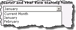
Starting month drop down menuSelect the Starting Month for the Quarter and Year views.

  • If you select January as the starting month, and are using a 3 month interval, January, February and March will will be the default months displayed in the Quarter view.

  • If you select Current Month, and are using a 3 month interval, the Quarter view by default will display the Current month and the 2 months that follow.

  • The selected Starting Month will be the first month shown in the Year view

3. Example of Quarter view with and without coded itemsChoose to Show color coding and icons in the Quarter and Year views. By default, color coding and icons are not shown in these views.
Configure the Optional settings for a Calendar Plus data source

Configure the Optional settings for a Calendar Plus data source

Overview of Calendar Plus Configuration settings

The following steps require you to have accessed the Calendar Plus Settings screens by clicking the Calendar Plus Web Part Settings button in the web parts configuration tool pane.

Step Action Result
1.

Complete the Required Steps associated with selected data source.

The Settings pop up window for the selected data source is divided into two sections:

  • Required Steps: the configuration settings which must be defined to add the data source to the Calendar Plus display
  • Optional steps: Modify the display options associated with the list or library

    NOTE: Only the Optional steps are discussed in this topic

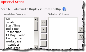
2. Select columns that will be displayed in a tool tip by moving Available columns into the Selected Columns list box using the arrow buttons.
By default no columns are selected for display in the tool tips.

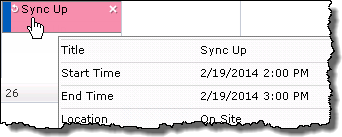
Users will see the tool tip when they mouse over an item in the calendar
Image of tool tip

Icon-Tip Use CTRL+click or SHIFT+click to select multiple columns.
Reorder the selected columns with the up and down arrow buttons

3. Select a column that provides a Description for the item.
Image of Description drop-down field

Icon-Tip Include the selected Description column in your tool tip to allow users to see content that is not displayed in the cell.

Description text will appear under the Display column in the Day and Work Week views.
Image of Description text under the Display text in an item
Keep in mind:

  • Display Item Descriptions is set to No by default. This settings must be changed to Yes on the Day and Work Week Views configuration screen, for the description value to be displayed
4.

Choose column to color code from the drop-down
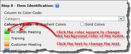
Select the Column to Color Code from the drop down.

  • The column values will be displayed with a randomly assigned color.

  • Change the color of the cell by clicking the color square to access the Bamboo Color Picker.

  • Change the color of the text by clicking on the text to access the Bamboo Color Picker.
  • Color values can be shown as Solid or Gradient.
Keep in mind:
1. Choice, Lookup, and Person or Group columns types are supported for color coding.

2. If using Bamboo List Rollup as the calendar’s data source, any special columns included in the rollup will be available.

3. Gradient colors are not shown in the Settings screen, but will display in the Web part.

5.

select the column that will be identified with icons from the drop-down
Icons can be used to provide additional visual information about the item.

  • Select the Column to Identify by Icon.

  • The column values will be automatically displayed.

  • Click the box associated with the icon value to access the popup screen

  • Enter the Icon URL and click View Icon to see a sample.

  • Click Save Icon

Choose an icon from the  popup screen
Keep in mind:
1. When using SharePoint Lists and Library or Bamboo List Rollup as the data source; Choice, Lookup, and Person or Group columns types are supported for icon assignment.

2. Icon images need to have been uploaded to a Library within the site collection.

3. The recommended image size is 16×16 pixels

4. If an icon is not associated with a column value, and you have elected to Display Icons
in the legend, you will see an empty box in the legend.
Image of legend with empty icon box

Configuring the Gantt view in Calendar Plus

Configuring the Gantt view in Calendar Plus

Overview of Calendar Plus Configuration settings

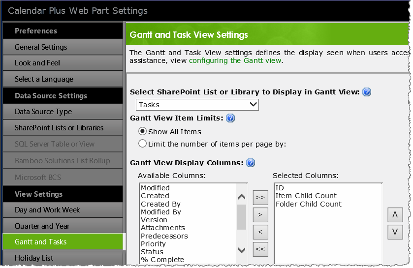
Image of Gantt and Task view settings screenThe Gantt and Task View Settings configuration screen defines the display seen when users access the Gantt view via the toolbar.
NOTE: The availability of the calendar views in the toolbar is determined by the Selected Calendar Views identified on the General Settings configuration screen. All views are available from the toolbar by default. All steps below are optional except Step 1. if you are using SharePoint Lists and Libraries as the calendars data source.

Icon-Warning IMPORTANT: Calendar Plus must be configured in General Settings to base the calendar on an Interval in order to display a Gantt view.

Step Action Result
1. If using SharePoint List and Library as the calendar data source, select a list or library to display in the Gantt view.
Gantt list drop down menu

The Available Columns selector box(see below) will be populated after you have made your selection.

Keep in mind:

  • Only one SharePoint List or Library can be shown in the Gantt View

  • The list must have been added as a data source on the SharePoint List and Library settings screen

  • When using List Rollup, SQL Table or List, or BDC the calendars data source this drop down is not shown since the data source does not need to be identified.

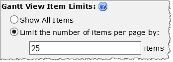
2. Show all items at once or set a limit on the number of items returned per page in the Gantt and Tasks View. Radio buttons to show all items or limit items
Show All Items is selected by default.

NOTE: Limiting the number of items that show when loading the Web Part can help improve performance.

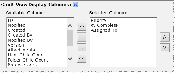
3. Select columns that will be displayed in the Gantt view by moving Available columns into the Selected Columns list box using the arrow buttons.Selector boxed with available and selected columns to display
Icon-Tip Use CTRL+click or SHIFT+click to select multiple columns.

Reorder the selected columns with the up and down arrow buttons

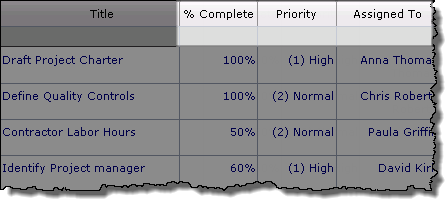
Selected display columns in the gantt view.

NOTE: The lists Title will be displayed in the Gantt view by default.

4.

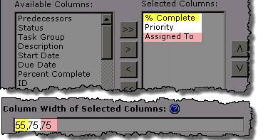
Leave the Column Width… field empty to use default column widths for the Selected Columns Enter columns width

To manually set the column width for the Selected Columns enter the width (pixles) for each column, in the order they appear in the Selected Columns box, separated by a comma, in the Column Width field.

Selected columns with modified width in gantt view
5.

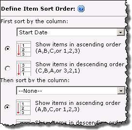
You can sort data displayed in the Gantt view by up to two columns.

  • Select a column and choose whether to sort in ascending or descending order.

  • You can sort by any column in the data source, not just by the columns selected for display.

    Gantt sort order feature added in Calendar Plus 4.5

Define Sort Order
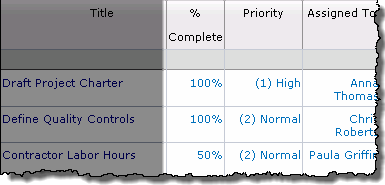
6. Select the % Complete columns to display progress within the item interval bar in the gantt chart. Click Select Progress Bar Color to change the randomly assigned color.Select % complete column from drop down.  Click color bar to select a new color
The Percent Complete Column field is empty by default

Task in Gantt chart with color bar to show progress

NOTE Item cell color coding is based on the optional Column to Color Code data source configuration setting.

7 Select the day of the week that should be considered Workdays.
Workdays.png
Workday Settings feature added in Calendar Plus 4.6

Item marked as non-working days will be highlighted in the Gantt chart display.
Nonwork.png

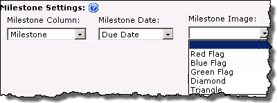
8 Choose a Milestone column, a date column to represent the Milestone date and an image to display the milestone on the Gantt view instead of an interval bar.
Milestone settings
Keep in mind:
The Milestone column needs to be a Yes/No column, where Yes designates the item as a milestone.
9

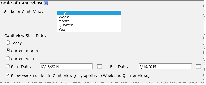
Use these settings to configure the appearance of the Gantt chat –

Calendar_Gantt_SetDate.png

  • Scale for Gantt View: Select the default time scale for the Gantt chart (Day, Week, Month, Quarter or Year). Scale feature added in Calendar Plus 4.6
  • Gantt View Start Date: Enter the Start Date for the date interval in the Gantt view, select the Today, Current Month, or Current Year option, or click Start Date to select a date range.
  • Show week number in Gantt view: Select this option to display the week numbers in the Gantt view. This option displays the week number in Week, Month and Quarter views only.

Fully configured gantt view

Configuring the Day and Work Week views in Calendar Plus

Configuring the Day and Work Week views in Calendar Plus

Overview of Calendar Plus Configuration settings

Image of Day and Work Week views in the calendar toolbar
The Day and Work Week View settings configuration screen defines the display seen when users access the Day and Work Week views via the toolbar.

NOTE: The availability of the calendar views in the toolbar is determined by the Selected Calendar Views identified on the General Settings configuration screen. All views are available from the toolbar by default.

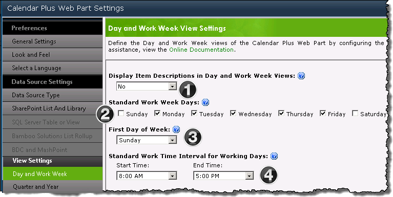
Day and Work View Settings Screens

Function
1.

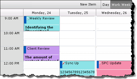
Setting Display Item Description to Yes will allow additional text to be displayed in the Day and Work Week views if:

  • A Description column was selected on the data source configuration screen. All data sources support configuring a Description column for display.

  • the Calendar Web part is configured to use the default Interval setting.

Day View
Day View.  Items include description text under the display text

Week View
Work Week View.  Items include description text under the display textIcon-TipInclude the selected Description column in your Tool Tips to allow users to see content that is not displayed in the cell. Tool Tips are an Optional configuration setting.

2. Select the days that are included in a standard work week. The Work Week View will display only the selected days.
3. Select which day will be used to identify the start of the week for the Month and Week views.

Keep in mind:
The identified Starting Day will only be used by the Work Week view if it is also identified as a Standard Work Week Day.

4.

Define the Start Time and End Time for the standard work day.

The Day and Work Week views will display events that fall within the Standard Work Interval… by default. To see items that fall outside these hours Show 24 Hours in the bottom left of the display. From the extended view click Show Business Hours to return to the default display.

Configuring Calendar Plus General Settings

Configuring Calendar Plus General Settings

Overview of Calendar Plus Configuration settings

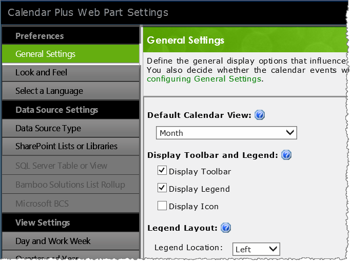
Image: Calendar Plus General Settings screen The Calendar Plus General Settings screen defines the general behavior of the web part.

NOTE: Unless otherwise stated the images in the Settings column represent the default configuration settings. In the table below, we provide some icons to help you quickly find a setting. You will not find them in the web part; they are provided here simply to help guide you to the appropriate setting as a visual guide.

Visual Guides Description Function

Default View

DefaultView.png

Calendar_GenSet_DefaultView.png
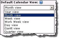
By default you see a Month view, but this can be changed using the drop down selector.
Select the Default Calendar View that will be displayed when users access the page.

Toolbar

Tools.png

Calendar-GenSet1a.png

Calendar_Full_toolbar.png
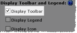
The toolbar allows users to interact with the Calendar Plus display, making calendar views and features, such as printing, available to end users. Uncheck Display Toolbar to hide the Calendar Plus toolbar.

NOTE: You can individually hide toolbar features

Legend

Legend.png

ColumnOrRow.png
Display Legend Values feature added in Calendar Plus 4.5

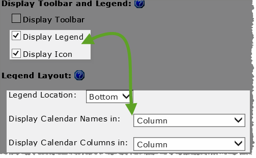
NOTE: Display Legend and Display Icon are not checked by default

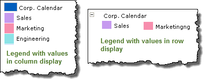
When you check Display Legend and maintain the default Bottom legend location, you will be given the choice of displaying the legend values as a Column or Row.
Calendar_GenSet_Legend_Displays.png
If you select Left or Right as the legend locations the legend values will be displayed in a column.

Display Icon

Icon.png

If the data source was configured with a Column to identify by Icons the values (or icons) associated with that column will be visible in the legend when Display Icon is selected.

DisplayIcon.png
Display Icon option added in Calendar Plus 4.5

NOTE: Display Icon is not checked by default.

Image showing the data source's legend, with icons, when Display Icon is set to yes
Image showing the data source’s legend, with icons, when Display Icon is set to yes.

Tooltip Display

pause.png

Tooltip Display Delay option added in Calendar Plus 4.6 The default value is 0 to make the tooltip appear instantly. Set the length of delay, in milliseconds, before displaying the tooltip popup.

Go to Date & Print Options

DatePrint.png

Calendar_GenSet_Toolbar_opts.png Calendar_GenSet_toolbar_cut.png
The Go To Date and Print buttons cannot be moved in the toolbar.

Available Views

CalViews.png

Calendar_GenSetting_4.png
Icon-Warning IMPORTANT: Calendar Plus must be configured to Base the Calendar on… an Interval (Start Date and End Date) at the bottom of the General Settings screen to display a Gantt view.

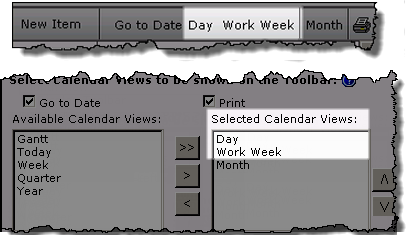
Calendar_View_Toolbar.png
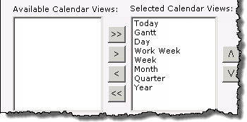
All available views are displayed in the toolbar by default. Use the < button to remove unwanted views from the Selected Calendar Views list box.
Icon-Tip

  • Keep the Default Calendar View in the Selected Calendar Views list box.

  • You can use CTRL+click or SHIFT+click to select items.

  • Use the up and down arrows to change the view order in the toolbar

Max Items Displayed

MaxItems.png

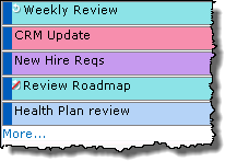
Calendar_GenSet_MaxItems_a.png Calendar_GenSet_MaxItems.png Identifies the Maximum Number of Items to Display in the Month, Quarter and Year views.

If there are additional items a More… link will be displayed.

Disable Item Link

Disable.png

Calendar_GenSet_Disable.png

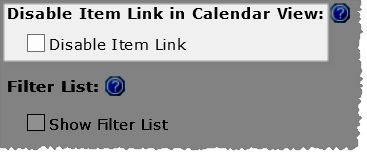
Select the Disable Item Link check box to prevent users from being able to click the item from the calendar and access the Edit form.

NOTE: This option will be grayed out if Calendar Plus is configured to use SQL Tables or Views or BDC and MashPoint as the data source
Calendar_GenSet_Delete_a.png

Filter List

Filter.png

Calendar_GenSet_Filter.png
Filter Lists feature added in Calendar Plus 4.5
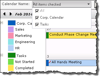
Calendar_GenSet_FilterLists.png When Show Filter Lists is checked, users will be able to filter the calendar display by the lists and libraries selected for display in the SharePoint List and Library data source configuration at runtime.

Text Settings

Text.png

Calendar_GenSet_TextWrap.png When Text Wrap is set to yes, enter the desired Height of Display Text to show multiple lines of text from the Display column selected when configuring the data source. This setting will apply to all item cells.
Calendar_GenSet_TextWrap_Ex.png

Calendar Size

CalSize.png

Calendar_Size.png
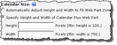
By default the size of the web part will Automatically Adjust…to fit the Web part zone

Keep in mind:

  • Setting the calendar size to the minimum height(100 pixles) and width(750 pixles)values, will require users to vertically scroll to see the full calendar.

Quick Delete

Delete.png

Calendar_GenSet_QuickDelete.png

Calendar_GenSet_Mouse_Delete.png
Check the Quick Delete box to allow users to delete items by clicking a small ‘x’ that is visible when the mouse cursor is moved over the item.

NOTE: This option will be grayed out if Calendar Plus is configured to use SQL Tables or Views or BDC and MashPoint as the data source

Recurring Items

Recurring.png

Calendar_GenSet_RecEvents.png Calendar_GenSet_RecurringItem.png
By default Recurring items are identified by a icon in the upper left corner of the item cell. If an item in the recurring series was edited, it will be indicated with a red slash through the icon.

Base Calendar

Interval.png

Calendar_GenSet_CalInterval.png

Determine whether you want to Base Calendar on a Single Start Date or Interval

  • An Interval will require you to define a Start Date and End Date when the data source settings are configured

  • Calendar_GenSet_SingleDate.png Selecting Single Date will change the data source settings so you can only select one date column.
Overview of Calendar Plus Configuration settings

Use a Bamboo List Rollup as the Calendar Plus data source

Use a Bamboo List Rollup as the Calendar Plus data source

Overview of Calendar Plus Configuration Settings

Bamboo Solutions List Rollup is one of the four available data sources for Calendar Plus.
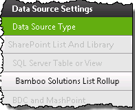
Data Source Settings screen with the Bamboo List Rollup radio button selected
When working with List Rollup keep in mind:

  • List Rollup must already be installed and the rollup created

  • Calendar Plus will use a single Bamboo List Rollup as the data source, however List Rollup can aggregate an unlimited number of lists.

The following steps require you to have accessed the Calendar Plus Settings screens by clicking the Calendar Plus Web Part Settings button in the web parts configuration tool pane.

Step Action Result
1.

Click the Bamboo Solutions List Rollup button under Data Source Settings in the navigation tool pane. Image of the Navigation Pane with the Bamboo List Rollup button available. All other data source buttons are grayed out

You will only be able to select this button if Bamboo Solutions List Rollup is selected as the Data Source Type

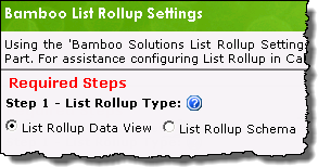
The Bamboo List Rollup Settings will be visible on the right side of the configuration screen and is divided into two sections:

  • Required Steps: the configuration settings which must be defined to add the data view or schema to the Calendar Plus display

    NOTE: Only the required steps are discussed in this topic

  • Optional Steps: Modify the display options associated with the data source

2.

Select the List Rollup type that will be used as a data source:

Radio buttons to select List Rollup type
Information on the differences between the Bamboo List Rollup tools is available here.
3.

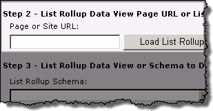
Enter the URL to the List Rollup instance that contains the content to be displayed in Calendar Plus, then click the Load List Rollup… button.

When entering the URL keep in mind:

  • If using List Rollup Classic, enter the page URL.
  • Both absolute paths (http :// server name/site ) or relative paths(./Site/) can be used for the site URL.Bamboo recommends using relative paths if:
    1. Multiple Alternative Access Mappings are being used
    2. The Web part will be included in a site template

Image of the Page or  Site URL field and the Load List Rollup button

The predefined rollups associated with the List Rollup you pointed to will be listed in List Rollup… drop-down menu.

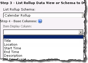
4. Select the rollup to display,then identify the display column from the Item Display Column drop down menu.
List Rollup schema/ dataview drop down ,and Item Display Column drop down

Image of color coded items in calendar display

NOTE: Two tone color coding is not available when using List Rollup as a data source

5. Select the Date and Time column(s) in the list or library that will be displayed in the calendar. Enter the desired start and end date fields from the drop-down menus Whether you see Start Date and End Datefields or Single Date field will depend on the selection made on the General Settings screen to use a …Single Date or Interval.
Image of the Base Calendar on Single Date or Interval drop down selector found on the general settings screen.
6.

Apply a filter for the list or library by selecting from the following options:

  • Show All Items

  • Specify Filter Conditions To Specify Filter Conditions select the radio button and set filter conditions in the 3 fields provided

    Use the Add Filters link is you want to add another filter using AND/OR boolean operators.

Keep in mind:
1. Calendar Plus supports the two SharePoint variables; [ME] representing the currently logged in user, and [Today], representing today’s date, that can be used to specify filter conditions

2. Use the Add Filters link if you want to add another specified filter condition using AND/OR boolean operators.

3. Web part connections can be used to filter the contents of the calendar display but are not configured in the Calendar Plus web part settings. Information on using web connections is available here

7.

Stay in the Bamboo List Rollup Settings screen and configure the Optional Steps associated with the data source

OR

Use the left navigation pane and configure View Settings for the Calendar Plus web part.

Clicking Save and Close will exit the Calendar Plus Web Part settings screen.

Overview of Calendar Plus Configuration Settings