How to Add a web.config Modification Using PowerShell
Background
Please see How to modify a web.config file using PowerShell for some additional background information about why you should modify your web.config file(s) programmatically.
Many Bamboo products implement Telerik controls and install a specific version of Telerik.Web.UI assembly to the SharePoint farm. If the farm already has a different version of Telerik.Web.UI assembly, this may cause a conflict and you may see errors on SharePoint pages where you use these controls.
Resolution
To resolve this problem, we need to add an assembly binding to the web.config to specify which version to use. However, adding text by manually editing a web.config file is not recommended because it is not synced across the servers in the farm and is not saved in the SharePoint configuration database.
The best way to modify a web.config file programmatically is via PowerShell.
NOTE: Be extra careful when making changes to the web.config. Backup your file before changing it. Do not add or remove something unless you are absolutely sure what it is.
To demonstrate, we will use an example with Telerik controls. Consider this scenario:
Before a Bamboo product is installed, a server has Telerik.Web.UI version 2012.3.1016.35 previously installed. During the Bamboo product installation process, Telerik.Web.UI version 2011.2.915.35 was installed. Although it is OK to have multiple Telerik versions on a single server, it may cause a conflict in SharePoint.
We need to add an assembly binding to the web.config to tell the assemblies looking for version 2011.2.915.35 to use version 2012.3.1016.35. The assembly binding addition to the web.config file will look like this:
<dependentAssembly>
    <assemblyIdentity name "Telerik.Web.UI" publickKeyToken "121fae78165ba3d4" culture "neutral" />
    <bindingRedirect oldVersion "2011.2.915.35" newVersion "2012.3.1016.35" />
</dependentAssembly>
NOTE: Always redirect all versions found to the newest version of Telerik.Web.UI on the system, for backwards compatibility of functionality.
| Step |
Action |
| 1. |
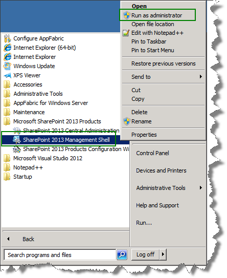
First, open the SharePoint 2010 Management Shell. From the Start menu, select All Programs > Microsoft SharePoint 2010 Products > SharePoint 2010 Management Shell. |
| 2. |
Next, create the SPWebConfigModification object for the assembly binding
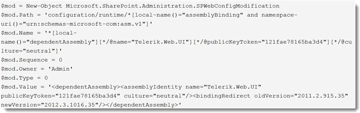
Where:
- Path: A string that contains an XPath expression that specifies the node. If the Type property specifies EnsureChildNode, the Path property contains the XPath expression for the parent node under which the node is created. In this example, the runtime element of the web.config file is placed in another xml-namespace, so we have to identify the namespace. Otherwise, that element will not be found.
- Name: A string that contains the name of the attribute or section node. When the type of web.config modification is EnsureChildNode, the Name property refers to an XPath expression that uniquely identifies the node under the parent node, as identified by the Path property.
- Sequence: A 32-bit unsigned integer between 0 and 65536. This property throws an InvalidOperationException if the number is outside this range. A sequence is used only if there is more than one modification of the same type to the same node or attribute. In this case, modifications with lower sequence numbers are applied first.
- Owner: A string that specifies the owner of the modification. You can use the Owner property to track ownership of modifications.
- Type: An SPWebConfigModification.SPWebConfigModificationType value that specifies the type of modification. There are 3 types:
- EnsureChildNode: Specifies that the web.config modification must ensure the existence of a child node of the node to which the XPath expression points. Value = 0.
- EnsureAttribute: Specifies that the web.config modification must ensure that there is a value for a particular attribute. Value = 1.
- EnsureSection: Ensures a singleton node. This node is only written once, even if multiple entities register multiple instances of EnsureSection to ensure the existence of a section. Value = 2.
- Value: If the Type property specifies EnsureChildNode, the Value property contains an XML string that represents the node to be populated as a child of the specified parent node. If the type is EnsureSection, Value contains the name of the section. If the type is EnsureAttribute, Value contains the value set in the attribute.
|
| 3. |
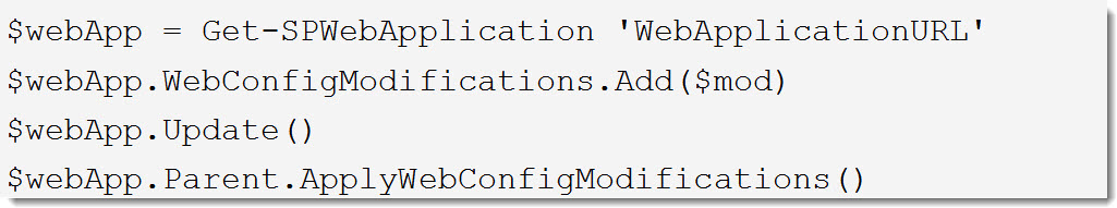
Then, apply the modification to the Web application (replace ‘WebApplicationURL’ with the actual URL of the Web application).
NOTE: Bamboo products are only tested with the Telerik version that they install. Therefore, if a newer Telerik version is used, there might be some unexpected problem.
|
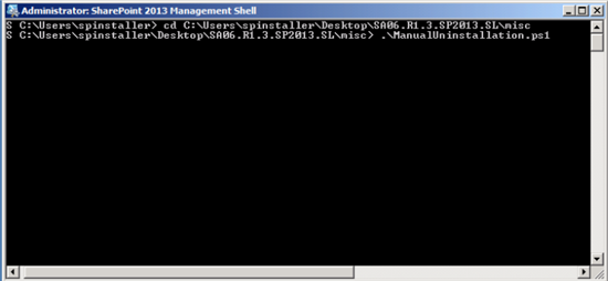
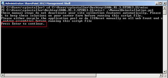
 IMPORTANT: As of April 2017, Bamboo no longer includes ManualUninstallation.ps1 file in product download packages. An updated uninstall script is included instead. Please see

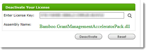
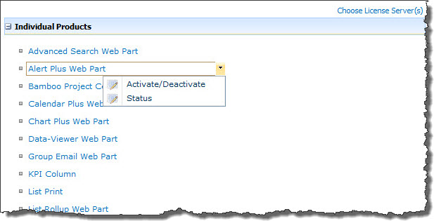
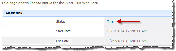
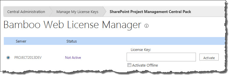
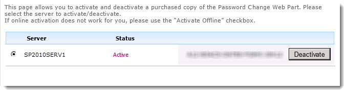
 ). The Assembly Name licensed with this key will be displayed. Ensure it is the product you expect and then click Deactivate.
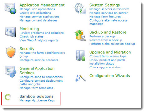
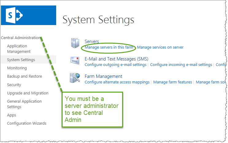
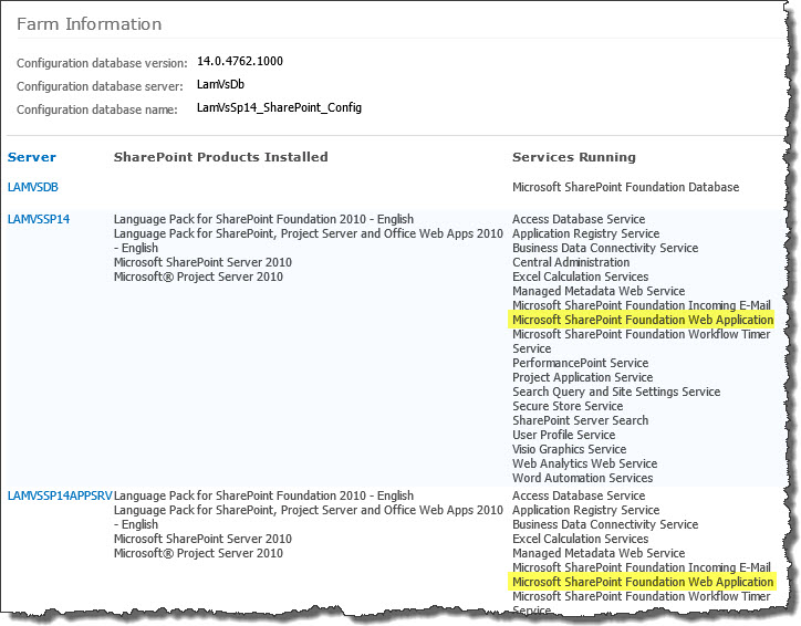 To determine which servers on the farm run these services, go to Central Administration > System Settings > and then Manage servers in this farm. If you are using WSSv3/MOSS, this page is accessed in Central Administration through Operations > Servers in Farm. In this example, there are two WFE servers on the farm.
 List Rotator allows you to select a list or library, such as Announcements or a Picture library, and display and rotate list items using configurable effects. You can also customize the source HTML and CSS directly to display list data in a format and style you want, while also including additional column data from the selected list or library along with the list item.
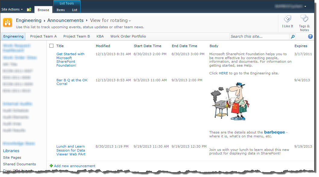
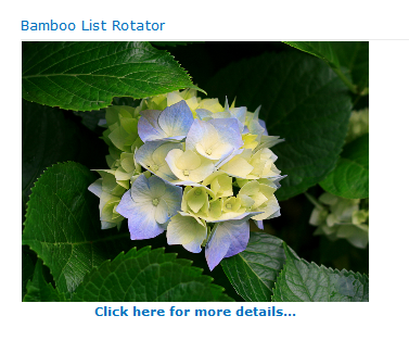 The example explained here rotates images from a SharePoint Picture Library. Below the image, a hyperlink column is displayed that end users can click on to go to a page that provides more information about the image.
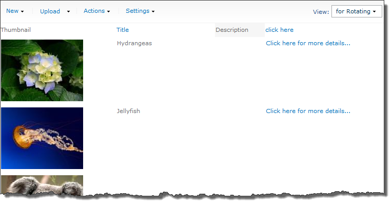
 The buttons in that section will become enabled.
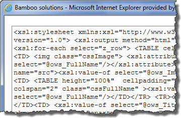
 SharePoint 2013:
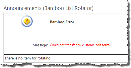

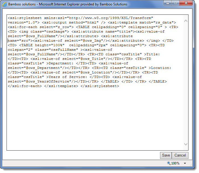
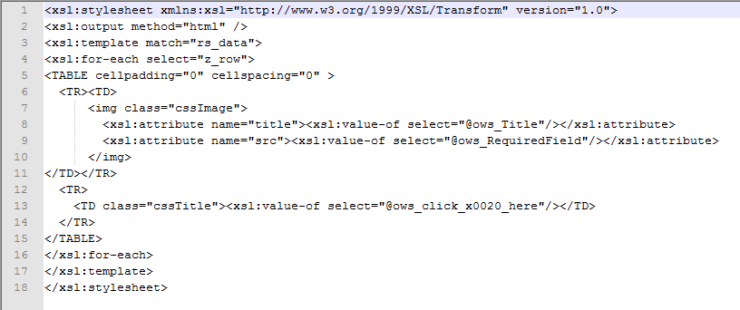
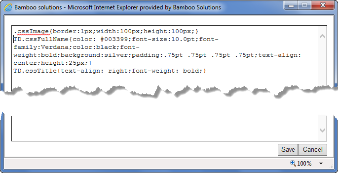
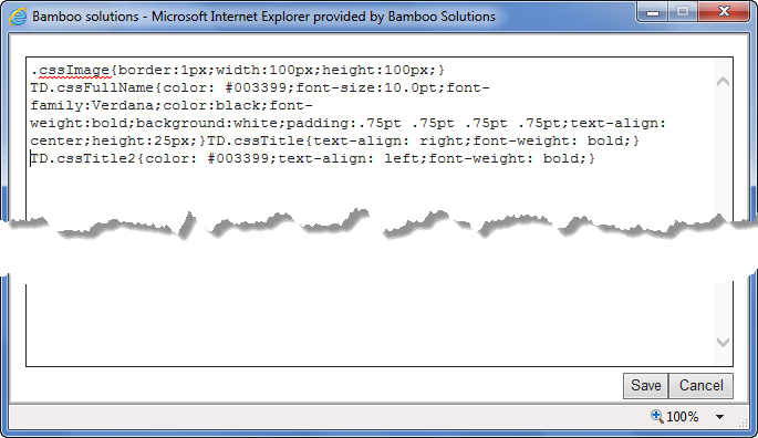
 It may be easier to copy this text into a text editor of your choice to make edits easier. You can paste edited text back into this dialog once the edits are complete.
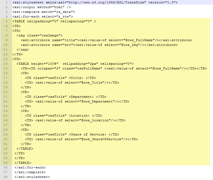
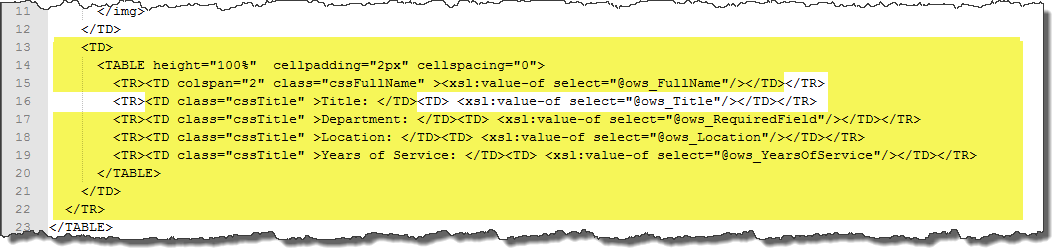
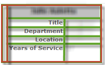 The main area to note is highlighted in yellow above. It includes two nested TABLE tags (table 1 starts on line 5 and the nested table starts on line 14; see the yellow highlight above). These tables look like the diagram shown here. The outside table (table 1, shown with red lines) has one row (<TR>) with two columns (<TD>). The inner table (shown with green lines) is inside the second column of the first table and has several rows with two columns each.
 Most layouts will have at least one table where you will display values from the columns of the list you want to rotate. Sometimes you may want to include column labels, as seen in the default layout above.
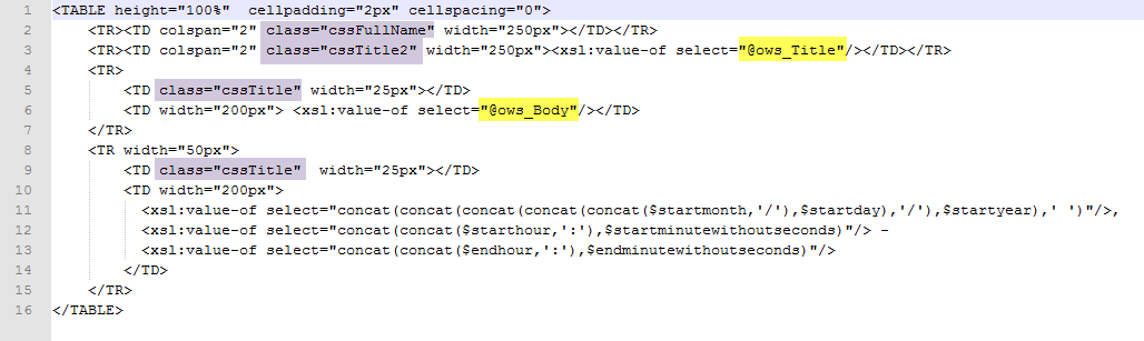
 You will find many of our products complement each other quite nicely saving you the time and trouble to write custom code. With Bamboo at the heart of your SharePoint investment, you gain access to a huge catalog of enhancements, components, and accessories that add the critical functionality your business requires.
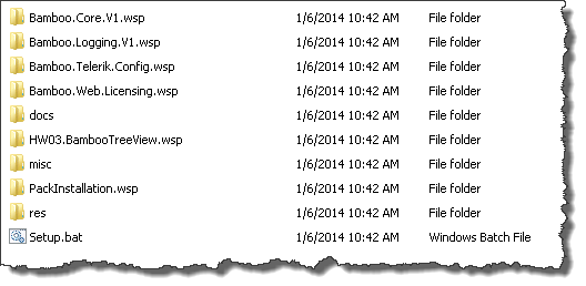 When you extract the product EXE to a location on your SharePoint server, several folders are created that contain installation files and Setup program configuration files. The root level of the extracted file system includes the file Setup.bat, which launches the Setup program. The list below shows the installation files for the Tree View Web Part, as an example.
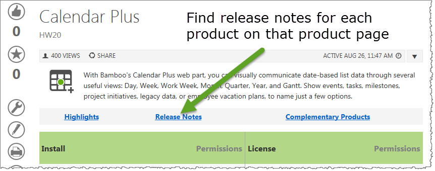 As you look at each product’s documentation page, you will see there is a link to the Release Notes for that product at the top of the page.