Troubleshoot Problems with Deploying Farm SolutionsTop
This topic applies to:
- WSS 3.0 and MOSS 2007
- SharePoint Foundation 2010/2013 and SharePoint Server 2010/2013/2016
Several issues and their corresponding solutions are described below. Click the link to jump to the appropriate issue.
Issue 1: Copying or Removing Assemblies
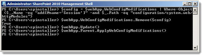
With SharePoint 2010 and 2013, we sometimes see failures when trying to copy assemblies to the Global Assembly Cache (GAC) or remove assemblies or other files from the bin or 14 or 15 hive during solution retraction and/or deployment.
Resolution:
- Restart the SharePoint 2010/2013 Administration service on all of the Web Front End servers (all servers on the farm where the Foundation Web Application service is running).
Restart the SharePoint 2010/2013/2016 Timer service as well.
 NOTE: The SharePoint Administration service carries out the actual removing and adding of files during deployment. Restarting the service works most of the time because the service should release the handle on a file. However, if the Administration service does not release the handle on the file, then deployment can fail. Restarting the timer service on SharePoint 2010/2013 will restart all SharePoint 2010/2013 timer jobs and you will need to delay installation for a while, until all of those jobs have had a chance to complete.
-
Remove the solution.
-
Reinstall the solution.
For more information, see:
http://msdn.microsoft.com/en-us/library/aa544500.aspx
Top
Issue 2: Deployment Fails or Times Out
Deployment fails, and the reason is not clear from the error shown in installation feedback (or just shows time out errors), or the Bamboo GUI installer appears to stop in the middle of the deployment, and eventually times out.
The Timer Job Definitions in Central Administration may show one or more persistent “one time” timer jobs listed.
Manual installations using stsadm also fails to complete the installation.
Resolution:
-
Delete the one-time timer jobs listed in the timer job definition list. Restart the SharePoint 2010/2013 Timer service on each server in the farm running the Foundation Web Application service.
Try the installation again.
-
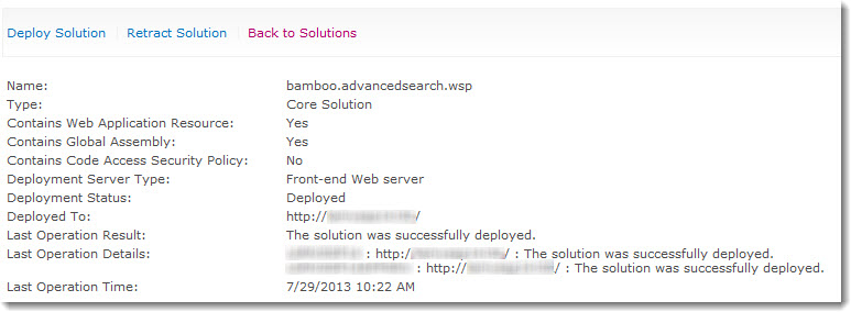
Any solutions that show up in on the Solution Management page in Central Administration with a status of “undeployed” or “error” need to be either deployed manually in Solution Management, or removed, if you are going to run the Bamboo GUI installer. For more information, see Installation stops at the Repair Remove or Install screen
-
Run the stsadm installation using the -local rather than the -immediate parameter for stsadm -deploysolution. This will not invoke the timer service. As stated in this Technet article:
-local “Deploys the solution synchronously on the local computer only. The timer service is not used.”
For more information about which server is running the Windows SharePoint Services Web Application Service, look in Central Administration:
– on SP 2007 in Operations > Servers in Farm
– on SP 2010 in System Settings > Manage Servers in this Farm
- Clear the SharePoint Configuration cache. The Web Front End servers may be out of sync. For more information and instructions see Clear the SharePoint Configuration Cache for Timer Jobs.
If you experience issues with WSS and MOSS timer jobs failing to complete are receiving errors trying to run psconfig, clearing the configuration cache on the farm is a possible method for resolving the issue. The config cache is where we cache configuration information (stored in the config database) on each server in the farm. Caching the data on each server prevents us from having to make SQL calls to pull this information from the configuration database. Sometimes this data can become corrupted and needs to be cleared out and rebuilt. If you only see a single server having issues, only clear the config cache on that server, you do not need to clear the cache on the entire farm.
To clear the cache a single server, follow the steps below on just the problem server.
- Stop the OWSTIMER service on ALL of the MOSS servers in the farm.
-
On the Index server, navigate to:
Server 2003 location: Drive:Documents and SettingsAll UsersApplication DataMicrosoftSharePointConfigGUID and delete all the XML files from the directory.
Server 2008 location: Drive:ProgramDataMicrosoftSharePointConfigGUID and delete all the XML files from the directory.
-
Delete all the XML file in the directory.
NOTE: ONLY THE XML FILES, NOT THE .INI FILE.
- Open the cache.ini with Notepad and reset the number to 1. Save and close the file.
- Start the OWSTIMER service on the Index server and wait for XML files to begin to reappear in the directory.
- After you see XML files appearing on the Index server, repeat steps 2, 3 & 4 on each query server, waiting for XML files to appear before moving to subsequent servers.
- After all of the query servers have all been cleared and new .xml files have been generated, proceed to the WFE and Application servers in the farm, following steps 2, 3, 4 and 5 for each remaining server.
Top
Issue 3: Copying a File Failed
This is the error message that you get: “Copying of this file failed. This operation uses the SharePoint Administration service (spadmin), which could not be contacted. If the service is stopped or disabled, start it and try the operation again.”
Resolution:
For instructions and more information, see this MSDN article.
Top
Issue 4: Resources Scoped for one Web App must be deployed to more Web Apps
This is the error message that you see: “This solution contains resources scoped for a Web application and must be deployed to one or more Web applications.”
Resolution:
Usually this can be resolved by running the Bamboo GUI installer, removing the product, and then reinstalling it.
We have also found that if the solution is showing up in the Solution Management page as installed but not deployed, you can try to run a manual deployment using stsadm.
See Best Practices for Installing Bamboo Products
Also see MSDN Issues Deploying SharePoint Solution Packages
Top
Issue 5: Cannot Find a Certain File
After an apparently successful deployment, you see errors about not being able to find file(s) when attempting to view products on a page.
Resolution:
Be sure to exclude directories such as %systemroot%Program FilesCommon FilesMicrosoft SharedWeb Server Extensions from file level antivirus scanning, or you may find that files that were deployed in that directory will be removed when the antivirus scan runs.
For more information, see this TechNet article.
Top
 Select the first product component in the Components section in the Setup program. When a component is selected, information specific to it is displayed on the right side of the interface. Verify the
 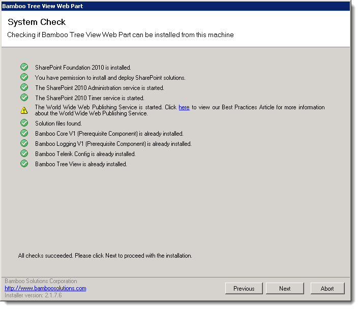 Click Next to begin the upgrade. Verify that the system checks pass successfully and click Next. If the system checks do not pass, you will not be able to proceed.
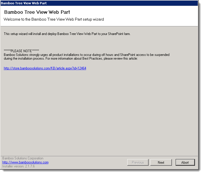
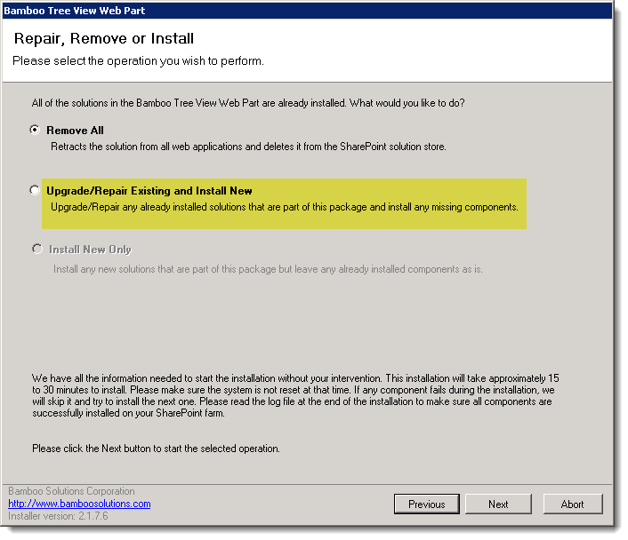 In the Repair, Remove or Install screen, select the Upgrade/Repair Existing and Install New option and click Next.
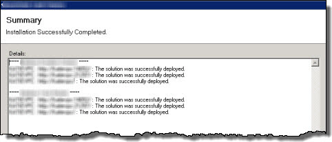 When the upgrade is complete, click Next to review the Summary screen and confirm that the product upgrade was successful. You may need to scroll up to review the entire summary. When satisfied, click Close.
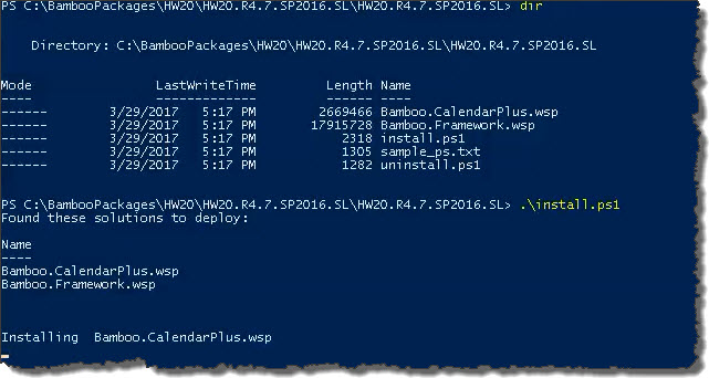
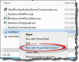 Run the Install.ps1 from a WFE server in PowerShell as an admin.
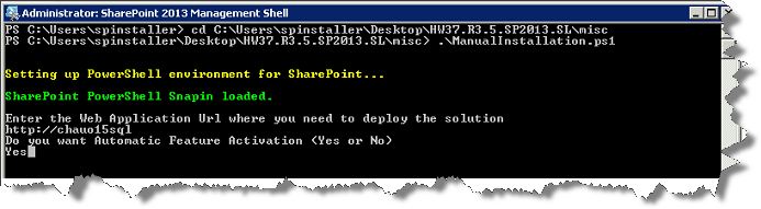
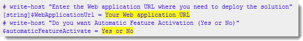
 The install.ps1 script is used to install a new product or uppgrade an existing product.
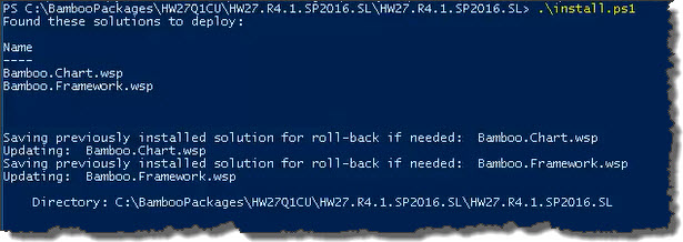 The script will look for WSPs in the install folder and list those found.
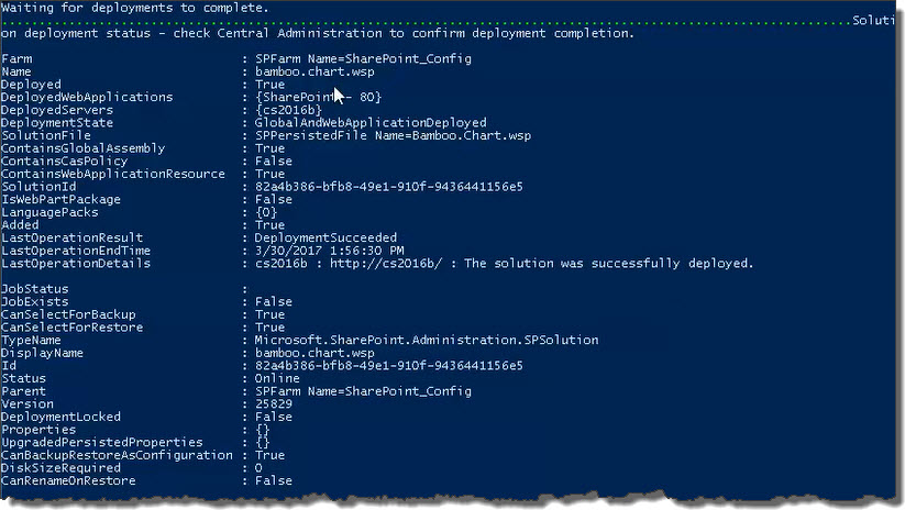 When the deployment completes, deployment status information will be displayed for each solution.
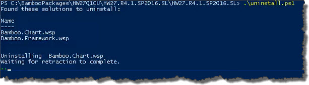 The script will look for WSPs in the install folder and list those found. It will uninstall them in alpha order.

 ) at the top of the components list to return to the Setup main page.
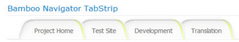
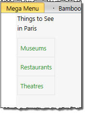
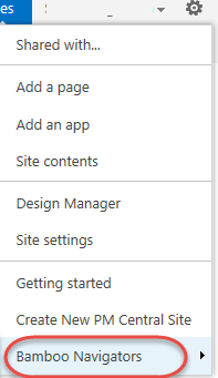
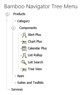
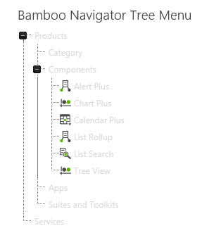
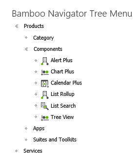
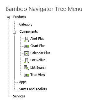
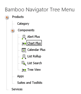
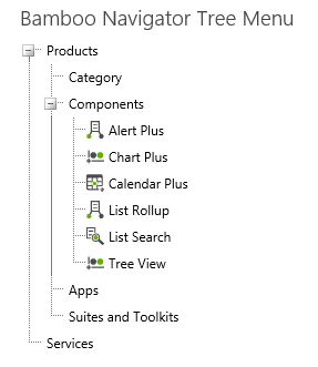
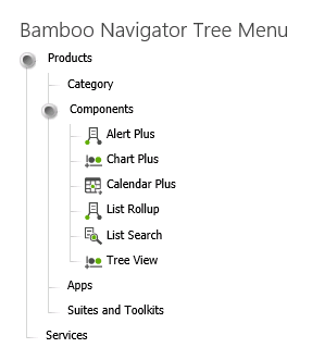
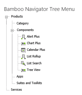
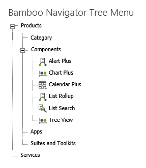
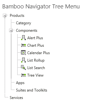
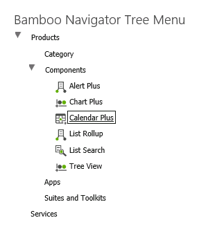
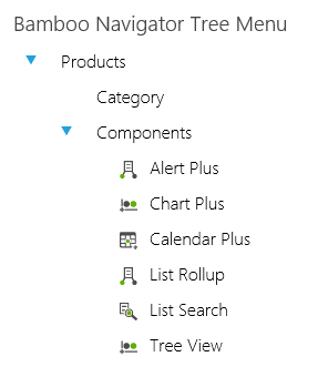
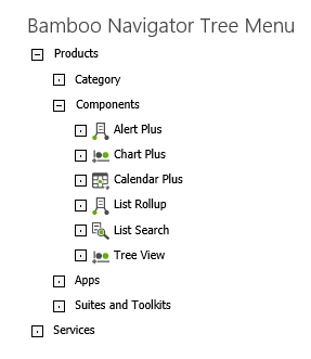
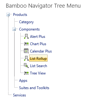
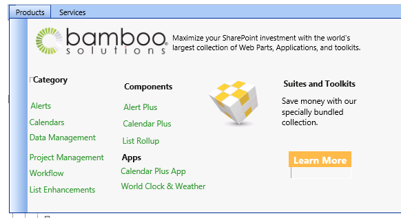
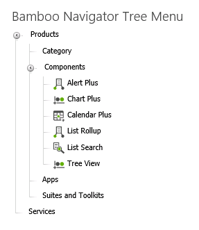
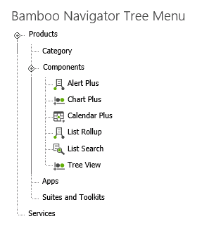
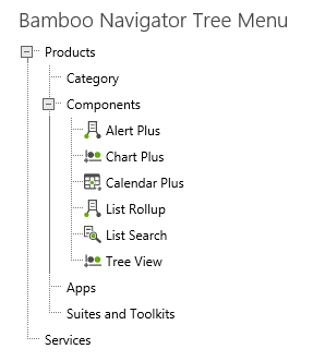
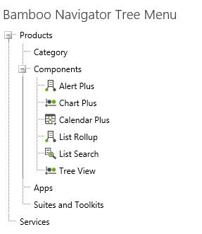
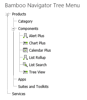
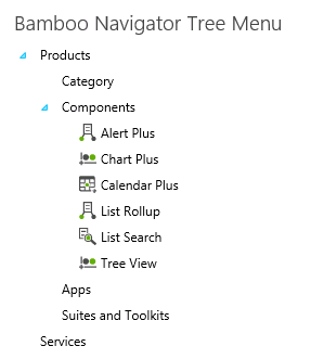
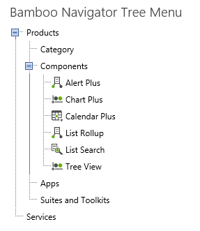
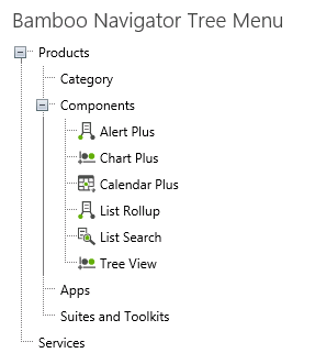
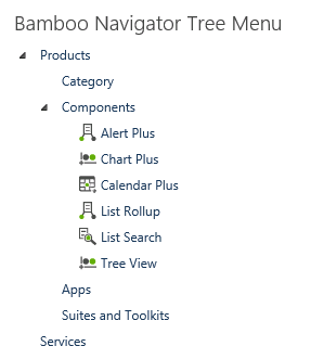
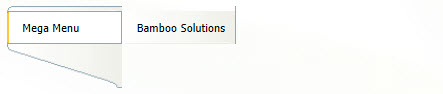
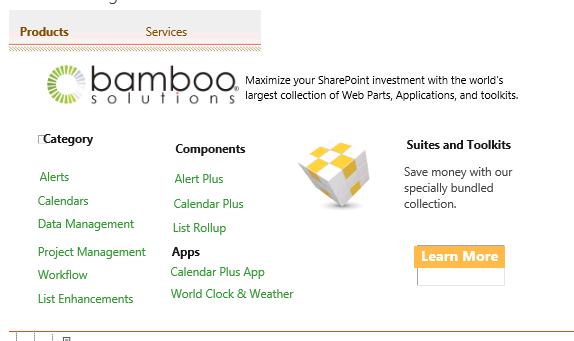
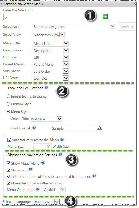 Navigators lets users create custom menus, tabs, tree items, and a Site Actions menu to navigate to sites, pages, or lists within and across sites and site collections. These navigation controls can help build a clean, user-friendly site that requires customized navigation controls. For example, if you have multiple sub-sites, various projects or links, you can simply go to the specific site by changing tabs instead of opening a separate browser window and entering the URL. Navigators lets you add tabs to the page. By changing the styles or content of the master page, you can quickly customize the appearance of an entire site and use it for other pages.
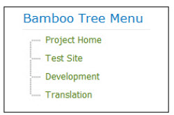

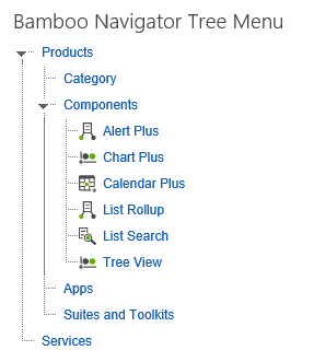
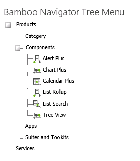
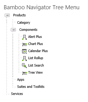
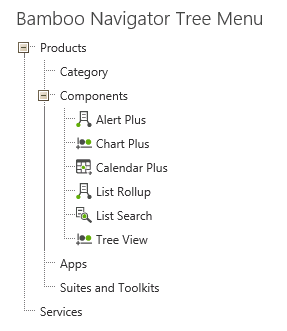


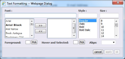
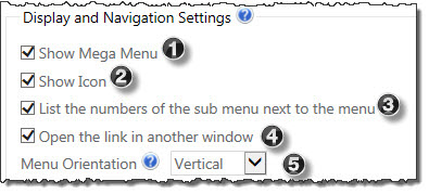
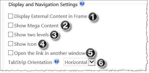
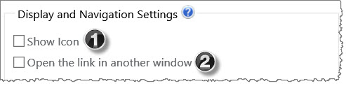
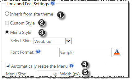 In the Web Part Tool Pane you can configure the following Look and Feel Settings to customize the Web Part Menu to individual needs.
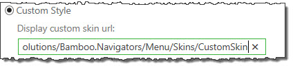

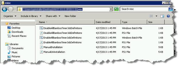
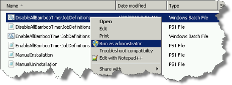 Right-click on the file DisableAllBambooTimerJobDefinitions.bat and choose Run as administrator. This script stops the timer job services for all Bamboo products installed on the farm, helping to put the farm in a quiescent state for the install.
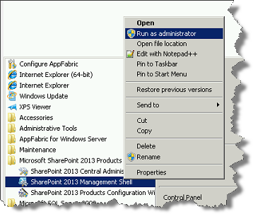 On the WFE where you extracted the product folders, right-click on the PowerShell application in the Start menu and choose Run as administrator. You can use Windows PowerShell or SharePoint 2013 Management Shell.
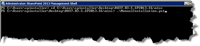
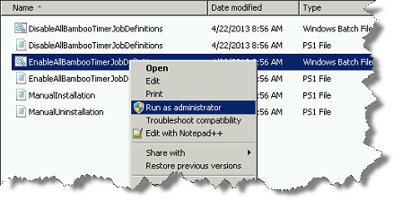 Return to the misc folder. Right-click on EnableAllBambooTimerJobDefinitions.bat and choose Run as administrator. This enables all Bamboo timer job services.
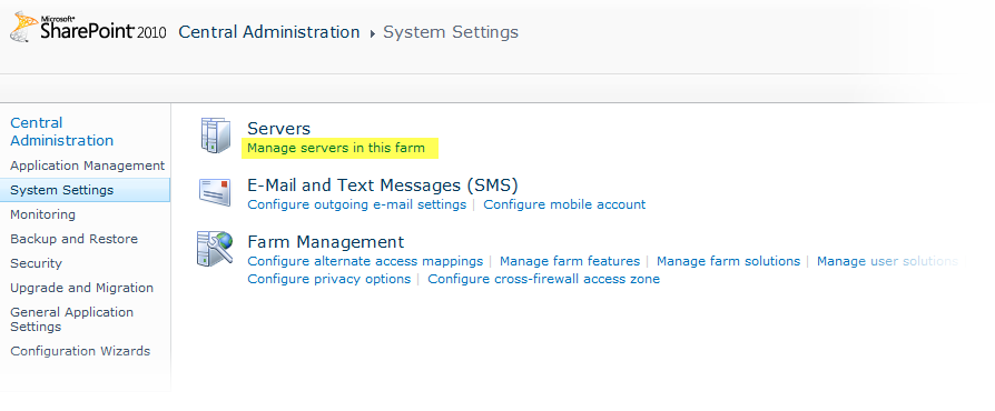

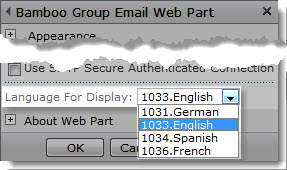
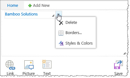
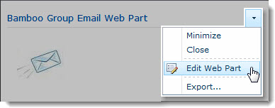 Click the edit drop-down menu on the Web Part title bar and select Edit Web Part (or Modify Shared Web Part if you are using SharePoint 2007). See the example from the Group Email Web Part.
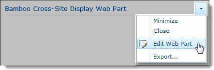 Click the edit drop-down menu on the Web Part title bar and select Edit Web Part (or Modify Shared Web Part if you are using SharePoint 2007).
 Click the [Product] Settings button in the Web Part tool pane.
 The script will look for WSPs in the install folder and list those found. It will install them in alpha order.
 Double-click the product EXE file to extract the contents of the product download.