Set Up a Column Chart
Back to Create a New Chart
Column charts are great for comparing multiple categories by one or more value. A column chart requires an x-axis category and at least one y-axis data series.
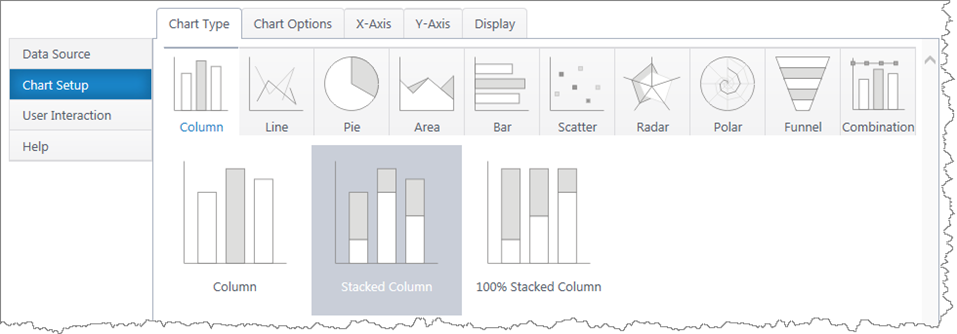
Multiple y-axis series will add an additional bar in each x-axis category. Stacked column charts will stack the bars in each category.
If you haven’t yet, select a data source.
As you’re building your chart, use the Preview button in the upper right to check your work in progress.
Chart Options (Choose X & Y Axis)
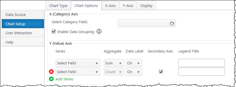
X (Category) Axis
Select Category Axis – Select which column of categories you would like to compare. The dropdown list will auto-populate with columns from your data source.
Enable Data Grouping – Group x values of the same category. Typically, you want grouping enabled. If off, each individual data point will be a separate column.
Y (Value) Axis
Series – Specify what value you would like to compare between the categories. Add additional y-axis series to compare.
Aggregate – If you have enabled grouping on the x-axis, aggregate the y-axis data you are comparing (sum, first, min, max, average, count). By default, chart plus compares the sum of y values.
Data Label – Toggle data labels for each Y series.
Secondary Axis – If using more than one Y series, you can add a secondary axis on the right side of the chart. The secondary axis will automatically adjust it’s range to include the maximum Y value from the series mapped to it.
(If using a stacked column chart, you must have more than one Y series to use the secondary axis feature.)
Legend Title – Customize legend titles for each y-axis series.
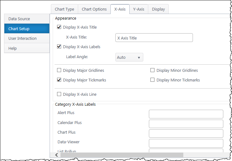
X-Axis Configuration
Data Type Settings – Appears if you select a Date/Time value for the x-axis. Configure how date categories display (date or time) and the scale of the x-axis. “Automatic” sizes the x-axis according to the scale of your dataset.
Appearance
X Axis Title – Toggle title display at top of chart and customize title text.
X-Axis Labels – Toggle x-axis labels & their display angle.
Gridlines & Tickmarks – Customize which gridlines and tickmarks display along the x-axis.
Display X-Axis Line – Toggle the x-axis line that runs along the bottom of the chart between the bars and x-axis labels.
Category X-Axis labels – Customize category names that appear on the x-axis.
Sort
Sort Axis – Specify an ascending or descending sort order for how categories display on the x-axis.
Y-Axis Configuration
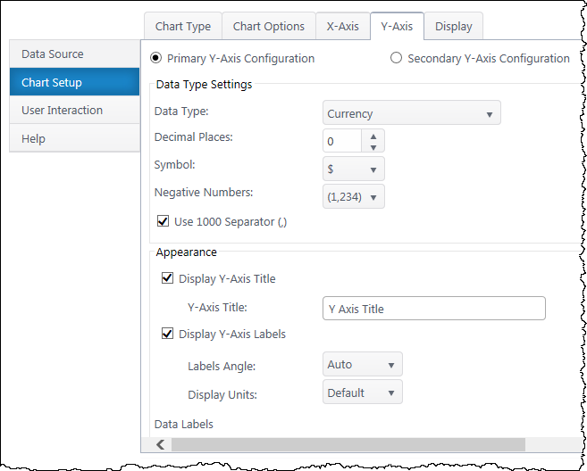
Secondary Axis – If you have a secondary y-axis, use the buttons at the top of the Y-Axis tab to switch between axis settings.
Data Type Settings
Data Type – Select a data type for y values (general, number, currency, date, time, percentage, scientific).
Format – Configure details on how Y values will display on the axis and labels. Date types also require you to select the date scale for the y-axis.
Appearance
Y-Axis Title – Toggle title display at top of chart and customize title text.
Y-Axis Labels – Toggle y-axis labels and their display angle & position.
Gridlines & Tickmarks – Customize which gridlines and tickmarks display along the y-axis.
Y-Axis Range – Configure the minimum and maximum values visible on the y-axis. These default to “auto” and adjust to the range of your dataset. Not available for “Date” & “Time” data types or 100% stacked column.
Display Y-Axis Line – Toggle the y-axis line between the y-axis scale and the chart canvas.
Next: Configure the Chart Display Settings
 You will find many of our products complement each other quite nicely saving you the time and trouble to write custom code. With Bamboo at the heart of your SharePoint investment, you gain access to a huge catalog of enhancements, components, and accessories that add the critical functionality your business requires.


 Widget Limitations:
 button to define the comparison values and criteria:
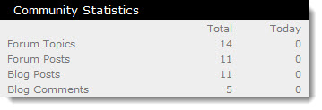 Community Central Home page statistics track participation across the entire community. Statistics displayed on the Community Central Home page include:
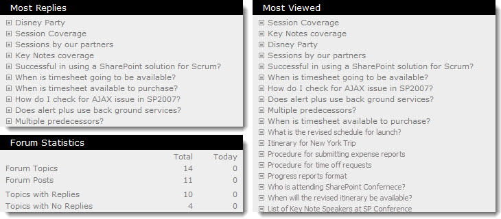 Forums Home page statistics track participation in all community forums. Statistics displayed on the Forums Home page include:
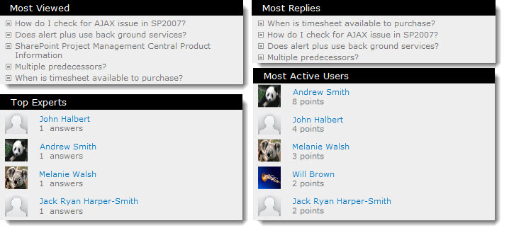 Forum site statistics provide a more in-depth view of forum participation and are specific to forums in that forum site. Statistics displayed on each forum site home page include:
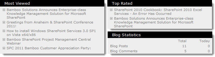 Blogs Home page statistics track participation in all community blogs. Statistics displayed on the Blogs Home page include:
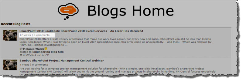 On the Blogs Home page and the blog site where a post was created, the number of views and comments is displayed for each blog post.
 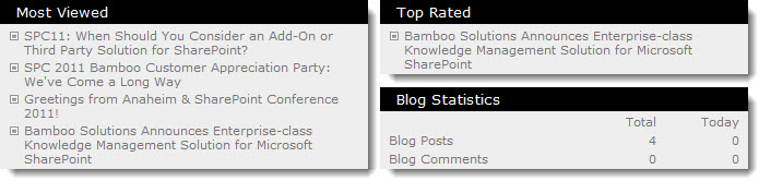 Blog site statistics provide a more in-depth view of forum participation and are specific to blogs posted to that blog site. Statistics displayed on each blog site home page include:
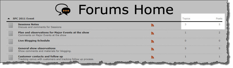
 On the Forums Home page, the total number of topics and posts for each forum.
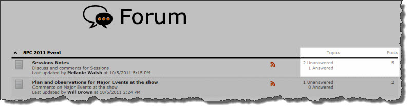
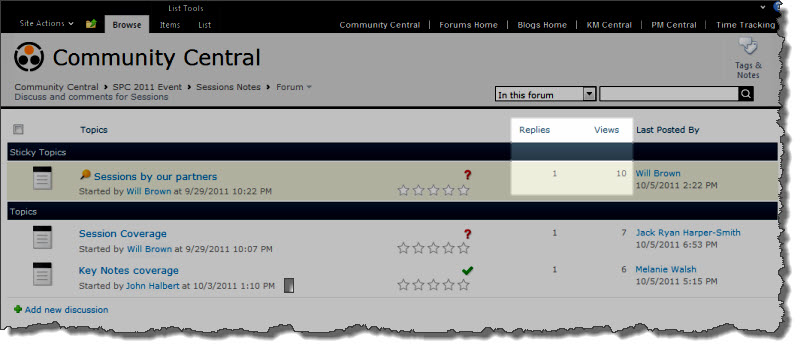 In the forum view, the number of replies for each post and the number of views for the topic.
 With its robust collection of components and tools, Bamboo Community Management Suite provides a flexible, scalable, and affordable social solution for your SharePoint environment. In addition to the powerful forums, blogs, and social networking features available in applications such as Community Central and Discussion Board Plus, Bamboo Community Management Suite features a wealth of complementary, feature-rich tools that will revolutionize community within your enterprise.
 No need to license each product! All of the products within your toolkit are licensed through your Suite or Toolkit License. When you are ready to install a product that is part of your suite or toolkit, use the links below to open the product landing page where you can follow the instructions under each section to Install, Configure and Work With each specific product(s) that are included in your suite or toolkit.


 to configure this Bamboo product.")

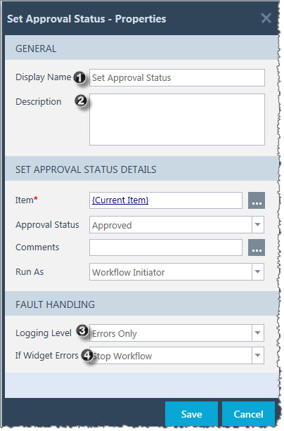 After a widget is dropped into the workflow, it must be configured before the workflow can use it. To set the properties of a widget, drag your widget to the studio and right-click on it to display the Widget Properties ** for that widget.
 IMPORTANT: After making changes to any property in the Widget Properties, be sure to click Apply to save your changes.
 and enter the Username and Password of another user account. Click Save.
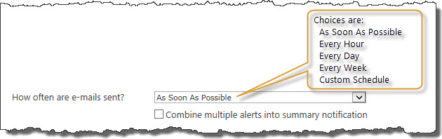 On the Event Tab, specify the frequency of the alert.
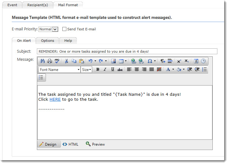 1. This format…
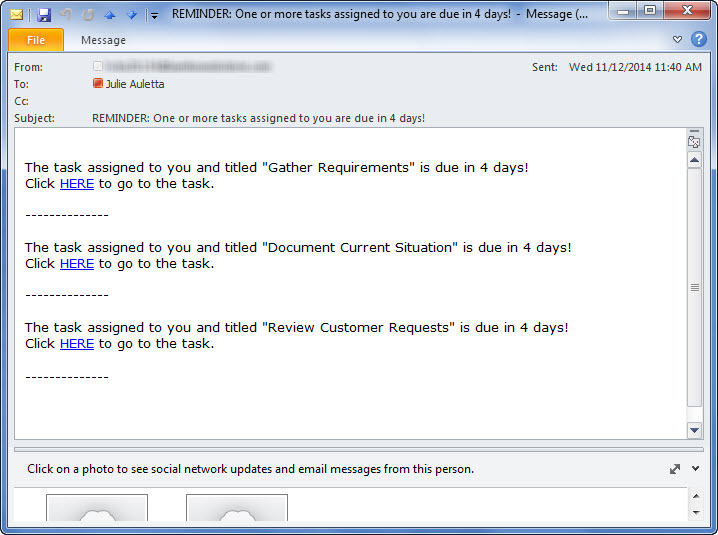 Generates an email that looks like this.
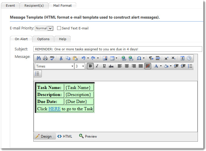 2. This format…
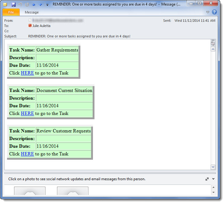 …generates an email message like this:
 After you have identified the Data-Viewer data source you will need to identify the columns that will be displayed in the Web Part. This step is
 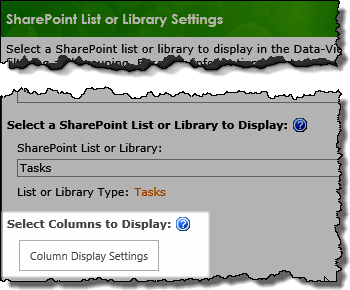 1. Click the Column Display Settings button found on the data source configuration screen.
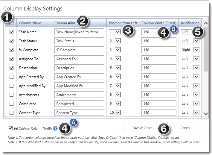


 ).
).  ) to search for a SharePoint or Active Directory user or SharePoint group* in the User Lookup form.
 ) in the User Lookup form.
 button to create or select a task form:
 ) to modify the settings for an existing field.
 ) to delete an existing field from the task form.
 ). If more than one item matches the criteria, the first item returned is checked out.
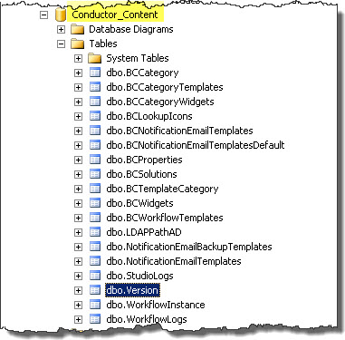 In SQL Server Management Studio, expand the Tables in your Workflow Conductor Configuration Database.
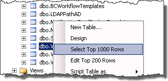 Right click the table called dbo.Version and choose *Select Top 1000 Rows* from the menu that appears.
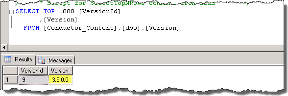 There is only one row in this table and it has two columns. Check the value of the Version column to learn the version of the Configuration Database. If you have just upgraded to Workflow Conductor R3.5, the value of this column should be 3.5.0.0