Chart Type Reference
Use the table of charts below to determine which chart type best fits your data and display needs.
Click on each chart for more detailed information on setup.
|
X-Axis |
Y-Axis |
# Y-Series |
Secondary Axis |
| Column |
Category |
Value |
1+ |
Yes |
| Line |
Category |
Value |
1+ |
Yes |
| Pie |
Category |
Value (optional) |
1 |
No |
| Area |
Category |
Value |
1+ |
Yes |
| Bar |
Value |
Category |
1+ |
Yes |
| Scatter |
Value |
Value |
1+ |
Yes |
| Radar |
Category |
Value |
1+ |
No |
| Polar |
Value |
Value |
1+ |
No |
| Funnel |
Category |
Value |
1 |
Yes |
| Combination |
Consult included chart types above; Does not support Dynamic Chart Switching |
Chart Title Settings
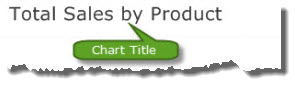
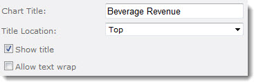 Chart Title: Enter a title to display with the chart. The following additional title options are available:
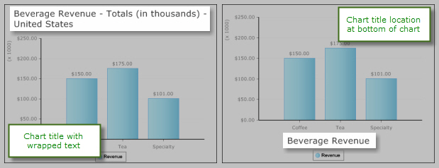
- Title Location: The chart title can be displayed at the top, bottom, left or right of the chart. Titles are always displayed horizontally.
- Show title: This option must be checked for the title to be visible.
- Allow text wrap: Check this option to allow the title text to wrap if it exceeds the chart width. If this option is not checked, the title is truncated.
About CSS
 You can also modify the chart title using CSS. To create Custom CSS using the CSS properties and values below, please make note of the following:
| 1. |
Custom CSS must be added in a hierarchical structure. The paths noted in the header of each table below indicates the correct structure after which the element to be edited. |
Please follow this structure exactly, custom design elements may not appear properly if attributes are not in the correct structure. |
| 2. |
CSS Attributes are separated using line breaks and tabs. For example,
<MainColor=”Yellow”> should be represented as:
 <Appearance>
   <FillStyle>
     <MainColor="Yellow">
|
The final attribute in the path will take precedence over attributes that came before.
CSS Attributes are enclosed in pointed brackets: < >
- To add CSS Properties and their specific values to a CSS Attribute, enclose the Property and Value in the pointed brackets with the Attribute.
- Example: <Appearance>
<TextQuality=”SystemDefault”>
|
| 3. |
CSS Values which are represented by italicized text should be replaced with the appropriate value described in the Description column. |
See also:
Chart Size
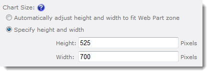 By default, the chart is automatically sized to fit the Web Part zone and height is three-fourths width.
To set a specific size for the chart, select the option Specify height and width and enter values in pixels.
See also:
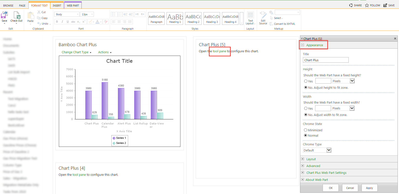
Chart Plus Display Settings
 Click on a category name below for details about the options available in the Chart Plus Display Settings section of the configuration tool pane settings. To access the Chart Display settings, edit the tool pane Chart Plus Web Part Settings and the Chart Display Settings is listed on the left navigation menu. Click each link below to learn about the features and functions for that setting.
Tip: Click the Preview button to preview the chart after changing a setting.
Chart Plus Data Connection Settings
Create charts from data in SharePoint lists, SQL Server tables or views, MashPoint or Microsoft Business Data Catalog applications, or data views created by Bamboo List Rollup Web Part. Update source data and watch your charts update in real-time! Read data from an Excel Workbook to generate charts using Excel Services, from SQL tables from another server using secure store account, and from external lists with External Content Type based on a SQL Server Table.
Click on a category name below for details about the options available in the Data Connection Settings section of the Web Part Settings. To edit Chart Plus Web Part Settings, edit the Web Part properties and click the Chart Plus Web Part Settings button in the Web Part tool pane.
Tip: Click the Preview button to preview the chart after changing a setting.
Data Source Settings Overview
Chart Plus
 Spice up your SharePoint site by displaying List, SQL or Bamboo List Rollup data using the Bamboo Chart Plus web part to quickly generate charts in your SharePoint environment and present powerful reports and data summaries to your users.
Install
|
Permissions
|
License
|
Permissions
|
|
|
 |
|
|
Configure
|
Permissions
|
Work With
|
Permissions
|
|
|
 to configure this Bamboo product.") |
|
 |
Click here if you would rather see a complete list
of all topics for this product. |
 Click on the shopping bag or here to download a trial of the product or to purchase it. Click on the shopping bag or here to download a trial of the product or to purchase it. |
|
Chart Orientation
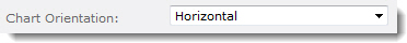
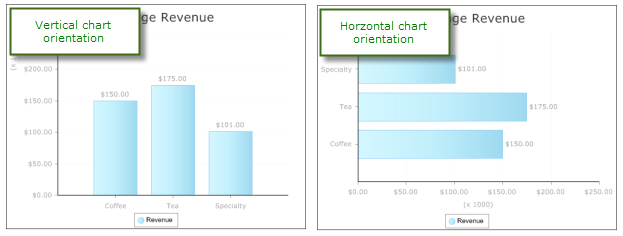
Charts can be displayed vertically (X-axis on the bottom) or horizontally (X-axis on the left).
The chart on the left is in a vertical orientation while the example on the right is showing a horizontal orientation.
See also:
Chart Options
Chart Options settings determine how users can interact with the chart in the Chart Plus Web Part.
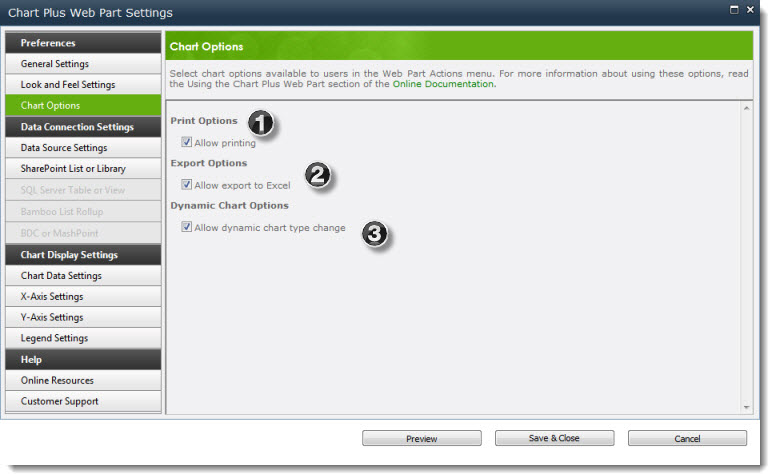
There are three chart options available:
| 1. |
Print Options |
Allow printing: Allows users to format the chart for printing. Adds the Print Preview option to the Action menu on the Web Part toolbar. |
| 2. |
Export Options |
Allow export to Excel: Provides an option for users to export the chart as an image to Excel. Adds the Export to Excel option to the Action menu on the Web Part toolbar. Note: Underlying chart data is not exported. |
| 3. |
Dynamic Chart Options |
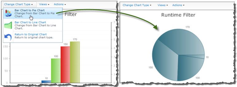
Allow dynamic chart type change: Allows users to switch from a Pie or Line Chart to a Bar Chart (and back again) or from a Bar Chart to a Pie or Line Chart (and back again) using the Change Chart Type menu in the Web Part toolbar. |
|
See also:
Chart Data Settings
 Configure options for chart data, including chart type, grouping options, and data value display options within this section of Chart Plus.
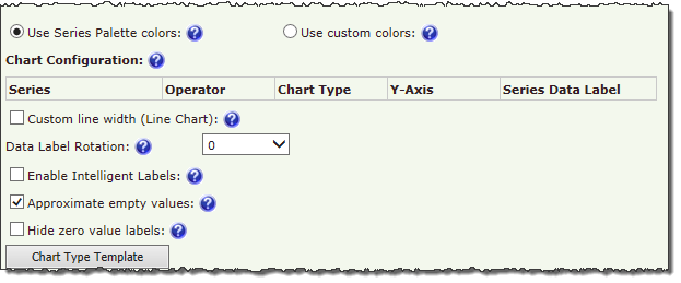
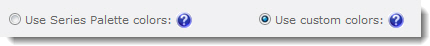
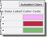
| Series Colors |
| Series colors options define the colors for series bars, lines, pie chart areas, etc. A default Series Palette can be defined in the Look and Feel Settings. To ignore the Series Palette choices and select your own colors for each series in the chart: |
| Step |
Action |
Result |
| 1. |
Select the option Use custom colors. |
 |
| 2. |
In the Chart Configuration table, click the Color Code block next to the series you want to customize. |
 |
| 3. |
To change a color for a series item, pick a new color in the Color Picker. If the series is a Choice column, you can select a color for each choice. To automatically select colors for all series, click the Autoselect Colors button. If you don’t like the colors that are assigned, you can click the button again to assign a different set of colors. |
NOTE: The Autoselect Colors feature will only work for the first 100 series. If your chart has more than 100 series (including Choice column option), you will have to manually assign colors for series item #101 and higher.
|
| Chart Configuration |
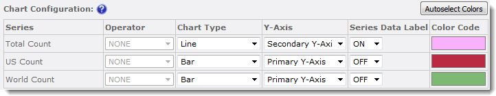 |
| The Chart Data Configuration table allows you to configure the following options for each series in the chart: |
| Operator |
If you selected Enable Grouping when selecting the Y-axes to display in the settings for the chart data source, you can select an operator to use to group series data. Available operators include SUM, COUNT, AVERAGE, PERCENT, and SUM_PERCENT. |
| Chart Type |
Select a chart type to use to display that series on the Y-axis. Use this option if you want to display one series as a bar chart and another as a line chart, for example. Some chart type combinations work better than others, so use the Preview button to see the results before saving your settings. For samples of chart types, click the Chart Type Template button below the Chart Data Configuration table. |
| Y-Axis |
Select which Y-axis to use (primary or secondary) to display series data. |
| Series Data Label |
If you want to display the value for each data point, select ON. To display only the chart element (bar, line, etc.) and not the value, select OFF. |
| Color Code |
Click the color block to assign custom colors for series items. See Series Colors above for more information. |
|
| Other Chart Data Settings |
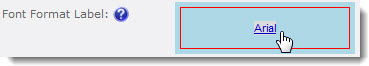
| Font Format Label |
To change the format for the labels, including font, size, style, color, and other options, click the Font Format box. |
 |
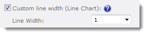
| Custom line width (Line Chart) |
For line charts, you can customize the line width by checking this option and entering a specific width from 1 to 10. |
 |
| Data Label Rotation |
To change the orientation of data labels on the chart, select a rotation percentage. |
A value of “0” will display data labels horizontally, no matter the chart orientation.
|
| Enable Intelligent Labels |
In charts that have many data points or data points with values close to one another, labels can overlap and make readability a problem. Enable Intelligent Labels to automatically align labels so that each value can be seen clearly. |
If the chart contains more than 100 data points, chart performance may be slowed when this option is enabled.
|
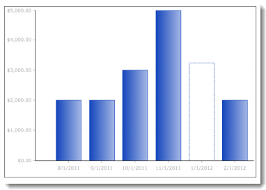
| Approximate empty values |
When checked, data points with empty (non-zero) values will be approximated and displayed as a dotted line. When unchecked, a value of “0” is used for the data point. |
 |
| Hide zero value labels |
Check this box to hide series items with a value of zero. |
| Chart Type Template |
Click to see a selection of available chart types. |
Change the skin of a TTM site
 Time Tracking and Management (TTM) includes a variety of skins that can be applied to change the color scheme and style of sites, providing an easy way to customize the appearance of TTM pages without manually modifying master pages and style sheets.
To change the TTM skin:
Changing Workflow Options
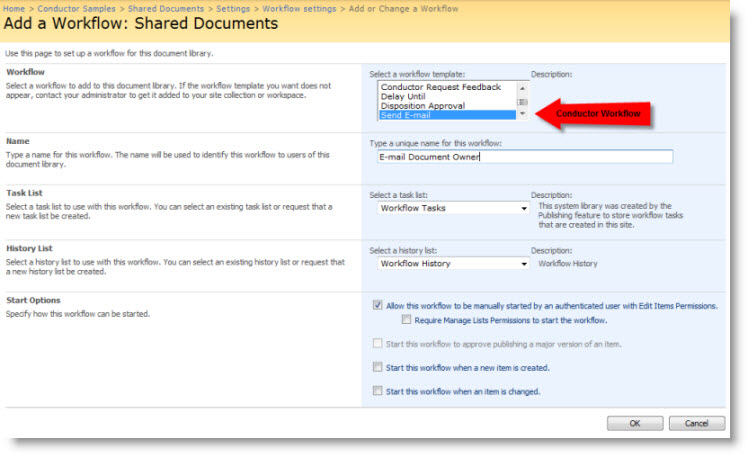
Workflow Conductor workflows support the same options as any other SharePoint workflow. To set these options after a workflow is deployed, go to Tools > Workflow Settings in the list or library (Site Actions > Site Settings > Workflow settings for site workflows). In the Workflow settings page, click the workflow name to change any of its settings, including:
- The workflow display name
- The Task and History lists the workflow uses
- Start options for the workflow:
- Permissions required for starting the workflow
- Starting the workflow automatically when an item is created or changed (does not apply to site workflows)
When you deploy a workflow with Workflow Conductor, it is automatically associated to the list or library with the following default options:
- Name: The name you gave the workflow in Conductor Studio
- Task List: The Default Task List defined in the Workflow Conductor Control Panel
- History List: Workflow History
- Start Options:* Allow this workflow to be manually started by an authenticated user with Edit Items Permissions
Workflow Conductor 1.5 and higher lets you select workflow Start Options at design time in Conductor Studio.
Other available Start Options for Workflow Conductor workflows include:
- Require Manage List Permissions to start the workflow
- Start this workflow to approve publishing a major version of an item (requires versioning)
- Start this workflow when a new item is created
- Start this workflow when an item is changed
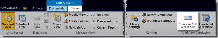
To change options for a workflow you deployed with Workflow Conductor, including workflow start options:
| Step |
Action |
Result |
| 1. |
SharePoint 2007:
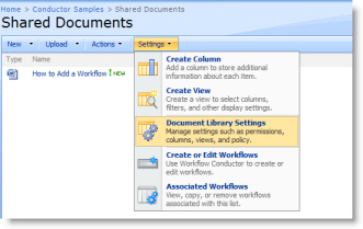
Go to Settings > List Settings (or Settings > Library Settings) in the list or library of the associated workflow.
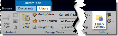
SharePoint 2010:
Click the List Settings or Library Settings button in the List or Library tab of the Tools ribbon.
|
|
| 2. |
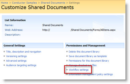
In the Permissions and Management section, click Workflow settings. |
 |
| 3. |
Change workflow options as desired, and then click OK. |
 |
|
See Also:
Spice up your SharePoint site by displaying List, SQL or Bamboo List Rollup data using the Bamboo Chart Plus web part to quickly generate charts in your SharePoint environment and present powerful reports and data summaries to your users.
Click here to see a complete list of all topics for this product or see Create a New Chart.
Install
|
Permissions
|
License
|
Permissions
|
|
|
|
|
|
Configure
|
Permissions
|
Work With
|
Permissions
|
|
|
|
|
|
Click here if you would rather see a complete list
of all topics for this product. |
Click on the shopping bag or here to download a trial of the product or to purchase it. |
Bamboo Configuration Tool panes
There are two styles of configuration tool panes associated with Bamboo Solutions Web parts and components.
Option 1
The configuration settings are found in the tool pane itself.
Option 2
The settings are configured in a seperate popup window that is accessed from the Web Part Settings button in the tool pane. 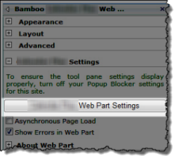 If your web part uses this option keep the following in mind:
- Popup Blocker settings must be turned off to allow access to the Web part settings window
- You can enable Asynchronous Page Load so the page loads before the web part finishes rendering
- Some web parts will give you the option of displaying Web part errors in the user interface by checking Show Errors in Web Part. Administrators may choose to uncheck this box as many errors do not prevent the web part from working and may prompt additional helpdesk tickets.
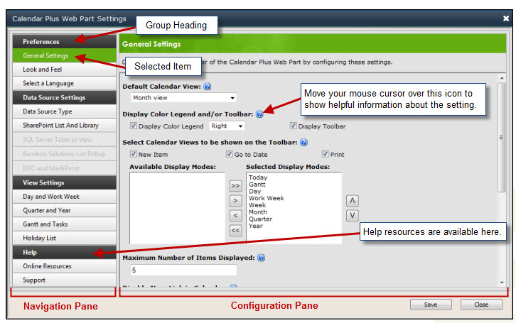
The associated popup Settings configuration screens allow you to navigate the settings from the left hand Navigation pane, and configure the corresponding settings on the right in the Configuration pane. As you configure the elements in the Configuration Pane, be sure to click SAVE before moving to the next configuration screen.
 If your dialog looks funny and you think you can’t see all the information, make sure the zoom level for viewing in your browser is set to 100%.
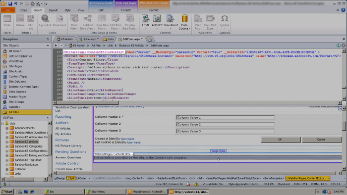
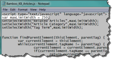
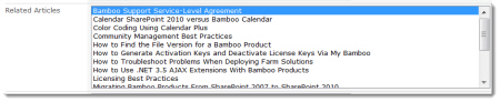
Change the width of the Knowledge Base article fields
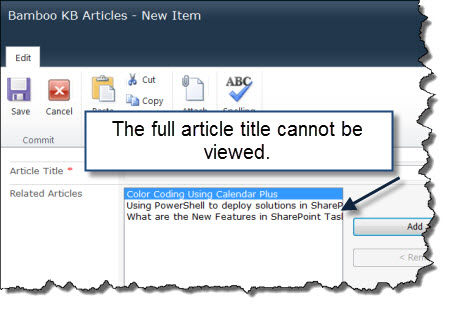 The width of the Related Articles and Article Category fields can be modified so that full article titles and categories are visible.
Change the Site Skin of PM Central sites
PM Central includes a variety of skins that can be applied to change the color scheme and style of sites, providing an easy way to customize the appearance of PM Central sites without manually modifying master pages and style sheets.
| Step |
Description |
| 1. |
 From the site where you want to change the skin go to Central Actions > PM Central Control Panel From the site where you want to change the skin go to Central Actions > PM Central Control Panel |
| 2. |
Under PM Central General Settings, click Change Skin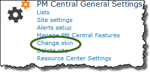
NOTE: You must have Full Control permissions on the site to complete this action.
|
| 3. |
From the PM Central Site Skins web part select the skin you want to use and click Apply. A preview of the skins provided is available here.
NOTE: The screen shot below shows the skins that are available for the Portfolio and Department sites.
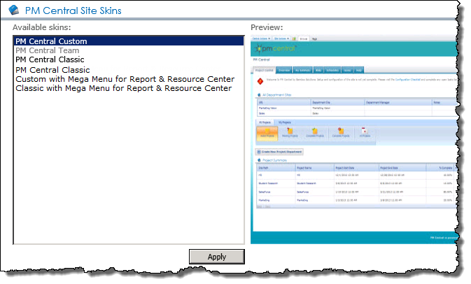
The Mega Menu skin options were added in PMC. 4.2.
|
How to Change Your Password
After the web part is installed and configured, users can then change their account passwords.
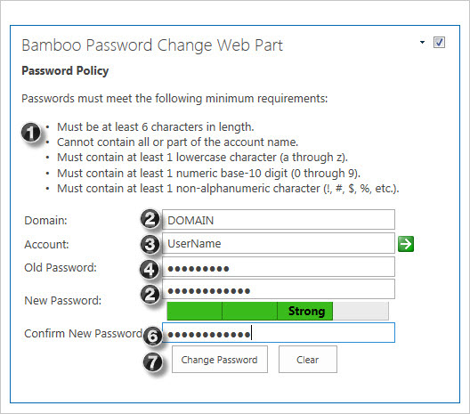 To use Password Change, enter the required information in the fields described below.
| Step |
Action |
| 1. |
The Password Policy section displays the text that your administrator has configured in the General Settings section of the Web Part Settings window. It describes the user account password policies created by your server administrator. |
| 2. |
The Domain field allows you to see and configure the domain name of the server where your account information is stored. This field is automatically filled in with the domain that you are currently logged into.
NOTE: This field may have been configured as hidden or view only by your server administrator to prevent inexperienced users from entering the incorrect domain.
|
| 3. |
The Account field allows you to enter or change the account name that you want to change the password for. This field is automatically filled in with the account name that is currently logged in.
NOTE: This field may have been configured as hidden or view only by your server administrator to prevent inexperienced users from entering the incorrect user name.
|
| 4. |
Enter your current password in the Old Password field to authenticate your identity.
- After entering your old password, enter your chosen password in the New Password field.
|
| 5. |
If the Password Strength Meter is displayed in the Web Part, it appears directly beneath the New Password field. The meter displays how strong your password is by filling in the gray bars and indicating the strength of the password by text, for example “Weak”.
Note: The Password Strength Meter displays password strength based on a fixed algorithm that cannot be edited. Passwords that conform to your password policy may not necessarily be considered “Strong”.
|
| 6. |
Once you have entered a strong password, re-type it into the Confirm New Password field. Make sure the password you enter in this field exactly matches the one you entered in the New Password field. |
| 7. |
Once you have filled in these fields, you can click the Change Password button to change your password. To clear all fields and start the procedure again, click the Clear button. After successfully changing your password, the system will display a message to notify you of the change and to prompt you to close your browser for applying the changes.
Note: Password Change will refresh the page. To prevent the loss of unsaved data, Password Change is often used on its own page, although this is not required.
|
|
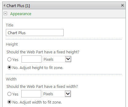
Change Size of Chart Web Part
Back to Create a New Chart
To access size settings, edit the page, click the Tool Pane link in the web part, and expand the Appearance section of the tool pane.
Under Height and Width specify the dimensions in pixels, inches, centimeter, millimeters, points, or picas using the dropdown.
Back to Create a New Chart
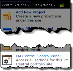
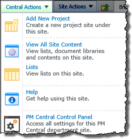
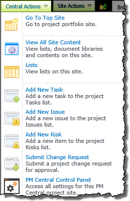
Using the Central Actions menu
The Central Actions menu provides quick access to areas where common activities are performed on the site. The specific options available to users from the Central Actions menu are determined by SharePoint Permissions.
NOTES:
1. Items marked with an asterisk (*) are made available by default with the Enhanced Central Actions Menu feature. This feature may have been disabled by your administrator.
2. Use the bulls eye icon  to access the Central Actions menu on SharePoint 2013
Central Actions for the Portfolio Site
| Description |
|
Add New Project:
Available to users with the Full Control permission level, or users who have been specifically granted the Create Sub Sites SharePoint permission. The link takes users to the Site Creation tool in PM Central. |
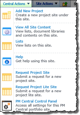 |
| View All Site Content: Displays a list of links to the settings pages for site lists and libraries. The list is visible to all users, but access is denied to users who do not have Design or Full Control permissions. |
| Lists: Displays the SharePoint view of all site content. Access to content is controlled by SharePoint permissions. |
| Help: A shortcut to the Help tab, which displays customizable text and links to PM Central online documentation and support resources. |
|
 Request Project Site & Request Project Lite Site: Allows users without access to the Add New Project option, or companies who have an approval process for new project sites, to submit a project site request for approval. Request Project Site & Request Project Lite Site: Allows users without access to the Add New Project option, or companies who have an approval process for new project sites, to submit a project site request for approval.
NOTE: Project approval routing features are available, including automated project site creation, if Workflow Conductor (sold separately) is installed.
|
| PM Central Control Panel: Access settings for the current PM Central Portfolio site. Only available to users with Full Control or Design permissions on the site. |
|
Central Actions for the Department Site
| Description |
|
Add New Project:
Provides a link to the site creation tool on the Portfolio site. |
 |
| View All Site Content: Displays a list of links to the settings pages for site lists and libraries. The list is visible to all users, but access is denied to users who do not have Design or Full Control permissions. |
| Lists: Displays the SharePoint view of all site content. Access to content is controlled by SharePoint permissions. |
| Help A shortcut to the Help tab, which displays customizable text and links to PM Central online documentation and support resources. |
| PM Central Control Panel:Access settings for the current PM Central Department site. Only available to users with Full Control or Design permissions on the site. |
|
Central Actions for the Project Site
Can trials be extended?
Once you have installed a Bamboo product on your farm and the trial period has passed, you cannot install a second trial. Instead, you need to extend the original trial period. Contact your Bamboo Sales Account Manager (Sales@bamboosolutions.com) for a trial extension.
Call Web Service
The Call Web Service widget allows a workflow to call a SOAP Web service and store the XML response from the service in a workflow variable.
You can also use this widget to create custom calls to SOAP Web services. Note: This feature is intended for advanced users who fully understand and have permission to edit the target Web service.
Widget Properties:
| Column |
Description |
| Web Service Method (Required) |
This property opens a form that allows you to define the connection and properties for the Web service. The properties below can be defined on this form:
|
| Save To Variable (Required) |
Select a workflow variable with a Text data type to store the results from the Web service call. Create variables in the Workflow Settings tab in the settings pane, or click the Create new variable link next to the variable list. |
| Run As |
This widget can run with the permissions of the workflow initiator, the workflow designer, or another user. Select the option in the Run As property that best matches your requirement. For more information, see the Common Widget Properties topic. |
| Click Apply to save the widget settings. |
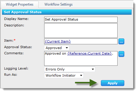
Example Using Call Web Service Widget
Return to External Data Widgets
See Also:
CAML Criteria Builder
When configuring the Event tab in Alert Plus, you have a choice regarding which items in the List will generate an alert for you. That choice gives you a variety of options to choose:
- Everything in the list generates an alert
- Items in a particular view will generate an alert
- Some Items (Advanced) allows you full control over the set of items in the Alert List that generate alerts. In order to specify which items to alert on, you will build a CAML Query that will be used to filter the list.
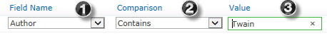
The easiest way to build a CAML Query is to use the Criteria Builder Tool on the Alert Plus Event tab. This tool provides a simple user interface to construct filter criteria and save it to the CAML Query field. This filtering capability allows you to specifically target your alert on items with specific List field values. Once you get familiar with it, the CAML Query builder is fairly simple and straightforward. The Criteria Builder resides at the bottom of the page. You simply pick the criteria based on content in a field.
As an example, consider an alert sent when the Author field is equal Mark Twain:
| Step |
Action |
Result |
| 1. |
Choose from a drop down list of all the columns in the list; in our case, we selected Author |
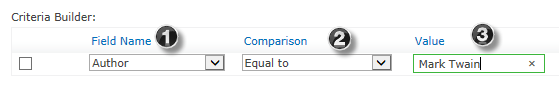
Some content may not be labeled in identical ways; some may enter “Twain, Mark” or some may use “Mark Twain” so in this instance, we prefer to use the comparison “Contains” and eliminate extraneous values so that the query finds anything in the author column that contains “Twain”.
 |
| 2. |
Choose the Comparison operation. |
| 3. |
Type in the Value; in this example, Mark Twain. |
| But we want to set an alert on multiple values; for example, whenever a document contains one value or another. |
| 4. |
In our example, we want to pick on the Author column again, but in this instance choose Twain or Dickens. |
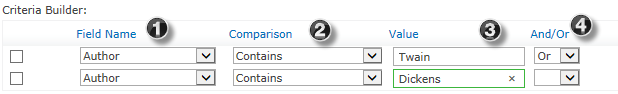
When selecting the Or option, a second level on the Criteria Builder becomes available so we can further define our selection criteria. |
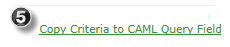
| 5. |
Once we have built our criteria, we use the button at the bottom of the web part to copy our criteria into the CAML Query box. |
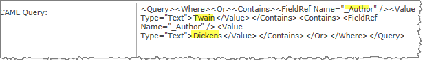
When you look closely at that string inside the CAML Query box, you can make out some of the choices we made in the criteria builder. Notice the statement is referencing the Author column, the value is Text and the words that we typed into the Value box are spelled out “Twain” “Dickens.” |
|
The above example is a very simple way of explaining the Alert Plus Criteria Builder. Developers and power users can become very proficient in writing CAML Queries and Bamboo provides this option to give you quite a lot of control over setting alert criteria.
Also see Additional Tips for using the CAML Criteria Builder
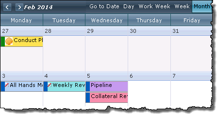
Calendars
Calendars in SharePoint offer a critical tool to maintain your schedules, but even with Outlook integration, the out-of-the-box SharePoint calendar experience presents a number of limitations. From visually communicating important deadlines to coordinating a team schedule, Bamboo offers a wide array of powerful, cost effective calendaring components.
| Product Details |
Documentation |
Description |
 |
Calendar Plus |
Visually communicate date-based list data through several useful views: Day, Week, Work Week, Month, Quarter, Year, and Gantt. Show events, tasks, milestones, project initiatives, legacy data, or employee vacation plans, to name just a few options. |
 |
Calendar Plus App |
Most organizations have events, tasks, and initiatives that are tracked across a variety of different SharePoint lists. If your organization is among them, you can now display them all in one central location, easily keeping the activities and events up-to-date and displayed in a convenient calendar UI with Calendar Plus App. You can also overlay items from multiple lists containing timelines in Bamboo’s Calendar Plus App, with color-coding and tooltips. |
 |
In/Out Schedule Board |
The SharePoint In/Out Schedule Board Solution Accelerator is an easy to use, all-in-one digital whiteboard designed to centralize scheduling and contact information for teams and groups. |
 |
Mini Calendar |
Dynamically filter your SharePoint list items based on a date and then connect this mini-calendar web part to your list and quickly select and view the items that are active on a particular date. |
 |
Team Calendar |
Provides a centralized group calendar that can interact with a SharePoint calendar list, multiple Microsoft Exchange calendars, or both side-by-side. |
|
Click here for a list view of the help topics.
Configure Data-Viewer to analyze and calculate data
 When applying calculations to data sets displayed in Data-Viewer keep in mind:
-
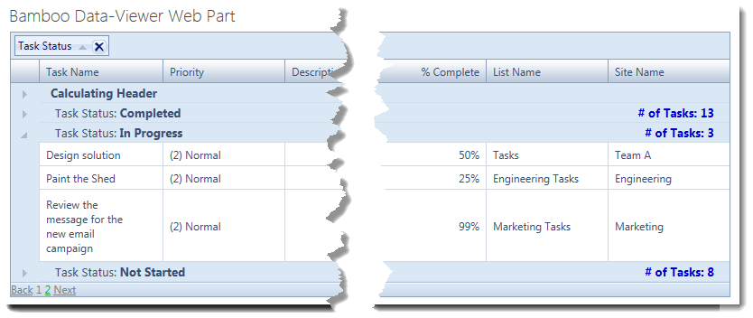
The Data-Viewer Web Part can display count, sum, average, maximum, or minimum calculated values for columns in parent or nested data sets.
-
You can apply more than one calculation to a data set.
-
If you are using Data Viewer 3.6 or earlier you will need to reset the calculation column(s) if the Column Display Settings screen is accessed after calculations are configured.
NOTE: Resetting the calculation column(s) is not required if you are using Data-Viewer 3.7. To find out what version you are using, click here
To configure Data-Viewer to display calculations:
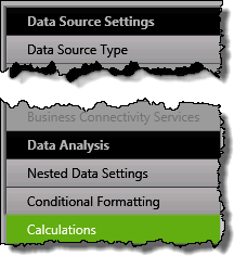 1. Click the Calculations button under the Data Analysis header in the Data-Viewer configuration screen.
NOTE:
This step requires you to have accessed the Data-Viewer Settings screens by clicking the Data Viewer Web Part Settings button in the web parts configuration tool pane.
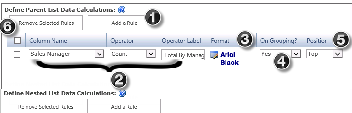
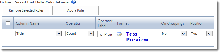
2. Define your calculation using the provided tool, shown below.
| # |
Function |
 . . |
| 1. |
Click the Add a Rule button for the list you want to analyze (parent or nested).
NOTES:
1. Multiple calculations can be defined by re-clicking Add A Rule
2. Nested calculations can only be defined if a Nested data source was configured
|
| 2. |
Use the following parameters to build the calculation rule:
- Column Name: Select the column that contains the values you want to calculate. The column list will include any columns you display for the data source. Columns that aren’t displayed won’t appear in the list.
- Operator: Select an operator to use on values in the selected column (Count, Sum, Average, Maximum, or Minimum). The operators are the same for all column types.
- Operator Label: When the calculation results are displayed in the Data-Viewer Web Part, you can accept the default label for the results (the name of the operator) or you can enter your own label.
|
| 3. |
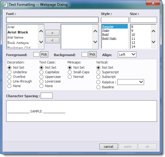 Click the edit icon ( Click the edit icon ( ) in the Format column to access the Text formatting pop-up. ) in the Format column to access the Text formatting pop-up.
- Define the format for the Operator Label and the calculation result by specifying,font, style, size, color (foreground), shading (background), etc.
|
| 4. |
 Select Yes in the On Grouping? drop down if you want the calculation result and the Operator Label to appear in the group headers. Select Yes in the On Grouping? drop down if you want the calculation result and the Operator Label to appear in the group headers.
NOTE:
1. The default value for this field is NO.
2. For more information about grouping click here
|
| 5. |
Select where you would like to position the calculation results in the data view. You can display results above the data set, below it, or both.
NOTE: The results will appear in the column that is associated with the rule, either at the top of the list or at the bottom. If On Grouping? is set to Yes, the result will appear on the right side of the group headers.
|
| 6. |
To remove a calculation, select the check box for the desired rule and click the Remove Selected Rules button. |
|
Result:
This configuration…
…will look like this in the Data-Viewer display.
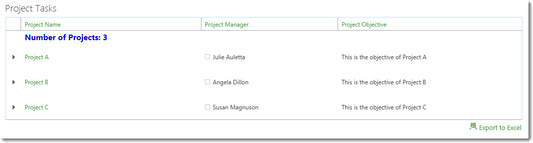
NOTE: This configuration uses the alias Project Name for the Title column and the Operator Label is set to Number of Projects:.
|
|
Calculate Widget
The Calculate widget accepts Excel-style functions and stores the results in a workflow variable. Function parameters can include lookups, and functions can be nested to perform multiple operations.
| Step |
Action |
Result |
| 1. |
Click the  button to enter a formula: button to enter a formula: |
Formula (Required):
-
Create Formula: Enter a formula in the formula box. For a list of available functions and usage information, click the Help  button. button.
-
Add Lookup: To insert a lookup in a function, click the Add Lookup button. See Using Lookups in Workflow Studio for more information.
|
| 2. |
Select a workflow variable with a Text, Date Time, or Number data type to store the results from the calculation. |
Save to Variable (Required)
Create variables in the Workflow Settings tab in the settings pane, or click the Create new variable link next to the variable list. |
| 3. |
Click Apply to save the widget settings. |
|
Widget in Action:
Return to Workflow Logic Widgets
See Also:
Bulk Import
 With
With
List Bulk Import, you can quickly and easily import data from Text, Excel, SQL and existing SharePoint Lists and Libraries into SharePoint 2007, SharePoint 2010, SharePoint 2013, or SharePoint Online (Office 365) Lists and Libraries. You can also identify duplicate entries and either skip their import or update the existing SharePoint data.
Install
|
Permissions
|
License
|
Permissions
|
|
|
|
|
|
Configure
|
Permissions
|
Work With
|
Permissions
|
- List Bulk Import does not
have
any configuration options.
|
|
|
|
Click here if you would rather see a complete list
of all topics for this product. |
Click on the shopping bag
or here to download a trial of the product or to purchase it. |
|
With Bamboo’s Calendar Plus web part, you can visually communicate date-based list data through several useful views: Day, Week, Work Week, Month, Quarter, Year, and Gantt. Show events, tasks, milestones, project initiatives, legacy data, or employee vacation plans, to name just a few options.
Install
|
Permissions
|
License
|
Permissions
|
|
|
|
|
|
Configure
|
Permissions
|
Work With
|
Permissions
|
|
|
|
|
|
Click here if you would rather see a complete list
of all topics for this product. |
Click on the shopping bag
or here download a trial of the product or to purchase it. |
With List Bulk Import, you can quickly and easily import data from Text, Excel, SQL and existing SharePoint Lists and Libraries into SharePoint 2007, SharePoint 2010, SharePoint 2013, or SharePoint Online (Office 365) Lists and Libraries. You can also identify duplicate entries and either skip their import or update the existing SharePoint data.
Click here to see a complete list of all topics for this product or see the Overview of Importing
Install
|
Permissions
|
License
|
Permissions
|
|
|
|
|
|
Configure
|
Permissions
|
Work With
|
Permissions
|
- List Bulk Import does not
have
any configuration options.
|
|
|
|
Click here if you would rather see a complete list
of all topics for this product. |
Click on the shopping bag
or here to download a trial of the product or to purchase it. |
 With List Bulk Export, you can quickly and easily export documents from a SharePoint Document Library to your file system. It also provides full process logging with the capability to be scheduled on a regular basis.
Install
|
Permissions
|
License
|
Permissions
|
|
|
|
|
|
Configure
|
Permissions
|
Work With
|
Permissions
|
|
|
|
|
|
Click here if you would rather see a
complete list of all topics for this product. |
Click on the shopping bag
or here download a trial of the product or to purchase it. |
Building a Workflow
Before building a workflow, make sure you are familiar with the Conductor Studio interface by reading Getting Started with Conductor Studio. All of the actions referenced in the list below are described in that section. Once you understand how Conductor Studio works, the rest is easy:
| Step |
Action |
Result |
| 1. |
Start with the end in mind. It may be helpful to draw it out on paper or a whiteboard so that you can make sure to capture all the steps in your business process so that you know what you want to accomplish throughout the workflow. |
| 2. |
In the list or library where you want the workflow to run, start Conductor Studio by clicking on the Create button in the List or Library tab of the Tools ribbon. If you want to build a site workflow, you can start Conductor Studio from any list in the site. |
NOTE: If you are using Simple Publishing to deploy workflows and you want to create a workflow that is available to any list or library in the entire site collection, you must start Conductor Studio from a list or library in the top-level site in the site collection. To build a site workflow, start Studio from any list in the site. Workflows deployed using Solution Deployment are always available to any site in the site collection no matter where they are created.
|
| 3. |
On the Workflow Settings tab in the settings pane, give your workflow a Title and Description. Select the desired workflow Start Option (does not apply to site workflows).
Make sure to click Apply to save the workflow settings. |
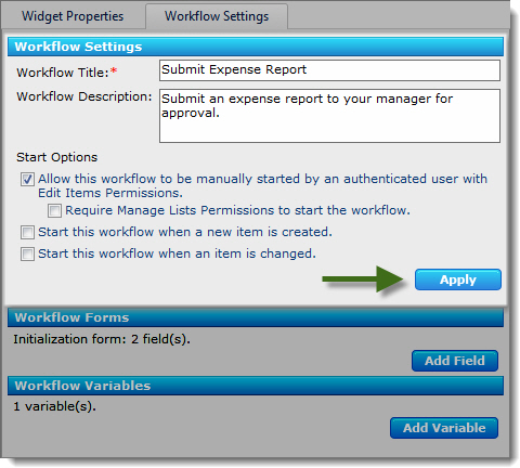
 Warning: If you do not enter a Title, you will get an error message when you attempt to deploy the workflow. Warning: If you do not enter a Title, you will get an error message when you attempt to deploy the workflow. |
| 4. |
Configure any workflow variables and workflow initialization form fields required for your workflow.
|
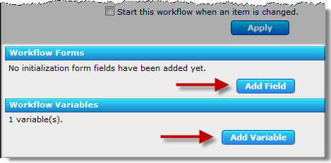
Workflow variables and form fields can be configured and updated at any time. |
| 5. |
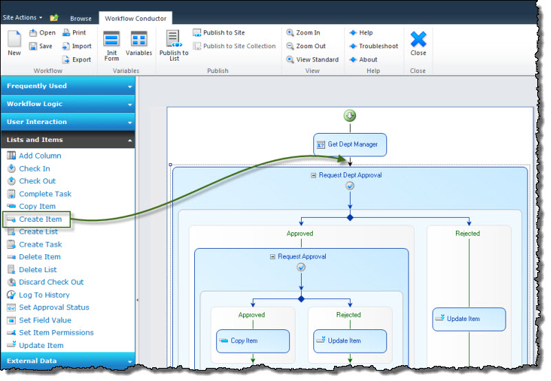
Drag widgets from the widget pane and arrange them in the workflow diagram pane according to your workflow requirements. For a description of available widgets, see About Workflow Widgets. |
 |
| 6. |
Set the required properties for each widget in the workflow on the Widget Properties tab in the settings pane. Make sure to click Apply after configuring the properties for each widget. |
 |
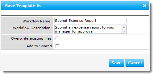
| 7. |
When you are finished, click Save in the Conductor Studio ribbon to save the workflow. See Workflow Conductor Templates for more information about saving workflow templates. |
If you do not save your workflow here, you will be prompted to save it when you deploy. |
| 8. |
In the Conductor Studio ribbon, click the publishing option that applies to your workflow. Publishing a workflow automatically associates it to the list, library, or site. |
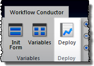
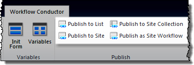
- If Workflow Conductor is configured to use the Solution Deployment method, Deploy will be the only option.
- If Workflow Conductor is configured to use the Simple Publishing method, you may see options to publish the workflow to the list, site, site collection, or as a site workflow, depending on the options configured.
Click the option that best fits the scope of the workflow.
-
For the Simple Publishing options Publish to Site and Publish to Site Collection, you will be prompted for additional settings for list and content type association.
-
The default settings will automatically associate the workflow to the list where you started Conductor Studio and will make it available to all content types in the list.
For more information about deployment methods and workflow scopes, see About Workflow Deployment.
|
| 9. |
Your workflow is now available in the list or library where you started Conductor Studio. |
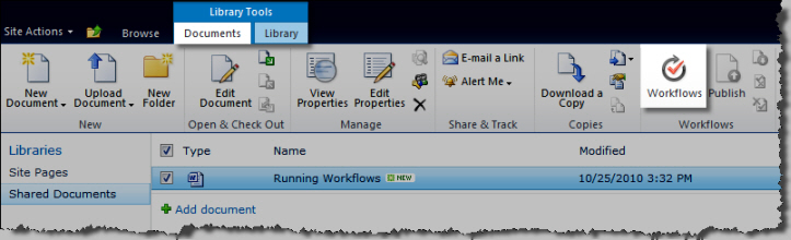
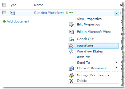 Depending on the Start Option you selected for the workflow, it can be started manually using the Workflows option for an item (as shown here), or will start automatically when an item is created, changed, or published. Depending on the Start Option you selected for the workflow, it can be started manually using the Workflows option for an item (as shown here), or will start automatically when an item is created, changed, or published.
You can also start workflows manually from the Tools ribbon or from the item properties:
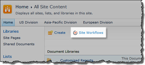
Site workflows are started from the All Site Content page. Automatic start options do not apply to site workflows.
 |
Now that you have successfully built and deployed a workflow, learn How to Manage Workflows in Your Farm.
Billing and Contact

 You can access this tab within the My Profile tile on My Bamboo or in the footer within the My Account section.
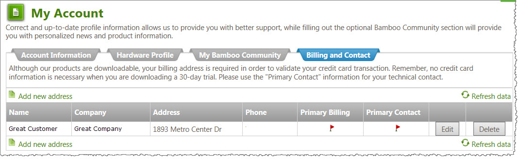 Our products are free to download and try; your billing address is required in order to validate your credit card transaction when you purchase a Bamboo product.
Add addresses to your account so that your bills are delivered to the appropriate place of business. No credit card information is necessary when you are downloading a 30-day trial, but do use the “Primary Contact” information for your technical contact in case we need to work through any technical issues in your environment during your trial.
Best Practices for Using Video Library with a File Share Library
Following is a list of best practices for using Video Library with a File Share Library.
End Users:
- Add, delete, and update media files from the Video Library.
- Do not update files in the File Share Library.
- Avoid updating files directly in the network file share. If you do, be aware that changes will not be visible in the Video Library until the next scheduled File Share Library synchronization.
Site Admin:
- Configure the File Share Library to copy files to the network file share when new items are added. If you add files only to the File Share Library, you lose the advantage of using an external file system to store your media files.
System Admins:
- Enable support for large files in your Web application so you can upload files larger than the SharePoint default of 50 MB without affecting your other SharePoint libraries.
Before you uninstall
IMPORTANT: Before you uninstall a Bamboo product, make sure that it is no longer in use on any site in your farm. If a web part resides on a page and you uninstall the web part, an error will be displayed for users that visit that page. The uninstall process does not update individual pages in your SharePoint portal.
Also, if you uninstall Workflow Conductor (WFC) and some workflows built with WFC are still active, those workflows will fail.
You have several choices for how to uninstall your Bamboo product:
| Option |
Comment |
| Use the Updated Uninstall Process for Bamboo components |
Based on feedback from our customers, Bamboo introduced updated install/uninstall processes for component products (web parts). Instead of the Setup.exe Installation Application, we now supply two PowerShell scripts – one for Install/Upgrade and the other for Uninstall – to be used to install, upgrade, or uninstall the product.
For more information, see Overview of the Updated Installation Process for Bamboo components.
|
| Bamboo Installation Package |
IMPORTANT: As of April 2017, Bamboo no longer includes the Installation/Setup program in product download packages.
You can use the Bamboo product installation package that you used to install the product to uninstall. This is the preferred method, because it performs some automated system checks to help ensure the uninstall will be successful. It also steps you through each component, so its easier to make sure everything is uninstalled. See Using the Setup program to Uninstall for more information.
|
| SharePoint Central Administration |
Many Bamboo products are deployed as SharePoint solutions, so you can retract and remove them from Central Administration. See Uininstalling from SharePoint Central Administration for more information. |
| PowerShell |
Some Bamboo products are packaged with a PowerShell script that you can use to uninstall. See Manually uninstall using PowerShell for more information. |
| stsadm |
If you prefer, you can use stsadm commands to retract and delete Bamboo SharePoint solutions. See Manually uninstall using stsadm for more information. |
| Add/Remove Programs |
Some Bamboo products include components that are installed using an EXE or MSI installer. See Uninstalling a Bamboo .msi or .exe for more information. |
Depending on the uninstall method you choose, there may be a solution left behind after the install. This is intentional, as several Bamboo products use some of the same components. See What is left behind after uninstalling? for more information and steps for how to uninstall completely.
Before you Migrate from SharePoint 2007 to SharePoint 2010 Read This
Overview
Microsoft recommends that you use one of two basic approaches when you upgrade from SharePoint 2007 to SharePoint 2010:
You can also combine these two types of upgrade in hybrid approaches that reduce downtime during an upgrade. For more information about these approaches, see Determine upgrade approach (SharePoint Server 2010) from Microsoft TechNet.
General Migration Restrictions for Bamboo Products
- Regardless of the upgrade method you choose, you MUST change existing SharePoint sites to use the new user SharePoint 2010 experience. If you don’t, some features of your Bamboo products will not work as expected.
- You need to make sure that you are running the latest available Bamboo product release in your SP2007 environment before migrating. Review information specific to the product(s) you are migrating to learn the minimum product release to migrate. See Bamboo product releases that are supported for migration from SharePoint 2007 to SharePoint 2010 for details.
- Bamboo Solutions does not support the migration of Bamboo products deployed on WSSv2/SharePoint 2003 environments to SharePoint 2010 farms.
- Bamboo Solutions does not support the downgrade of SharePoint editions when migrating from SharePoint 2007 to SharePoint 2010. For example, Bamboo products are not supported when migrating from MOSS 2007 to SharePoint Foundation 2010.
Migration Restrictions for Specific Bamboo Products
Before following the instructions for the method you choose, review information specific to the product(s) you are migrating. The In-Place Upgrade method is sometimes easier, but it takes longer. Some Bamboo products do not support the In-Place upgrade method and we recommend a hybrid In-Place Upgrade method as an alternative.
Before using List Print
After installing the List Print on your SharePoint farm, you will need to activate the Bamboo List Print Site Collection feature before you can use it on any site of the collection.
As part of the installation process, you may have automatically deployed List Print to one or more web applications on your farm, but it is not possible to automatically activate a feature on individual Site Collections in the web application (check this).
For List Print, there is just one Site Collection feature to activate at the Site Collection level. There are no Site Features.
Do I need to activate this feature? If you do not activate this feature, you will not see the Print List option on the List Ribbon (or the Actions… menu if using WSSv3/MOSS) on any list or library in sites of the site collection.
Bamboo products that use Telerik
| Product |
Uses Telerik? |
| Alerts Administrator |
Yes |
| Alert Plus |
Yes |
| Bulk Export |
No |
| Bulk Import |
No |
| Calendar Plus |
Yes |
| Chart Plus |
Yes |
| Column Level Security |
Yes |
| Community Central |
Yes |
| Cross List |
No |
| Cross Site Display |
No |
| Custom Identifier |
No |
| Data Viewer |
Yes |
| Discussion Board Plus |
Yes |
| File Share Library |
No |
| Filters Collection |
Yes |
| Grants Management |
Yes |
| Group Email |
Yes |
| Group Redirect |
Yes |
| In/Out Schedule Board |
Yes |
| Knowledge Base Solution Accelerator |
Yes |
| KPI Column |
Yes |
| List Consolidator |
Yes |
| List Print |
No |
| List Rollup |
Yes |
| List Rotator |
No |
| List Search |
Yes |
| Lookup Selector |
No |
| Mini Calendar |
No |
| My Alerts Organizer |
No |
| Navigators |
Yes |
| Password Change |
Yes |
| Password Expiration |
No |
| Password Reset |
No |
| Password Management Toolkit |
Yes |
| PM Central |
Yes |
| Poll |
Yes |
| Project Portfolio Dashboard |
Yes |
| Rating |
Yes |
| Rich Text |
Yes |
| Site Creation Plus |
No |
| SQL View |
No |
| Task Master |
Yes |
| Team Calendar |
Yes |
| Time Tracking and Management |
Yes |
| Tree View |
Yes1
No2 |
| User Account Setup |
Yes |
| User Directory |
Yes |
| User Manager for Sites |
Yes |
| User Profile Plus |
No |
| User Profile Sync |
No |
| User Redirect |
No |
| User Registration Accelerator |
No |
| Validator column |
No |
| Video Library |
No |
| Virtual Map View |
No |
| Visual Indicator column |
No |
| Wiki Publisher |
No |
| Workflow Conductor |
Yes |
| World Clock and Weather |
No |
1SharePoint 2007 and SharePoint 2013
2SharePoint 2010
Bamboo Select Release Notes
NOTE: Release Notes will open in a new browser tab
| WSSv3/MOSS |
SharePoint 2010 |
SharePoint 2013 |
| Release Notes |
Release Notes |
Release Notes |
Release Notes |
Microsoft ended mainstream support for SharePoint 2007 in October 2012. See Microsoft’s Lifecycle Support Policy.
At that time, Bamboo stopped enhancements to our SharePoint 2007 product line, but continues to provide support and bug fixes to customers with active support contracts until October 2017. Previously purchased licenses will continue to function after October 2017, but support for these products will end, and no additional bug fixes will be provided beyond that time. Bamboo plans to cease selling new licenses and annual support contacts for its SharePoint 2007 products in October 2016 to ensure customers will be eligible to receive support for at least one year after purchase. |
Microsoft plans to end mainstream support for SharePoint 2010 in October 2015. See Microsoft’s Lifecycle Support Policy. At that time, we will stop any enhancements for our SharePoint 2010 product line but will continue to provide support and bug fixes for our SharePoint 2010 products to customers with active support contracts until October 2020. Previously purchased licenses will continue to function after October 2020, but support for these products will end, and no additional bug fixes will be provided beyond that time. Bamboo plans to cease selling new licenses and annual support contacts for its SharePoint 2010 products in October 2019 to ensure customers will be eligible to receive support for at least one year after purchase. |
Bamboo Solutions has also begun releasing Bamboo Apps to the SharePoint Store, for additional details, see the SharePoint Apps & Mobile products page where you can get the latest info about each of our Apps as they release to the Microsoft Store.
A separate installation package and license key is required for SharePoint 2013 deployment. For additional details, review the following knowledge base articles:
|
Understanding Bamboo Releases:
- Bamboo offers Trial, Basic and Premium support.
- Free Trial support expires after 30 days.
- For more information about Basic and Premium support, please see the Support Plans page.
- There may be a fee to upgrade from a major version to another.
See Also:
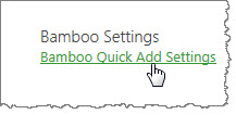
Bamboo Quick Add Settings
The Bamboo Quick Add Settings page is found under your site collection Settings|Bamboo Settings option after you have activated the site feature. For more information about how to do that, see the information contained within the Overview of QuickAdd Configuration Toolpane.
| Step |
Action |
Description |
| 1. |
Limit the total number of items to be added each time to xx items. |
The default setting is originally set for 50 items. You can increase or decrease the amount of items to add at one time in this setting. |
| 2. |
You may allow an unlimited set of items to be added at any given time by clicking on this option. |
NOTE: There may be performance impacts if an extremely large number of Quick Add item creations are attempted at one time.
|
| 3. |
The third options on the screen is the Bamboo Quick Add version information, which may be of help to Bamboo Support should you run into issues and need to contact us. |
| 4. |
Click the OK button to save your choices or click the Cancel button to leave the options as is and cancel anything you may have changed while on the page. |
|
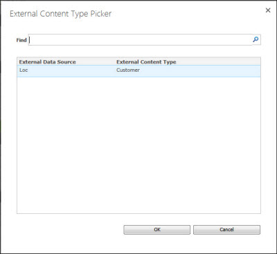
BDC or MashPoint
You have a variety of options when configuring Chart Plus, one of which is using a Mashpoint or BDC connection as your data source. Depending on your choices, you see different options. This covers leveraging MashPoint/BDC as your data source.
See also:
Bamboo Select
 With plug-and-play tools for data aggregation, search, calendaring, and much more, Bamboo Select allows you to give your SharePoint sites and applications the kind of advanced functionality you need.
|
Everything about your suite or toolkit, from retrieving your license keys to downloading products included in the suite or toolkit, can be managed through My Bamboo. All Bamboo Toolkit products are license-protected and must be activated for use on each Web front-end server beyond the initial trial period. This requires the installation of the Toolkit License and Bamboo Web License Manager. Once you have installed these components, all products included in your Bamboo Toolkit can be activated using a single license key.
This section provides instructions for the following required steps:
To get started, log in to My Bamboo using the account information provided by your Bamboo Account Manager when you purchased your suite or toolkit. Until the license package is installed, the suite or toolkit will not appear in the Bamboo Web License Manager in SharePoint Central Administration.
|
Suite/Toolkit Installation and Licensing
|
Permissions
|
|
|
|
|
|
No need to license each product! All of the products within your toolkit are licensed through your Suite or Toolkit License. When you are ready to install a product that is part of your suite or toolkit, use the links below to open the product landing page where you can follow the instructions under each section to Install, Configure and Work With each specific product(s) that are included in your suite or toolkit.
NOTE: The web parts included in the Toolkit require installation; however, installation can occur before OR after license activation of the Toolkit, Suite, or Library.
Learn more about the specific products included in Bamboo Select:
Click here if you would rather see a complete list
of all topics for this product. |
Click on the shopping bag or here to download a trial of the product or to purchase it. |
|
Bamboo product releases that are supported for migration from SharePoint 2010 to SharePoint 2013
The table below shows the minimum required Bamboo product version required when migrating Bamboo products from SharePoint 2010 to SharePoint 2013. If you have an earlier version installed than the one listed, please upgrade that product before migrating to SharePoint 2013.
For additional information:
| Product |
minimum SP2010 version |
minimum SP2013 version |
| Alert Plus |
30.2.115 |
30.2.121.2013 |
| Alerts Administrator |
10.4.52 |
10.4.62.2013 |
| Calendar Plus |
40.1.143 |
40.1.155.2013 |
| Chart Plus |
30.5.109 |
30.5.143.2013 |
| Column Level Security |
10.3.34 |
10.3.48.2013 |
| Community Central |
10.1.91 |
10.5.76.2013 |
| Cross List |
10.5.20 |
N/A |
| Cross Site Display |
10.2.26 |
10.2.40.2013 |
| Custom Identifier Column |
10.0.45 |
10.0.57.2013 |
| Data-Viewer |
30.5.67 |
30.5.57.2013 |
| Discussion Board Plus |
10.5.22 |
20.0.57.2013 |
DWG Parser
SharePoint 2007 Only |
N/A |
N/A |
| Filters Collection |
10.3.25 |
10.3.35.2013 |
| File Share Library |
20.0.60 |
20.0.81.2013 |
| Grants Management |
10.5.20 |
N/A |
| Group Email |
10.7.43 |
10.7.46.2013 |
| Group Redirect |
20.3.27 |
20.3.33.2013 |
| Hello |
20.1.9 |
N/A |
| In/Out Schedule Board |
10.4.56 |
10.4.57.2013 |
| Knowledge Base |
20.2.47 |
20.2.75.2013 |
| KPI Column |
10.3.65 |
10.3.78.2013 |
| List Bulk Export |
1.4.12 |
20.0.18.1 |
| List Bulk Import |
2.5.105 |
30.0.29.2013 |
| List Consolidator |
10.0.79 |
10.0.107.2013 |
| List Print |
10.4.31 |
10.4.35.2013 |
| List Rollup |
60.0.64 |
60.0.70.2013 |
| List Rotator |
20.5.82 |
20.5.99.2013 |
| List Search Advanced |
10.8.93 |
10.8.121.2013 |
| List Search Simple |
20.1.140 |
20.1.167.2013 |
| Lookup Selector Column |
20.3.61 |
20.3.88.2013 |
| Mini-Calendar |
20.8.67 |
20.8.86.2013 |
| My Alerts Organizer |
10.4.43 |
10.4.51.2013 |
| Navigators |
10.3.47 |
10.3.57.2013 |
| Password Change |
40.1.65 |
40.1.68.2013 |
| Password Expiration |
10.6.43 |
10.6.49.2013 |
| Password Reset |
20.4.51 |
20.4.70.2013 |
| Poll |
10.4.53 |
10.4.63.2013 |
| Project Management Central |
40.1.135 |
40.1.109.2013 |
| Project Portfolio Dashboard |
10.8.58 |
10.8.80.2013 |
| Quick Add |
10.0.29.0 |
10.0.29.2013 |
| Rating Column |
10.2.43 |
10.1.54.2013 |
| Rich Text Column |
10.3.27 |
10.3.28.2013 |
| Site Creation Plus |
10.4.66 |
10.4.71.2013 |
| SQL View |
10.6.26 |
N/A |
| Task Master |
30.5.117 |
30.5.116.2013 |
| Team Calendar |
10.7.18 |
10.7.36.2013 |
| Time Tracking and Management |
1.6.46 |
10.6.88.2013 |
| Tree View |
10.7.83 |
10.8.23.2013 |
| User Account Setup |
40.0.107 |
40.0.148.2013 |
| User Directory |
10.7.53 |
10.7.81.2013 |
| User Manager for Sites |
10.3.46 |
10.3.62.2013 |
| User Profile Plus |
10.4.39 |
10.4078.2013 |
| User Profile Sync |
1.6.10 |
20.0.20.2013 |
| User Redirect |
10.5.16 |
10.5.27.2013 |
| User Registration Accelerator |
10.3.24 |
10.3.35.2013 |
| Validator Column |
10.3.20 |
10.3.35.2013 |
| Video Library |
20.0.87 |
20.0.106.2013 |
| Virtual Map View |
10.9.46 |
10.9.42.2013 |
| Visual Indicator Column |
10.3.59 |
10.3.79.2013 |
| Wiki Publisher |
10.0.65 |
10.0.85.2013 |
| Workflow Conductor |
30.0.0 |
30.0.1.2013 |
| World Clock and Weather |
20.4.47 |
20.4.52.2013 |
Bamboo product releases that are supported for migration from SharePoint 2007 to SharePoint 2010
The table below shows the minimum required Bamboo product release required when migrating Bamboo products from SharePoint 2007 to SharePoint 2010. If you have an earlier release installed than the one listed, please upgrade that product before migrating to SharePoint 2010.
For additional information:
| Product |
minimum SP2007 release |
minimum SP2010 release |
| Alert Plus |
3.0.62 |
30.0.59 |
| Alerts Administrator |
1.4.12 |
10.4.30 |
| Calendar Plus |
4.0.96 |
40.0.36 |
| Chart Plus |
2.5.43 |
20.5.25 |
| Column Level Security |
1.3.4 |
10.3.7 |
| Cross List |
1.5.5 |
10.5.6 |
| Custom Identifier Column |
1.0.35 |
10.0.35 |
| Data-Viewer |
3.3.59 |
30.3.67 |
| DWG Parser |
N/A |
N/A |
| Filters Collection |
1.3.5 |
10.3.13 |
| File Share Library |
|
|
| Grants Management |
TBD |
TBD |
| Group Email |
1.7.4 |
10.7.11 |
| Group Redirect |
2.3.11 |
20.3.14 |
| Hello |
TBD |
TBD |
| In/Out Schedule Board |
|
|
| Knowledge Base |
2.0.71
NOTE: Releases earlier than 1.2 are no longer supported for upgrade or migration.
|
20.0.56 |
| KPI Column |
1.2.40 |
10.3.33 |
| List Bulk Export |
N/A |
N/A |
| List Bulk Import |
N/A |
N/A |
| List Consolidator |
1.0.87 |
10.0.62 |
| List Print |
1.4.5 |
10.4.18 |
| List Rollup |
Classic: 5.0.55
Schema: 5.0.77 |
Classic: 40.5.13
Schema: 50.0.85 |
| List Rotator |
2.5.24 |
20.5.44 |
| List Search Advanced |
1.8.51 |
10.8.48 |
| List Search Simple |
1.8.64 |
10.8.60 |
| Lookup Selector Column |
1.3.24 |
20.3.15 |
| Mini-Calendar |
2.7.8 |
20.7.11 |
| My Alerts Organizer |
1.4.13 |
10.4.40 |
| Navigators |
1.3.11 |
10.3.12 |
| Password Change |
3.5.8 |
30.5.14 |
| Password Expiration |
1.5.11 |
10.5.19 |
| Password Reset |
2.4.11 |
20.4.31 |
| Project Management Central |
2.1.21 |
20.1.12 |
| Rich Text Column |
1.3.9 |
10.3.14 |
| Site Creation Plus |
1.4.31 |
10.4.18 |
| SQL View |
1.6.17 |
10.6.23 |
| Task Master |
2.0.150 |
20.0.34 |
| Team Calendar |
1.5.4 |
10.5.11 |
| Tree View |
1.7.29 |
10.7.27 |
| User Account Setup |
3.4.8 |
30.4.31 |
| User Directory |
1.7.1 |
10.7.2 |
| User Manager for Sites |
1.3.1 |
10.3.19 |
| User Profile Plus |
1.4.7 |
10.4.35 |
| User Profile Sync |
N/A |
N/A |
| User Redirect |
1.5.3 |
10.5.14 |
| Validator Column |
1.3.1 |
10.3.12 |
| Virtual Map View |
1.9.25 |
10.9.9 |
| Visual Indicator Column |
1.3.7 |
10.3.19 |
| Wiki Publisher |
1.0.26 |
10.0.25 |
| Workflow Conductor |
1.5.1 |
1.5.1 |
| World Clock and Weather |
2.3.15 |
20.3.15 |
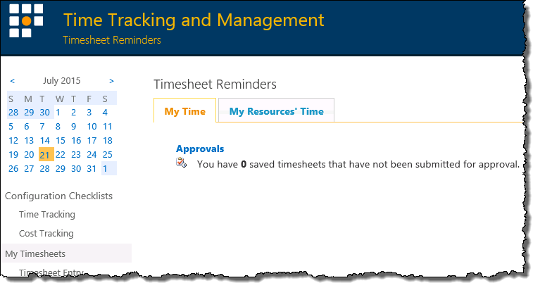
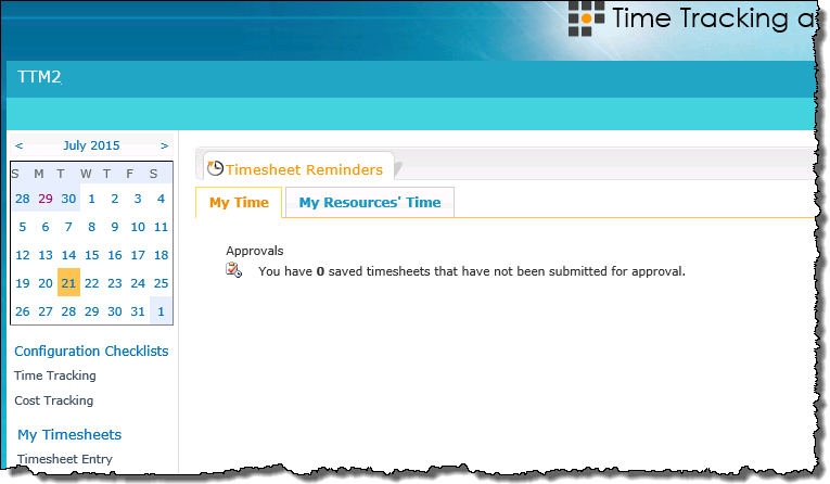
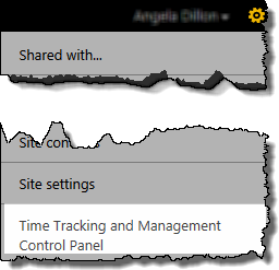 From the TTM site’s Site Actions menu, select Time Tracking and Management Control Panel.
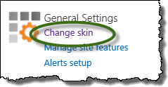 Click Change skin under the General Settings header
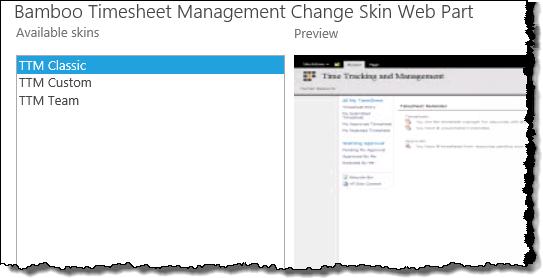 Preview the available skins , then click Apply.
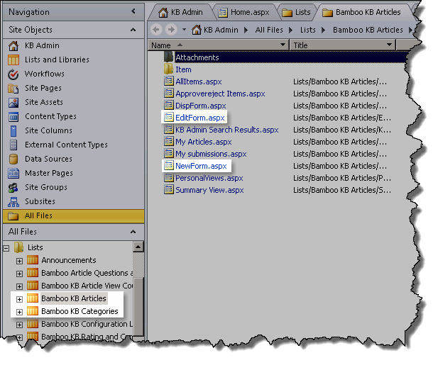
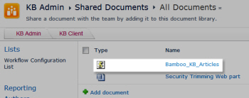
 and browse to Shared Documents > Bamboo_KB_Articles.js. Click OK and save the page.
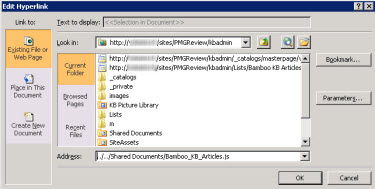
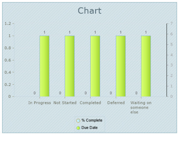
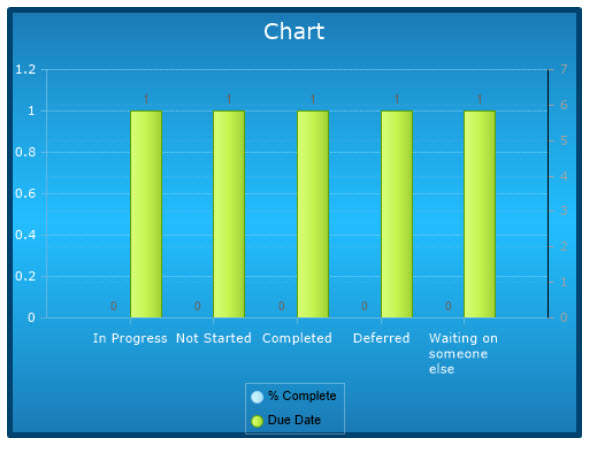
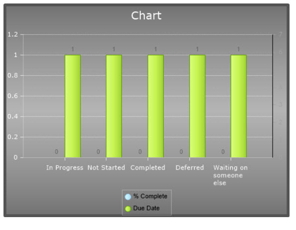
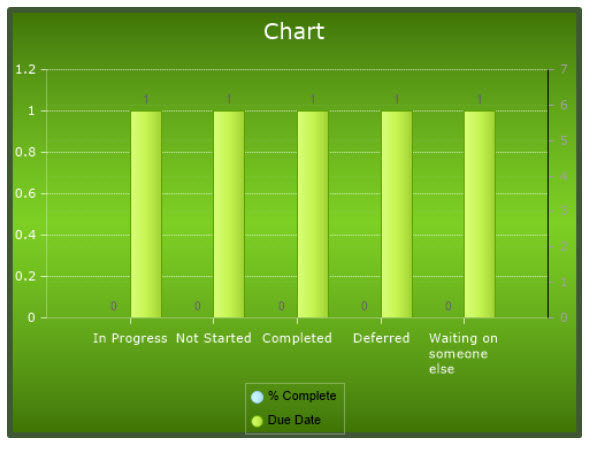
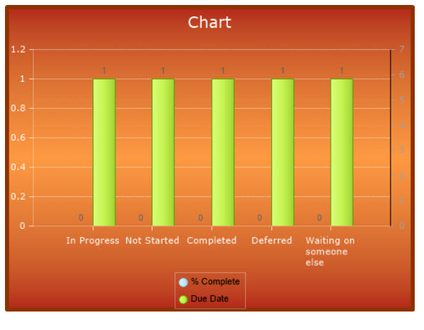
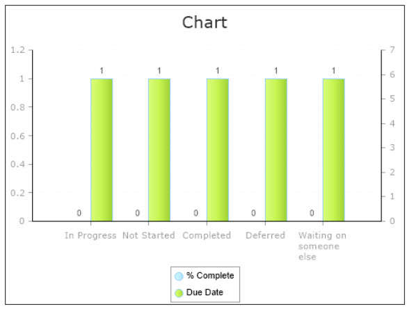
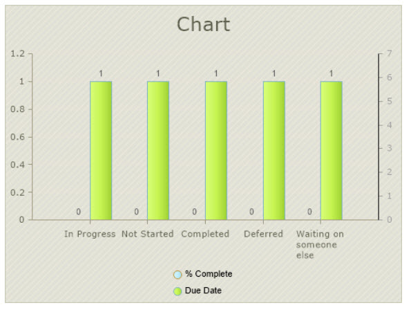
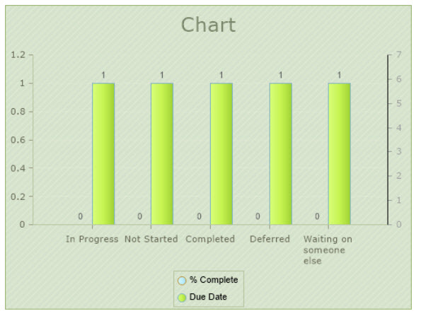
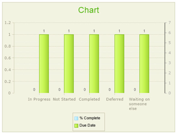
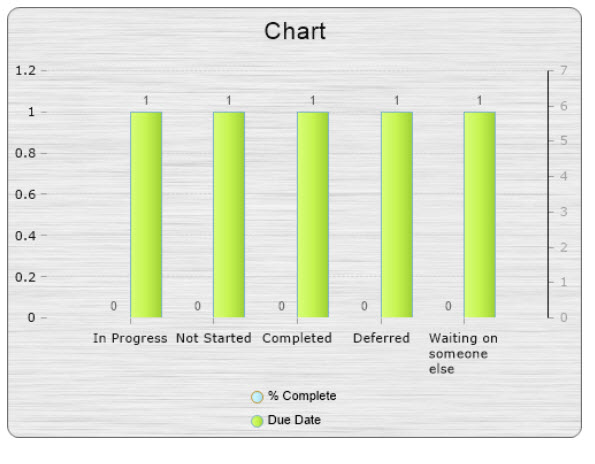
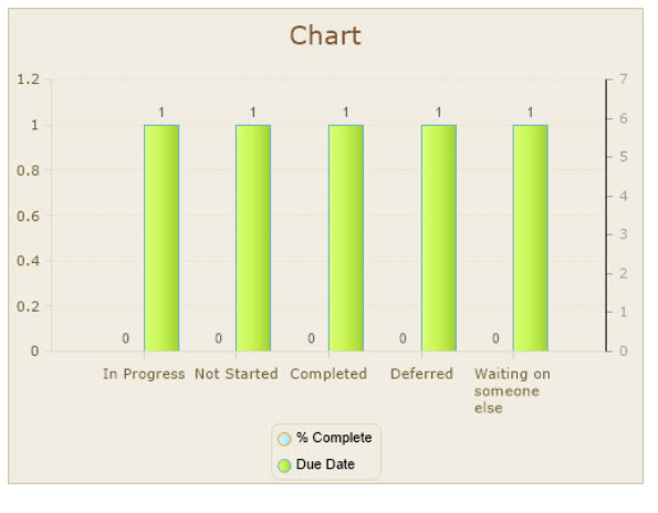
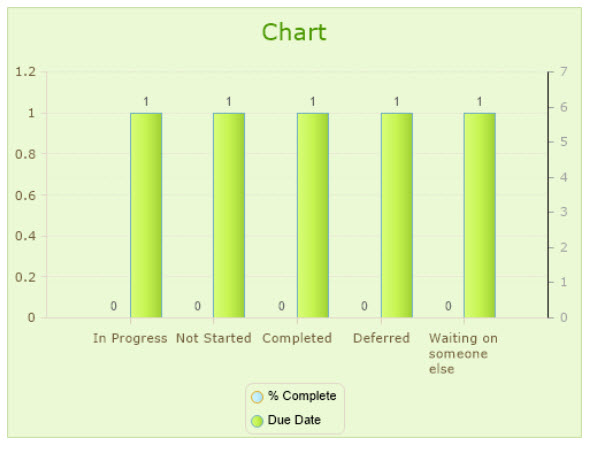
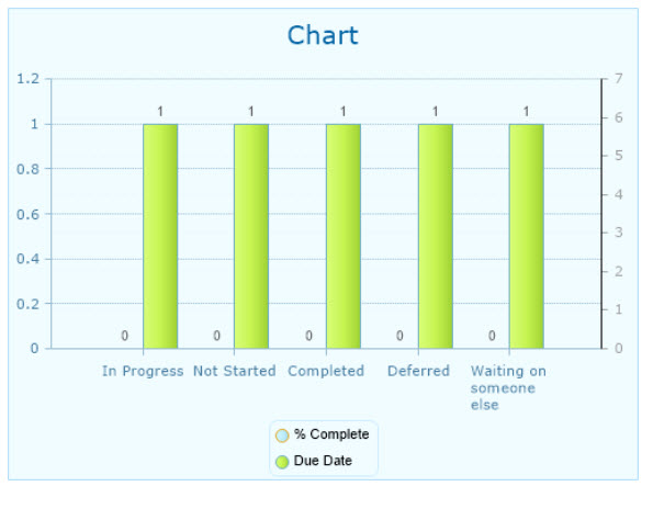
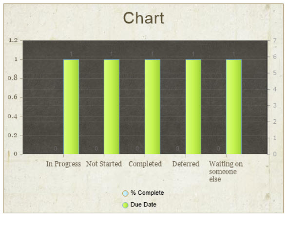
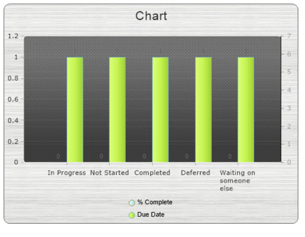
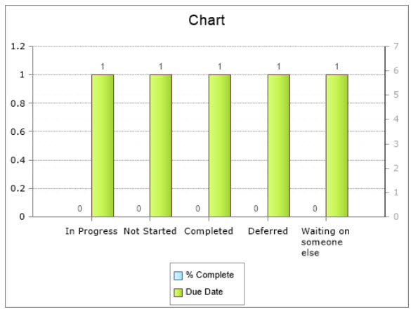
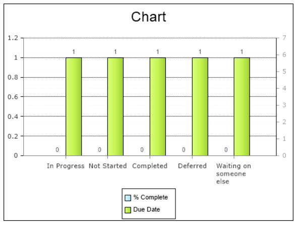
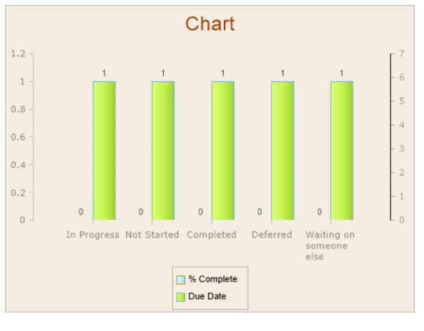
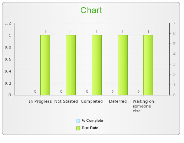
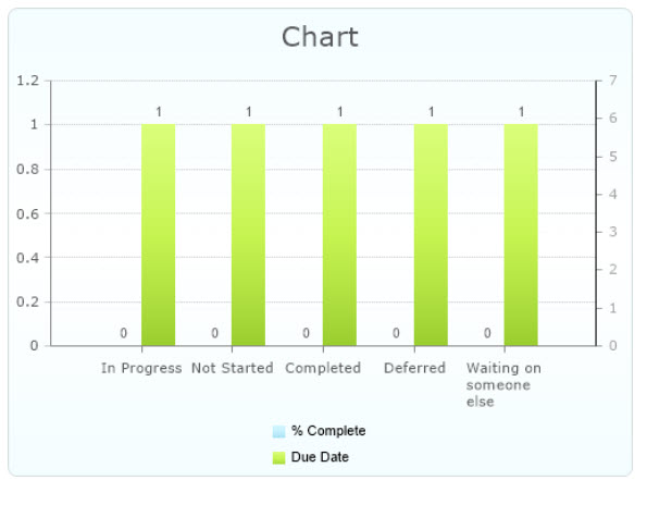
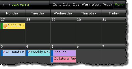
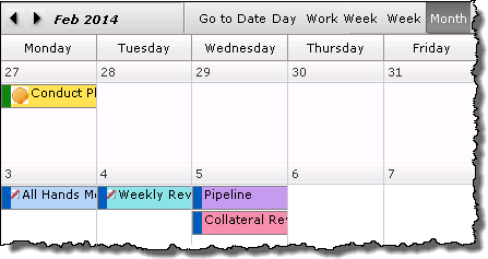
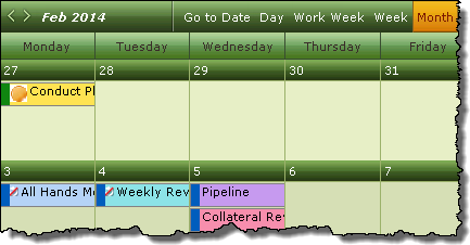
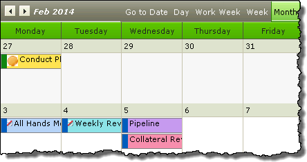
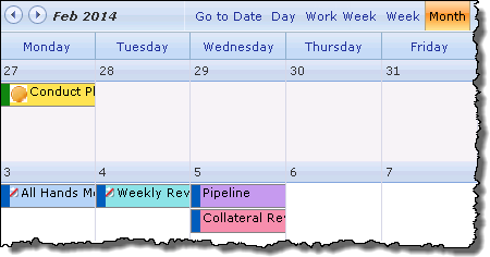
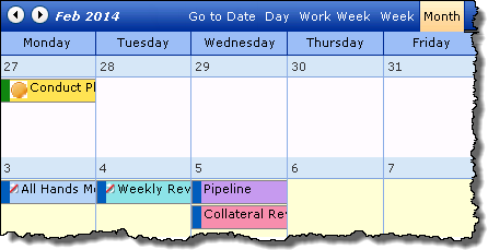
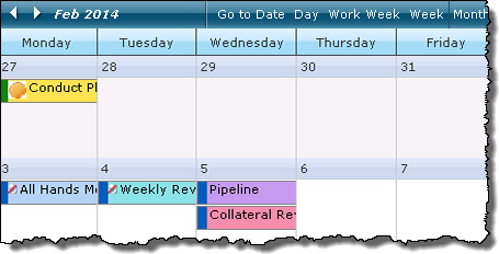
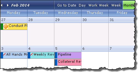
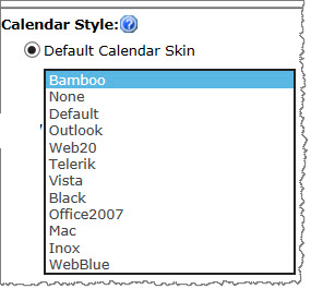 A variety of skins are available when configuring Look and Feel settings to change the appearance of the Calendar Plus display. Shown below are the look and feel of the various options.
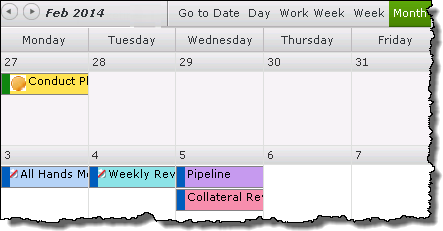
 Most organizations have events, tasks, and initiatives that are tracked across a variety of different SharePoint lists. If your organization is among them, you can now display them all in one central location, easily keeping the activities and events up-to-date and displayed in a convenient calendar UI with Calendar Plus App.
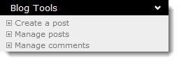 The Blog Tools list contains links to common blog activities.
 From the blog site page, click Create a post in the Blog Tools list.
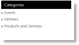 To browse categories, go to a blog site page and click a link in the Categories Web Part.
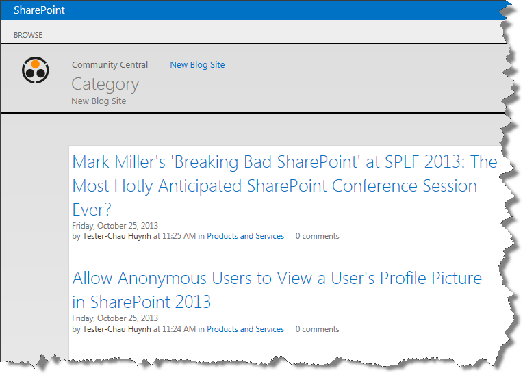
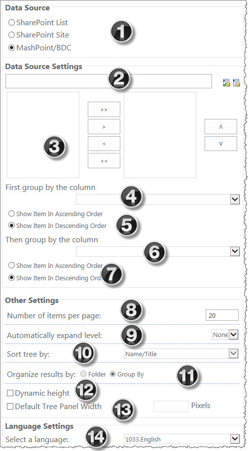
 to the right of the Data Source Settings box to select non-SharePoint content in your environment.