Organize how data is displayed in Data-Viewer
Top
After you have selected a data source and have identified which columns will be displayed by default in the Data-Viewer web part, you can optionally configure how the displayed data will be organized, including specifying:
Keep in mind:
-
The options discussed on this page define the default display of data in the Web Part.
-
You may also allow your end users to change sorting, filtering, and grouping on-the-fly by enabling interactive options in the General Settings page of the Preferences section of the Data-Viewer Web Part Settings.
NOTE: Changes made interactively are not saved and the web part configuration will revert back to its saved configuration when the page is re-loaded.
To organize Data-Viewer’s default display:
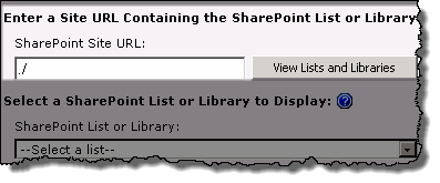
 1. Use the scroll bar found on the data source configuration screen to scroll down the page to the desired section.
NOTE: This step requires you to have accessed the Data-Viewer Settings screens by clicking the Data Viewer Web Part Settings button in the web parts configuration tool pane.
2. Configure the desired option
| Option |
Description |
|
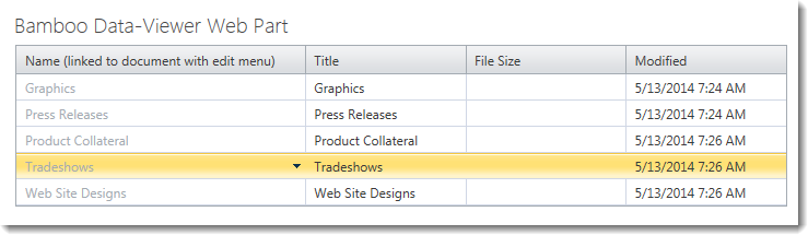
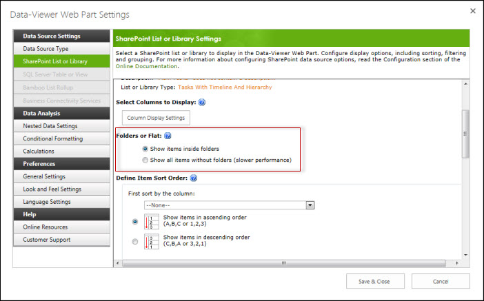
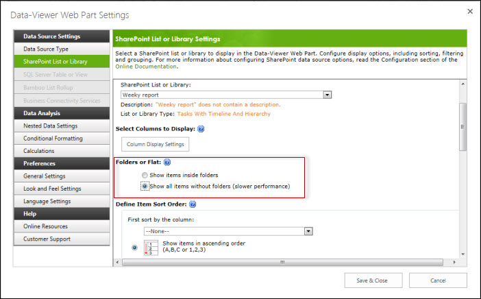
Folders or Flat
|
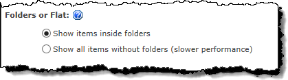 If a SharePoint library containing folders was selected for display, use the Folders or Flat radio buttons to determine whether to include the folders in the display. If a SharePoint library containing folders was selected for display, use the Folders or Flat radio buttons to determine whether to include the folders in the display.
NOTES:
1. The Show Items inside folders is selected by default.
2. This option is not displayed for other types of data sources.
3. Showing items without folders will take longer to display due to the additional processing required.
Top |
|
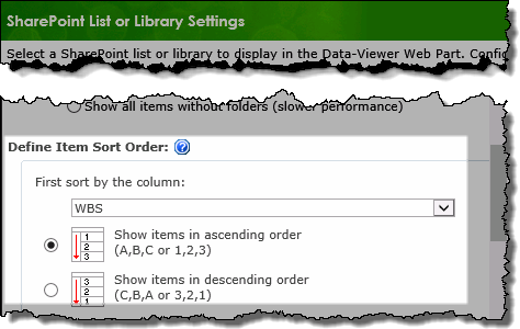
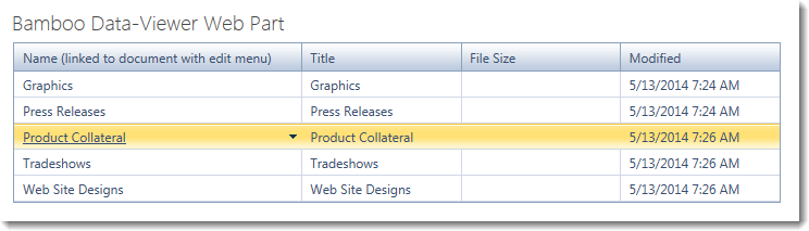
Sort Order
 |
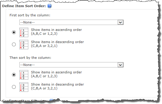 Data displayed in the Data-Viewer Web Part can be sorted by up to two columns, by default. This is similar to SharePoint list views will be the initial sort for the display. Data displayed in the Data-Viewer Web Part can be sorted by up to two columns, by default. This is similar to SharePoint list views will be the initial sort for the display.
Select a column from each drop down and choose whether to sort in ascending or descending order.
NOTE:
You can sort by any column in the data source, not just by the columns that were selected for display.
Top |
|
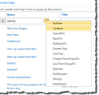
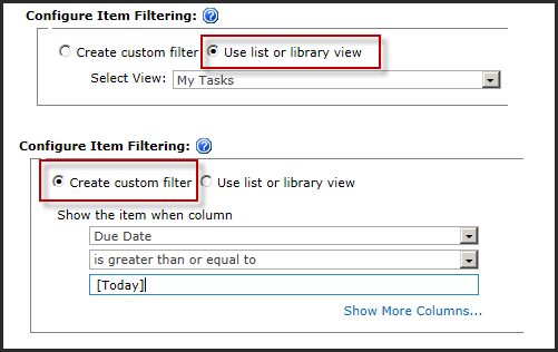
Filter
 |
Apply a default filter to the displayed data by selecting from one of the following options:
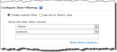
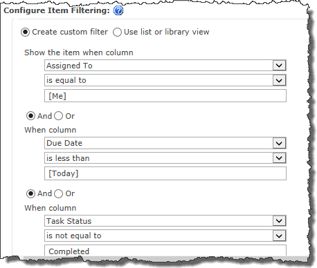
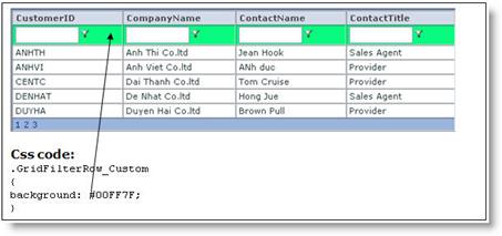
1. Create Custom Filters:
Select the column(s) that you want to filter on, the comparison type and the value that you are comparing. If needed, add more conditions by clicking the Show more columns… link.
 The custom filter in the Data-Viewer supports the SharePoint variables [Me], representing the currently logged in user, and [Today], representing today’s date. Use either or both in your filter conditions for SharePoint Lists or Libraries or List Rollups. They are not available for SQL and BCS data sources. The custom filter in the Data-Viewer supports the SharePoint variables [Me], representing the currently logged in user, and [Today], representing today’s date. Use either or both in your filter conditions for SharePoint Lists or Libraries or List Rollups. They are not available for SQL and BCS data sources.
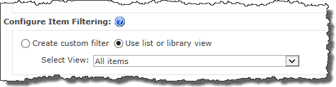 2. Use list or library view: 2. Use list or library view:
When selected the you will be able to select an existing view associated with the configured list to filter the displayed data.
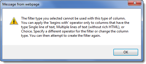
NOTE: The Use List or Library view filter is only available when using a SharePoint List or Library as the data source.
 ** New ** in Data-Viewer 3.7: This filter option is selected by default when using a SharePoint list or library as a data source and users are able to change list views in run-time from the Web Part display. ** New ** in Data-Viewer 3.7: This filter option is selected by default when using a SharePoint list or library as a data source and users are able to change list views in run-time from the Web Part display.
Top
|
|
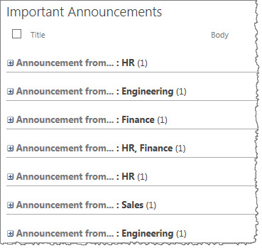
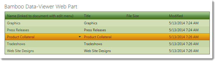
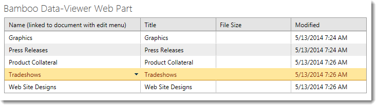
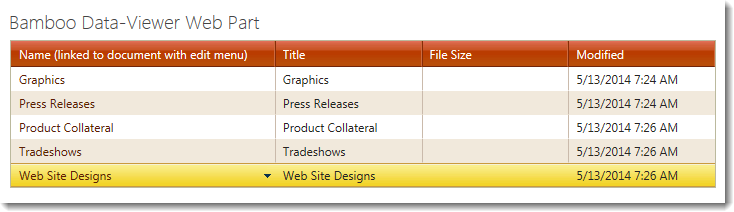
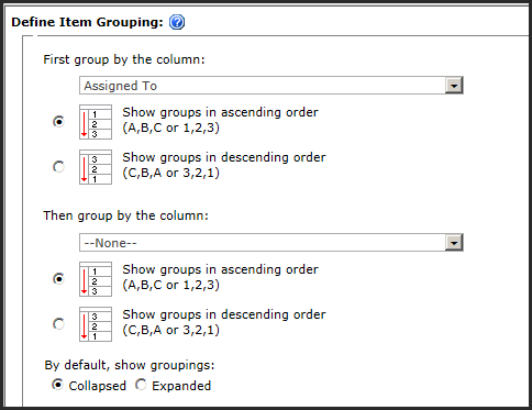
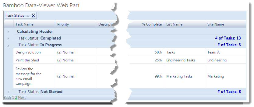
Grouping
 |
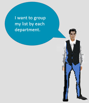
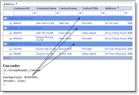
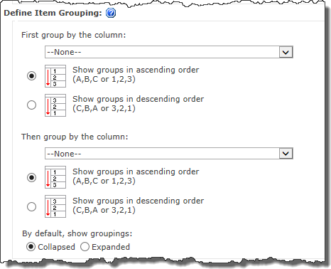 To configure default grouping for your display: To configure default grouping for your display:
1. Select the column for the first level grouping
2. If needed, select a column for the second level of grouping
3. Select whether the groupings will be collapsed or expanded by default.
NOTES:
1. Collapsed is selected by default.
2. Unlike sort options, you can only group by columns displayed in the Web Part.
Top |
|
Number of Items to Display
 |
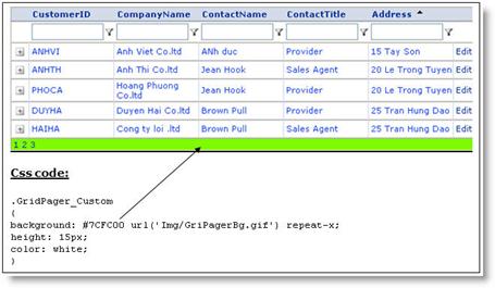
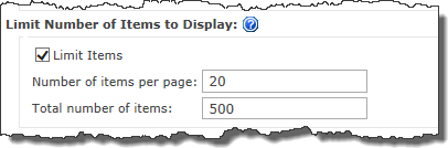 Use the Limit Number of Items to Display setting to set a limit for the number of items displayed per page and the total number of items the Data-Viewer Web Part can display. Use the Limit Number of Items to Display setting to set a limit for the number of items displayed per page and the total number of items the Data-Viewer Web Part can display.
NOTES:
1. The Limit Items box is selected by default.
2. Limiting the number of items can help to improve performance.
Top |


 IMPORTANT: Although you can enter a URL for another Site Collection, be careful about going across Web Applications. You may have issues if the other web app has a significantly different security setup.
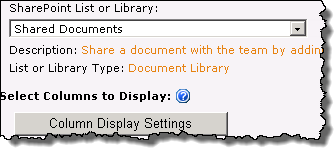
 The Data-Viewer Web Part can connect to Microsoft SQL Server 2005 or SQL Server 2008.
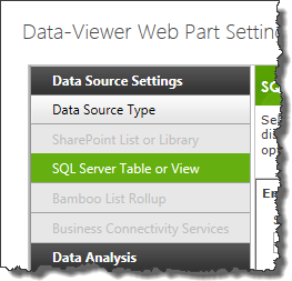
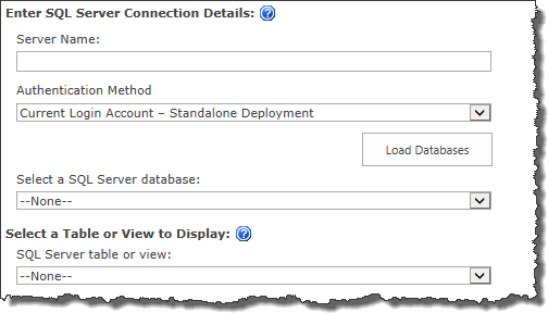
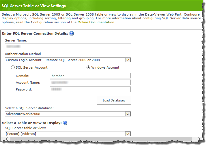 Enter the Server Name for the SQL Server. Then choose an Authentication Method. Options are:
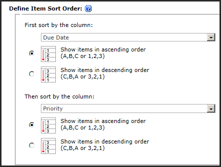
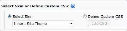
 A variety of skins are available when configuring Look and Feel settings to change the appearance of the Data-Viewer display.
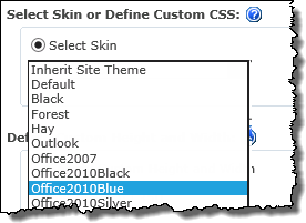 To select a skin, click the Look and Feel button under Preferences, then pick the desired skin from the available options.

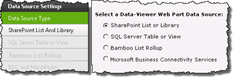
 .Microsoft Business Connectivity Services is one of the four available data sources for Data-Viewer
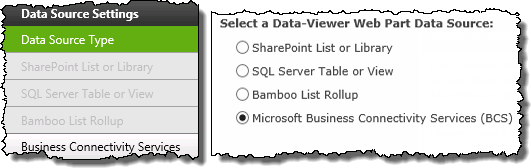
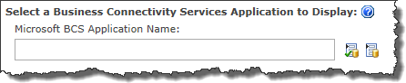
 ) to verify the data source.
 ).
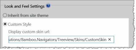
).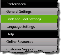 1. Click the Look and Feel Settings button under the Preferences header in the Data-Viewer configuration screen.
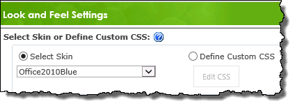
 By default, the Data-Viewer will fill the available space in the web part zone or the wiki page where you put it.
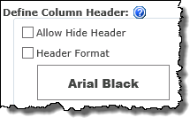 Determine whether the column headers will be visible in the display, or define special formatting for the column headers.
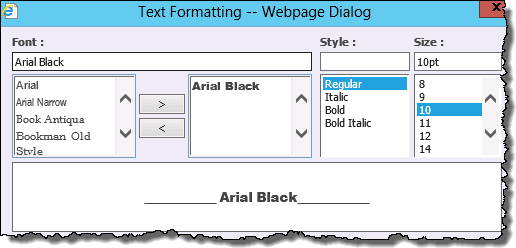
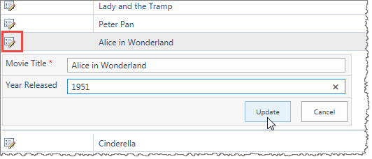
 Data-Viewer can be configured to allow users to update and modify the appearance of the data set in run-time. When working with the Interactive Options keep in mind:
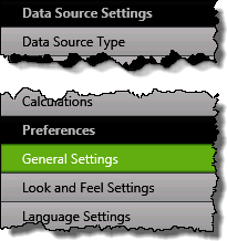 1. Click the General Settings button under Preferences.
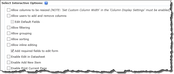
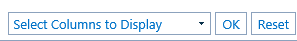 Allows users to customize the column view using a drop-down menu located in the Data-Viewer Web Part.
 ) is added to each row of data.


 to match the currently logged on user or
  to match the current date.


 Data-Viewer can be configured to allow users to export data to Microsoft Excel. When working with the Data Export options keep in mind:
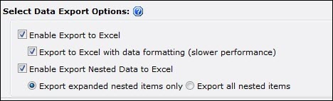
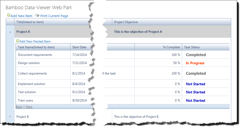
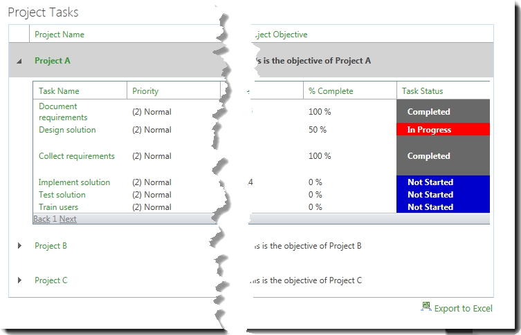
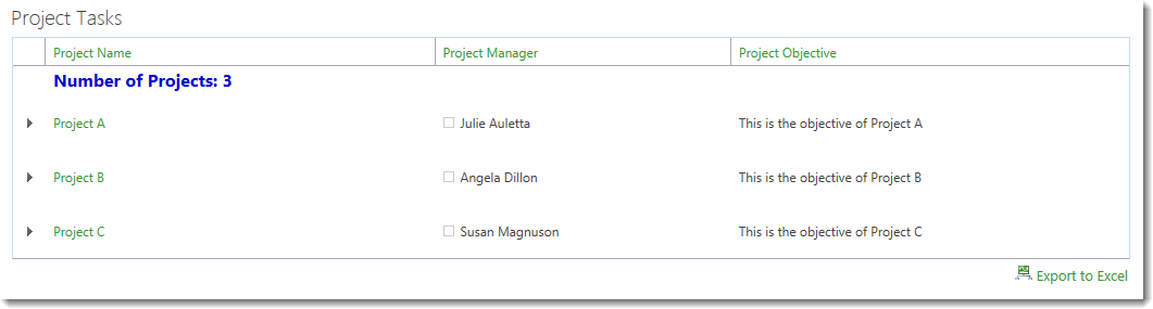
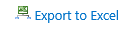 When checked the Export to Excel link will be visible in the bottom right corner of the Data-Viewer Web part.

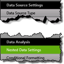
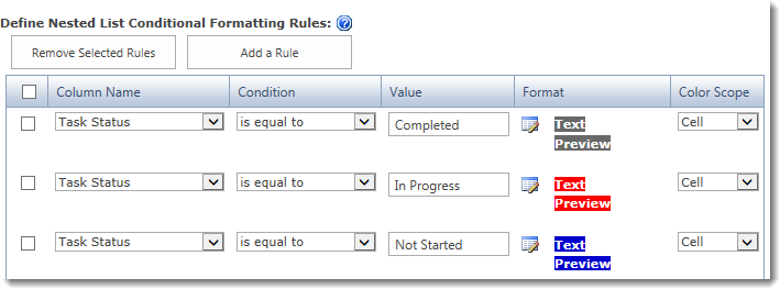
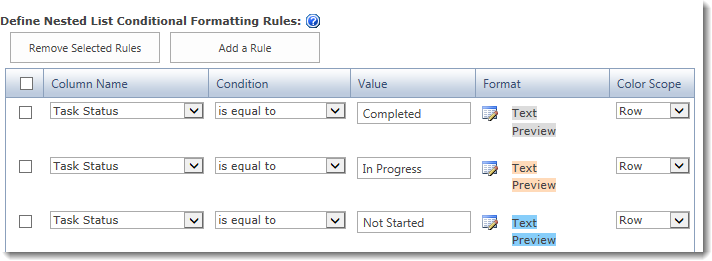
 To apply conditional formatting, click the Conditional Formatting button under Data Analysis.
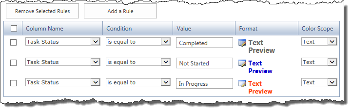
 Data-Viewer Web Part Configuration


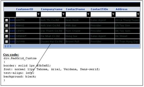
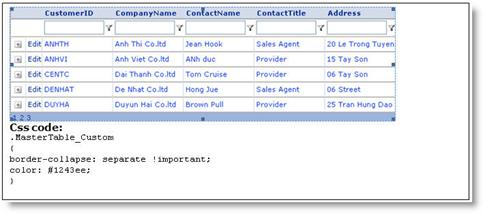
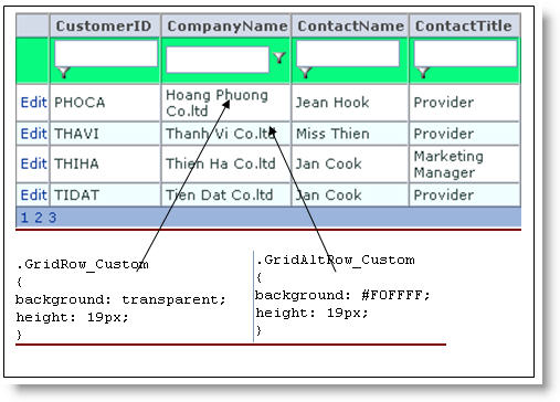
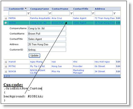
 By default, the Data-Viewer web part renders the user interface using the default CSS styles that are selected in your SharePoint sites, assuming you are inheriting the site theme. The look and feel of the web part can further customized by editing the custom cascading style sheet (CSS) file from the tool pane of the web part.
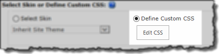 Click the Define Custom CSS radio button to enable the Edit CSS button
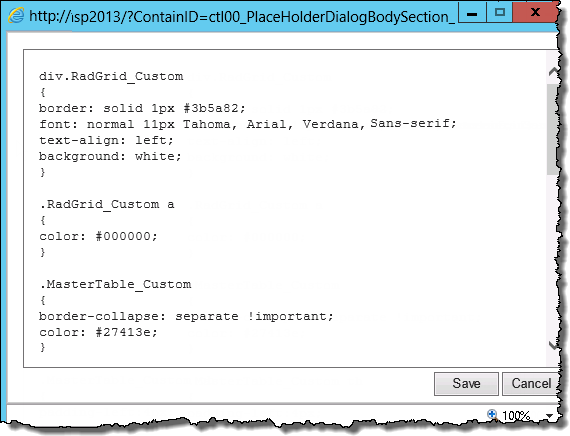 Click Edit CSS.
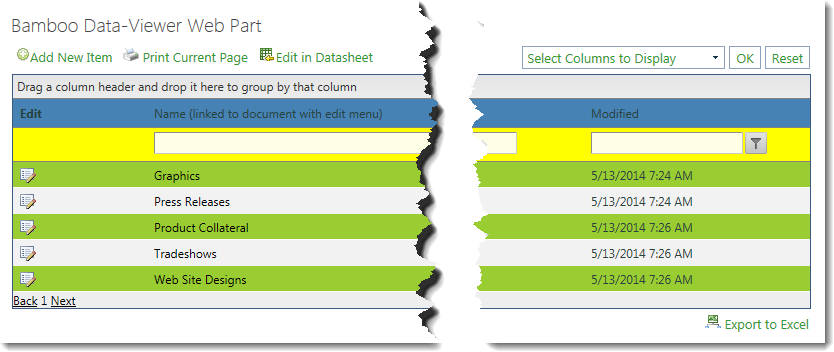
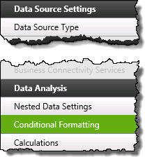 1. Click the Conditional Formatting button under Data Analysis.
 Select a Condition to use when comparing the value in the selected column to the condition’s value.
 to match the current user or
  to match the current date.
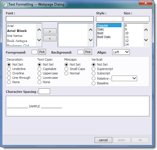
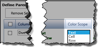
 ) in the Format column to access the Text formatting pop-up.
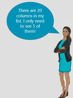
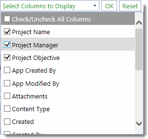
 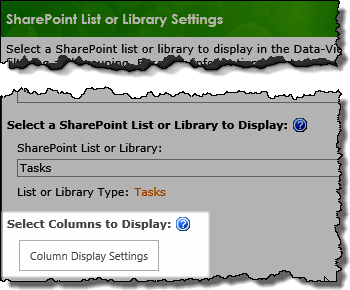 1. Click the Column Display Settings button found on the data source configuration screen.
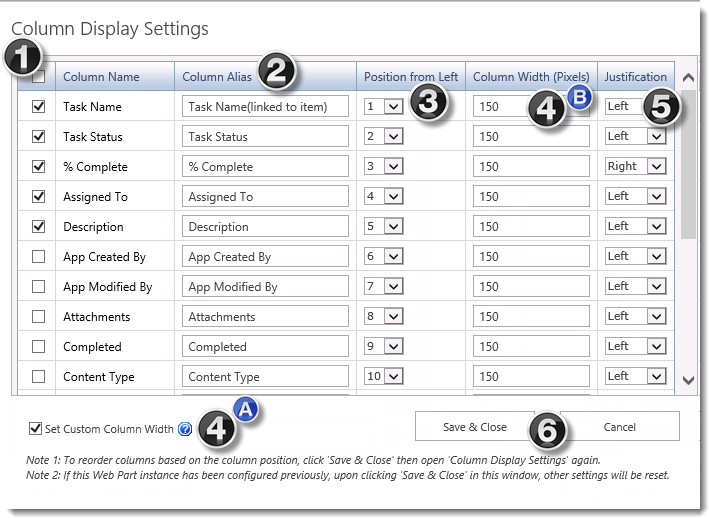
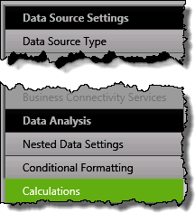 1. Click the Calculations button under the Data Analysis header in the Data-Viewer configuration screen.
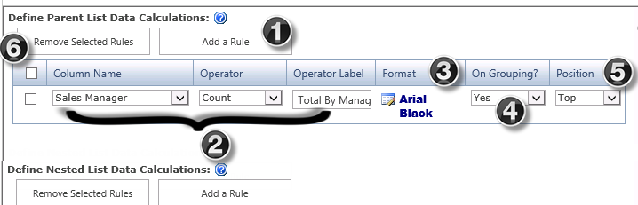
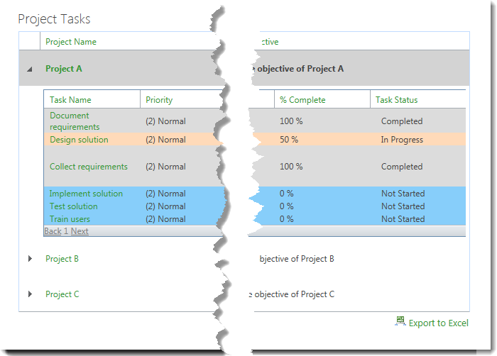
 Select Yes in the On Grouping? drop down if you want the calculation result and the Operator Label to appear in the group headers.
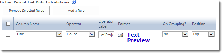
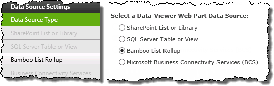
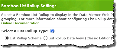
 Bamboo List Rollup is one of the four available data sources for Data-Viewer.