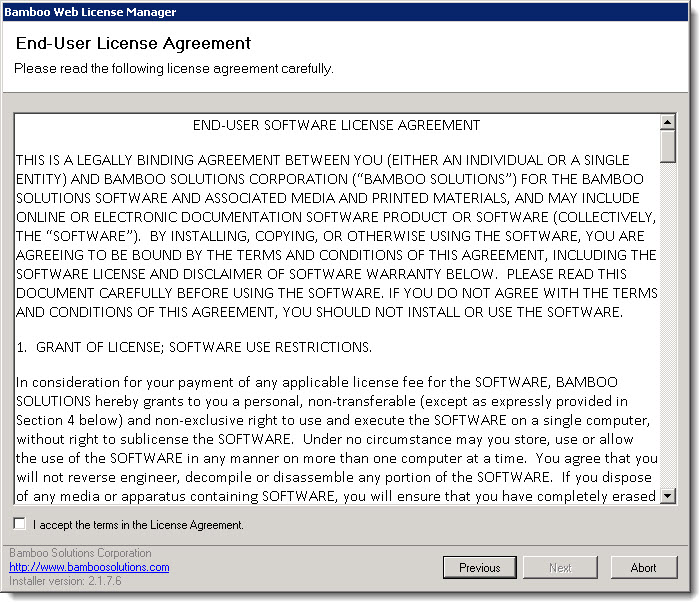
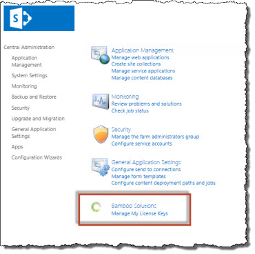
IMPORTANT: As of April 2017, Bamboo has changed the installation process for Bamboo components. The Setup Program has been replaced by an updated process. Please see Overview of the Updated Installation Process for Bamboo components and Uninstalling using the updated process for details.
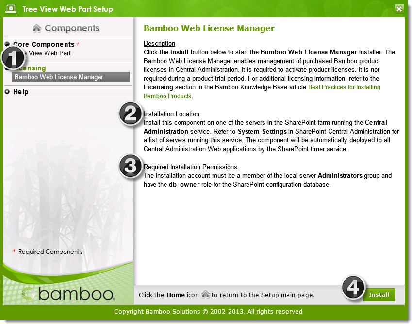
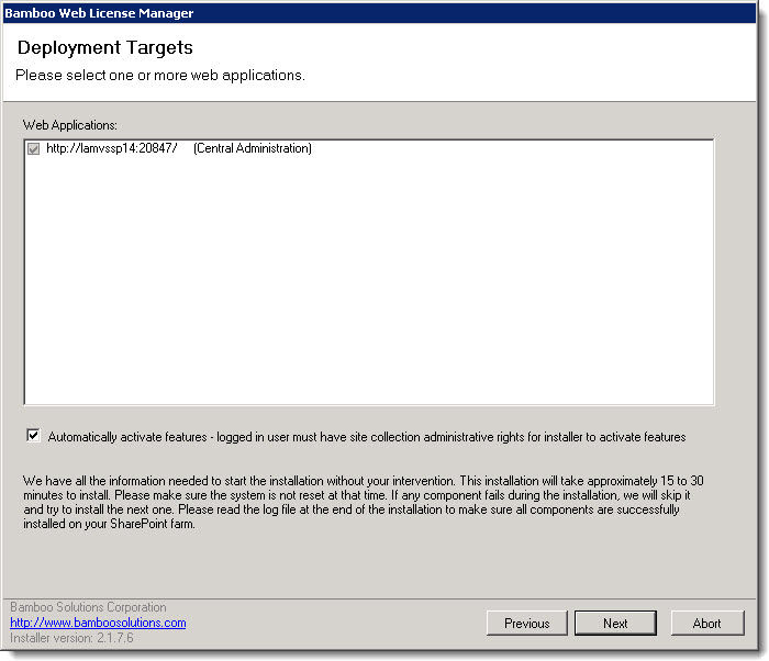
If you are installing a Bamboo product in a SharePoint farm environment, make sure to start the installation on the correct server. The required installation location is listed in the Setup/Installation program interface in the description for each component. See Overview of the Setup Program from more information.
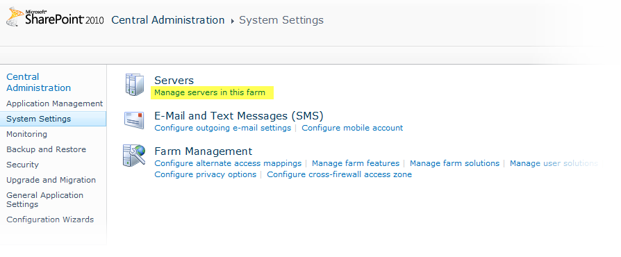
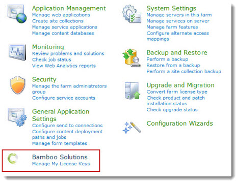
Most Bamboo products are installed on a farm server running the Microsoft SharePoint Foundation Web Application service (or the Windows SharePoint Services Web Application if you are using SharePoint 2007), but some are installed on a farm server running the Central Administration service. Refer to SharePoint Central Administration -> System Settings -> Servers -> Manage servers on this farm for a list of farm servers running these services. If you are using SharePoint 2007, find the list of farm servers in Central Administration > Operations > Servers in Farm.
During the install process, the component will be automatically deployed to all Web front-end servers by the SharePoint Timer service via SharePoint Solution Deployment. There is no need to run the Setup/Installation program on more than one server in the farm.
Refer to Required Installation Permissions for information about the level of permission the installation account requires.

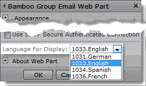
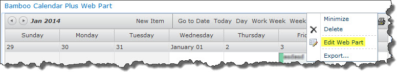
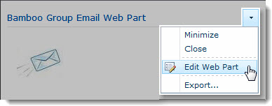 Click the edit drop-down menu on the Web Part title bar and select Edit Web Part (or Modify Shared Web Part if you are using SharePoint 2007). See the example from the Group Email Web Part.
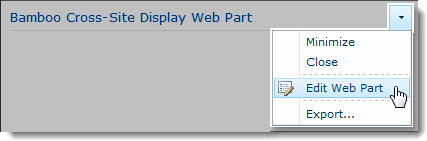 Click the edit drop-down menu on the Web Part title bar and select Edit Web Part (or Modify Shared Web Part if you are using SharePoint 2007).
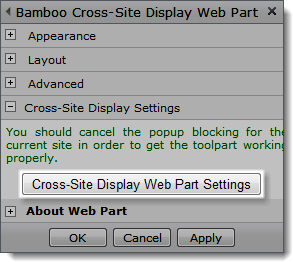 Click the [Product] Settings button in the Web Part tool pane.
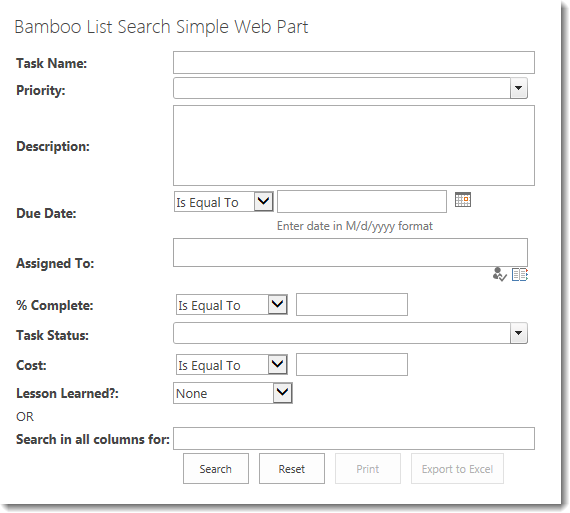
 Perform Powerful Searches and Get More Targeted, Relevant Results with List Search
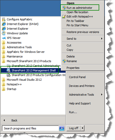
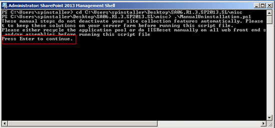
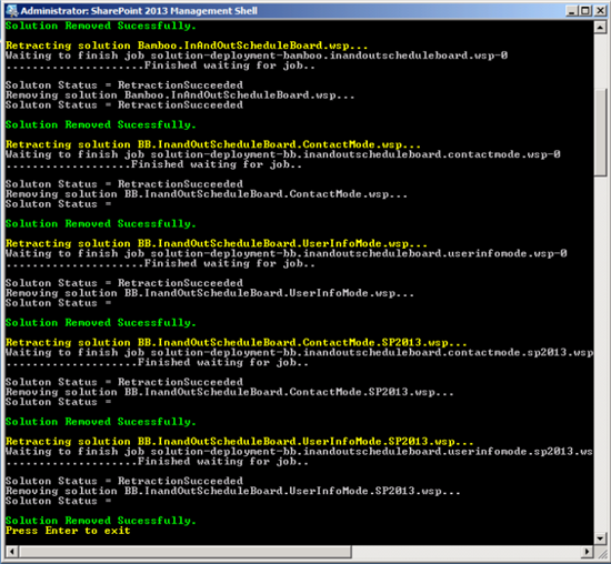
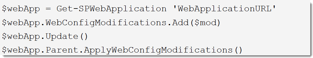
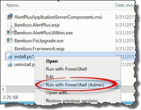 Run the Install.ps1 from a WFE server in PowerShell as an admin.
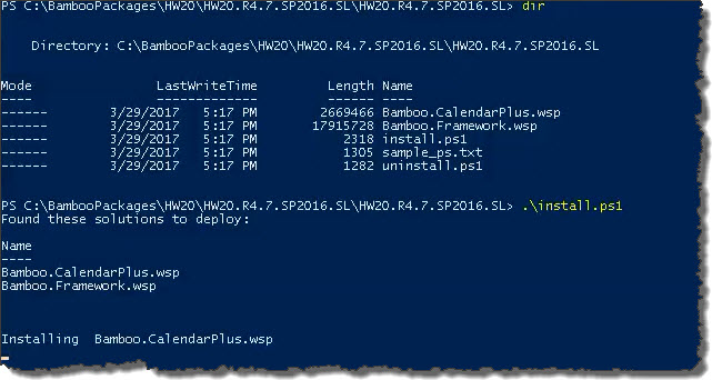 The script will look for WSPs in the install folder and list those found. It will install them in alpha order.
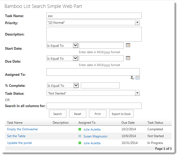
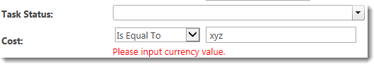
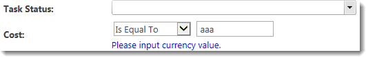
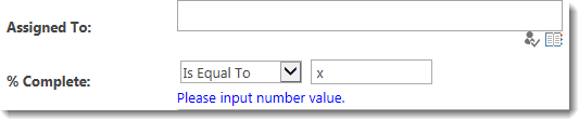
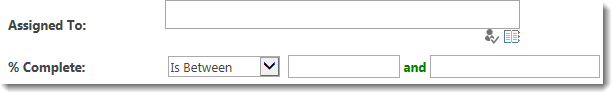
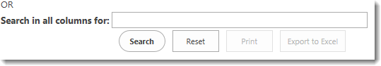
 Often users don’t notice that some criteria is configured by default when the search page appears. They enter their criteria and click Search. Since they didn’t specifically enter other criteria, they are surprised when they seem to get more results than they expected.
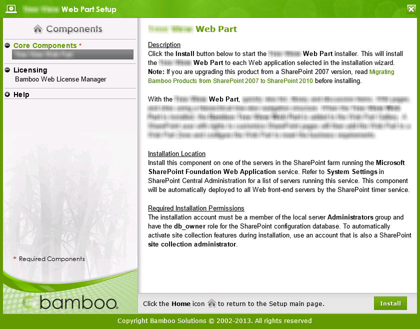 Double-click the product EXE file to extract the contents of the product download.
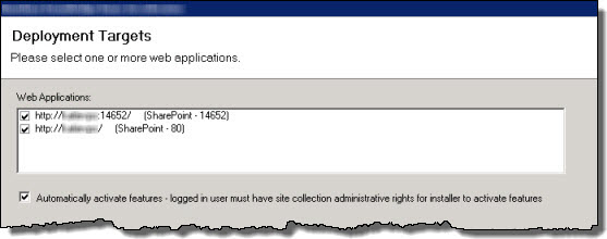

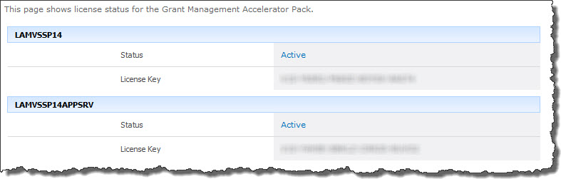

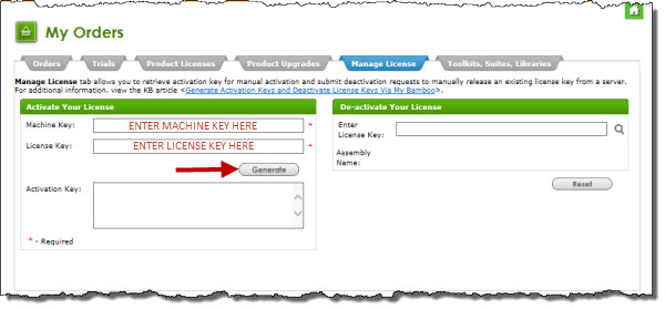
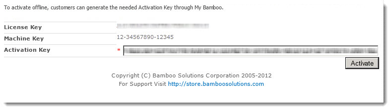
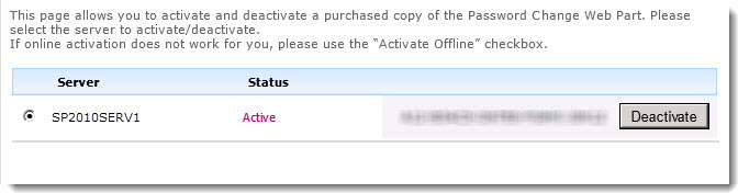
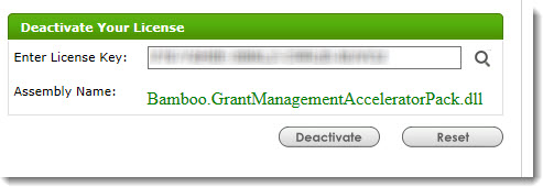
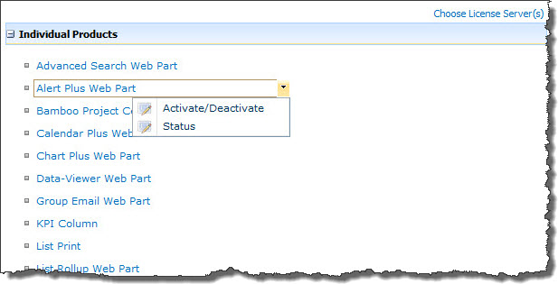
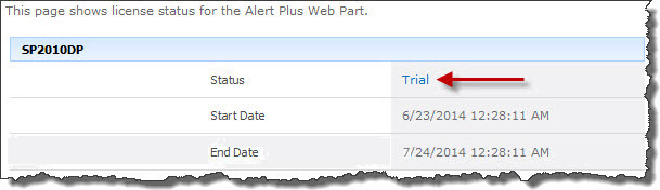
 ). The Assembly Name licensed with this key will be displayed. Ensure it is the product you expect and then click Deactivate.
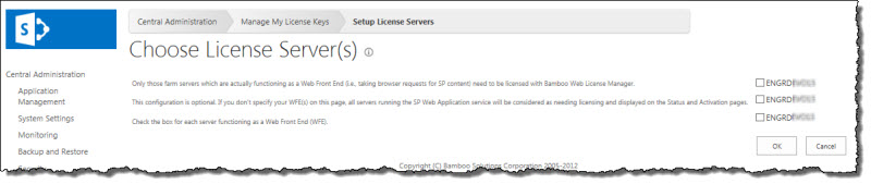
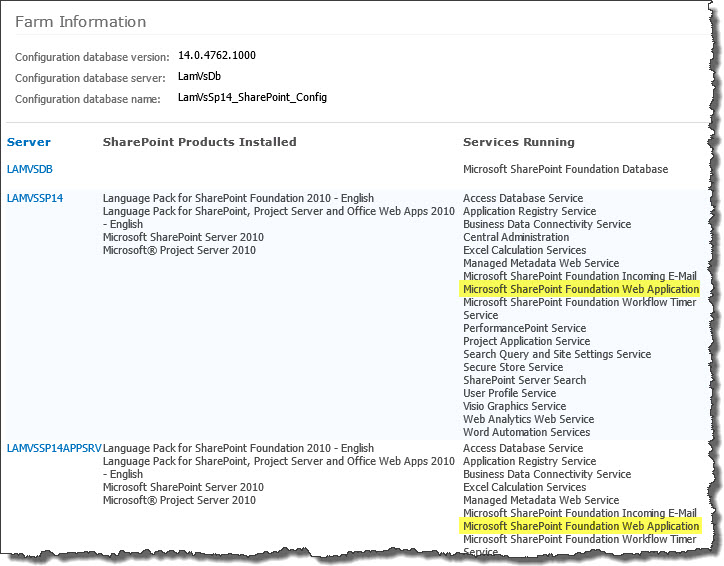 To determine which servers on the farm run these services, go to Central Administration > System Settings > and then Manage servers in this farm. If you are using WSSv3/MOSS, this page is accessed in Central Administration through Operations > Servers in Farm. In this example, there are two WFE servers on the farm.
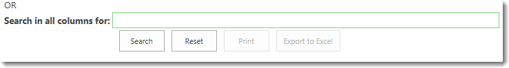
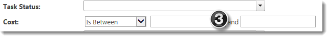
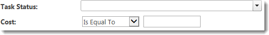
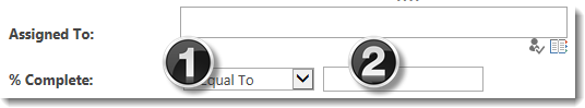
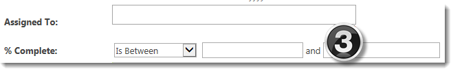
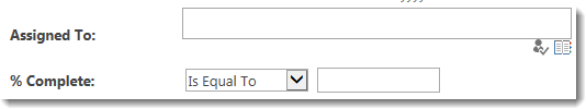
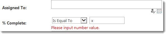
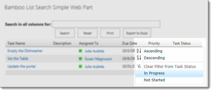 On the column that you want to filter with, hover over the column header with your cursor to access a menu. Choose to filter from this menu.
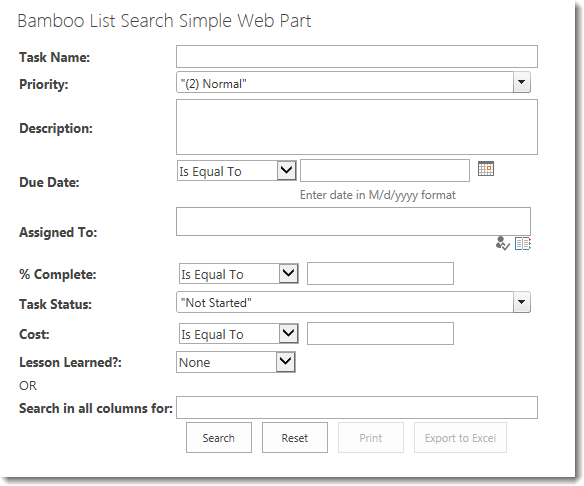
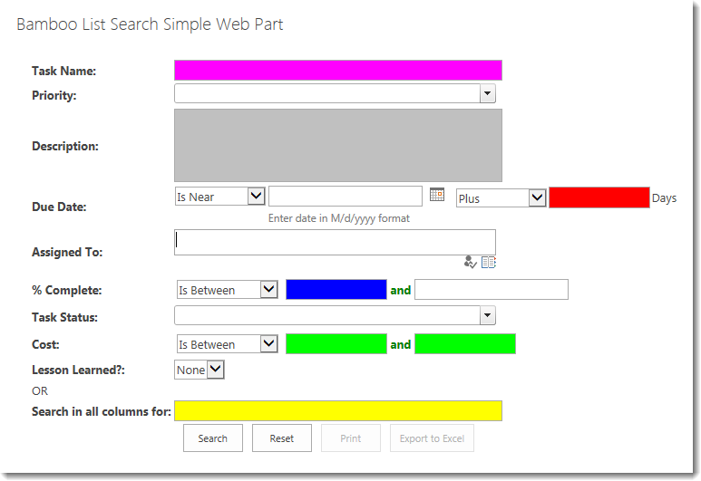
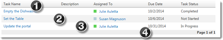
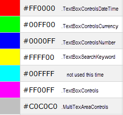 Color Key:
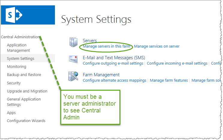 SharePoint 2013:
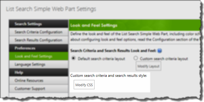 On the Look and Feel Settings page accessed from the Preferences section of the Web Part Settings, click Modify CSS to access the style sheet for this instance of the web part.
 It’s a good idea to save contents of the default style sheet to your local PC before making any changes. Once you make changes, there isn’t a reset button.
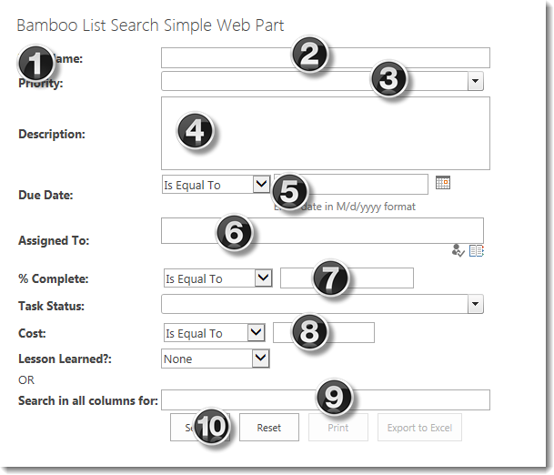
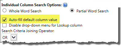
 Check this
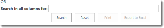

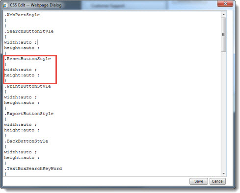 Each CSS element is listed in the CSS Editor, along with any styles currently defined for it. Add CSS style attributes as desired to customize how elements are displayed in the Web Part.
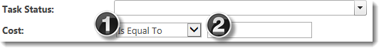


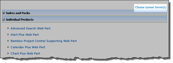
 You will find many of our products complement each other quite nicely saving you the time and trouble to write custom code. With Bamboo at the heart of your SharePoint investment, you gain access to a huge catalog of enhancements, components, and accessories that add the critical functionality your business requires.