Password Change Policy Display
In this section, you can configure the description of your password policy, whether to display the policy, and where to display it.
To configure this section of the Web Part, follow these steps:
| Column |
Description |
| 1. |
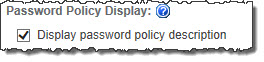
Check the box next to Display Password Policy Description to show the configured text in the Web Part. If you choose not to display this information, uncheck the box and disregard the following steps.
 |
| 2. |
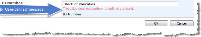
In the Edit password policy text editing area, type the description you would like to display that accurately describes your policy regarding the strength of passwords (length, inclusion of numbers, capital or lowercase letters, special characters, etc.). The edit box contains the formatting options that are typically used in the content editor web part. Bamboo has provided sample text and this should be replaced with your password policy.
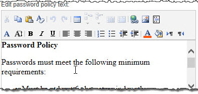
NOTE: Editing the password policy text does not change the password policy, only the description that appears in this Web Part. Users with the Design permission level may edit this text, but only the server administrator can change the password policy.
|
| 3. |
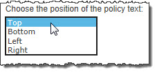
Use the Choose the Position of the Policy Text drop-down list to determine where the policy text will be displayed.
 |
|
Password Change Messages
The Password Change Web Part features feedback tools to help users change their passwords more effectively. To turn these tools on or off, check or uncheck the appropriate box.
Password Change Look and Feel Settings
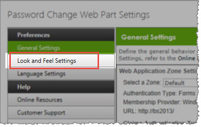 The Password Change Web Part can be customized by creating a custom HTML layout and editing the CSS provided in the Password Change Web Part Settings window.
To change look and feel settings, perform the following steps:
- Customize the Web Part Layout
- Customize the Look and Feel (CSS)
The default layout of the Password Change Web Part is a vertical orientation of text fields in the following order:
- Domain (This field can be hidden)
- Account (This field can be hidden)
- Old Password
- New Password
- Password Strength Meter (This field is tied directly to the New Password field and always appears directly beneath it)
- Confirm Password
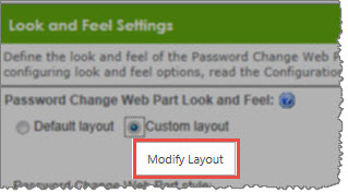 To customize the layout of the Web Part, select Custom Layout, and then click the Modify Layout button.
Password Change Logging
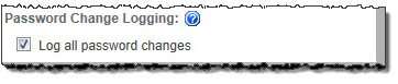 Checking the Log All Password Changes box enables logging of all successful and unsuccessful password change attempts.
Audited password change attempts are logged in a list that is created by Password Change in the SharePoint site collection. This list will show you the history of password change attempts.
Audit logs are stored in Site Contents > Bamboo Password Change Audit Log.
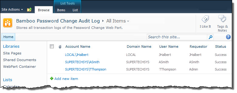
- The audit log is a standard SharePoint list.
- SharePoint administrators can apply alerts and workflows to help monitor password change attempts.
- The permissions for this list can be modified to restrict access to certain users or groups to protect user information.
- The Bamboo Password Change Audit Log displays every password change attempt using the following columns:
| Column |
Description |
| Account Name |
This column displays the User Name and Domain Name in the format that they were sent to the Authentication Provider. |
| Domain Name |
This column displays the domain which hosts the account that the user was attempting to change the password for. |
| User Name |
This column displays the name of the account that the user was attempting to change the password for.
Requestor: This column displays the name of the user who attempted to change a password using the Web Part. |
| Status |
This column displays whether the password change attempt was a success (Success) or a failure (Fail). |

The Password Reset allows SharePoint users to reset their forgotten password without requiring IT Administrator’s intervention.
Install
|
Permissions
|
License
|
Permissions
|
|
|
 |
|
|
Configure
|
Permissions
|
Work With
|
Permissions
|
|
|
 to configure this Bamboo product.") |
|
 |
Click here if you would rather see a complete list
of all topics for this product. |
 Click on the shopping bag or here to download a trial of the product or to purchase it. Click on the shopping bag or here to download a trial of the product or to purchase it. |
Password Management Toolkit
 The Password Management Toolkit is a combination of Bamboo’s four most popular administrative tools. By combining these four powerful self-service administrative web parts and the step-by-step guide to creating an effective password management solution, users will be able to manage their own passwords faster.
|
Everything about your suite or toolkit, from retrieving your license keys to downloading products included in the suite or toolkit, can be managed through My Bamboo. All Bamboo Toolkit products are license-protected and must be activated for use on each Web front-end server beyond the initial trial period. This requires the installation of the Toolkit License and Bamboo Web License Manager. Once you have installed these components, all products included in your Bamboo Toolkit can be activated using a single license key.
This section provides instructions for the following required steps:
To get started, log in to My Bamboo using the account information provided by your Bamboo Account Manager when you purchased your suite or toolkit. Until the license package is installed, the suite or toolkit will not appear in the Bamboo Web License Manager in SharePoint Central Administration.
|
Suite/Toolkit Installation and Licensing
|
Permissions
|
|
|
|
|
|
 No need to license each product! All of the products within your toolkit are licensed through your Suite or Toolkit License. When you are ready to install a product that is part of your suite or toolkit, use the links below to open the product landing page where you can follow the instructions under each section to Install, Configure and Work With each specific product(s) that are included in your suite or toolkit.
NOTE: The web parts included in the Toolkit require installation; however, installation can occur before OR after license activation of the Toolkit, Suite, or Library.
Learn more about the specific products included in the Password Management Toolkit:
Click here if you would rather see a complete list
of all topics for this product. |
Click on the shopping bag or here to download a trial of the product or to purchase it. |
|

Using the Password Expiration web part, you can notify users through email and/or display notifications through a Web Part when account password is approaching expiration.
Install
|
Permissions
|
License
|
Permissions
|
|
|
|
|
|
Configure
|
Permissions
|
Work With
|
Permissions
|
|
|
|
|
|
Click here if you would rather see a complete list
of all topics for this product. |
Click on the shopping bag or here to download a trial of the product or to purchase it. |
Password Change Account Display Settings
In this section, you will configure whether users can see and change the Domain and Account information linked to the password they are changing. These settings are represented by a series of buttons and check boxes.
| Choice |
Action |
Description |
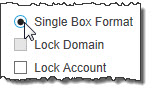
2-Box Format Single Box Format
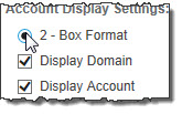 |
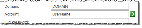
Enter the Domain and Account Name in separate fields. |
Used for logons with the pre-Windows 2000 format (DOMAINACCOUNT) |
Single Box Format
 |
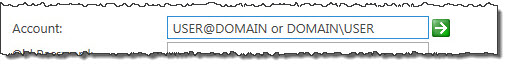
Enter the Domain and Account Name in one common field. |
Used for the User Principle Name (UPN) logons (account@domain) |
|
Definitions of Above Choices:
- Display Domain: Displays a field for the user to enter the domain name of the server that contains the account to update.
- Lock Domain: Automatically displays the domain name that the user is currently logged in with. If this box is checked, the user cannot edit this field.
- Display Account: Displays a field for the user to enter the account name that they want to change the password for.
- Lock Account: Automatically displays the account name that the user is currently logged in with. If this box is checked, the user cannot edit this field.
Page hangs or does not open
When the weather feed is not currently available from either MSN or Yahoo!, there are times when your page will hang on loading and you might feel as though your page has completely broken.
A quick and simple way to remove to the web parts that might be causing a page load issue is to look at the web parts maintenance page. To do this, add a string of characters to the end of the URL in your address bar
?contents=1
Example: http://CompanyName/sites/SitePages/default.aspx?Contents=1
This opens the Web Parts maintenance page showing you a list of all the web parts that are on the page so that you may delete any that are causing conflicts. Be aware of which web part you delete; this is a permanent action that you cannot undo! Typically older versions of web parts or web parts using JavaScript or JQuery code may be in conflict. By removing one at a time, you can determine the one causing the issue.
Packages
Bamboo Suites and Toolkits are specifically designed to meet the most urgent needs of real-world SharePoint users such as managing projects, structuring and accessing corporate knowledge, and extending your lists’ capabilities without requiring Form Libraries and InfoPath. Our Suites and Toolkits are pre-packaged and ready to deploy and can help you complete specific business critical operations such as project management, password management and community management.
| Product Details |
Documentation |
Description |
 |
Administration Toolkit |
Bring advanced IT SharePoint administration functionality to your everyday sites and applications. This toolkit contains a full range of tools to help you with SharePoint password, user, and site management. |
 |
Bamboo Premier |
No matter what you’re trying to do in SharePoint, Bamboo Premier includes a smarter, faster way to do it. Aggregate data, build complex navigation systems, orchestrate context-sensitive alerts, or streamline everyday administration tasks with a full range of solutions that are ready to use with a click of the mouse. Contact us today to learn more, and find out how Bamboo Premier can make the high cost of SharePoint customization a thing of the past. |
 |
Bamboo Select |
With plug-and-play tools for data aggregation, search, calendaring, and much more, Bamboo Select allows you to give your SharePoint sites and applications the kind of advanced functionality you need. |
 |
Community Management Suite |
With its robust collection of components and tools, Bamboo Community Management Suite provides a flexible, scalable, and affordable social solution for your SharePoint environment. In addition to the powerful forums, blogs, and social networking features available in applications such as Community Central and Discussion Board Plus, Bamboo Community Management Suite features a wealth of complementary, feature-rich tools that will revolutionize community within your enterprise. |
 |
Essentials Suite |
With its robust collection of components and tools, Bamboo Community Management Suite provides a flexible, scalable, and affordable social solution for your SharePoint environment. In addition to the powerful forums, blogs, and social networking features available in applications such as Community Central and Discussion Board Plus, Bamboo Community Management Suite features a wealth of complementary, feature-rich tools that will revolutionize community within your enterprise. |
 |
Knowledge Management Suite |
With its robust collection of components and tools, Bamboo Community Management Suite provides a flexible, scalable, and affordable social solution for your SharePoint environment. In addition to the powerful forums, blogs, and social networking features available in applications such as Community Central and Discussion Board Plus, Bamboo Community Management Suite features a wealth of complementary, feature-rich tools that will revolutionize community within your enterprise. |
 |
List & Forms Toolkit |
SharePoint out of the box provides a sufficient collection of base column types for initial SharePoint deployments. However, as these deployments continue to grow, requirements grow as well. The need for reporting, analytic and visual aids in SharePoint lists and libraries rises—which is where the List and Forms Extensions Toolkit comes into play. Take advantage of the List and Forms Extensions Toolkit’s versatile, customizable column types that are designed to enrich and improve your users’ experience in SharePoint. |
|
Password Management Toolkit |
With the Password Management Toolkit, users now have the ability to maintain their own passwords, including changing their password, resetting forgotten passwords, and receiving notification when their password is about to expire. |
 |
Project Management Suite |
With the Password Management Toolkit, users now have the ability to maintain their own passwords, including changing their password, resetting forgotten passwords, and receiving notification when their password is about to expire. |
 |
TechLib Subscription |
The Bamboo Technical Library™ (TechLib) can help you achieve better SharePoint solution building results. With Bamboo’s entire set of products for SharePoint 2007, SharePoint 2010, and SharePoint 2013 are at your disposal. You can quickly create application prototypes and test working pre-production solutions. |
|
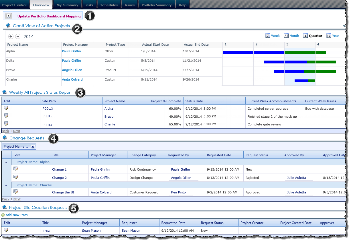
PM Central Portfolio – Overview tab
The Overview tab on the portfolio site provides users with the high level view of Active projects.
NOTE: Unless noted the Web Parts shown on the Overview page of department sites are the same as those on the portfolio site. The content displayed in the Web Parts will be determined by the department site’s filter configuration.
|
|
Name / Web Part |
Description |
| 1. |
Update Portfolio Dashboard Mapping |
A link to the Portfolio Dashboard Mapping page. You must manually update the contents of this list in order to see information in the Gantt View of Active Projects. |
| 2. |
Gantt View of Active Projects
Bamboo Project Portfolio Dashboard |
The Gantt View of Active Projects displays the timeline of the active projects, with the project’s timeline depicted in green, and progress shown in blue.
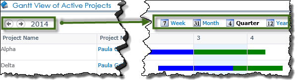
Project timeframes will be displayed in the Quarter view, by default, but Week, Month and Year views are available. Use the arrow buttons on the top left of the Gantt View to scroll through weeks, months, quarters by year, and years (depending on the view selected).
|
| 3. |
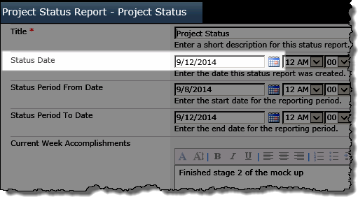
Weekly Project Status Reports
Bamboo Data Viewer Web Part |
The Weekly Project Status Reports display provides a consolidated view of the current status of Active projects in the portfolio. Project Status Reports with a Status Date within the last 7 days are displayed.
 |
| 4. |
Change Requests
Bamboo Data Viewer Web Part |
The Change Requests data view provides information regarding any change requests submitted at the project. The data is rolled up using Bamboo’s List Rollup Web Part from all Active projects and will be displayed in the web part grouped by Project Name. Change Requests can be easily Approved or Rejected using the Inline Edit feature of the display
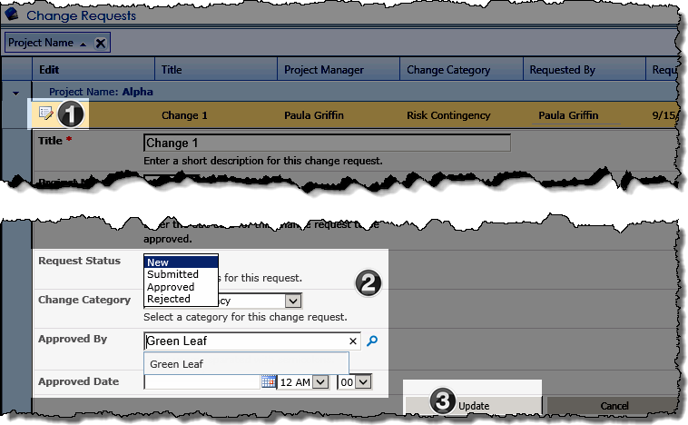
- Click the Edit icon next to the change request item to edit it.
- Select the updated Request Status from the drop down, then identify the decision maker by entering the name, clicking the icon
 , then selecting the user from the drop down selector. , then selecting the user from the drop down selector.
- Click Update
|
| 5. |
Project Site Creation Requests
Bamboo Data Viewer Web Part |
Displays the pending project site requests. From the Add New Item link above the Web Part, or from the Request Project Site link in the Central Actions drop down menu, stakeholders who do not have permissions to create project sites to submit requests for new project sties.
|
|
Packages
Bamboo Suites and Toolkits are specifically designed to meet the most urgent needs of real-world SharePoint users such as managing projects, structuring and accessing corporate knowledge, and extending your lists’ capabilities without requiring Form Libraries and InfoPath. Our Suites and Toolkits are pre-packaged and ready to deploy and can help you complete specific business critical operations such as project management, password management and community management.
| Product Details |
Documentation |
Description |
|
Administration Toolkit |
Bring advanced IT SharePoint administration functionality to your everyday sites and applications. This toolkit contains a full range of tools to help you with SharePoint password, user, and site management. |
|
Bamboo Premier |
No matter what you’re trying to do in SharePoint, Bamboo Premier includes a smarter, faster way to do it. Aggregate data, build complex navigation systems, orchestrate context-sensitive alerts, or streamline everyday administration tasks with a full range of solutions that are ready to use with a click of the mouse. Contact us today to learn more, and find out how Bamboo Premier can make the high cost of SharePoint customization a thing of the past. |
|
Bamboo Select |
With plug-and-play tools for data aggregation, search, calendaring, and much more, Bamboo Select allows you to give your SharePoint sites and applications the kind of advanced functionality you need. |
|
Community Management Suite |
With its robust collection of components and tools, Bamboo Community Management Suite provides a flexible, scalable, and affordable social solution for your SharePoint environment. In addition to the powerful forums, blogs, and social networking features available in applications such as Community Central and Discussion Board Plus, Bamboo Community Management Suite features a wealth of complementary, feature-rich tools that will revolutionize community within your enterprise. |
|
Essentials Suite |
With over twenty components and tools, the Bamboo Essentials Suite gives you instant access to critical functionality missing from out of the box SharePoint. With the power of the Essentials Suite, you’re just a few clicks away from the instant data aggregation, visualization, and user/file management you’ll need to get real work done in SharePoint. |
 |
Essentials Plus Suite |
With the Essentials Plus Suite, you can implement targeted solutions using over forty powerful, SharePoint-boosting components, with tools to manage users, sites, data, and more. We’ve taken the integral tools that make up our applications and combined them into an ultimate utility package, so you can customize solutions that fit your organization’s diverse needs. |
|
Knowledge Management Suite |
Deliver a complete information and knowledge management solution that will help leverage the SharePoint platform to maximize the creation and dissemination of information across your organization |
|
List & Forms Toolkit |
SharePoint out of the box provides a sufficient collection of base column types for initial SharePoint deployments. However, as these deployments continue to grow, requirements grow as well. The need for reporting, analytic and visual aids in SharePoint lists and libraries rises—which is where the List and Forms Extensions Toolkit comes into play. Take advantage of the List and Forms Extensions Toolkit’s versatile, customizable column types that are designed to enrich and improve your users’ experience in SharePoint. |
|
Password Management Toolkit |
With the Password Management Toolkit, users now have the ability to maintain their own passwords, including changing their password, resetting forgotten passwords, and receiving notification when their password is about to expire. |
|
Project Management Suite |
With the Password Management Toolkit, users now have the ability to maintain their own passwords, including changing their password, resetting forgotten passwords, and receiving notification when their password is about to expire. |
|
TechLib Subscription |
The Bamboo Technical Library™ (TechLib) can help you achieve better SharePoint solution building results. With Bamboo’s entire set of products for SharePoint 2007, SharePoint 2010, and SharePoint 2013 are at your disposal. You can quickly create application prototypes and test working pre-production solutions. |
|

The Password Change web part allows users to change their password from within the SharePoint environment.
Install
|
Permissions
|
License
|
Permissions
|
|
|
|
|
|
Configure
|
Permissions
|
Work With
|
Permissions
|
|
|
|
|
|
Click here if you would rather see a complete list
of all topics for this product. |
Click on the shopping bag or here to download a trial of the product or to purchase it. |
Overview of Workflow Conductor Web Parts
There are three web parts included with the Workflow Conductor. They are described below.
| Web Part |
Description |
| My Workflows |
The My Workflows Web Part displays all the workflows initiated by the current user in the site, the Web application, or the entire farm. My Workflows displays the status, workflow name, a link to the item that triggered the workflow, and additional information that might be relevant depending on the type of workflow. From this Web Part, the workflow initiator can Cancel a workflow that is Running, or Restart a workflow that errored. Use this web part to see a list of all your workflows, particularly ones that may have errored, in one central place so you can more easily manage them.
How to use the My Workflows Web Part
How to configure the My Workflows Web Part |
| My Workflow Tasks |
The My Workflow Tasks Web Part displays tasks created by workflows. These tasks typically reside in lists called Workflow Tasks. My Workflow Tasks can display tasks for the current user or for all users, and can display tasks for the site, the Web application, or the entire farm. Use this web part to provide a central location to see all your workflow tasks.
How to use the My Workflow Tasks Web Part
How to configure the My Workflow Tasks Web Part |
| Workflows Reports |
The Workflow Reports Web Part allows you to create reports about workflows in the current site or site collection. The report is displayed graphically, with a summary text-based list below the chart. there are options to specify the workflows you wish to see in the generated report.
How to use the Workflow Reports Web Part
How to configure the Workflow Reports Web Part |
Overview of Workflow Conductor Components to Install
 Workflow Conductor’s installation interface (shown at right) lists the Components available for install with the Workflow Conductor Installation/Setup application. For a description of each component, see the table below.
NOTE: Previous releases of the Workflow Conductor may have had other components listed. For example, Release 3.x had Legacy Workflow Assemblies listed, but that component has been combined with the Workflow Conductor component in R3.5 and is no longer listed separately.
The Workflow Start Feature listed under Optional Items is new for R3.5. If you don’t see it, you may be installing an earlier version.
| Component |
Description |
| Workflow Conductor |
Installs the core Workflow Conductor components, including Conductor Studio, widgets, and reporting Web Parts. As of Release 3.5, it also installs the Legacy Workflow Assemblies, which maintain support for workflows created in previous releases of Workflow Conductor. |
| Control Panel |
Adds a page in Central Administration that provides global settings for Conductor and a view of all workflows running across the installed Web applications. This component needs to be installed on the farm servers that run the Central Administration service. |
| Legacy Workflow Assemblies |
Installs the Legacy Workflow Assemblies are needed to maintain support for workflows created in previous releases of Workflow Conductor. |
| Configuration Database |
Installs the Workflow Conductor Configuration Database utility, which installs and configures the Workflow Conductor database. |
| Bamboo Feature Activation |
This component automatically finds and activates specific product features that may not properly activate when automatic activation is selected during the installation. This step doesn’t install any new components, it runs the utility. |
| Workflow Start Feature |
The Workflow Start Feature provides the ability to add configurable buttons to the SharePoint item ribbon to allow user to easily start a specific workflow on a selected item. It installs like other components. When installation is complete, see How to configure the Workflow Start Feature for more information. |
| Bamboo Web License Manager |
The Bamboo Web License Manager controls the licensing for Bamboo products. It is included in the installation for all Bamboo products. Install it only if you need to activate a purchased license and it has not been previously installed on your SharePoint farm. See Activating Your Bamboo Product License for more information. If you are trialing the Workflow Conductor, you will not need to install this component. |
Overview of Workflow Conductor Studio
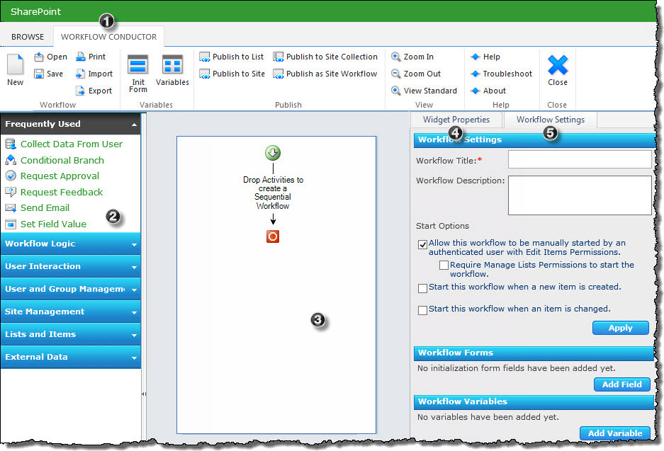 Workflow Conductor provides a simple, yet powerful way to automate and manage your business processes. A simple drag-and-drop interface lets designers easily create and deploy complex workflows without the need for custom coding. Conductor Studio is the Workflow Conductor interface that allows you to create, edit, and deploy new workflows or workflow templates.
The image has been edited to better display the configuration options
| Step |
Action |
Result |
| 1. |
Workflow Conductor Ribbon |
The Workflow Conductor ribbon replaces the list ribbon when you open the Workflow Conductor Studio. Detailed information about the options on the menu ribbon are illustrated here. |
| 2. |
Widgets |
The left section of Conductor Studio, the widget pane, contains a list of the widgets used to design a workflow. You can optionally change which widgets appear in which group from the Configuring WF Conductor Categories page of the Workflow Conductor Control Panel in SharePoint Central Administration. |
| 3. |
Workflow Diagram Pane |
The center section of Conductor Studio is the workflow diagram pane, where widgets are dropped to create the workflow path. The diagram pane is described in more detail here. |
| 4. |
Widget Properties Tab |
Displays the properties of the currently selected widget. You can read an overview of the widget pane and the common widget properties here, but keep in mind each widget has its own unique properties so if you are working on a specific widget and want to get an understanding of the properties for that widget, find the widget in the Alphabetical List of Workflow Conductor Widgets. |
| 5. |
Workflow Settings Tab |
This tab contains general settings for the workflow, including the title and description, workflow start options, and workflow variables. You can read more in depth information about the settings tab here. |
|
To start Conductor Studio, first make sure that the account you are using has the Design or Full Control permission level for the list or library. Then, navigate to a list or library and click the Create or Edit Workflows button in the List or Library tab of the Tools ribbon.
NOTE: Administrators can further restrict who can design workflows in Conductor Studio using the Workflow Designers settings in Central Administration > Workflow Conductor. If you are a SharePoint Designer but do not have the Create or Edit Workflows option in the Tools ribbon, contact your SharePoint administrator.
Overview of World Clock & Weather Configuration
 To modify the web part properties, select Edit (or Modify) Web Part from the drop-down menu of the World Clock and Weather configuration tool pane.
We have broken out the overview for this configuration tool pane into multiple sections for ease of understanding how the parts fit together to make the whole. You can click on any of the topics below to read detailed information about configuring that section of the tool pane.
- Weather Providers and Locations
- Show Weather
- Showing Clocks in World Clock and Weather
- Show Upcoming Events in World Clock and Weather
- Location Arrangements & Text Styles for World Clock and Weather
- Special Effects for World Clock and Weather
- Localizing the Language for World Clock and Weather
Overview of Visual Indicator Column configuration
 Bamboo Visual Indicator Column gives you the ability to visually display incremental progress or status in a SharePoint list.
When using Visual Indicator, keep in mind:
-
A Visual Indicator Column will be displayed in the SharePoint list view and on the display form. When creating new items, or editing existing items, the column will be hidden.
-
Visual Indicator Column is not supported in Datasheet view, on InfoPath forms, or on the Document Information Panel in desktop MS Office products.
-
Visual Indicator Column does not support Choice columns in Check box mode, or Lookup columns with multiple selections.
-
The referenced column does not have to appear in the view displaying the Visual Indicator Column.
 |
| Function |
|
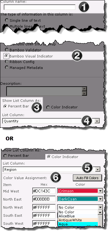
1. From the List Settings menu, click Create column, then enter the Column Name
|
|
2. Select the Bamboo Visual Indicator radio button. The screen will refresh.
|
|
3. From the Show List Column As selectors, choose the desired option.
|
|
4. When Percent Bar is selected, the List Column drop down is filtered to display Number columns in the list.
Keep in Mind:
If the selected number column does not represent content as a Percentage, the values must be entered in .xx to be read correctly.
|
|
5. When the Color Indicator is selected, the List Column drop down is filtered to display Choice or Lookup columns.
Keep in Mind:
Visual Indicator does not support Choice columns in Check box mode, or Lookup columns with multiple selections.
|
|
6.
Assign colors to the unique column values using the following options:
The color associated with a manually entered hex number will not display in the configuration tool pane, but will be displayed in the list. 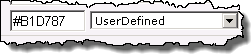
|
|
Overview of Visual Indicator
The Bamboo Visual Indicator gives you two simple methods for displaying list data graphically, depending on the type of data. Visual Indicator columns are essentially display-only columns tied to traditional list columns; if you want to add or change list values do so in the normal choice, lookup, or percentage columns, and these changes are reflected in the visual indicators. You can then hide the traditional, non-visual columns, and display the easier-to read-Visual Indicator columns instead.
Overview of Virtual Map View Web Part
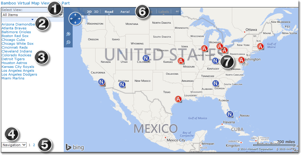
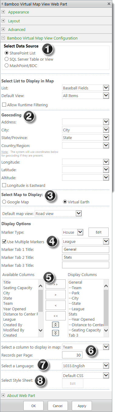
An example of the Virtual Map View displaying the location for each Major League Baseball park in the USA is shown below. Use the numbers shown to learn more about the display features of the web part.
|
Description |
| 1. |
 Select View. This is an optional display feature. You may not see it if it wasn’t configured in the instance of the map you are using. Select View. This is an optional display feature. You may not see it if it wasn’t configured in the instance of the map you are using.
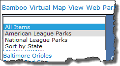
It allows you to select different views of the data to be displayed. Typically, the various views are ones that filter the data different ways.
For example, in our baseball field example, we have a view that includes only the parks from the National League teams and another view that includes only the parks from the American League. Another view is one that includes all the parks, but is sorted by State. The first view on the list (which is the default view) is a view called All Items)) that includes all of the parks, regardless of the League. It is sorted by ID.
Because the map is automatically zoomed to show just the best view of the displayed locations, selecting a view of just the locations in a certain area provides a convenient way to zoom into that area of the map.
In addition to the filter in a view, the sort order is also used for the Virtual Map View display. Choosing a different view may change the sort order of the items displayed in the list on the left side of the display. for example, choosing the sort by State view in our example will display the list of parks sorted by State, even though State is not displayed in the list.
|
| 2. |
Sort Bar. Clicking the arrow on the sort bar will sort the list of items displayed. Clicking it a second time will reverse the sort order.
NOTE: If your list spans multiple pages, the sort impacts just the items on the current page.
|
| 3. |
List of Displayed Locations. The list on the right side includes all the locations that appear on the map, at the particular time. The locations will change if your locations are displayed in pages (see #5 below).
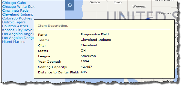 Hover your cursor over a list item and a popup appears listing additional information about the location. The information displayed on this popup is configurable, so if you don’t see something you expect to see, talk to the person who configured the map. Hover your cursor over a list item and a popup appears listing additional information about the location. The information displayed on this popup is configurable, so if you don’t see something you expect to see, talk to the person who configured the map.
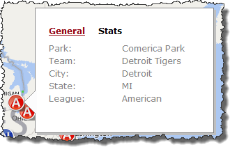 If you click on a list item, that location will be centered on the map and another popup, if configured, will appear next to the marker. This popup is also configured and can show data in up to three different tabs. If you click on a list item, that location will be centered on the map and another popup, if configured, will appear next to the marker. This popup is also configured and can show data in up to three different tabs.
The example shown here has just two tabs: General and Stats. Notice how the order of the displayed information is the same as the list item popup; its just spread across the two tabs.
|
| 4. |
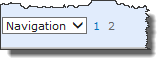 Navigation selection. The Navigation selection will always appear regardless of whether the map is configured to show locations in multiple pages. The options available in the selection are: Navigation selection. The Navigation selection will always appear regardless of whether the map is configured to show locations in multiple pages. The options available in the selection are:
|
| 5. |
Page Navigation. Click the page number to display locations from that page.
Because the map is automatically zoomed to show the best view of the displayed locations, selecting a different page will refresh the map and may zoom into another area of the map since each page includes different locations.
|
| 6. |
Map Provider Tools. Use the standard map user interface to zoom, pan and select the type of background on the map (i.e., simple streets, roads with terrain, aerial views, satellite).
 IMPORTANT: The available tools will depend on the Map Provider used. Available options are GoogleTM or BingTM. IMPORTANT: The available tools will depend on the Map Provider used. Available options are GoogleTM or BingTM.
|
| 7. |
Map Markers. Click a map marker and that location will be centered on the map and the marker pop-up, if configured, will appear next to the marker. This pop-up is configured in the web part tool pane and can show data in up to three different tabs. If you don’t see the data you need, talk with the person responsible for configuring the map.
To close the pop-up, in BingTM just move the cursor to a different location on the map. To close it on a GoogleTM map, click the X in the upper right corner of the pop-up or click another marker.
With the BingTM maps, hovering over the marker will cause the pop-up to appear. No need to click. However, if you want to center the marker on the map, click the marker.
NOTE: Clicking the marker on a GoogleTM map doesn’t center the location. It may shift the map so the popup can be displayed.
|
Overview of Virtual Map Configuration
 Configuring Virtual Map View offers a variety of options from the type of data source to the type of maps and markers to display.
Each of the sections within the configuration tool pane window is divided for ease of use when configuring the web part.
- Data Source for Virtual Map View
- Geocoding
- Select the Map Provider and choose a marker type
- Use Multiple or Custom Markers
- Using Marker Tabs
- Select a column to display and the number of items per page
- Language
- CSS for Virtual Map View
Overview of Video Library
These days, companies need to share more than just documents. From training materials to commercials, companies are accumulating rich media like videos quickly. While SharePoint is pretty good at storing a lot of things, video and audio files have their own needs. Bamboo’s Video Library provides a centralized location for not only storing videos, but for playing them back and sharing them as well. The SharePoint Video Library provides several advantages over a standard Document Library, such as:
- An embedded video/audio player that supports multiple file types.
- Ability to capture and display metadata such as file type, duration, and resolution.
- Display of video thumbnails.
- Storage of media in the library, in a network file share using Bamboo File Share Library (sold separately), or linking to external sources.
- Ability to share links to videos or embed them in another page.
Video Library provides users with a simple but powerful library that is designed specifically for storing media. Upload or link to video and audio files in a variety of formats and locations, and allow users to view media details (like resolution and length) and play content using the embedded media player. Bamboo Video Library lets you centralize and organize your rich media the way it was meant to be.
Also see:
Overview of Validator Column
When a Validator Column is created, the site administrator determines column’s data type, as well as the comparison type to be used in validation — either Pattern, Range, or Value/Column comparison. Then, depending on the comparison type, validation criteria are added. These can include everything from spacing, to preset minimums and maximums, to the inclusion of certain strings, and can be customized programmatically.
If, for example, you wanted to store social security numbers, you would create a Validator Column “set to Pattern Comparison”, and use the built-in preset for Social Security Number.
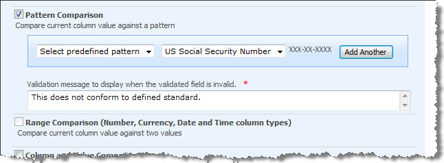
When users attempt to enter a value into the column, the New/Edit form will automatically reject values that don’t match the specified format — in this case, three digits, a dash, two digits, another dash, and four digits — and displays an administrator defined error message.
Overview of Quick Add User Display
The image here shows the Quick Add button in the List Ribbon. 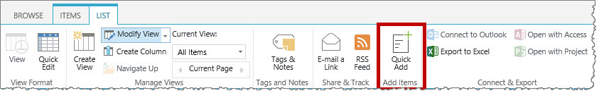 It will show up on any list when the feature is activated; if you know your organization has the Quick Add feature installed, it will not show up in your List Ribbon until your SharePoint admin has activated the feature on your site.
Entering Items through Quick Add
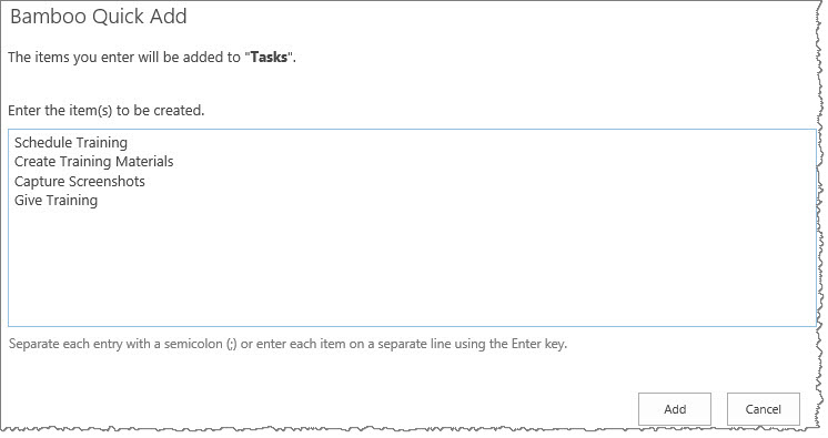 When you enter tasks into the Quick Add form, you will see a prompt confirming that the items you are entering are being added to a specific list; the list name will be in bold text to let you take notice that you are entering the items to the expected list.
Confirming Items Added
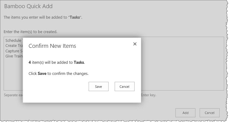 You will get a confirmation screen showing how many items you are adding to the list; click the Save button in order to add the items. Later you can return to the list and update the items as needed, but now you have a way to get some items added to a list very quickly so you don’t forget about them.
Overview of Configuration Tool Pane
 After you first add the web part to a page, you will need to edit the web part so you can configure the options within the tool pane window. There are several that are showing in collapsed view that you will need to expand and set up. Click the topics linked below to learn how to configure that section of the web part.
The Account Request Process
Here’s what happens when a visitor to the site containing User Registration Accelerator makes an Account Request.
- The email address submitted by the user is checked against the Configuration List.
- If it fails to match any of the rules there, the request is denied.
- If it matches a rule, the request procedure continues – if the account request is ultimately successful, the new account will be created according to the specifics of the matching rule.
NOTE: These rules are checked in the order they are stored in the list, so that if the supplied email address falls under multiple rules, User Registration Accelerator will use the earliest one listed.
-
Next, the email address is checked against the Pending Request list.
- If it does not match any of the addresses stored on the list, it is confirmed as an original request, and the request procedure continues.
- If it does match an existing address, the request is denied.
-
Once the system has determined the email address has not already been used to create an account, an email message is sent to the submitted address to confirm its authenticity. At this point, the request is “pending”.
-
When a user clicks the link contained within the authentication email, the new account is created, based on the specifics contained in the Configuration list (determined in Step 2).
-
Finally, a confirmation message is sent to the account’s email address, containing the new user name and password.
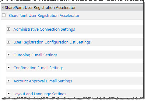
Overview of User Registration Accelerator
Components of the Accelerator
Once installed, the SharePoint User Registration Accelerator gives you the ability to create a central, public-facing location for new users to request their own SharePoint account. The Accelerator consists of three parts, each of which handles a different aspect of the user account creation process.
The User Registration Web Part (URWP) is the only part of the Accelerator accessible to the public. It’s through the Web Part that users enter their account information and ultimately make an account creation request. Additionally, the Web Part’s tool pane contains several administrative options, such as the location of the Configuration List, administrative login credentials, language, and formatting options for confirmation emails.
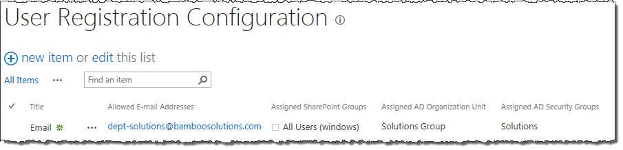 The User Registration Configuration List is automatically created when User Registration Accelerator is added to a page. This list contains any and all custom rules regarding the creation of user accounts, including which domains and email addresses are permitted to register new accounts. Rules are enforced in the order in which they’re listed, so if the email address of an account creation request meets multiple criteria, it will use the first rule in the list it matches.
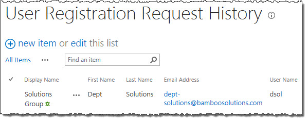 The Request History List contains a full record of all account creation requests, along with other information, including email address (to prevent duplicate account creation) and the status of the request (successful, failed, or pending).
Both lists are automatically created when you add User Registration Accelerator to a page; they are used by the web part and contain the different account creation rules and all account creation requests that have been made, respectively.
The Account Request Process
Here’s what happens when a visitor to the site containing User Registration Accelerator makes an Account Request.
- The email address submitted by the user is checked against the Configuration List.
- If it fails to match any of the rules there, the request is denied.
- If it matches a rule, the request procedure continues – if the account request is ultimately successful, the new account will be created according to the specifics of the matching rule.
NOTE: These rules are checked in the order they are stored in the list, so that if the supplied email address falls under multiple rules, User Registration Accelerator will use the earliest one listed.
-
Next, the email address is checked against the Pending Request list.
- If it does not match any of the addresses stored on the list, it is confirmed as an original request, and the request procedure continues.
- If it does match an existing address, the request is denied.
-
Once the system has determined the email address has not already been used to create an account, an email message is sent to the submitted address to confirm its authenticity. At this point, the request is “pending”.
-
When a user clicks the link contained within the authentication email, the new account is created, based on the specifics contained in the Configuration list (determined in Step 2).
-
Finally, a confirmation message is sent to the account’s email address, containing the new user name and password.
Overview of User Redirect Web Part
Microsoft’s Windows SharePoint Technology and Services, which includes SharePoint Portal Server (SPS) and Windows SharePoint Services (WSS) allows teams to create Web portals for information sharing and document collaboration that helps increase individual and team productivity. It also serves as a platform for application development, providing IT resources as portals, team workspaces, e-mail, presence awareness, and Web-based conferencing. SharePoint enables developers to quickly build collaborative applications based on a robust set of out-of-the-box functionalities.
As a collaboration platform, information stored in SharePoint is often shared with immediate team members as well as corporate employees, and external people such as clients, vendors, and partners. While it is very easy to share information in SharePoint to a wide audience, the other important factor is to restrict access to certain information in the portal by set up appropriate user security access. This is especially important with external users such as clients and partners where you want them to only “need-to-know” pages. As the system admin, you can create a security structure to enforce user access to the system by several methods:
-
User authentication through IIS. This is the first level of security. SP does not perform its own authentication, but rather rely on IIS. Authentication is the process of verification of identity of a person or process that needs access to SP server. IIS authentication mechanism requires an NT account, either local machine or Active Directory (AD) account.
-
Site Groups Permissions. Site groups let you specify which of your users can perform specific actions in your site. For example, a user who is a member of the Contributor site group can add content to Windows SharePoint Services lists, such as the Task list, or a document library.
-
Per-list Permissions. You can manage permissions more finely by setting unique permissions on a per-list basis. For example, if you have a document library containing sensitive financial data for the next fiscal year, you can restrict access to that list so that only the appropriate users can view it. Per-list permissions override site-wide permissions for the lists.
-
Site Collection Permissions. You can also manage user at the Site Collection level. A Site Collection is a set of logically related Web Sites that can be collectively managed, and each Site Collection has a single top level Web Site. Site Collection permission is managed trough setting up Cross Site Groups. Users can be added to cross site group where they are rolled up at the site collection level, and can be managed at that level and are scoped to the site collection level.
From a practical implementation level, implement access policy for external users can be complicated and time consuming affair due to:
- All users have access to home page and top level menu by default, so limiting a sub site or a page to a set of user have to be well designed and throughout tested.
- Site Group and Cross Site Group can be used to enforce security access, but will often break down when users belongs to multiple groups, especially when there are mix use of these group both as security and functional areas.
- It is a tedious process to set up the security and test all possible combination of navigation, especially for a larger site where site administrator have the freedom to create links to other sites within the portal.
The User Redirect Web Part will provide the portal admin a simple way to route users from the sites where they are not suppose to have access.
Overview of User Redirect Configuration Tool Pane
User Redirect displays the list of users, allowing the administrator to define redirect paths. When a user accesses a page in SharePoint, the web part redirects the user to the specified destination URL if the user is on the redirect list. A different redirect page can be identified for each specified user. With User Redirect, you can have pages that are restricted for most users but allow certain users to access them.
After User Redirect is added to the page, you have three configuration decisions to make:
- Determine if you want to allow or restrict access for selected user(s)
- Identify users to be allowed or restricted
- Identify the page to which users will be redirected.
To customize User Redirect, edit the web part.
The tool pane is displayed on the right side of the screen:
Overview of User Manager for Sites
When you first access the site where the User Manager for Sites Web Part is installed, you see the default User Manager for Sites console as shown below.
The main user interface elements for this Web Part are described in the table below:
| Option |
Action |
Result |
| 1. |
New |
Click this button to create new users or groups depending on what you have selected in the tree. |
| 2. |
Actions |
Click this button to delete or e-mail a group, or delete or e-mail a user depending on what you have selected in the tree. |
| 3. |
Settings |
The site collection administrator uses these menu items to configure e-mail settings, user setup properties, user profile properties and excluded users. See Configuration Overview for more information. |
| 4. |
Breadcrumb |
The breadcrumb displays your navigation path from the root node of the tree. The information that is displayed is either user or site depending upon your current selection. |
| 5. |
View Pane |
The view pane allows you to select a view of your user collection in the following ways:
- Organization: Display users in a hierarchical tree by organizational unit (OU) structure in Active Directory starting with the specified OU configured in the tool pane.
- Alphabetical: Display all the users sorted by Last Name, First Name.
- Sites: Display all the sites within the site collection where the Web Part is installed. Expand each site node to see the groups and users for each site. You can also view all the groups in one view for each site (including the top level site) under the Groups node.
|
| 6. |
Tree View |
Located in the left view pane, the tree allows users to navigate and select nodes based on the current view. |
| 7. |
Search |
Enter a user’s last name or first name. Search results are shown under the Search Results bar in the view pane. The Search Results bar appears after running a search. |
Overview of User Profile Plus Web Part
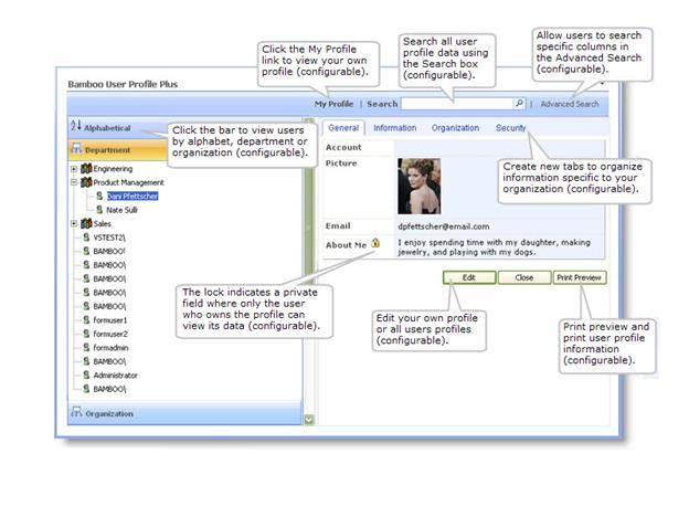 With User Profile Plus added to a page in your site, you will have a variety of activities you can perform directly from the web part. The left navigation window may be configured to let you view users alphabetically or by department. You can view (or edit if it has been configured) your own user profile. The web part allows you to search profile data through the simple search box; or when you click on the Advanced Search box, you have more options by which to search for users.
The Advanced Search window can be configured to show the following display options:
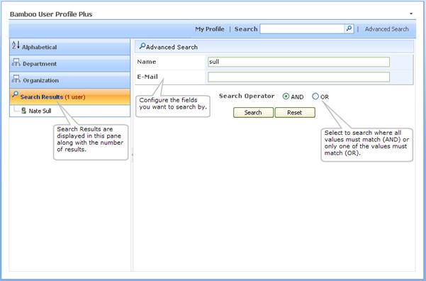
If you see different columns, check with your site administrator to see whether it has been configured with a different set of criteria.
Configuration Overview of User Manager for Sites
To configure User Manager for Sites, edit the web part and follow the steps in the table below. User Manager for Sites also has a Settings menu on its tool bar. See Settings Menu in the Toolbar to review the settings that are configurable under this toolbar menu.
| Image |
Step |
Action |
Description |
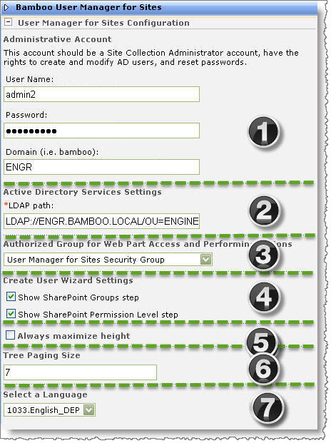 |
1. |
Administrative Account |
Enter the User Name, Password and the Domain of an account that a Site Collection Administrator has rights on which to create and modify Active Directory users and rights to reset Active Directory user passwords. |
| 2. |
Active Directory Services Settings |
Enter the LDAP path where you want users created in Active Directory. |
| 3. |
Authorized Group for Web Part Access and Performing Actions |
Site Collection Administrators can access the web part and perform actions by default. However, if you want to delegate user management to site administrators or designated administrators, then it is recommended that you create a SharePoint group specifically for these users and select that group here. |
| 4. |
Create User Wizard Settings |
Select from the following to determine whether you want admin users to assign SharePoint user groups and permission levels.
IMPORTANT: If you do not select one or both of these check boxes, then a new user account is created ONLY in Active Directory.
- Show SharePoint Groups step. Select this check box to allow the authorized group users to assign a SharePoint group during new user account creation.
- Show SharePoint Permission Level step. Select this check box to allow the authorized group users to assign a SharePoint permission level during new user account creation.
|
| 5. |
Always maximize height |
Select this check box to allow the User Manager for Sites interface to change its height based on the number of items shown in the tree. |
| 6. |
Tree Paging Size |
Enter the number of child nodes displayed in the tree at a time. If you enter “7”, then seven child nodes will be displayed at a time with a View more… link following the last child node. Click the View more… link to show another 7 child nodes. |
| 7. |
Select a Language |
Pull down the drop-down box to select a language other than English. (Steps to localize language can be found here.) |
Overview of User Display Custom Identifier
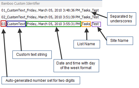 As an end user, what you see depends on how your admin has configured the column. Custom Identifier Column can generate a unique identifier as illustrated here.
NOTE: Custom Identifier Column does not display on the New Item form or the Edit Item forms. It is only displayed in the Display form and List views (where assigned).
Overview of User Directory Web Part
Many companies use Active Directory Services to manage their users. With the addition of SharePoint, another user directory database has been introduced – the User Profile Database. But even with SharePoint features such as Single Sign On and automatic importing of Active Directory profile information to SharePoint, the bulk of the workload to maintain user information is still on the Administrator. What is lacking is a way to allow the owners of the user information to maintain it themselves, both safely and securely, using either database as their directory service source.
User Directory provides a quick and easy way to manage real-time user information in the SharePoint User Profile and Active Directory Services databases. User Directory takes user management one step further to make SharePoint the central place for managing directory services. 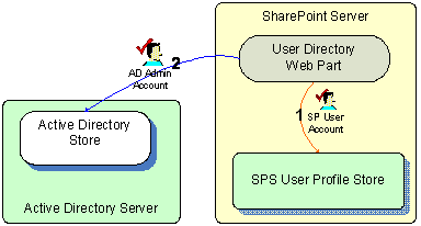 Maintain your current IT user administration policies and standards by providing an easy to use, SharePoint-based self-service directory for users to maintain on their own.
User Directory reads and updates user profile data from SharePoint Portal Server’s User Profile database or an Active Directory database. The diagram shown here depicts how each of these components fit together as part of the solution.
Overview of User Account Setup Web Part
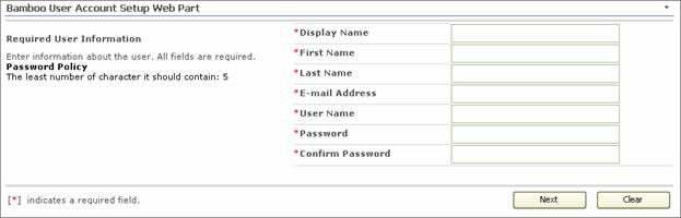 User Account Setup is typically added to a page within your site. When a user with Administrator Site Group access visits the page, they can add new users to both SharePoint and Active Directory or local NT.
NOTE: The user can click the Clear button to clear text in all the fields on the Web Part.
After the User Account Setup Web Part is configured, users follow a simple one or two-step process to create accounts.
- Enter account information; all columns are required fields.
- If configured as an option, select Active Directory and SharePoint group membership and permission levels.
When the request is submitted, and after an optional approval process is complete, the account is created in Active Directory, or the local server, or SQL membership provider, which are also configured in SharePoint.
Overview of the Updated Installation Process for Bamboo components
In April 2017, with the Q1 Cumulative Update (CU) Bamboo introduced updated install/uninstall processes for component products (web parts). Instead of the Setup.exe Installation Application, we now supply two PowerShell scripts – one for Install/Upgrade and the other for Uninstall – to be used to install, upgrade, or uninstall the product. The install package downloaded from My Bamboo is now a *.zip file rather than a self-extracting executable.
The installation process was updated based on feedback from our customers. We are excited about the benefits the new processes offer:
| Benefits |
| The processes are now very transparent; you know exactly what happens during the install/upgrade/uninstall. If you want/need to modify the scripts for your farm, you can do that. |
| If you are upgrading to a new version of a Bamboo product or if a new install updates a shared component used by another Bamboo product installed previously, the installed solution is saved before the upgrade. If the new install fails, you can easily rollback to the previously installed solution. |
| Rather than deploying each solution individually, deployments are queued which minimizes farm disruption by reducing the IIS Resets on the farm. |
| By design, the scripts are written to be compatible with PowerShell versions found on an SP2010 WFE server. Written to use the features of the older version of PowerShell, the scripts are simple and should work the same in all environments. If you would prefer to employ some PowerShell features available in new versions (e.g., output results to the grid/table), you can modify the scripts to use the PowerShell features available in your environment. |
|
Please note the following for the new scripts:
- The script installs all the WSPs found in the installation folder, in alpha order
- The install/upgrade script deploys to all content web apps. If you would prefer to deploy to a single web app, you can modify the script or deploy via Central Administration.
- Uses Upgrade instead of Install for existing components.
For additional information about how to use the updated processes:
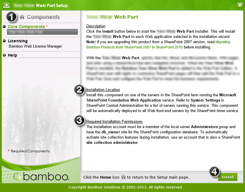
Overview of the Installation/Setup Program
IMPORTANT: As of April 2017, Bamboo no longer includes the Installation/Setup Program in product download packages. Please see Overview of the Updated Installation Process for Bamboo components for details.
There are several areas of note in the Installation/Setup program interface, shown below.
 |
| No. |
Function |
| 1. |
The Setup program contains links to various product components listed under the Components header on the left. Click on any of these links to view additional information about the component on the right.
The product components fall into the following categories:
- Prerequisites: Some products include prerequisite components that must be installed before the Bamboo product core components. Not all products will have prerequisites. Examples of prerequisites include the Microsoft Exchange Web Services (EWS) Managed API, Shared Assemblies Library, Microsoft AJAX Extensions, and Bamboo AJAX Config. If you have more than one Bamboo product installed on your farm, some of the pre-requisites may already be installed.
- Core Components: The product will include one or more core components that are required for the Bamboo product to work.
- Optional Items: Optional items provide additional features or functionality but are not required to use the Bamboo product. Not all products will have optional items.
- Licensing: All products will include the Bamboo Web License Manager or Bamboo License Manager. Licensing is required to activate a product license. It is not required during 30-day product trials. If you have previously installed the Bamboo Web License Manager with another Bamboo product, it may not be necessary for you to install it again.
- Help: When clicking the Help component, you will see links for the Online Documentation and other product-related resources.
Click the Home icon ( ) at the top of the components list to return to the Setup main page. ) at the top of the components list to return to the Setup main page.
|
| 2. |
The Installation Location section will tell you where to run the Installation/Setup program for the selected component. Read this information carefully before proceeding. |
| 3. |
The Required Installation Permissions section will explain required permissions for the selected component. Read this information carefully before proceeding. If the person running the installation/setup doesn’t have the appropriate level of permission, the install will fail. |
| 4. |
When ready, click the Install button to begin the installation process. It will
- do a few system checks,
- ask you to agree to our End User License Agreement,
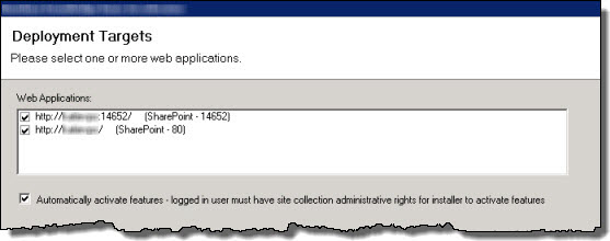
- ask which Web Applications you want to install to (you don’t have to pick any), and
- ask if you want to automatically activate the solution on the selected web apps.
When the install is complete, it will display an Installation Summary that you should review carefully. See an example below.
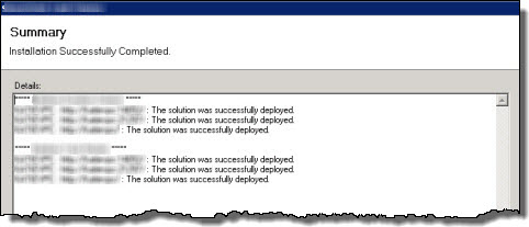
|
Click here for information about running the installation or go back to Installing for the first time… topics.
Overview of the Rating Column configuration screen
 Bamboo Rating Column is a custom column type that can be added to a List or Library to allow users to rate content.
When using Rating Column keep these things in mind:
- Rating Column can be used to rate SharePoint Site pages
- You can set up one of three types of ratings
- If you change from one type to another, your ratings will be reset
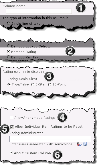
The above image has been edited to better represent the configuration options |
| Function |
|
1. From the List Settings menu click Create column, then enter the Column Name
|
|
2. Select the Bamboo Rating radio button. The screen will refresh.
|
|
3. Use the radio buttons to select the Rating Scale Size from the following options:
The screen will refresh to expose the configuration fields appropriate for your selection
|
|
4. Decide whether anonymous users or authenticated users only will be able to rate content
Do not Allow Anonymous Ratings is the default setting
-
In this mode Anonymous users cannot rate content, but they will be able to view the average rating.
-
Ratings from Authenticated users are stored, ensuring that there is only one rating per user. Users can modify their ratings at any time.
OR
Check the Allow Anonymous Ratings check box to allow both Anonymous and Authenticated users to rate content.
-
User information is not maintained in this mode; just the number of ratings and the average rating, making the feedback anonymous from all users.
-
Users can rate content an unlimited number of times.
|
|
5. Allow Individual Ratings to be Reset
This option which is not selected by default, allows designated users the ability to reset ratings for a specific item.
Use the People Picker and Check Name functions, to add Ratings Administrators
|
6.
Expand About Custom Column to see version information for the column
See the Release Notes for additional information on your release |
|
|
Overview of User Account Setup Configuration
 User Account Setup allows authorized SharePoint users to add accounts in Active Directory Services, the local Windows server, or a SQL membership provider. The new account can simultaneously be added to SharePoint, with updated profile information and SharePoint group membership. Need the ability to approve new accounts before they are created? User Account Setup provides a configurable approval process, with customizable notifications and a simple Web-based approval form. New account transactions can also be logged, with relevant account data stored in a custom SharePoint list for easy retrieval and review. Configure User Account Setup following the steps below.
First, add the web part to a pageand then follow the links below to configure User Account Setup.
-
Security Settings for User Account Setup
-
Display Settings for User Account Setup
-
Language Settings
-
Authentication Providers and Required Permissions
-
Active Directory Services Settings
-
Account Approval Settings
- Audit Log Configuration
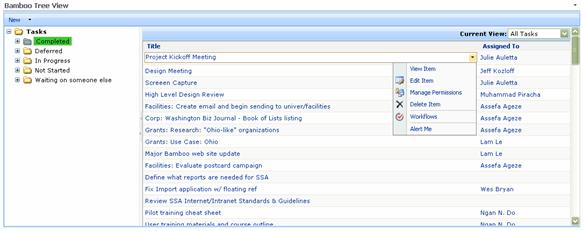
Overview of Tree View
The Tree View Web Part displays list, library, discussion and wiki items, as well as site navigation, in a hierarchical structure allowing the user to navigate to the information much like the navigational structure of Windows File Explorer. This tree view structure allows users to quickly view the content structure of the list, library, discussion or wiki and visually determine the fastest way to locate an item.
SharePoint Document and Picture Libraries
Folder items are displayed in the left pane while their contents are displayed in the right pane. The user clicks to expand a folder item in the left pane to view sub folders. Users select a folder to view its contents in the right pane. If a list has no groupings or a library has no folders, then all items are displayed in the right pane when the user selects the top node for the list or library in the left pane.
You can also create new documents or folders, upload documents, and perform standard SharePoint actions (depending on your list/library configuration settings) by using the New, Upload and Action buttons on the toolbar.
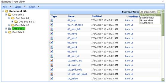
SharePoint List Views
When displaying a SharePoint List in the Tree View Web Part, the tree hierarchy can display the Group By configuration of the selected list view or a folder hierarchy depending on the option selected in the Web Part tool pane. In other words, if you selected to display your Tree View items in the All Tasks view and you configured the All Tasks view to be grouped by “Status” then each grouping is displayed in the left pane as a folder and displays the items related to that grouping in the right pane. You only see a tree structure for a view if the selected view has been configured to group list items by one or more columns.
Users can also create new List items in the configured List using the New button just over the left pane.
Overview of TTM’s Timesheet Entry Web Part
Before you start to use Time Tracking and Management (TTM) you will need to configure the Timesheet Entry Web Part to reference the appropriate data-sources for your implemetation. This configuration is a mandatory step in the Time Tracking configuration checklist.
When configuring the Timesheet Entry Web Part keep in mind:
-
You will need to identify data-sources for the following:
- Tasks
- Administrative Time
- Resources
-
The TTM configuration decision map is available to help determine how you should configure the Web Part.
-
Information on using the Timesheet Entry Web Part is available here
To configure the Timesheet Entry Web Part:
| Step |
Action |
| 1. |
From the TTM site, click the Timesheet Entry link in the TTM quick launch
OR
Use the link in the Time Tracking configuration checklist.
|
| 2. |
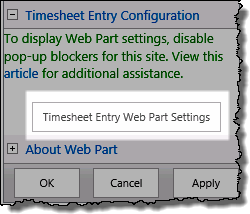
Edit the Timesheet Entry Web Part and click the Timesheet Entry Web Part Settings button to access the pop-up configuration window
IMPORTANT: If you don’t see the dialog screen (shown below), make sure that you have disabled popup blockers for this site.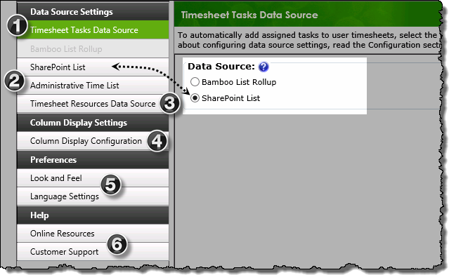
|
| 3. |
Use the left hand navigation to access the appropriate configuration screens:
| # |
Function |
| 1 |
Timesheet Tasks Data Source:
Use the radio buttons to Select a Task Data Source from ONE of the following
options:
- Bamboo List Rollup:
Select this option if your task list is one of the following, and then configure the Bamboo List Rollup settings described below:
- A task list in a Bamboo Project Management Central site.
- A Bamboo List Rollup configured for task lists in other sites.
- SharePoint List:
Select this option if your task list is one of the following, and then configure the SharePoint List settings described below.
- The default Timesheet Tasks list included with Time Tracking and Management.
- A SharePoint Tasks list in another site.
The corresponding button will be available in the navigation pane, allowing you to access the data-source’s configuration screen.
|
| 2. |
Administrative Time
By default Timesheet Entry Web Part uses the local Administrative Time list to track time that is not related to a specific project.
- If you will use this default list no further configuration is required in this section,
Otherwise…
- Configure the Web Part to use another SharePoint list to define Administrative Time
|
| 3. |
Timesheet Resources data source
Select a Resource Data Source from ONE of the following
options:
- Timesheet Resources – this is the default setting and uses the local Timesheet Resources list to get information about users.
- If you will use this list then no configuration is required in this section.
- PM Central Enterprise Resource Pool (ERP)
|
| 4. |
Column Display Settings:
|
| 5 |
Preferences
|
| 6. |
Help
- Click Customer Support to access available online resources for the web part.
- If you are unable to find the answer to your question with these resources, our Customer Support engineers are standing by to help.
|
|
| 4. |
Click Save & Close to commit the changes and exit pop-up configuration screen.
To return to the Time Tracking configuration checklist, use the Time Tracking link in the TTM quick launch menu
To mark this item as complete in the checklist, click the
 button for the item. button for the item.
More information on using the checklist is available here |
Overview of Time Tracking and Management
When Time Tracking and Management is installed, a new site template called Time Tracking and Management is added to the SharePoint Create screen. A SharePoint user with rights to create new sites can select the Time Tracking and Management Site template to create a new time tracking site.
Time Tracking and Management allows you to enter hours spent on administrative and project tasks. You can save time entered in your timesheet each day, or enter time all at once. When you are ready, submit your timesheet to your timesheet manager for approval. To be able to enter time in a timesheet, the following requirements must be met:
- Your account must be configured in the Timesheet Resources list or in the Project Management Central resources list.
- A timesheet reporting period must exist for the dates you want to enter time for.
- Once these requirements are met, simply browse to the timesheet you want to complete and enter time.
Once the site is created, users can then conduct the following tasks:
Overview of the localization process for Bamboo Products
Bamboo Products have been designed with Localization in mind. Localization is the process of customizing your application for a given culture and locale.
Localized resources, or translated text strings, in SharePoint use the localization features of the .Net Framework for displaying user interface labels appropriate for a particular user’s culture and locale.
SharePoint implements Resource (.resx) files in different ways and locations depending on the type of SharePoint functionality that is being localized. For the functionality included in Bamboo Products, you may find resource files in these general areas:
-
Site and List Definitions can have resources located in the 12/14/15 Hive Resources folder
-
Web applications and custom pages can have resources that are located in the 12/14/15 Hive CONFIGResources folder and are copied at Web App creation time to the App_GlobalResources folder located under each SharePoint Web Application
-
Web parts can have their resources compiled into their own set of resource files which can then be located either in the GAC, or in a sub-directory of the bin folder. Bamboo web part resources are stored in a subdirectory of the bin folder.
Depending on the Bamboo Product you need to localize, you may need to look in all three areas. For example, PM Central includes List Definitions, Custom Pages, and Web Parts. Group Email, on the other hand is a simple web part. Use the links below to get to the information appropriate for your Bamboo product.
Overview of the PM Central Installation
 Project Management Central is typically installed like other Bamboo products, by using the Installation/Setup program. For other options, see Options for Installing
Like other Bamboo products, there are Core Components and Optional ones to install. The Project Management Central core component includes 33 features and typically takes about 30 minutes to install. The Bamboo PM Central Administration component includes the PM Central pages displayed from within SharePoint Central Administration.
Before installing any component, we recommend you read Best Practices for a successful install.
You decide whether to install the Optional Items based on the way you plan to use PM Central. The descriptions below will help you decide whether or not to install:
- Alert Plus Timer Job. The Alert Plus Timer Job is required if you want to use Alert Plus alerts in PM Central and you haven’t installed it previously on your SharePoint farm. The most beneficial feature of Alert Plus from a project management perspective is that it allows you to send reminder alerts to project team members when they forget to update their task information. It also sends reminders to task assignees when a task is coming due; this helps to minimize late tasks and keep the project schedule on track.
- Alert Plus Utilities. If you are upgrading Alert Plus (included with SharePoint Project Management Central) from a previous version, these utilities are needed to update existing alerts to leverage new features. If you are installing PM Central (and Alert Plus) for the first time, you do not need to install/run this utility. However, it is a good idea to keep it around on a WFE server in case you need it later. See Overview of the Alert Plus Utilities for more information.
- Microsoft Project Add-In. If your Project Managers (PMs) like to build their project plans with Microsoft Project, they should install this Add-In on the PC where they run MS Project. With the Add-In, they exchange task data between PM Central and Microsoft Project. See Installing the Microsoft Project Add-In for PM Central for more information.
- Bamboo Feature Activation. PM Central has several site collection features that need to be activated before use. You can activate these features automatically in the site collections of the selected web applications during the initial install. However, you may choose to activate the features manually if you don’t want them automatically activated in all site collections. Use this tool to quickly and easily activate the correct features. See Using the Bamboo Feature Activation tool to activate features for more information.
- Workflow Start Feature. The Workflow Start Feature allows custom workflow start buttons to be added to the Item ribbon of lists in SharePoint 2010 or 2013. This feature can be used in conjunction with a workflow tool like Workflow Conductor (sold separately) to help automate processes such as project site creation and change request approval.
You need to install the Web License Manager only if you are ready to activate a purchased license and you haven’t installed it previously on your farm. The Web License Manager is included with all Bamboo products and one installation is used to activate any/all products you may have installed on your farm. See Installing the Bamboo Web License Manager for more information.
Overview of the List Rollup Web Parts
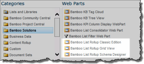 After successfully installing, deploying, and activating the List Rollup product, you will see three web parts in your web part gallery when you begin to add a web part to a page:
- Bamboo List Rollup Classic Edition (retired)
- Bamboo List Rollup Grid View
- Bamboo List Rollup Schema Designer
Use the information in the table below to decide which to use and when.
| Web Part |
Description |
|
Bamboo List Rollup Schema Designer
Use this first to design a Schema!
|
The List RollupSchema Designer is used to define schemas. Schemas describe the data that you want to roll up. Although you can preview data in the Schema Designer, it is not used to display data for end users. Use the List Rollup Grid View instead to display the data.
Although you can put this web part on any page in any site, it is best to put it on one page per site. When you add the web part to a page, a list called Bamboo List Rollup Configuration is created. This list is where schema definitions are stored. Since only one list of this name can reside in a site, all List Rollup Schema Designer Web Parts on the site will use the same list.
Consider putting your List Rollup Schema Designer Web Part on one page per site collection, so your schema definitions can be managed in a central location.
For more information, see:
|
Bamboo List Rollup Grid View
Use this web part to display the data in the schema you designed!
|
The List Rollup Grid View web part is used to display the data defined in the schema definition. You can put this web part on any page on any site in your portal.
For more information, see:
If you own the Data Viewer Web Part, Calendar Plus Web Part, Chart Plus Web Part, List Search Advanced or Alert Plus Web Part, you can also use them with a List Rollup Schema. Click the link to the product for more information.
|
| Bamboo List Rollup Classic Edition (Retired) |
IMPORTANT: This Web Part has been retired and is no longer available as of List Rollup 7.0. Please see Migrate an existing List Rollup Data View to the new List Rollup Schema Architecture to learn how to migrate old rollups.
The List Rollup Classic Edition Web Part was previously used to create Rollups Data Views. This is the original List Rollup web part and is now retired. It is included in the package to support customers who may still have it in use. We recommend that list rollups created with this web part be migrated to a schema-based rollups for better performance.
|
List Rollup Schema Designer Configuration Options
Once you add the web part to a page, you can configure the display settings in the List Rollup Schema Designer tool pane.
| Setting |
Description |
| Header Options |
These options allow you to show or hide the various settings found in the header of the Web Part.  |
| Look and Feel Settings |
Select the style applied to the Web Part.
- Use Default Style – This setting will use Bamboo’s default settings for the Web Part theme.
- Inherit Site Theme – This setting will attempt to inherit most fonts, colors, etc. from the values used by the current site theme in SharePoint.
- Create Custom Style – This setting will allow you to customize the various fonts, colors, borders, etc. in the Web Part.
|
| Select a Language |
All you need to do is select the Language that you want to use.
See Localize Bamboo Web Parts for your Language for more information about translation and languages.
After selecting the language, click Apply and then OK to save your configuration and close the tool pane. Otherwise, click Cancel to close the tool pane without saving any changes.
|
NOTE: The page does not need to be in Edit mode in order to create a schema.
See Create a new List Rollup Schema or Edit an existing List Rollup Schema for information about creating a new or editing an existing List Rollup schema definition.
List Rollup Grid View Configuration Options
 Once you add the web part to a page, there isn’t a lot to configure in the List Rollup Grid View tool pane. All you need to do is:
- Choose who should be able to modify the grid view settings, which is done from the browser. Enter a SharePoint Group name and click Check Names (
 ) to make sure you entered it correctly. Alternatively, use the people finder (
 ) to search for the group name. Separate multiple group names with a semi-colon (;). Everyone in the group(s) identified will be able to modify the settings of the display.
- Choose a style for displaying the web part. See List Rollup Grid View Skins for visual examples of each choice and Custom CSS for more information about customizing the CSS.
- Choose the settings for the rest of the Web Part layout. Select from the default Bamboo theme, inheriting the SharePoint theme, or creating a custom theme (requires version 7.0 or later).
- Select the Language that you want to use. See Localize Bamboo Web Parts for your Language for more information about translation and languages.
When ready, click Apply and then OK to save your configuration and close the web part tool pane.
List Rollup Classic Configuration Options
 Once you add the web part to a page, there isn’t a lot to configure in the List Rollup Classic Edition Web Part tool pane. All you need to do is select the Language that you want to use.
See Localize Bamboo Web Parts for your Language for more information about translation and languages.
After selecting the language, click Apply and then OK to save your configuration and close the tool pane. Otherwise, click Cancel to close the tool pane without saving any changes.
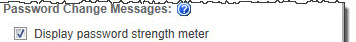
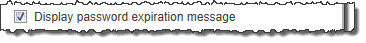
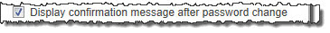
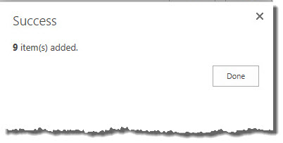


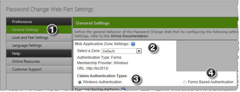
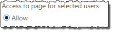
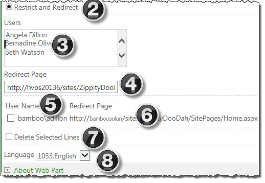
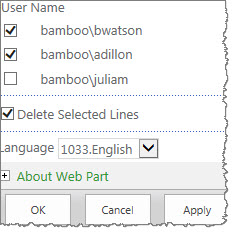
 Community Central is a flexible, scalable, and affordable knowledge-sharing application, complete with forums, blogs, and social networking features like ratings and scoring for top contributors.
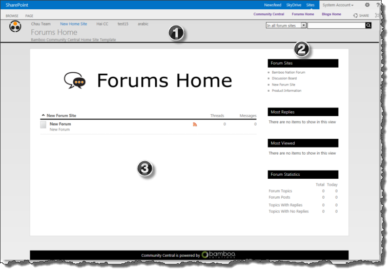 Forum sites are sub-sites of the Community Central Home site and collect related forums.
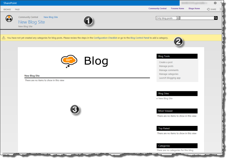 Blog sites are also sub-sites of the Community Central Home site and collect related blog posts.
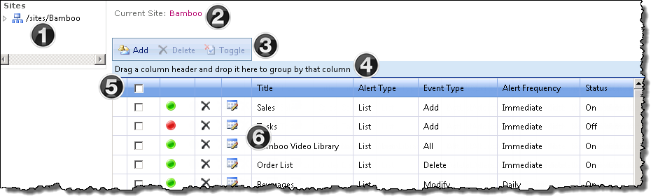
 Clicking the site name hyperlink will take you to the site’s home page
 From the toolbar you can
  SharePoint alerts will be displayed in the console for the selected site and can be
  The select all checkbox in the upper left allows you to quickly Delete or Toggle the alerts shown on the current page
  Each item has icons that allow you to