-
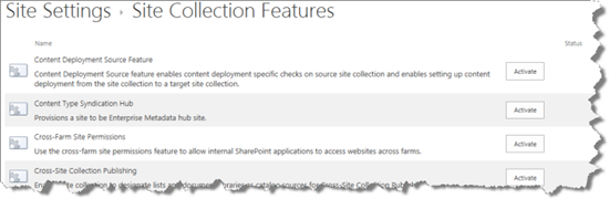
Verify that the associated product feature is active in the site collection by following the instructions for Activating a Bamboo Site Collection Feature. If you are wondering which Site Collection Feature to activate for your product, refer to.
-
If the product feature is active but you still have problems adding it to the site, deactivate it and then activate it again.
-
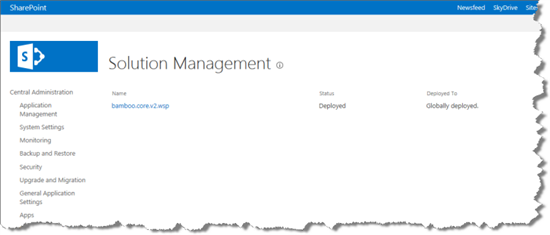
If the product feature is not available to the site collection, verify that the product was successfully deployed to the Web Application. Deployment status can be verified in SharePoint Central Administration > System Settings > Manage Farm Solutions. If you are using WSSv3/MOSS, its in SharePoint Central Administration > Operations > Solution Management.
-
If the product does not appear in the list of Farm Solutions in Central Administration, it hasn’t yet been installed on the farm.
-
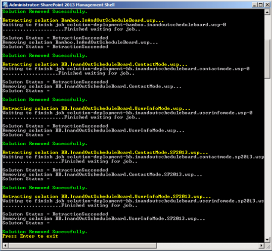
If the product shows a status of “Error” in the Farm Solutions list in Central Administration, Retract and then Remove the solution before running the Installation/Setup Program again to reinstall it. Refer to How to run the Installation-Setup Program for more information.
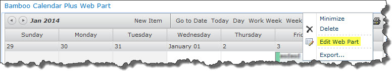
How to Use Calendar Plus with Web Part Connections
Calendar Plus can be connected to other SharePoint lists if the data source for Calendar Plus is a list or List Rollup.
This feature is available for a single list as a source.
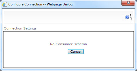
Note: If the user has multiple lists as source, Web Part Connections cannot be used. In this case, when attempting to use Web Part Connections for filtering, after selecting Consume Filter From, the following pop-up window will be displayed.
Filter Using Web Part Connection for a Single List as a Source
| Step | Action | Result |
| 1. | Create a standard SharePoint list containing team members responsible for various tasks. | |
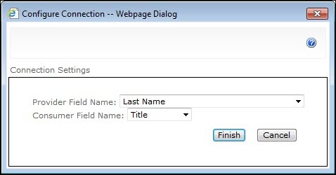
| 2. | Open the web part menu and select Connections > Send Row of Data To | 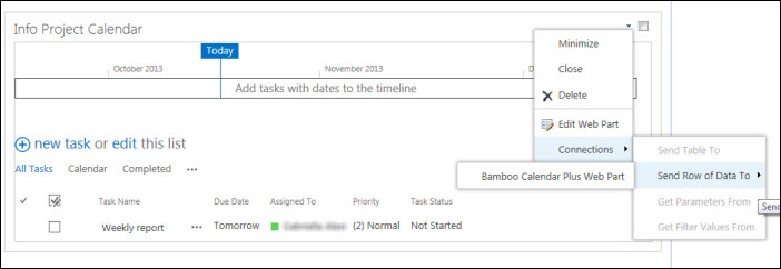 Select the column that contains the Provider Field Name and Consumer Field Name.
|
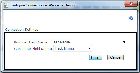
| 3. | Alternatively, you can make the connection from Calendar Plus, via Connections > Consume Filter From > Person responsible. | 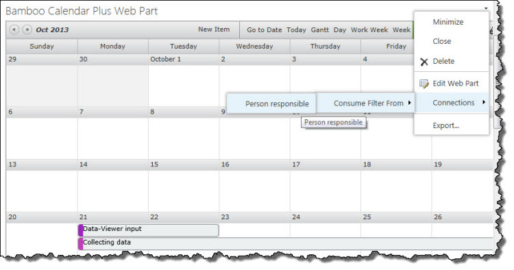
|
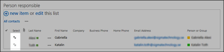
| 4. |
Once your List View Web Part (in this example, Person responsible) is added to the page, you can filter based on a selected view.
|
 |
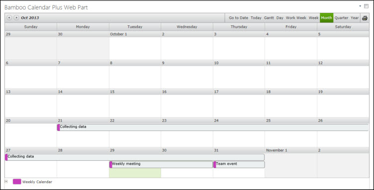
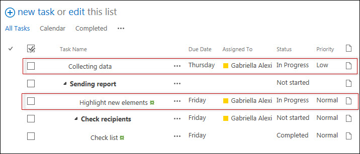
| 5. | The following example shows the Calendar displaying the assigned tasks for both persons set in Person responsible List View. |
|
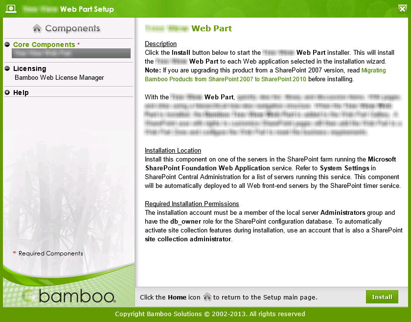 Double-click the product EXE file to extract the contents of the product download.
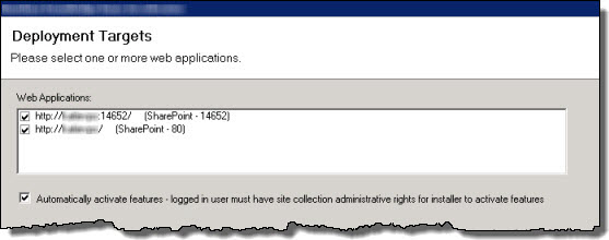

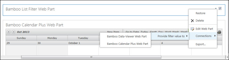
How to Filter Data Using the List Filter Web Part
Filter Data Using List Filter Web Part
Calendar Plus allows the user to filter calendar data via the List Filter Web Part in case of a single list.
Note: If the calendar is set up to display multiple lists, it is not possible to connect to a List Filter Web Part and you will receive the following notification.

To connect and configure a List Filter Web Part, follow the procedures described below after you add the List Filter web part to the page.
Connecting the List Filter Web Part to Calendar Plus
| Step | Action | Result |
| 1. | From the List Filter Web Part’s Edit menu, Select Connections > Provide filter value to > Bamboo *Calendar Plus. |
|
Filtering via the List Filter Web Part
| Step | Action | Result |
| 1. | The List Filter Web Part must be connected to a SharePoint List Web Part before it can be configured. Otherwise, you’ll see this message in the tool pane when you attempt to configure the web part. | 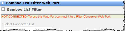 |
| 2. | If you haven’t already done so, add the Web Part that should receive filtered data to the current page. | |
| 3. | From the Site Actions page, select Edit Page. | |
| 4. |
From the List Filter Web Part’s Edit menu, select Connections > Send Filter Values To > (your destination Web Part).
|
|
| 5. | Once you have established the connection between the Calendar Plus and the List Filter Web Parts, you can filter calendar data by configuring the List Filter Web Part and entering filter value. | 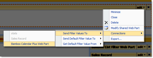 |
| 6. | When you add the List Filter Web Part to the page, it will indicate that it needs to be configured, as shown here. | 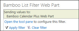 |
| 7. | To configure the Web Part, either click the link, or, from the menu located in the top right corner of the web part, select Modify Shared Web Part. Either way, the tool pane will open. | The settings are pictured below.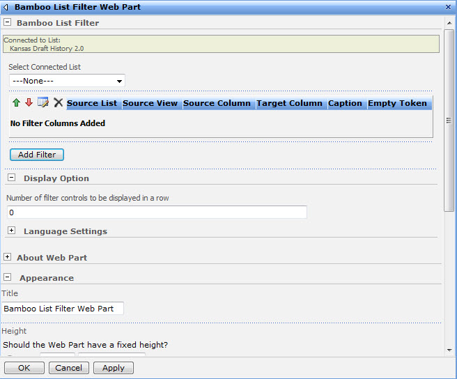 |
| 8. | Select Calendar Plus from the drop-down menu under Select Connected List. |
|
| 9. | To add a filter column, click the Add Filter button and the following controls will display. | 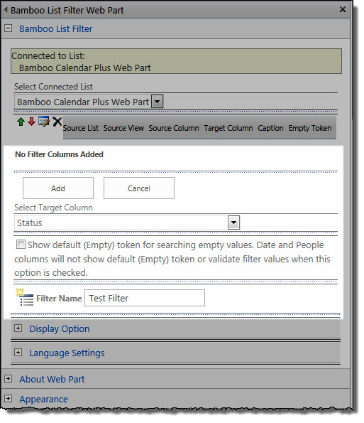 |
| 10. |
First, select the target column from the drop-down menu. This is the column that the filter will be matched against. In the example below calendar data will be filtered based on Status.
|
|
| 11. | To make the default filter value “(Empty)”, select the corresponding checkbox located below the Select Target Column option. | |
| 12. | Enter a name for your filter column. Click Add and then OK. |
|
| 13. | You can edit the filter columns by moving columns up and down, or delete them by clicking the corresponding control. When editing is done, click the Save/Update filter icon to apply your changes. | |
| 14. | To activate the filter, enter filter values into one or more of the listed filter columns and click Apply Filter. To remove the filter and display all data, click Clear Filter. |
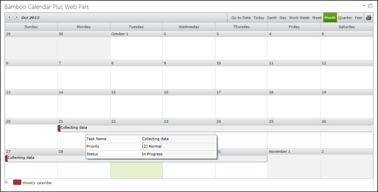
This example shows the Calendar displaying tasks for all statuses set in Weekly report List View.
|

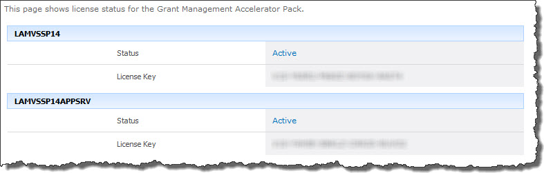
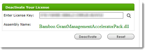
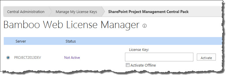
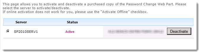
 ). The Assembly Name licensed with this key will be displayed. Ensure it is the product you expect and then click Deactivate.
How to Color Code Tasks for Multiple Users
| Step | Action | Result |
| 1. | Configure Calendar Plus to display items from a Tasks List, displaying the Title column, and color-coding each Task item by Created By. |
|
Manual User Entry
| Step | Action | Result |
| 1. | Type a user name in the field and separate with semicolons (;). Then click Save. |
|
Address Book User Entry
| Step | Action | Result |
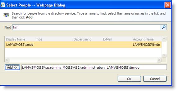
| 1. | Click the Browse Address Book icon to search for users. | 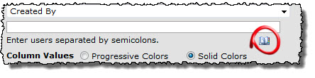 |
| 2. | Enter the user name in the Find box and click the Search icon. | |
| 3. | Select a user from the results list and click Add. | |
| 4. | Click OK after all users are selected. Calendar Plus automatically assigns color codes for each of the users you entered. | |
| 5. | Click a user name to change the color. | |
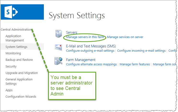
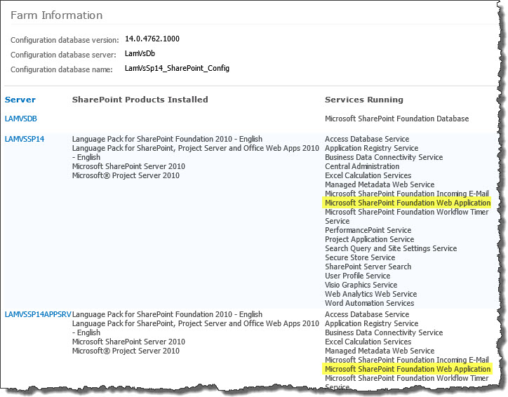 To determine which servers on the farm run these services, go to Central Administration > System Settings > and then Manage servers in this farm. If you are using WSSv3/MOSS, this page is accessed in Central Administration through Operations > Servers in Farm. In this example, there are two WFE servers on the farm.
Highlights of Calendar Plus
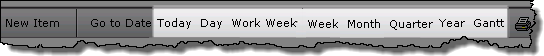
 Visually communicate date-based list data through several useful views: Day, Week, Work Week, Month, Quarter, Year, and Gantt. Show events, tasks, milestones, project initiatives, legacy data, or employee vacation plans, to name just a few options.
Use a SharePoint List, a SQL Server Table or View, or aggregated views created by our List Rollup as the data source for your calendar items.
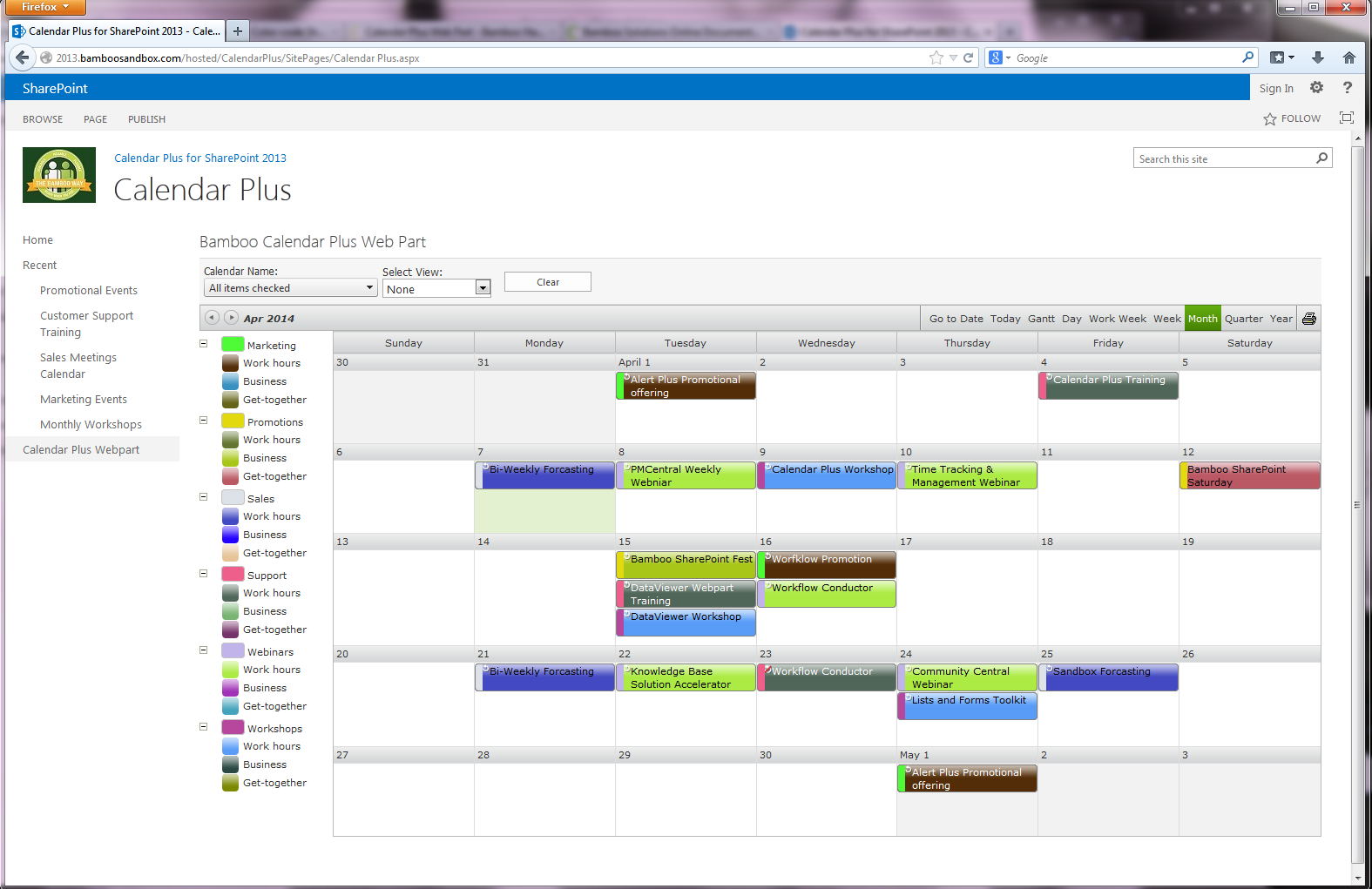 Display calendar items by the list column of your choice, apply color-coding, apply a custom or list view filter to the calendar items, and display holidays stored in a separate list.
In addition, configure the Gantt View to display project task information, along with percent complete and milestone indicators.
Calendar Plus also provides support for several languages including Spanish, French, Italian, and German.
 SharePoint 2013:
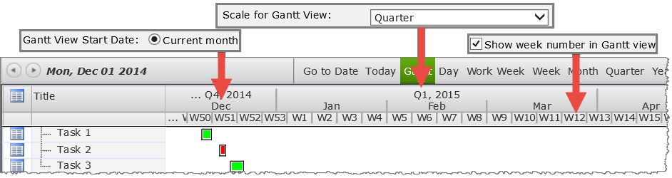
Display Calendar in Quarter View
Set up calendar to display data in Quarter View
CSS for Calendar Plus
 There are several ways to change the visual appearance and style of the Calendar Plus Web Part. By default, Calendar Plus renders the user interface using a default calendar skin. However, the look and feel of the Web Part can be further customized by editing the custom CSS file in the tool pane of the Web Part.
If you need to change the color of the text shown for a calendar event and you are color-coding the events, you don’t need to create a custom CSS. Please see Configuring the Optional data source settings for Calendar Plus for more information.
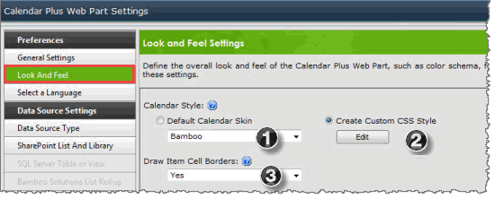
You have two options for styling the web part; follow the steps below to pick a skin or you can create custom CSS:
| Step | Action | Result |
| 1. | To use a default style calendar skin, select Default Calendar Skin. | 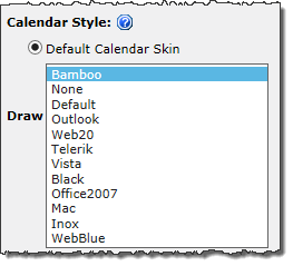 Select a skin from the available skins in the drop down selector. |
| 2. | To customize the style of the Web Part, select Create Custom CSS and click the Edit button. | 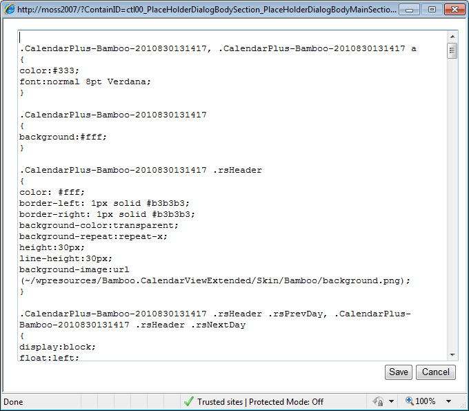 The text editor opens and displays the default CSS styles. Make any changes to the applicable the style selectors. |
| 3. | Select ‘yes’ or ‘no’ from the drop-down box to Draw Item Cell Borders. | Click Save and confirm the prompt to save your changes. |
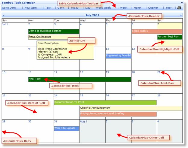 The Calendar Plus Web Part uses the following class selectors to define each elements of the calendar.
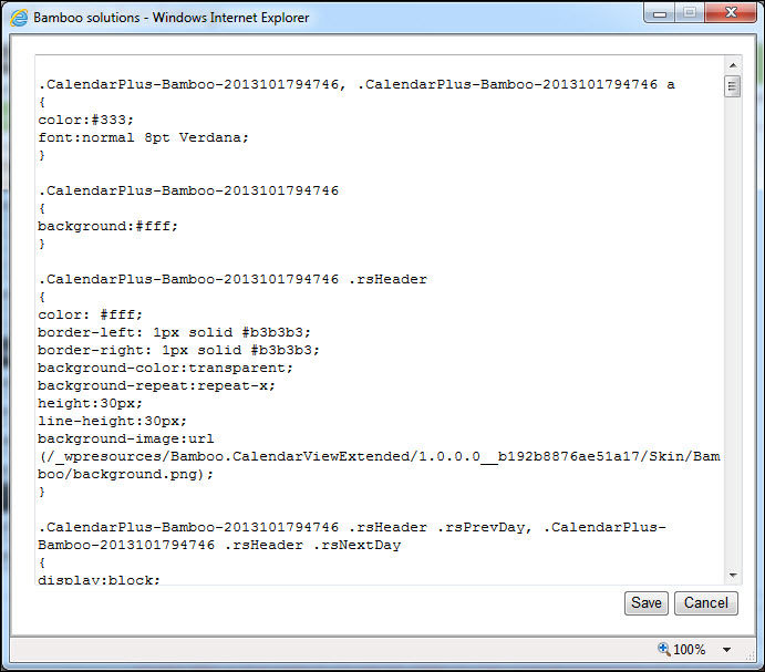
IMPORTANT: Notice that the CSS class names have a number attached to them (see highlighted number in the example below). This is to uniquely identify a CSS Class for a particular instance of the Web Part. It is strongly recommended that you do not change this number.
Example: CalendarPlus-Bamboo-2010830131417
For additional reference and example of CSS, see http://www.w3schools.com/css/css_reference.asp.
Configuring the Style
There are several ways to change the visual appearance and style of the Calendar Plus Web Part. By default, Calendar Plus renders the user interface using a default calendar skin. However, the look and feel of the Web Part can be further customized by editing the custom CSS file in the tool pane of the Web Part.
- Do one of the following:
- To use a default style calendar skin, select Default Calendar Skin and select a skin.
- To customize the style of the Web Part, select Create Custom CSS and click the Edit button. The text editor opens and displays the default CSS styles. Make any changes to the applicable the style selectors.
- Select ‘yes’ or ‘no’ from the drop-down box to Draw Item Cell Borders.
-
Click Save and confirm the prompt to save your changes.
The Calendar Plus Web Part uses the following class selectors to define each elements of the calendar.
WARNING: Notice that the CSS class names have a number attached to them (see highlighted number in the example below). This is to uniquely identify a CSS Class for a particular instance of the Web Part. It is strongly recommended that you do not change this number.
Example: CalendarPlus-Bamboo-2010830131417
The default CSS style for the Calendar Plus Web Part is listed here.
Note: Please see the Knowledge Base section on our web site for additional hints and tips on how to use the CSS style sheet with the Calendar Plus Web Part. For additional reference, see an example of CSS.
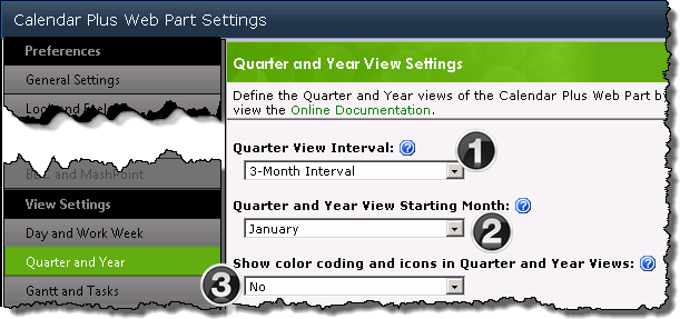
Configuring the Quarter and Year views in Calendar Plus
| Overview of Calendar Plus Configuration settings |
|---|
 The Quarter and Week View Settings configuration screen defines the display seen when users access the Quarter and Year views via the toolbar.
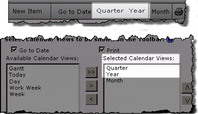
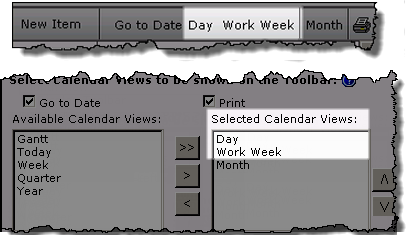
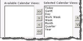
NOTE: The availability of the calendar views in the toolbar is determined by the Selected Calendar Views identified on the General Settings configuration screen. All views are available from the toolbar by default.
| Function | |
|---|---|
| 1. | Set the interval length for the Quarter view as 3 months or 6 months |
| 2. |
|
| 3. | 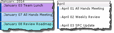 Choose to Show color coding and icons in the Quarter and Year views. By default, color coding and icons are not shown in these views. Choose to Show color coding and icons in the Quarter and Year views. By default, color coding and icons are not shown in these views. |
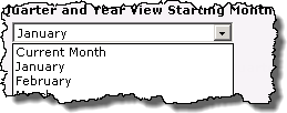 Select the Starting Month for the Quarter and Year views.
 Configure the Optional settings for a Calendar Plus data source
| Overview of Calendar Plus Configuration settings |
|---|
The following steps require you to have accessed the Calendar Plus Settings screens by clicking the Calendar Plus Web Part Settings button in the web parts configuration tool pane.
| Step | Action | Result |
|---|---|---|
| 1. |
Complete the Required Steps associated with selected data source. |
The Settings pop up window for the selected data source is divided into two sections:
|
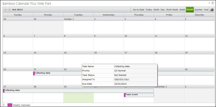
| 2. | Select columns that will be displayed in a tool tip by moving Available columns into the Selected Columns list box using the arrow buttons. 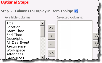
|
Users will see the tool tip when they mouse over an item in the calendar 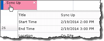
|
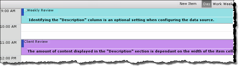
| 3. | Select a column that provides a Description for the item.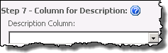
|
Description text will appear under the Display column in the Day and Work Week views.
|
| 4. |
|
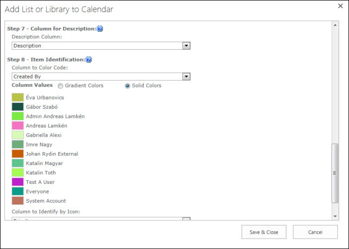
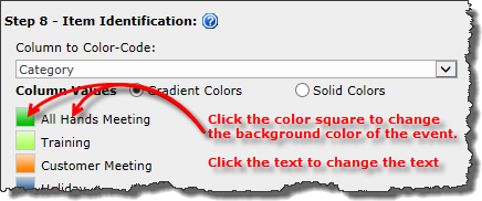
Keep in mind: 1. Choice, Lookup, and Person or Group columns types are supported for color coding. 2. If using Bamboo List Rollup as the calendar’s data source, any special columns included in the rollup will be available. 3. Gradient colors are not shown in the Settings screen, but will display in the Web part. |
| 5. |
|
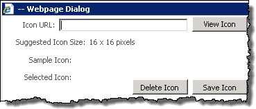
2. Icon images need to have been uploaded to a Library within the site collection. 3. The recommended image size is 16×16 pixels 4. If an icon is not associated with a column value, and you have elected to Display Icons |
Configuring the Gantt view in Calendar Plus
| Overview of Calendar Plus Configuration settings |
|---|
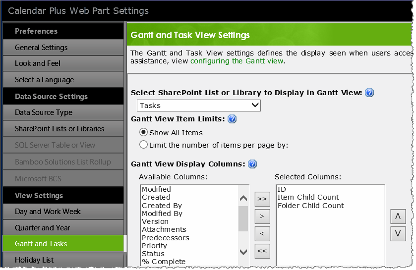 The Gantt and Task View Settings configuration screen defines the display seen when users access the Gantt view via the toolbar.
NOTE: The availability of the calendar views in the toolbar is determined by the Selected Calendar Views identified on the General Settings configuration screen. All views are available from the toolbar by default. All steps below are optional except Step 1. if you are using SharePoint Lists and Libraries as the calendars data source.
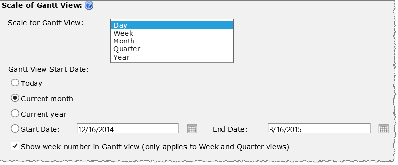
IMPORTANT: Calendar Plus must be configured in General Settings to base the calendar on an Interval in order to display a Gantt view.
| Step | Action | Result |
|---|---|---|
| 1. | If using SharePoint List and Library as the calendar data source, select a list or library to display in the Gantt view. 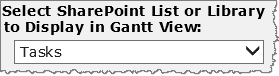
|
The Available Columns selector box(see below) will be populated after you have made your selection. Keep in mind:
|
| 2. | Show all items at once or set a limit on the number of items returned per page in the Gantt and Tasks View. 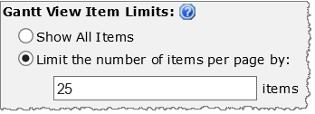 Show All Items is selected by default. |
|
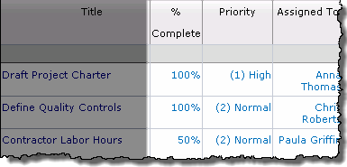
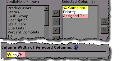
| 3. | Select columns that will be displayed in the Gantt view by moving Available columns into the Selected Columns list box using the arrow buttons.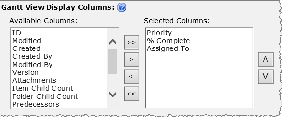 Use CTRL+click or SHIFT+click to select multiple columns. Use CTRL+click or SHIFT+click to select multiple columns.
Reorder the selected columns with the up and down arrow buttons |
|
| 4. |
Leave the Column Width… field empty to use default column widths for the Selected Columns To manually set the column width for the Selected Columns enter the width (pixles) for each column, in the order they appear in the Selected Columns box, separated by a comma, in the Column Width field. |
 |
| 5. |
You can sort data displayed in the Gantt view by up to two columns.
|
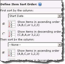 |
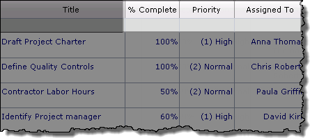
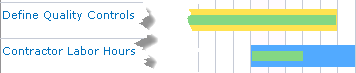
| 6. | Select the % Complete columns to display progress within the item interval bar in the gantt chart. Click Select Progress Bar Color to change the randomly assigned color.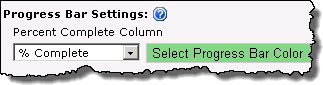 The Percent Complete Column field is empty by default |
|
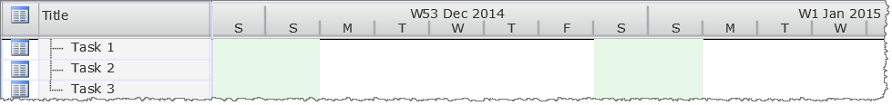
| 7 | Select the day of the week that should be considered Workdays.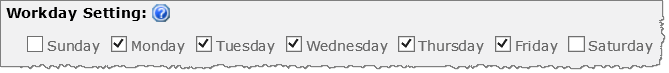 Workday Settings feature added in Calendar Plus 4.6 Item marked as non-working days will be highlighted in the Gantt chart display. |
|
| 8 | Choose a Milestone column, a date column to represent the Milestone date and an image to display the milestone on the Gantt view instead of an interval bar. 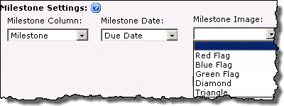 |
Keep in mind: The Milestone column needs to be a Yes/No column, where Yes designates the item as a milestone. |
| 9 |
Use these settings to configure the appearance of the Gantt chat –
|
|
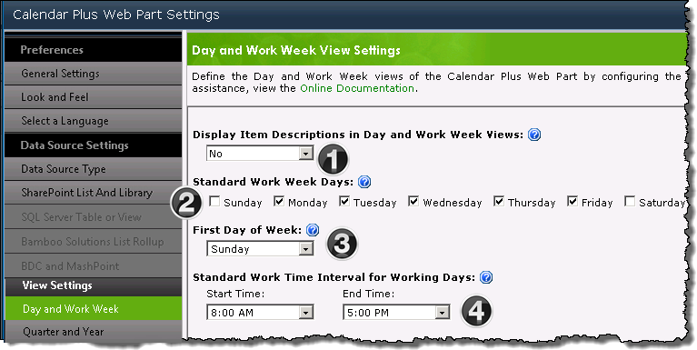
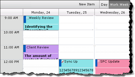
Configuring the Day and Work Week views in Calendar Plus
| Overview of Calendar Plus Configuration settings |
|---|
The Day and Work Week View settings configuration screen defines the display seen when users access the Day and Work Week views via the toolbar.
NOTE: The availability of the calendar views in the toolbar is determined by the Selected Calendar Views identified on the General Settings configuration screen. All views are available from the toolbar by default.
| Function | |
|---|---|
| 1. |
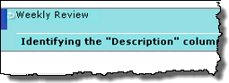
Setting Display Item Description to Yes will allow additional text to be displayed in the Day and Work Week views if:
Day View Week View |
| 2. | Select the days that are included in a standard work week. The Work Week View will display only the selected days. |
| 3. | Select which day will be used to identify the start of the week for the Month and Week views.
Keep in mind: |
| 4. |
Define the Start Time and End Time for the standard work day. The Day and Work Week views will display events that fall within the Standard Work Interval… by default. To see items that fall outside these hours Show 24 Hours in the bottom left of the display. From the extended view click Show Business Hours to return to the default display. |
Configuring Calendar Plus General Settings
| Overview of Calendar Plus Configuration settings |
|---|
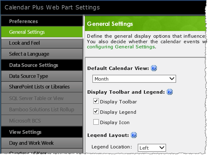 The Calendar Plus General Settings screen defines the general behavior of the web part.
NOTE: Unless otherwise stated the images in the Settings column represent the default configuration settings. In the table below, we provide some icons to help you quickly find a setting. You will not find them in the web part; they are provided here simply to help guide you to the appropriate setting as a visual guide.
| Visual Guides | Description | Function |
|---|---|---|
|
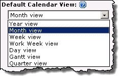 By default you see a Month view, but this can be changed using the drop down selector. |
Select the Default Calendar View that will be displayed when users access the page. |
|
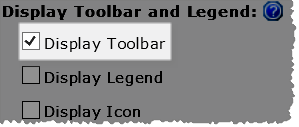 |
|
|
|
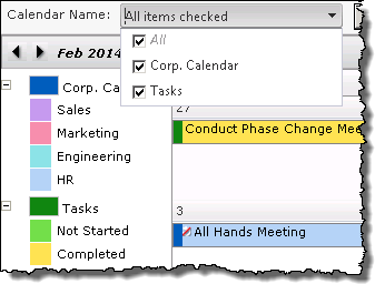
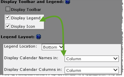
When you check Display Legend and maintain the default Bottom legend location, you will be given the choice of displaying the legend values as a Column or Row. 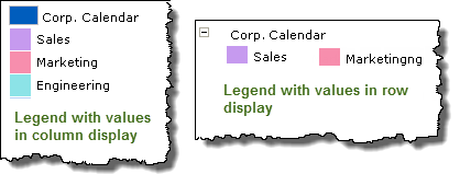 If you select Left or Right as the legend locations the legend values will be displayed in a column. |
|
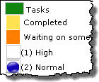
If the data source was configured with a Column to identify by Icons the values (or icons) associated with that column will be visible in the legend when Display Icon is selected.
|
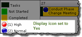 Image showing the data source’s legend, with icons, when Display Icon is set to yes. |
|
Tooltip Display Delay option added in Calendar Plus 4.6 | The default value is 0 to make the tooltip appear instantly. Set the length of delay, in milliseconds, before displaying the tooltip popup. |
|
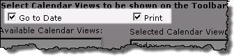 |
 The Go To Date and Print buttons cannot be moved in the toolbar. |
|
 IMPORTANT: Calendar Plus must be configured to Base the Calendar on… an Interval (Start Date and End Date) at the bottom of the General Settings screen to display a Gantt view. IMPORTANT: Calendar Plus must be configured to Base the Calendar on… an Interval (Start Date and End Date) at the bottom of the General Settings screen to display a Gantt view. |
|
|
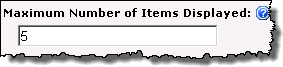 |
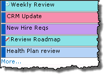 Identifies the Maximum Number of Items to Display in the Month, Quarter and Year views. Identifies the Maximum Number of Items to Display in the Month, Quarter and Year views.
If there are additional items a More… link will be displayed. |
|
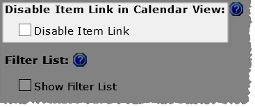 |
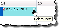
Select the Disable Item Link check box to prevent users from being able to click the item from the calendar and access the Edit form.
|
|
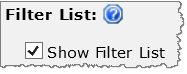 Filter Lists feature added in Calendar Plus 4.5 |
 When Show Filter Lists is checked, users will be able to filter the calendar display by the lists and libraries selected for display in the SharePoint List and Library data source configuration at runtime. When Show Filter Lists is checked, users will be able to filter the calendar display by the lists and libraries selected for display in the SharePoint List and Library data source configuration at runtime.
|
|
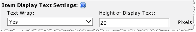 |
When Text Wrap is set to yes, enter the desired Height of Display Text to show multiple lines of text from the Display column selected when configuring the data source. This setting will apply to all item cells. 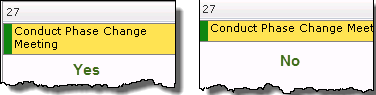 |
|
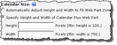 By default the size of the web part will Automatically Adjust…to fit the Web part zone |
Keep in mind:
|
|
 |
|
|
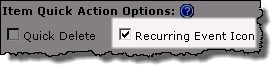 |
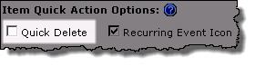
 By default Recurring items are identified by a icon in the upper left corner of the item cell. If an item in the recurring series was edited, it will be indicated with a red slash through the icon. |
|
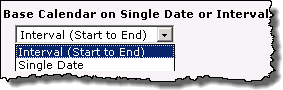 |
Determine whether you want to Base Calendar on a Single Start Date or Interval
|


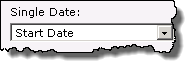 Selecting Single Date will change the data source settings so you can only select one date column.
| Overview of Calendar Plus Configuration settings |
|---|
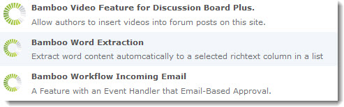
Complementary Products for Calendar Plus
 You will find many of our products complement each other quite nicely saving you the time and trouble to write custom code. With Bamboo at the heart of your SharePoint investment, you gain access to a huge catalog of enhancements, components, and accessories that add the critical functionality your business requires.
The same components can be easily used in future applications and they all come from a single, trusted vendor, ensuring an easy purchase process and support you can count on. That’s the Bamboo Way!
|
 |
|
||


Register today for our Workplace Collaboration Webinar and see several Bamboo web parts in action!
Calendar Plus Skins
| Overview of Calendar Plus Configuration settings |
|---|
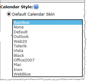 A variety of skins are available when configuring Look and Feel settings to change the appearance of the Calendar Plus display. Shown below are the look and feel of the various options.
Bamboo |
Black |
Default |
Inox |
Mac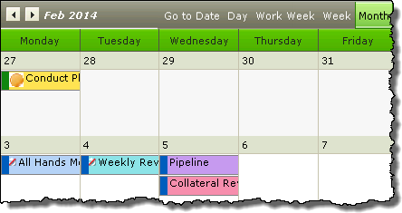 |
Office2007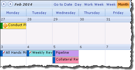 |
Outlook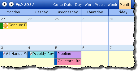 |
Vista |
Web20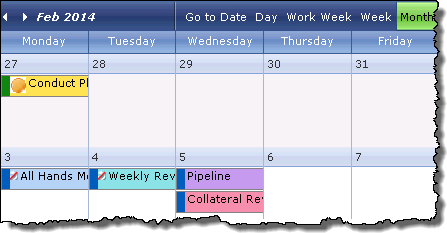 |
WebBlue |
| Overview of Calendar Plus Configuration settings |
|---|
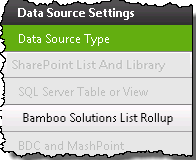
Use a Bamboo List Rollup as the Calendar Plus data source
| Overview of Calendar Plus Configuration Settings |
|---|
Bamboo Solutions List Rollup is one of the four available data sources for Calendar Plus.
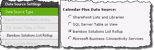
When working with List Rollup keep in mind:
-
List Rollup must already be installed and the rollup created
-
Calendar Plus will use a single Bamboo List Rollup as the data source, however List Rollup can aggregate an unlimited number of lists.
The following steps require you to have accessed the Calendar Plus Settings screens by clicking the Calendar Plus Web Part Settings button in the web parts configuration tool pane.
| Step | Action | Result |
|---|---|---|
| 1. |
Click the Bamboo Solutions List Rollup button under Data Source Settings in the navigation tool pane. You will only be able to select this button if Bamboo Solutions List Rollup is selected as the Data Source Type |
The Bamboo List Rollup Settings will be visible on the right side of the configuration screen and is divided into two sections:
|
| 2. |
Select the List Rollup type that will be used as a data source:
|
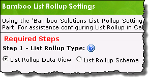 Information on the differences between the Bamboo List Rollup tools is available here. |
| 3. |
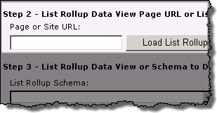
Enter the URL to the List Rollup instance that contains the content to be displayed in Calendar Plus, then click the Load List Rollup… button. When entering the URL keep in mind:
|
The predefined rollups associated with the List Rollup you pointed to will be listed in List Rollup… drop-down menu. |
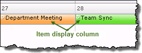
| 4. | Select the rollup to display,then identify the display column from the Item Display Column drop down menu.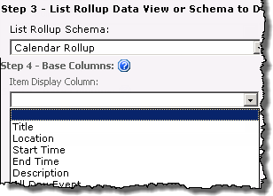 |
|
| 5. | Select the Date and Time column(s) in the list or library that will be displayed in the calendar. 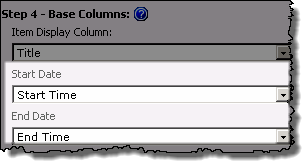 |
Whether you see Start Date and End Datefields or Single Date field will depend on the selection made on the General Settings screen to use a …Single Date or Interval. 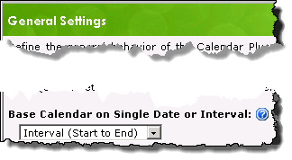 |
| 6. |
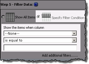
Apply a filter for the list or library by selecting from the following options:
|
Keep in mind: 2. Use the Add Filters link if you want to add another specified filter condition using AND/OR boolean operators. 3. Web part connections can be used to filter the contents of the calendar display but are not configured in the Calendar Plus web part settings. Information on using web connections is available here |
| 7. |
Stay in the Bamboo List Rollup Settings screen and configure the Optional Steps associated with the data source ORUse the left navigation pane and configure View Settings for the Calendar Plus web part. |
Clicking Save and Close will exit the Calendar Plus Web Part settings screen. |
| Overview of Calendar Plus Configuration Settings |
|---|
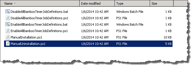
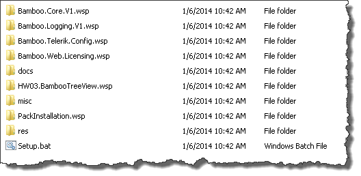 When you extract the product EXE to a location on your SharePoint server, several folders are created that contain installation files and Setup program configuration files. The root level of the extracted file system includes the file Setup.bat, which launches the Setup program. The list below shows the installation files for the Tree View Web Part, as an example.
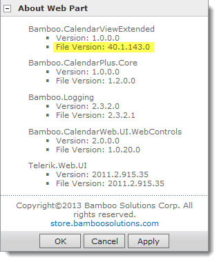
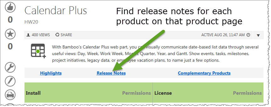 As you look at each product’s documentation page, you will see there is a link to the Release Notes for that product at the top of the page.