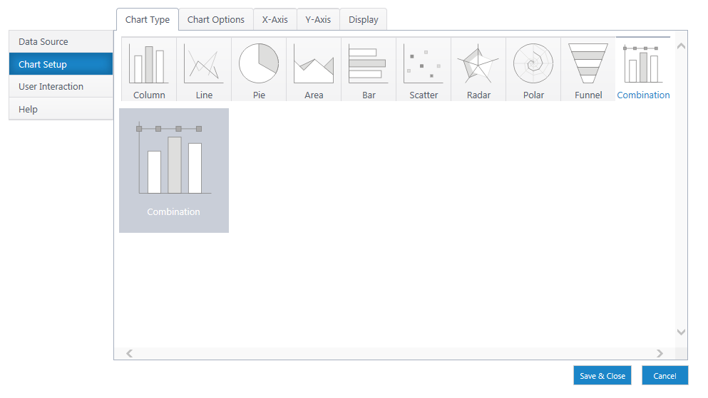
Set Up a Column Chart
Back to Create a New Chart
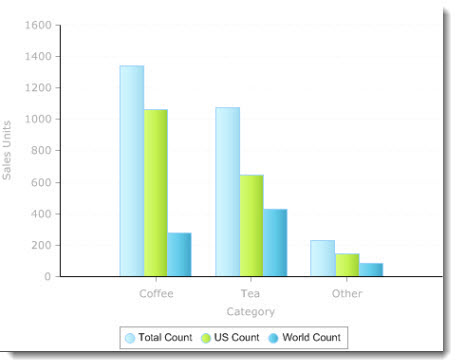
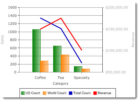
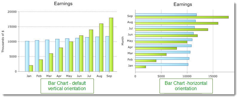
Column charts are great for comparing multiple categories by one or more value. A column chart requires an x-axis category and at least one y-axis data series.
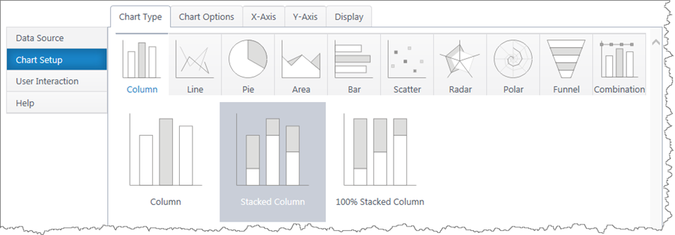
Multiple y-axis series will add an additional bar in each x-axis category. Stacked column charts will stack the bars in each category.
If you haven’t yet, select a data source.
As you’re building your chart, use the Preview button in the upper right to check your work in progress.
Chart Options (Choose X & Y Axis)
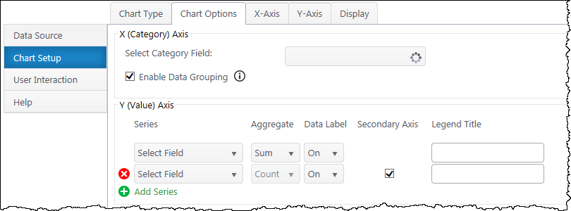
X (Category) Axis
Select Category Axis – Select which column of categories you would like to compare. The dropdown list will auto-populate with columns from your data source.
Enable Data Grouping – Group x values of the same category. Typically, you want grouping enabled. If off, each individual data point will be a separate column.
Y (Value) Axis
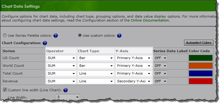
Series – Specify what value you would like to compare between the categories. Add additional y-axis series to compare.
Aggregate – If you have enabled grouping on the x-axis, aggregate the y-axis data you are comparing (sum, first, min, max, average, count). By default, chart plus compares the sum of y values.
Data Label – Toggle data labels for each Y series.
Secondary Axis – If using more than one Y series, you can add a secondary axis on the right side of the chart. The secondary axis will automatically adjust it’s range to include the maximum Y value from the series mapped to it.
(If using a stacked column chart, you must have more than one Y series to use the secondary axis feature.)
Legend Title – Customize legend titles for each y-axis series.
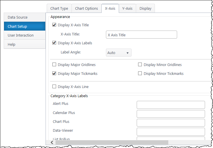
X-Axis Configuration
Data Type Settings – Appears if you select a Date/Time value for the x-axis. Configure how date categories display (date or time) and the scale of the x-axis. “Automatic” sizes the x-axis according to the scale of your dataset.
Appearance
X Axis Title – Toggle title display at top of chart and customize title text.
X-Axis Labels – Toggle x-axis labels & their display angle.
Gridlines & Tickmarks – Customize which gridlines and tickmarks display along the x-axis.
Display X-Axis Line – Toggle the x-axis line that runs along the bottom of the chart between the bars and x-axis labels.
Category X-Axis labels – Customize category names that appear on the x-axis.
Sort
Sort Axis – Specify an ascending or descending sort order for how categories display on the x-axis.
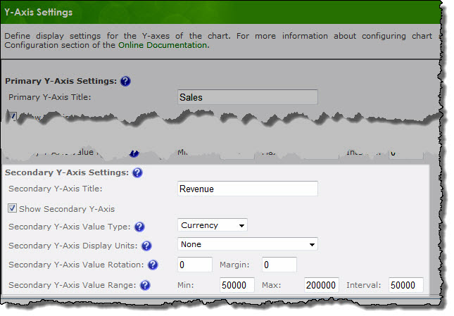
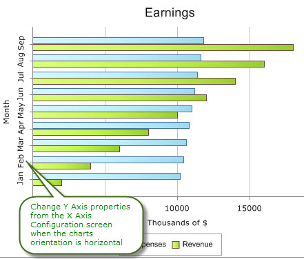
Y-Axis Configuration
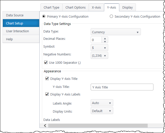
Secondary Axis – If you have a secondary y-axis, use the buttons at the top of the Y-Axis tab to switch between axis settings.
Data Type Settings
Data Type – Select a data type for y values (general, number, currency, date, time, percentage, scientific).
Format – Configure details on how Y values will display on the axis and labels. Date types also require you to select the date scale for the y-axis.
Appearance
Y-Axis Title – Toggle title display at top of chart and customize title text.
Y-Axis Labels – Toggle y-axis labels and their display angle & position.
Gridlines & Tickmarks – Customize which gridlines and tickmarks display along the y-axis.
Y-Axis Range – Configure the minimum and maximum values visible on the y-axis. These default to “auto” and adjust to the range of your dataset. Not available for “Date” & “Time” data types or 100% stacked column.
Display Y-Axis Line – Toggle the y-axis line between the y-axis scale and the chart canvas.
Next: Configure the Chart Display Settings
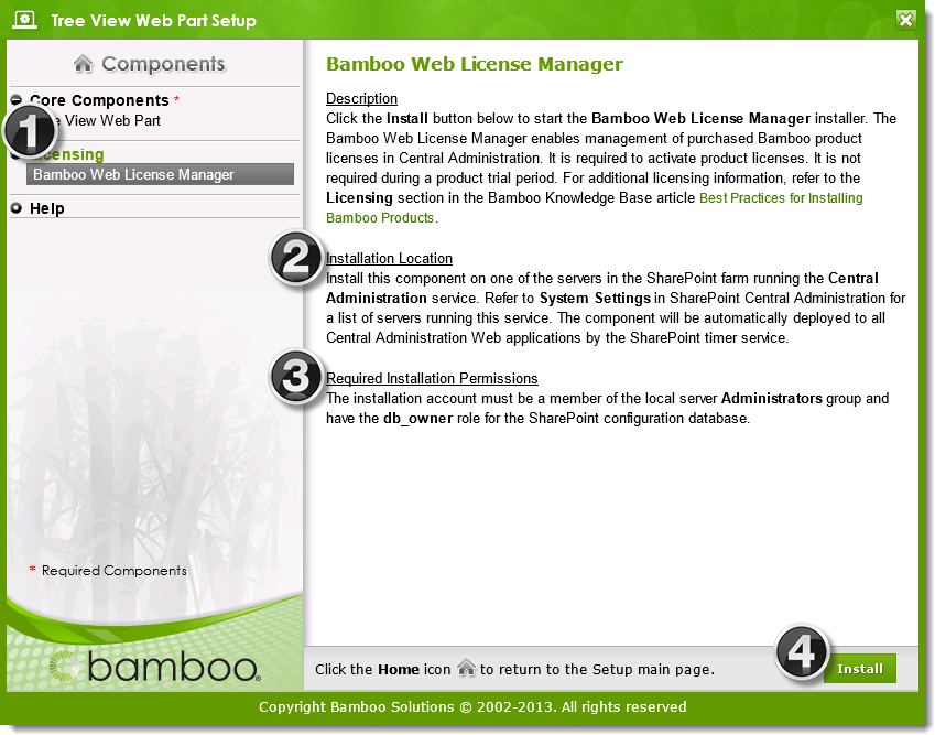
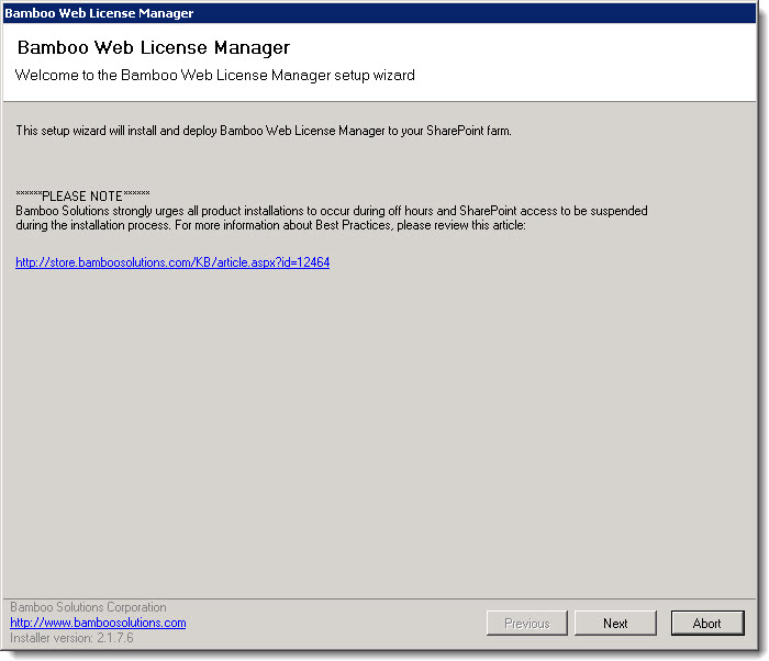
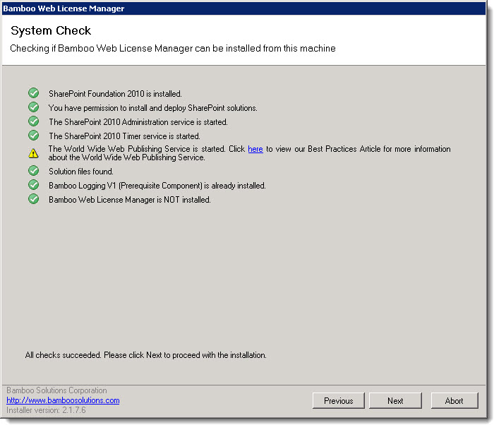
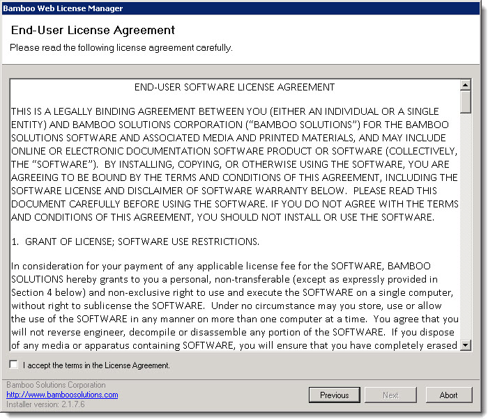
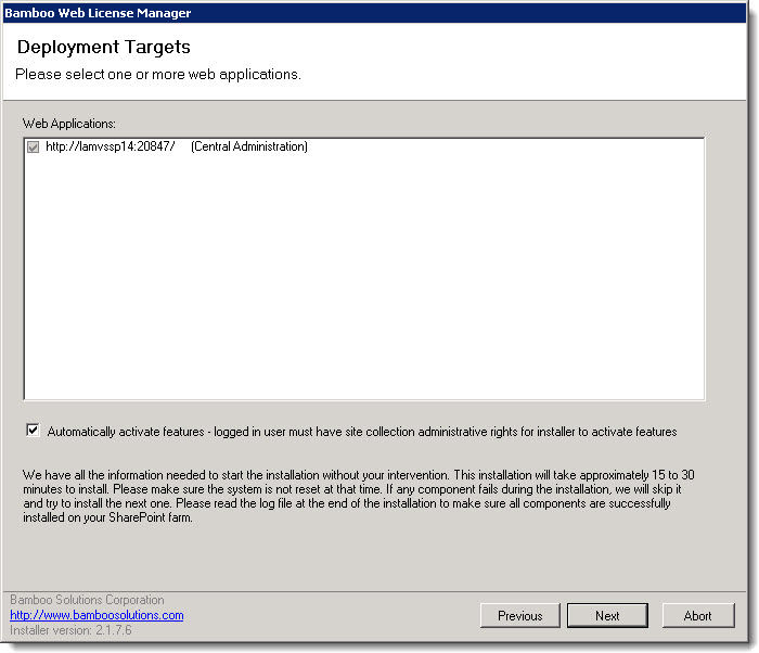
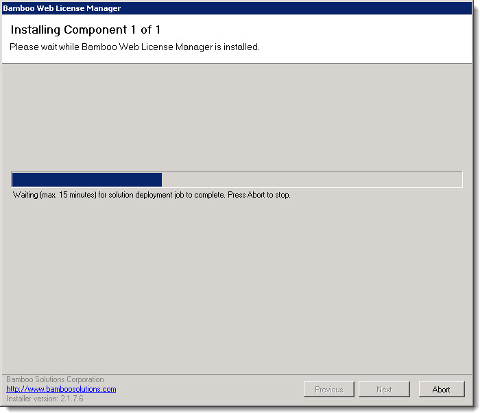
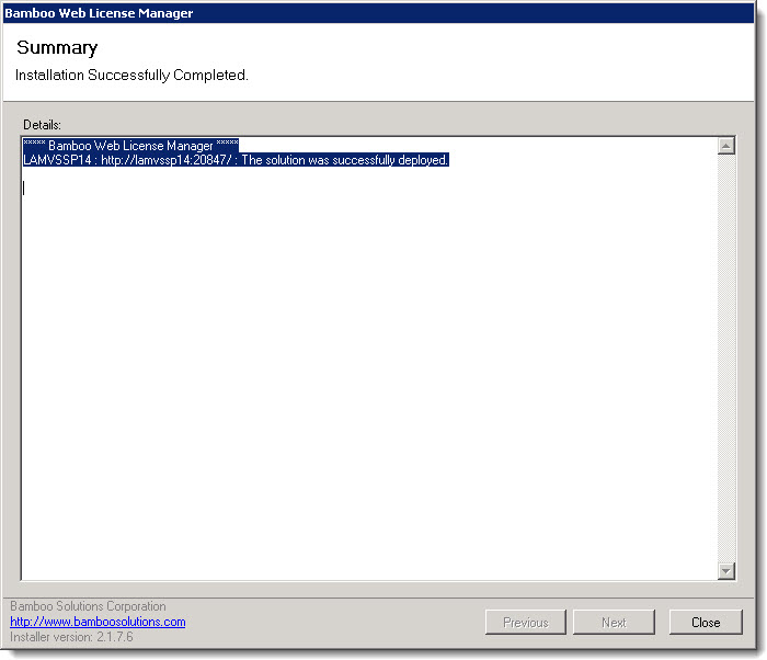
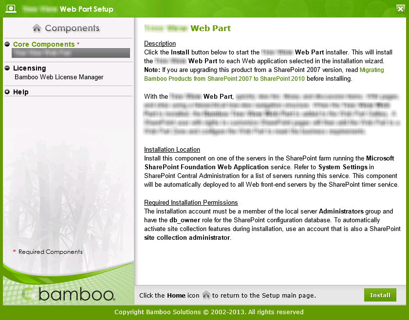
IMPORTANT: As of April 2017, Bamboo has changed the installation process for Bamboo components. The Setup Program has been replaced by an updated process. Please see Overview of the Updated Installation Process for Bamboo components and Uninstalling using the updated process for details.

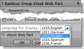
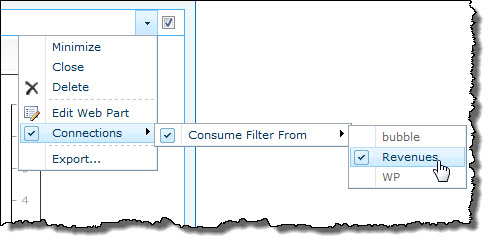
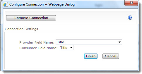
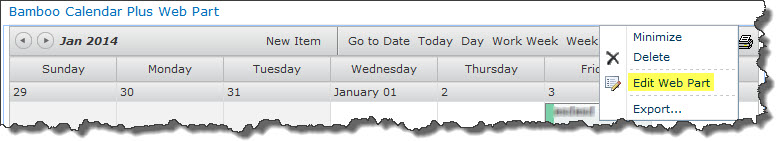
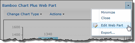
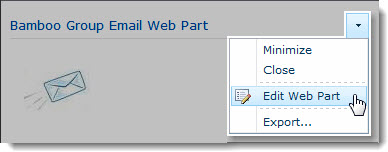 Click the edit drop-down menu on the Web Part title bar and select Edit Web Part (or Modify Shared Web Part if you are using SharePoint 2007). See the example from the Group Email Web Part.
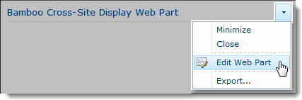 Click the edit drop-down menu on the Web Part title bar and select Edit Web Part (or Modify Shared Web Part if you are using SharePoint 2007).
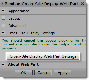 Click the [Product] Settings button in the Web Part tool pane.
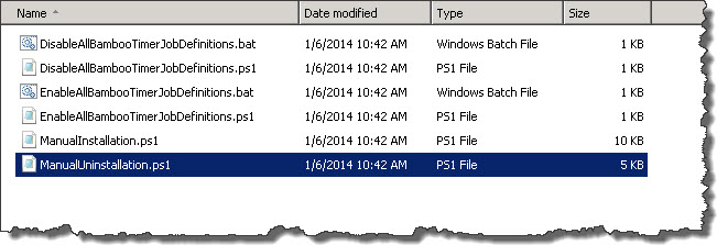
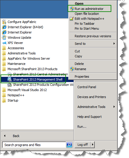
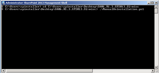
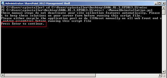
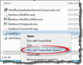 Run the Install.ps1 from a WFE server in PowerShell as an admin.
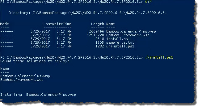 The script will look for WSPs in the install folder and list those found. It will install them in alpha order.
 Double-click the product EXE file to extract the contents of the product download.
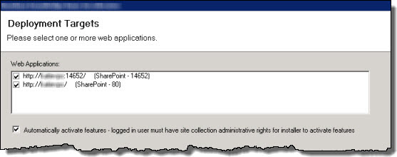

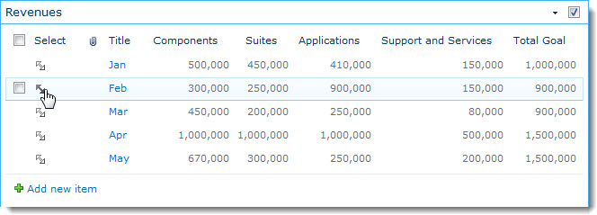
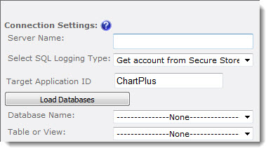
 If your company has data in a legacy database, there may be situations where you need to expose that data graphically in SharePoint. Chart Plus will not only display data from a SharePoint List or Library, it will also chart data from other sources, including a SQL server table or view.
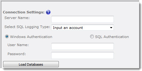
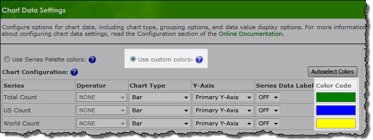
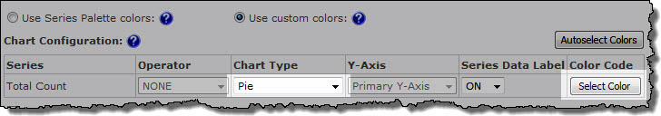
 The color scheme configuration options available in Chart Plus 3.0 ensure that the charts you create will be visually impressive. Chart Plus provides two options for applying color to your charts; you can use one of the predefined Series Palettes, or create your own Custom Palette.
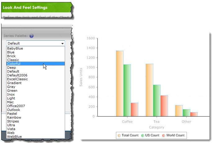

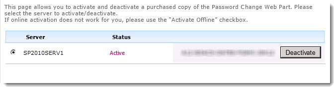
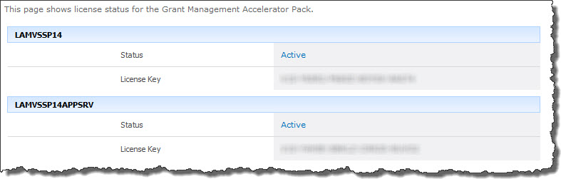
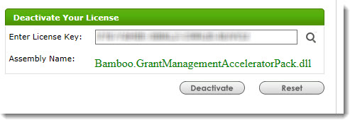
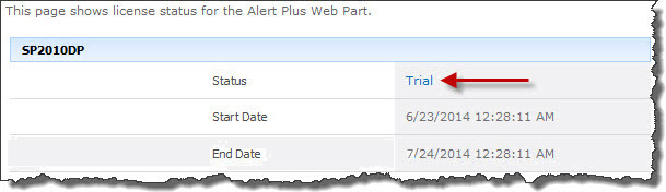
 ). The Assembly Name licensed with this key will be displayed. Ensure it is the product you expect and then click Deactivate.
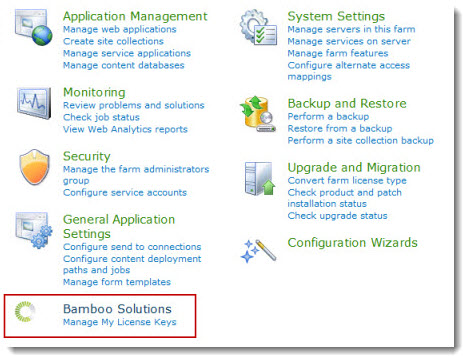
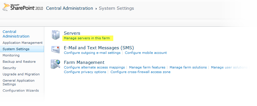
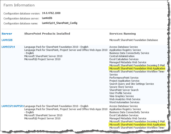 To determine which servers on the farm run these services, go to Central Administration > System Settings > and then Manage servers in this farm. If you are using WSSv3/MOSS, this page is accessed in Central Administration through Operations > Servers in Farm. In this example, there are two WFE servers on the farm.
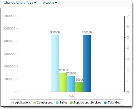
 Chart Plus more features, no code. Visually communicate critical data quickly and effectively to assist in making more informed business decisions.
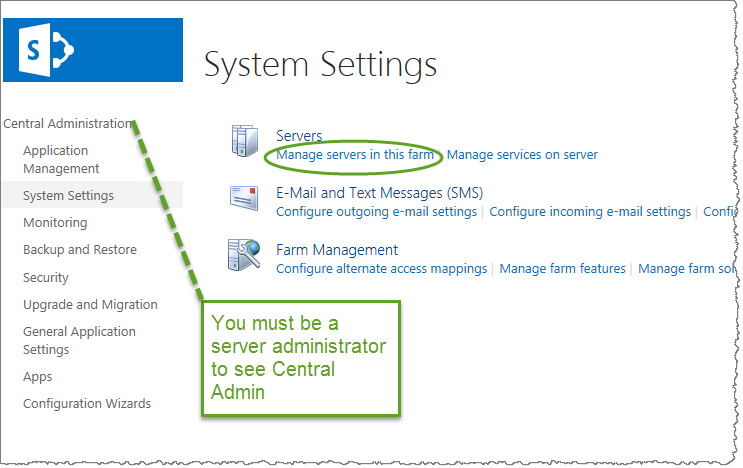 SharePoint 2013:
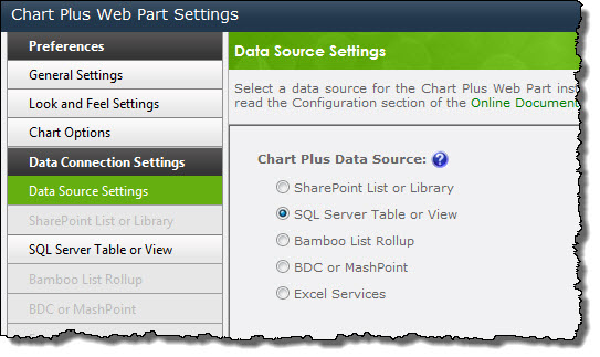
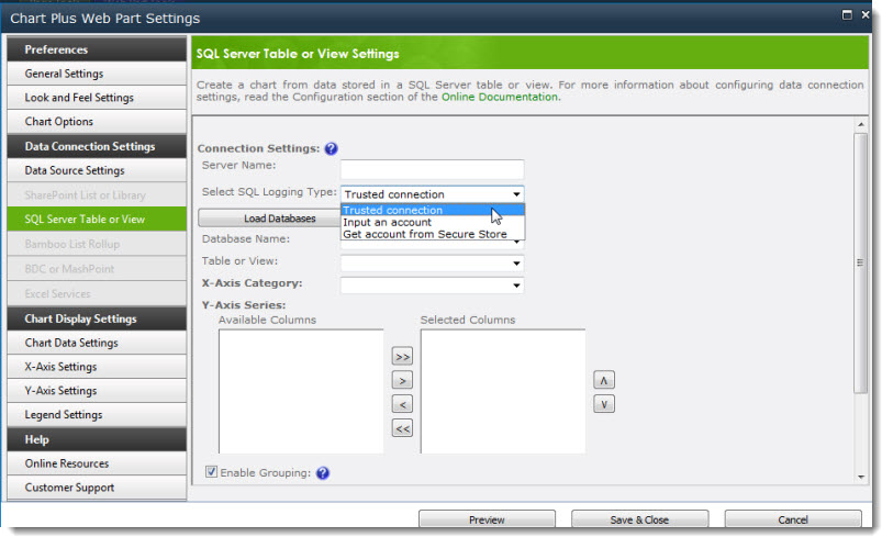
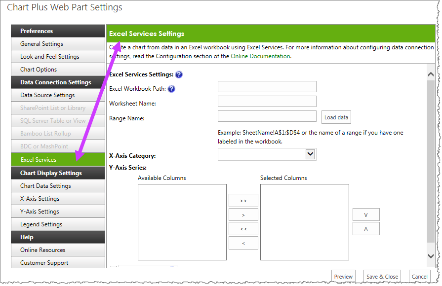 When you choose the Data Source Type, the link for that type on the left side of the Chart Plus Web Part Settings dialog is enabled. The corresponding options display so that you may configure the appropriate options for that data source type.
 Display data from a
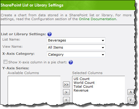
  To display data from more than one list or library in a Data-Viewer Web Part, connect to a
  To create a chart using data stored in an Excel workbook, configure the connection options as instructed
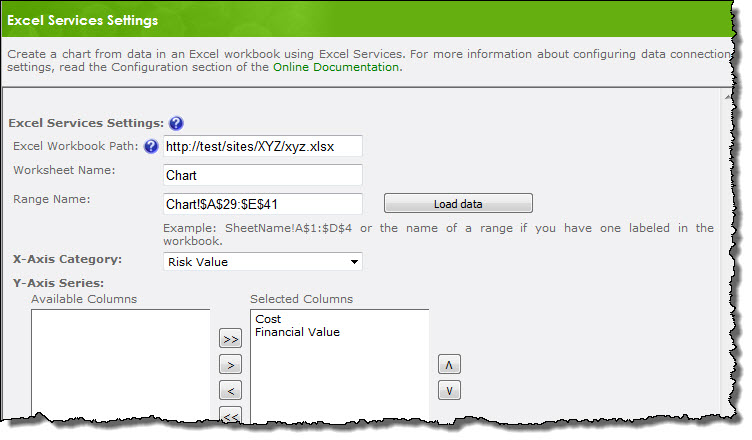
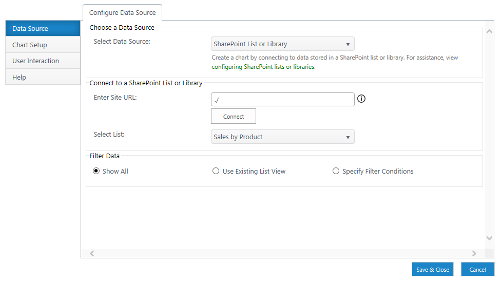
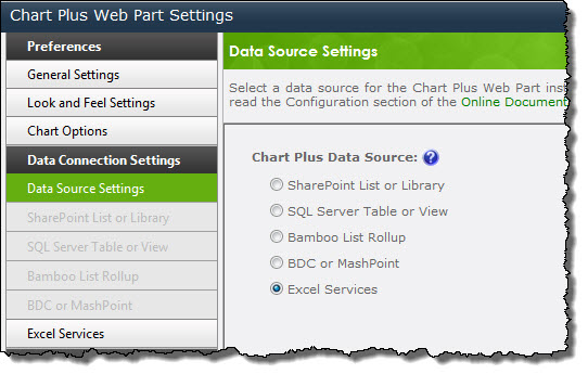
 To get started, Add the Chart Plus Web Part to a Page and edit the Web Part properties. Click the Chart Plus Web Part Settings button in the Web Part tool pane to display the Web Part Settings page.
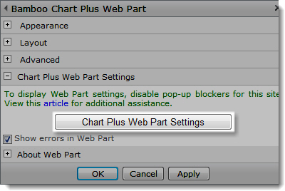

 You will find many of our products complement each other quite nicely saving you the time and trouble to write custom code. With Bamboo at the heart of your SharePoint investment, you gain access to a huge catalog of enhancements, components, and accessories that add the critical functionality your business requires.
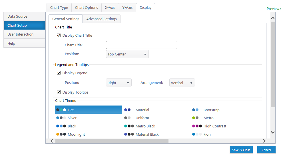
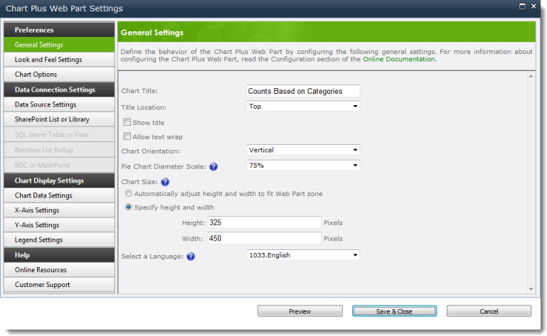
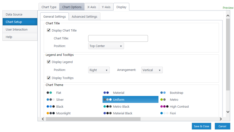
 Click on a category name below for details about the options available in the Chart Plus Display Settings section of the configuration tool pane settings. To access the Chart Display settings, edit the tool pane Chart Plus Web Part Settings and the Chart Display Settings is listed on the left navigation menu. Click each link below to learn about the features and functions for that setting.
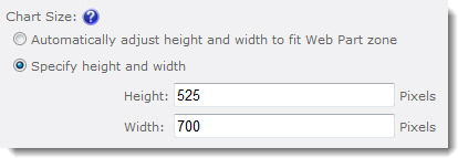 By default, the chart is automatically sized to fit the Web Part zone and height is three-fourths width.
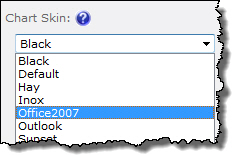
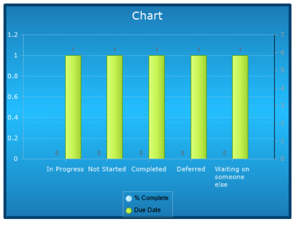
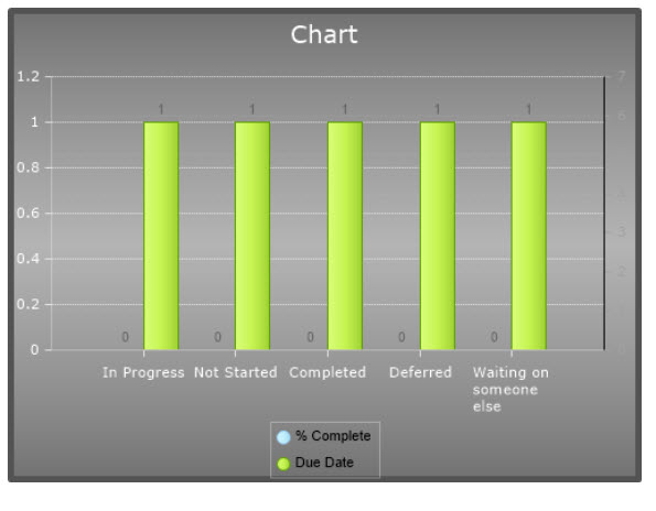
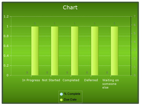
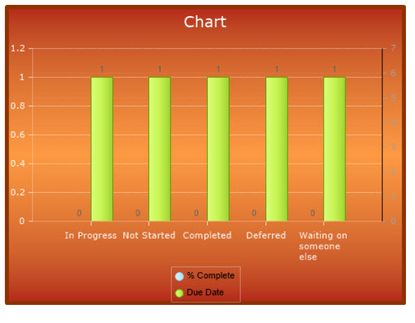
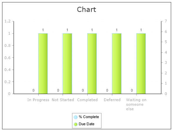
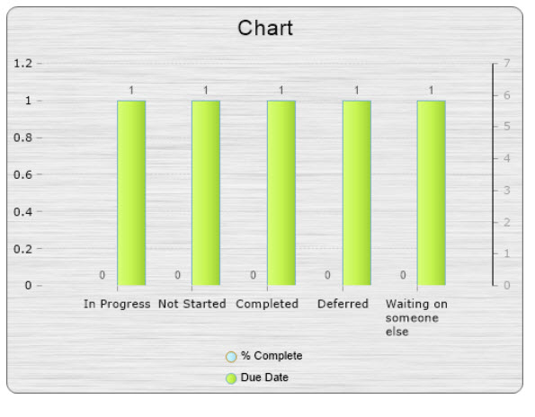
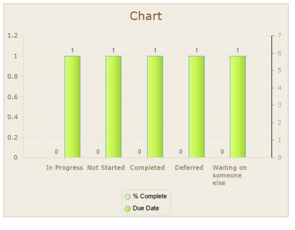
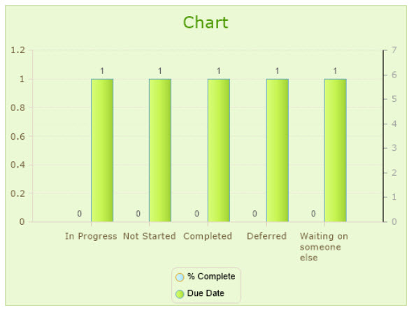
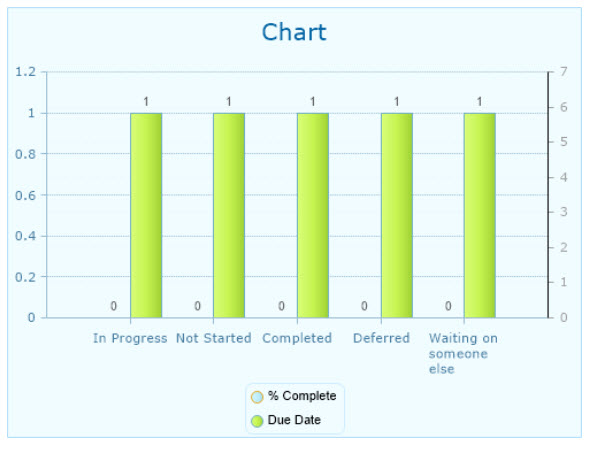
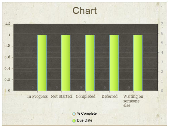
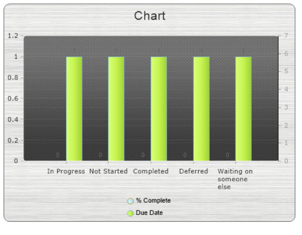
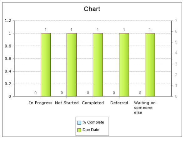
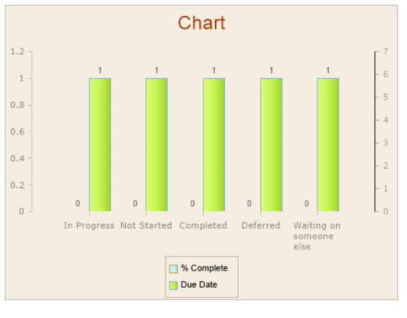
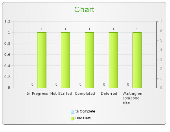
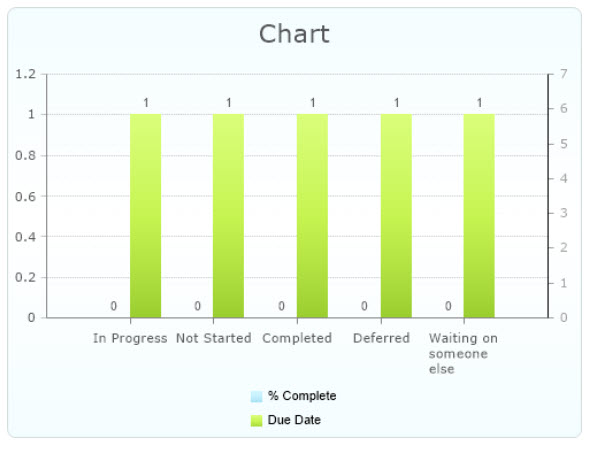
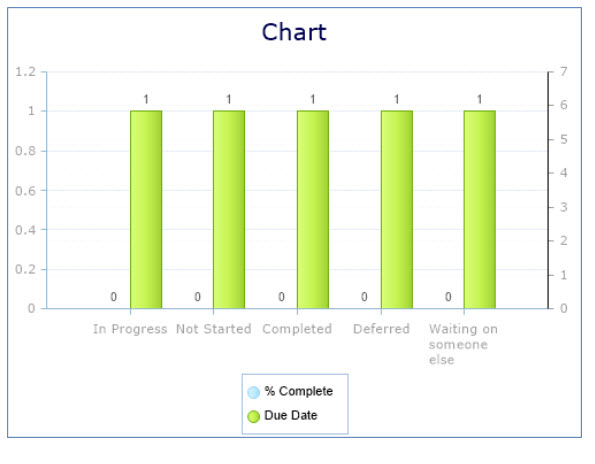
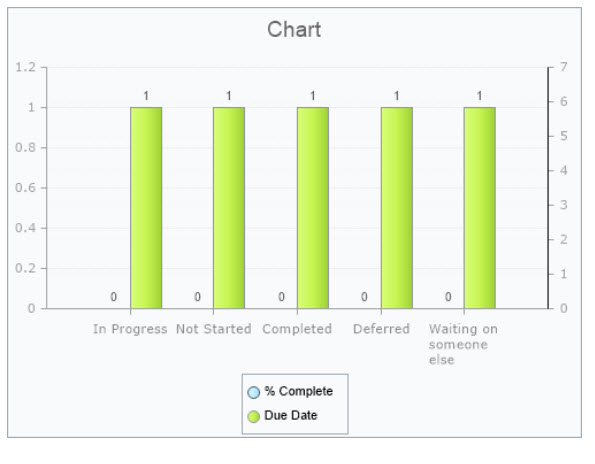
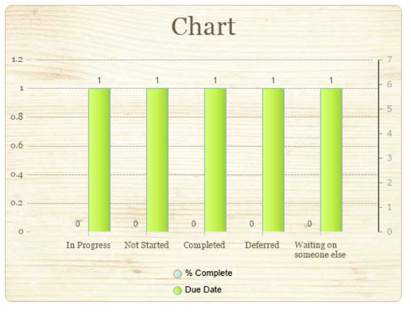
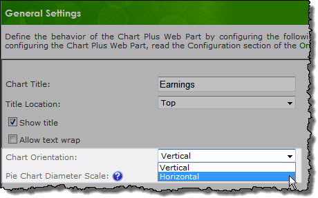
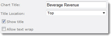 Chart Title: Enter a title to display with the chart. The following additional title options are available:
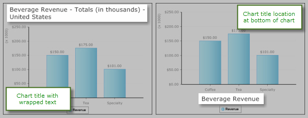
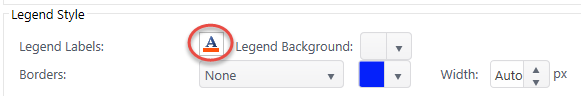
 You can also modify the chart title using CSS. To create Custom CSS using the CSS properties and values below, please make note of the following: