Viewing Team Calendar Event Information
Calendar event labels and tooltips display the information from selected columns of the connected data source.
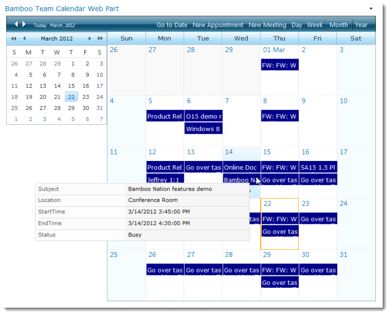
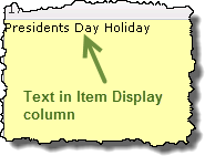
- Event Label: The event label displays information from one column (usually a title column) and provides a quick summary about a calendar event.
- Event Tooltip: The event tooltip displays more information about a calendar event when you mouse-over the event label. The tooltip contents are obtained from columns in the Exchange calendar or SharePoint list.
- Event Details: If you are using a SharePoint list as your data source, you can click on an event to display the full list item details in a pop-up window. If you have the appropriate permissions, you can edit the event by clicking the Edit Item button in the pop-up window.
The event label can be customized to help you recognize the status, creator, or type of calendar event.
- Show color legend: You can choose to display a color legend to explain your color-coding options. See Configuring Team Calendar for more details.
- Allow text wrap: Normally, calendar event labels display one line of descriptive text. If the information displayed in the event label does not fit on one line, the text is cut off. You can choose to allow calendar event label text to wrap to a second line if you want to display more information about events. See Configuring Team Calendar for more details.
Viewing Suite Orders and Support Details
Log in to My Bamboo and click Toolkits, Suites and Libraries. Your Bamboo Suite orders are listed in the Product Licenses section.
The following information is available in the Product Licenses section:
- A list of Toolkits, Suites or Libraries you have purchased from Bamboo
- License keys
- Support plan details
- Support expiration and renewal information
NOTE: Your support status and expiration for all products is also available by clicking the Support Contracts link on the My Bamboo Home page.
To view a list of the products included with your Bamboo Suite, click an order in the Product Licenses section. The list of products available in that Suite will be listed in the Individual Product Installation Packages section. (For convenience, we list the individual products and links to the online documentation on the landing page for each suite or toolkit right here on the documentation page.)
See also:
Viewing Search Results
 Search results are displayed in a grid view on the page where the List Search Simple Web Part is configured. Depending on the Search Results Configuration, results will either
- be displayed below the list of search criteria, or
- will replace the search criteria.
The columns shown in the search results are also configured in the Search Results Configuration.
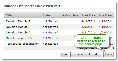
In the example shown here, the Web Part has been configured to replace the search criteria with the search results page. To return to the search criteria page, click the Back button.
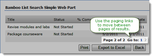 If there are more search results than can be displayed on one page (number of items displayed per page is another configuration parameter), use the paging links at the bottom of the search results grid to move between pages of results.
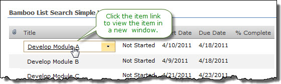 To view the details for an item, click the item link. The item will be displayed in a new page.
NOTE: If the search results view does not include the column with the link to item option, you will not be able to click to go to the item.
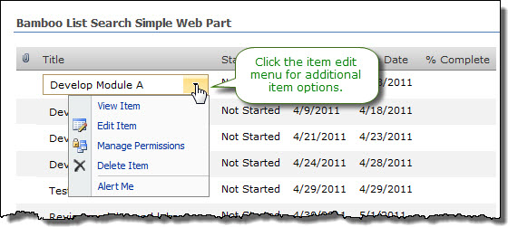 You can perform additional item actions (edit, delete, etc.) using the item edit menu, if it is available in the results.
NOTE: The search page will be reset when you perform item actions using the edit menu.
 Bamboo’s Visual Indicator Column gives you the ability to display incremental progress or any other status in the form of a color-coded bar or a percentage-based progress bar. Visual indicators support floating tooltip information, custom color sets, and display percentage information in both visual and numeric form, enabling you to quickly scan through lengthy SharePoint lists at a glance, while still retaining access to individual list item data.
Install
|
Permissions
|
License
|
Permissions
|
|
|
 |
|
|
Configure
|
Permissions
|
Work With
|
Permissions
|
|
|
 to configure this Bamboo product.") |
|
 |
Click here if you would rather see a complete list
of all topics for this product. |
 Click on the shopping bag or here to download a trial of the product or to purchase it. Click on the shopping bag or here to download a trial of the product or to purchase it. |
 The Virtual Map View web part geographically displays SharePoint list data or SQL data using marker icons on a Google™ or Bing™ map.
Install
|
Permissions
|
License
|
Permissions
|
|
|
|
|
|
Configure
|
Permissions
|
Work With
|
Permissions
|
|
|
|
|
|
Click here if you would rather see a complete list
of all topics for this product. |
Click on the shopping bag or here to download a trial of the product or to purchase it. |
View users by Department in User Profile Plus
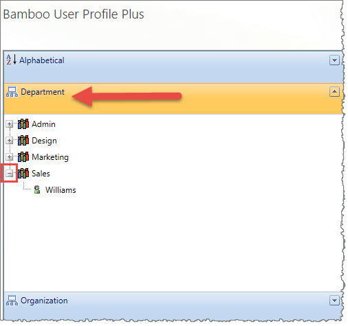 Within User Profile Plus, you have the option to search for users by Departments. Expand the left navigation pane and you will see the list of departments in your organization. Next to those departments where a user exists, you will see a plus symbol. When you click it, the list expands to show you the user’s last name.
You can click on the user’s last name to open the contact information.
View users alphabetically in User Profile Plus
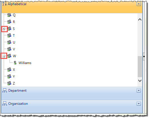 Within User Profile Plus, you have the option to search for users in alphabetical order by last name. Expand the left navigation pane and you will see the list of alphabet letters. Next to those letters where a user exists, you will see a plus symbol. When you click it, the list expands to show you the user’s last name.
You can click on the user’s last name to open the contact information.
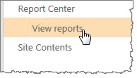
View reports in TTM Report Center
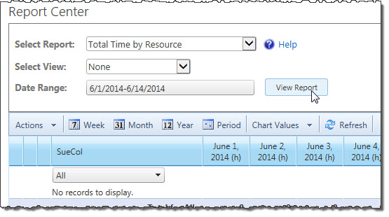
Time Tracking and Management Report Center includes several preconfigured reports for resource use and timesheet status. If you have the proper permission to view reports, follow the steps listed below; scroll down to see the list all the available reports.
| Step |
Action |
Result |
| 1. |
Either from the navigation or from the Report Center, click View Reports. |
 |
| 2. |
Select Report |
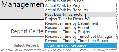
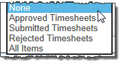
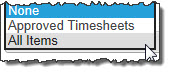
TTM provides a variety of report options; select the report you want.
 |
| 3. |
Based upon the report you selected above, you have various views to pick. |
  |
| 4. |
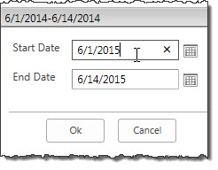
Select the Date Range for the report you want to see. |
 |
| 5. |
Click View Report. |
 |
|
The reports available to you are as follows:
| Report Name |
Description |
| Actual Work by Period |
Shows the actual number of hours worked vs. the number of hours available for tasks, grouped by timesheet period. Expand a period to see the work performed by each resource and an indicator that shows the status of the work budget for each task. |
| Actual Work by Project |
Shows the actual number of hours worked vs. the number of hours available for tasks, grouped by project. Expand a project to see the work performed by each resources and an indicator that shows the status of the work budget for each task. |
| Actual Work by Resource |
Shows the actual number of hours worked vs. the number of hours available for tasks, grouped by resource. Expand a resource to see the work performed by each resource and an indicator that shows the status of the work budget for each task. |
| Past Due |
Provides a summary of timesheets for periods ending before the current date that are not yet approved, grouped by resource. |
| Project Time by Resource |
Shows total time a resource entered for each project in a single reporting period. Expand a project to see the total time for each project task. |
| Resource Time by Department |
Shows total time for each resource in a single reporting period, grouped by department. Expand a resource to see the total time for each task. |
| Resource Time by Period |
Shows total time a resource entered for each resource in a single reporting period. |
| Resource Time by Project |
Shows a resource time entered for each project in a single reporting period. Project hours can be summarized in a chart. Expand a resource to see the time for each project task. |
| Resource Time by Timesheet Manager |
Shows total time for each resource in a single reporting period, grouped by timesheet manager and timesheet status. |
| Resource Time by Timesheet Status |
Shows total time for each resource in a single reporting period, grouped by timesheet status. Select the All items view to see a chart of total time by timesheet status. |
| Total Time by Resource |
Shows the total time entered for all project tasks, group by resource. Use the date range icons to see time for different time periods, or use the arrow buttons at the top of the report to change reporting periods. |
View or Edit your user profile
The link for My Profile may or may not be visible on your User Profile Plus web part depending on how it has been configured. 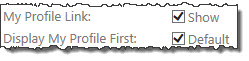 When your site admin configures the web part, s/he can select a check box to display a link at the top of the web part next to the Search box that shows “My Profile.”
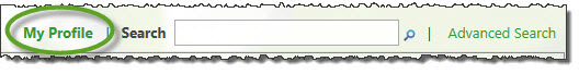
Displaying My Profile link on the web part.
The second option pertaining to “My Profile” is whether or not to display it first in the search results. If this box is checked in the configuration tool pane, your profile is the first one you see in the web part.
View or Edit User Profile
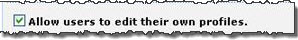 If your site admin has configured User Profile Plus to allow you to do so, the Edit button will display on the user profile record as shown below.
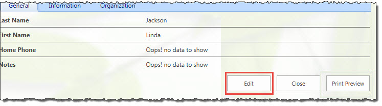
When the edit window opens, you will see it is a simple process to update the record by simply clicking in the field and entering new data.
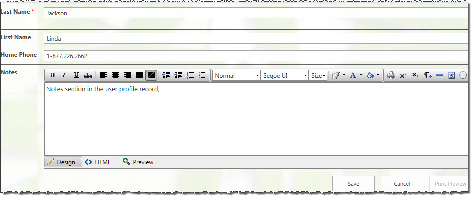
The edit window also provides a Notes section so that you can quickly update the record with a short note, formatted as you prefer. You also have a Preview button inside the edit window so that you can get a quick glance at your changes before saving them.
Click the Save button to complete your edits.
Change the current site for Alerts Administrator
Alerts Administrator provides users, with the appropriate administrative permissions, the ability to quickly and easily create and manage SharePoint alerts.
Unlike out-of-the-box alert administration tools, Alerts Administrator allows you to work with alerts in a web application simply by changing the current site information displayed in the console.
| Step |
Action |
Result |
| 1. |
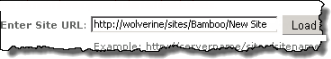
To view the alerts associated with another site, click the edit icon next to the site path hyperlink on the Alerts Administrator display page

NOTE: Clicking the hyperlink will return you to the sites homepage
|
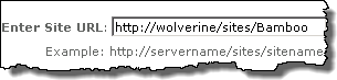
The URL for the existing current site will be displayed
 |
| 2. |
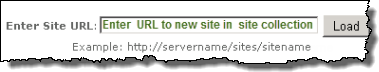
Replace the existing text with the URL to the desired site located in the same web application and click the Load button
NOTES:
1. The new site must be in the same web application
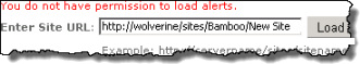
2. You must have administrative permissions on the destination site to complete this action or you will see the following message:
|
 The Enter Site URL field will remain visible on the page and the console will display the alerts associated with the new site The Enter Site URL field will remain visible on the page and the console will display the alerts associated with the new site
 |
View actual cost in PM Central
If you elected to copy actual cost from TTM to PM Central when you configured cost tracking options, you can view the cumulative actual cost per task and for the entire project in PM Central. You can also view reports that compare actual cost from timesheets with planned and actual cost from the project.
Viewing Actual Cost Per Task
To view the total actual cost entered in timesheets for a task, add the Actual Cost (Time Entry) field to the project Tasks list. This field contains the cumulative cost of all work approved for a task to date, and is updated each time a timesheet that has the task is approved. You must follow the steps below for EACH project in your PM Central portfolio where you want to view the Actual Cost (Time Entry) field.
| Step |
Action |
Result |
| 1. |
In the PM Central project site, click the Tasks tab and go to the All Tasks view. |
 |
| 2. |
Edit the Task Master Web Part |
| 3. |
In the Column Settings section of the Web Part configuration tool pane, click Add Row and add the Actual Cost (Time Entry) field to the list of fields displayed in the Web Part. |
 |
| 4. |
Click Apply and then OK to save your changes. |
You can add the Actual Cost (Time Entry) field to any instance of Task Master, including the Overdue Tasks and My Tasks views. |
|
Viewing Actual Cost Per Project
To view the sum of the Actual Cost (Time Entry) field for all project tasks, look at the Project Actual Cost (Time Entry) field in the Project Health list. To access this list, go to the Project Home page and click the project name in the Project Info section.
You can also add the Project Actual Cost (Time Entry) field to the Update Project Cost & Schedule web part so you can compare Actual Cost calculated in TTM with other budgeted and actual values. To add additional fields to the Web Part, follow these steps:
| Step |
Action |
Result |
| 1. |
In the project site, go to Tasks > Progress Management. |
| 2. |
In the Progress Management page, edit the Project Cost & Schedule web part. |
| 3. |
In the Web Part settings tool pane, scroll to the bottom of the View Fields list and select Project Actual Cost (Time Entry). Click the right arrow (>) to add it to the Display Fields list, and use the up and down arrows to order the field where you want it. |
 |
| 4. |
Click Apply and then OK to save your changes. |
 |
Actual Cost Reports
When you connect PM Central to a TTM site, several additional reports are enabled in PM Central to allow you to view actual cost data from timesheets and compare it to cost data from projects. To view these reports, click the Reporting tab in the portfolio site. The following cost-related reports are available:
- Actual Cost (Project Tracking vs. Time Entry): Compares Actual Cost calculated based on % Complete in the project to the calculated cost for Actual Work entered in resource timesheets.
- Cost (Planned) vs. Actual Cost (Time Entry): Compares the total planned Cost value in the project to the calculated cost for Actual Work entered in resource timesheets.
- Actual Cost (Time Entry): Displays the calculated cost for Actual Work entered in resource timesheets.

View Alert Status
Alert Plus displays the list of configured alerts, including important information about the current status of each.
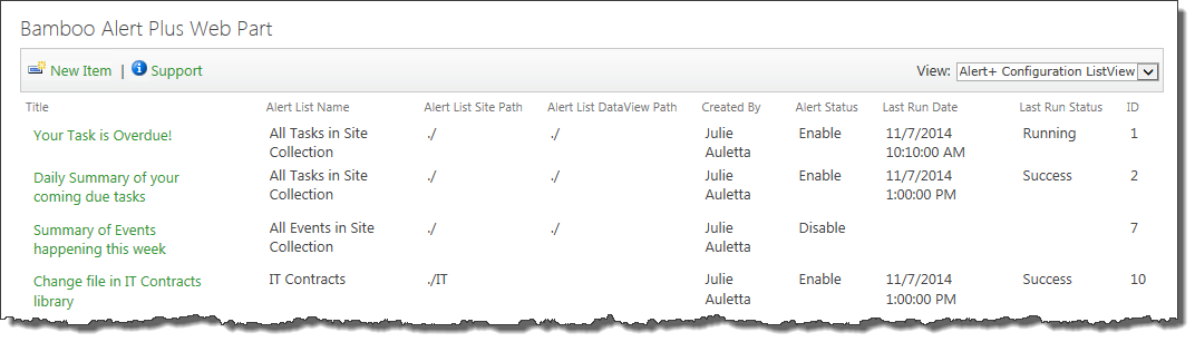
Use this list to periodically check the status of the alerts.
| Column |
What is it showing? |
| Alert Status |
This column shows you if the alert is enabled. If it is disabled, no alerts will be sent. |
| Last Run Date |
This column shows you the date the timer job last processed this alert.
NOTE: This date isn’t necessarily the last time an email was sent. An email is not always sent every time an alert is processed. Sometimes no items match the alert criteria when an alert is processed and therefore no emails are sent.
 If you never see a value in the Last Run Status column even though the alert is enabled, the timer jobs aren’t running for some reason. Check to make sure they were installed. See The Last Run Date Column is Blank for more information. If you never see a value in the Last Run Status column even though the alert is enabled, the timer jobs aren’t running for some reason. Check to make sure they were installed. See The Last Run Date Column is Blank for more information.
|
| Last Run Status |
This column shows you the current status of the alert. It will report:
- Running when the timer job is running.
- Success when the timer job completes with no errors.
- Failure or an Error Code when the timer job stops due to an error. Generally, the specific error will be listed here to help troubleshoot.
NOTE: Sometimes you may notice that an alert is reporting Running for an unusually long time. This may be an indication of an error with the timer job and no error was reported. This happens when the job times out – no error is reported, but the alert status is never updated to indicate that the job is stalled. As long as the status is running, the job will not run again. See My Alert Seems to be Stuck in a Running Status to address this issue.
|
Video Library Supported File Types
Media File Types Supported by Video Library
For the most up-to-date list of media file formats that can be played by Video Library, click the Supported File Formats link on the page where you upload new media files. For Video Library 2.0, the supported file formats include:
- Windows Media Video Files (7, 8, 9, and Advanced Profile): WMV, WM, ASF
- MP4 files (MPEG-4 Part 2/Part 10): MP4
- Flash video files: FLV
- Audio Video Interleave (AVI) Files: AVI
- MPEG files (MPEG-1/MPEG-2 Part 2): MPEG, MPG, MPE, MPV2
- Various audio files: MP3, MP2, MPA, WMA, WAV
Supported File Types for Thumbnail Images
The free version of Microsoft Expression Encoder 3 can generate thumbnail images for the file types listed below. Note that Microsoft Expression Encoder 3 (free version) cannot generate thumbnail images for all of the file formats supported by Video Library (see above). You can manually assign thumbnail images to unsupported file types. If you are unsure if Video Library will be able to generate a thumbnail for your video file, try importing the file into Microsoft Expression Encoder. If you see a thumbnail in Expression Encoder, you will see one in Video Library.
For your convenience, a link to the Microsoft Expression Encoder 3 (free version) download page is provided in the Video Library Setup program. For more information about installing Microsoft Expression Encoder, read Installing Microsoft Expression Encoder in the Video Library Installation section.
- Windows Media Video (WMV)
- DVD video (VOB)
- MPEG (MPG, MPEG)
- Audio Video Interleave (AVI)
- Microsoft Digital Video Recording (DVR-MS)
Video Library Storage Settings
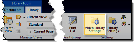 In addition to standard SharePoint library settings, Video Library provides additional library settings that can be used to customize each Video Library instance. To access these settings, click the Video Library Settings button in the Library tab of the Tools ribbon.
In the Storage Settings section of the Video Library Settings page, select where the multimedia files in your Bamboo Video Library will be stored.
You have two options.
- This topic covers the configuration choices for storing files in Bamboo’s Video Library.
- Read more details about Configuring a File Share Library to use instead of a Video Library.
Storing Files in Video Library
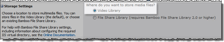 Select the Video Library option to store media files directly in the Video Library (the default).
Files uploaded to the Video Library are stored in the SharePoint content database, and are managed just like any SharePoint Document Library.
NOTE TO SYS ADMIN: Files uploaded to Video Library are subject to the file size limit defined for your Web application (default 50 MB). If you need to upload files larger than 50 MB, you must either increase the Maximum Upload Size setting in the Web Application General Settings page in Central Administration, or use a Bamboo File Share Library (sold separately) to store your Video Library files. Read more details about Configuring a File Share Library to use instead of a Video Library.
Click the links below to read about each option that can be configured. When you have finished changing Video Library settings, click Save.
Video Library Player Settings
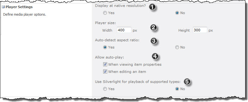 Some of the settings you can customize let you define how the Video Library will play back your video: through native resolution, pixel size and ratio and whether to allow automatic playback as well as using Silverlight in supported browsers. Details for each setting are listed below.
| Step |
Action |
Result |
| 1. |
Display at native resolution |
- When set to No, the video will play at a resolution appropriate for the specified player size.
- When set to Yes, the video will play at the same resolution it was recorded. This option disables player size and aspect ratio settings, which will be set according to the video resolution. If the native resolution is larger than the client display, the video will instead be played at a resolution appropriate for the specified player size.
|
| 2. |
The Width and Height settings determine the size of the window the media content plays in. |
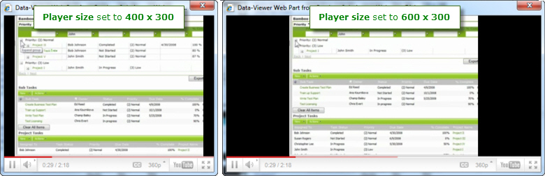
- If the Auto-detect aspect ratio setting is set to Yes, actual video size will be adjusted to fit within the player while preserving video aspect ratio, as shown in the example below.
- If Auto-detect aspect ratio is set to No, the video will be stretched to fit the new player size.
|
| 3. |
-
When set to No, videos will be stretched to fit the specified player size. This may cause distortion of the video image if player size is not appropriate.
-
When set to Yes, video aspect ratio will be preserved, as shown in the example for the Player size setting above. Excess player screen will appear as black space around the video image.
|
| 4. |
-
When the options When viewing item properties or When editing an item are checked, the media file will automatically start playing whenever you view or edit the item properties.
-
When not checked, the media file will not start playing when item properties are viewed or edited. The media file can still be played by clicking on the thumbnail image in these views.
|
| 5. |
Use Silverlight for playback of supported types |
By default, media stored in Video Library will be played using Windows Media Player on the client machine. Silverlight allows media playback using the Silverlight browser plug-in. To use Silverlight instead of Windows Media Player to play media files, set Use Silverlight for playback of supported types to Yes.
NOTE: The Silverlight plug-in must be installed on the client browser. If it is not, users will see a link to install Silverlight. To check if Silverlight is installed, visit the Microsoft Silverlight page.
|
Complementary Products for Video Library
 You will find many of our products complement each other quite nicely saving you the time and trouble to write custom code. With Bamboo at the heart of your SharePoint investment, you gain access to a huge catalog of enhancements, components, and accessories that add the critical functionality your business requires.
The same components can be easily used in future applications and they all come from a single, trusted vendor, ensuring an easy purchase process and support you can count on. That’s the Bamboo Way!
Video Library Display Settings
The following settings customize how Video Library items are displayed in the library:
| Step |
Action |
Result |
| 1. |
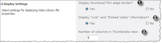
Display thumbnail film edge border? |
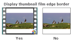
- When set to Yes, the thumbnail image in the library includes a filmstrip border on the left and right of the image.
- When set to No, there is no border.
|
| 2. |
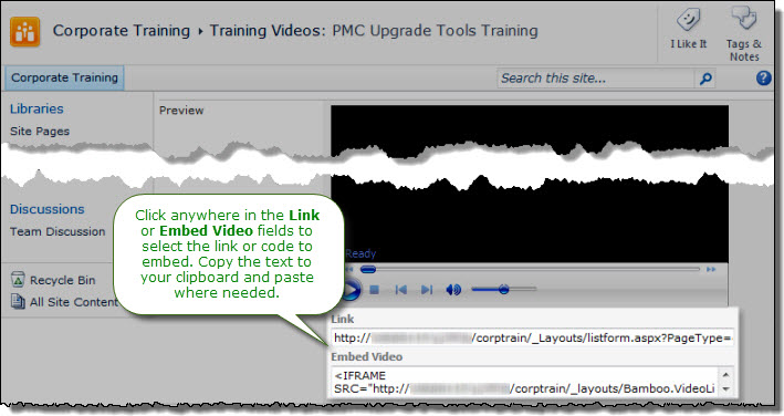
Display “Link” and “Embed Video” information? |
-
When set to Yes, the Link and Embed Video code that allows links to Video Library items from other sites is displayed when viewing item properties. For more information about linking to and embedding media in other pages, read Using Video Library.
-
When set to No, the links are not available to users when viewing the item. Select No when you don’t want other users linking to media content in your Video Library from other locations.
|
| 3. |
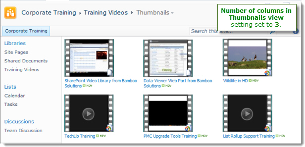
Number of columns in Thumbnails view: |
The Thumbnails view displays only the media item thumbnail image and the item Title. The Number of columns setting controls the number of columns used to display items horizontally on the page. In the example below, the number of columns was set to “3”.
 |
|
Versioning for Solution Deployment Workflows
Saving workflows as templates allows you to conveniently open a saved workflow and make changes to it. If you have Workflow Conductor 2.0 or higher configured to use the Simple Publishing method, simply publish the workflow with the same name. You will be prompted to overwrite the existing version. Workflow instances already running will continue to run under the old version, and new workflow instances will automatically run with the new version.
If you have Workflow Conductor 1.6.1 or earlier or Workflow Conductor 2.0 or higher configured to use the Solution Deployment method, you cannot deploy another workflow with the same name to the same Web application. To deploy a new version of a workflow, you can either deploy it with a different name and remove the previous version from the list, or you can retract and remove the previous version from the Web application before deploying the updated version with the same name.
After you deploy a Workflow Conductor workflow solution, you may want to make a minor change to it and deploy a new version. However, once a workflow solution is deployed to a web application, you cannot deploy another workflow with the same name to the same web application. The Solution Deployment method deploys workflows as farm solutions. To deploy a new version of a workflow, you have two options:
- Give the workflow a new name when deploying it in Conductor Studio.
- Retract and remove the workflow from the web application
See Detailed Instructions for Retracting and Removing the Existing Workflow from the Web Application.
NOTE: Solution Deployment workflows can overwrite Simple Publishing workflows of the same name directly from Conductor Studio. You do not need to remove the existing published workflow before deploying the new workflow solution.
See also:
Versioning for Simple Publishing Workflows
To create a new version of a workflow published using a Simple Publishing option (Publish to List, Publish to Site, Publish to Site Collection, or Publish as Site Workflow):
- In Conductor Studio, go to Workflow > Open and open the workflow template.
- Edit the workflow template and save it with the same name.
- Publish the updated template.
- Conductor will detect that there is already a published workflow with the same name and will ask if you want to overwrite it. Select the Overwrite option to publish the new version.
Instances of the old workflow version that are in progress will continue to run until they are complete. New instances of the workflow will run as the new workflow version.
NOTE: Simple Publishing workflows cannot overwrite Solution Deployment workflows. However, Simple Publishing workflows can overwrite other Simple Publishing workflows. The table below shows which Simple Publishing workflows can be overwritten.
| New workflows… |
Can overwrite existing workflows of the same name… |
| Published to List |
Published to List |
| Published to Site |
Published to List or Site* |
| Published to Site Collection |
Published to Site Collection* |
| Published as Site Workflow |
Published as Site Workflow |
|
* If you check the option to automatically associate the workflow with the current list when you publish the new workflow version, the copy of the workflow of the same name that is associated to the list where Studio was started will be updated with the new workflow version. Workflows of the same name associated to other lists in the site (or other sites) will not be updated. If you do not check the auto-associate option, the existing workflow association for the current list will continue to use the old workflow version, but any new associations you add will use the new workflow version.
Verifying the PM Central Upgrade
Before using portfolio, department, and project sites, verify that all upgrade processes have completed successfully.
| Step |
Action |
| 1. |
Go to SharePoint Central Administration. In the Monitoring page, under Timer Jobs, click Check job status. |
| 2. |
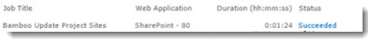 The Bamboo Update Project Sites job is triggered when you click the Upgrade button from the Project Central Upgrade Monitoring Page. The Bamboo Update Project Sites job is triggered when you click the Upgrade button from the Project Central Upgrade Monitoring Page.
Verify that this job is listed in the Job History list with a status of Succeeded.
|
| 3. |
Verify that the timer jobs listed below are shown in the Job History list with a status of Succeeded.
- Bamboo Update Dashboard List.
- Bamboo Update Summary Project List
- Bamboo Update Task, Issues, Project Health List.
- Bamboo Reporting Calculation Timer Job V4
- Bamboo Reporting Top Site Calculation Timer Job
- Bamboo Gantt Chart Timer Job.
See Overview of PM Central Timer Jobs for more information about what these timer jobs do.
NOTE: If you see these jobs listed in the Running Jobs list, wait until they have finished before continuing. The portfolio site home page will not display any data until the Bamboo Update Summary Project List job has completed.
|
| 4. |
After the timer jobs have run successfully, verify the upgrade status of all portfolio, department, and project sites.
- Go to the first portfolio or project site.
Go to Site Actions > View All Site Content.
Click on the Configuration Checklist list.
Ten minutes after all upgrade processes are complete, you should see a new item called Upgrade Project Central in the View All Items view.
If the upgrade was successful, the description reads: “Upgrade to PM Central 4.0/4.1/4.2 was successfully completed on: PM.”
If the upgrade was not successful, the description reads: “Upgrade to PM Central 4.0/4.1/4.2 was NOT successful. Upgrade was attempted on PM.”
|
The Bamboo Update Project Sites job is triggered when you click the Upgrade button in the Project Central Upgrade Monitoring Page. Verify that this job is listed in the Job History list with a status of Succeeded.
Update Project Sites timer job
Verify that the following timer jobs are listed in the Job History list with a status of Succeeded. If you see these jobs listed in the Running Jobs list, wait until they have finished before continuing. The portfolio site home page will not display any data until the Bamboo Update Summary Project List job has completed.
Attention: During the Verifying the PM Central Upgrade step, if you do not see the Bamboo Reporting Calculation Timer Job V4, deactivate and then reactivate the Bamboo Reporting Services feature. See Monitoring the Timer Jobs for the troubleshooting instructions.
Note: PM Central timer jobs are scheduled to run at a frequency designed to maximize performance. If the Project Central Upgrade Monitoring Page shows that all your sites are upgraded, but the timer jobs listed below have not yet run, you can run them manually (see instructions below).
Verify Source Data
List Bulk Import supports SQL Server 2005, SQL Server 2008, and SQL Server 2012 tables and views through ODBC connection. It is certified to support the following attribute types:
- Char
- Vchar
- Ntext
- Date
- Datetime
- Decimal
- Real
- Float
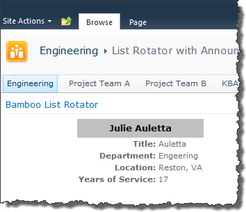
Values for My Columns Do Not Appear in the Custom Display That is Rotated
Problem:
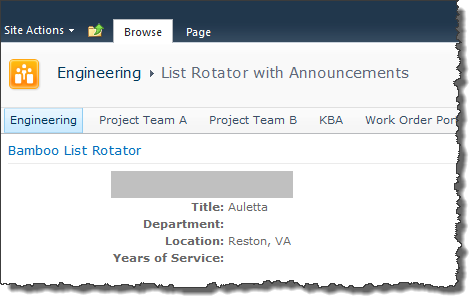 You configured a custom layout for an instance of the List Rotator, but some of the values aren’t showing. See Department and Years of Service in the screen shot.
You want to rotate the view of your Contacts list shown below.
Resolution:
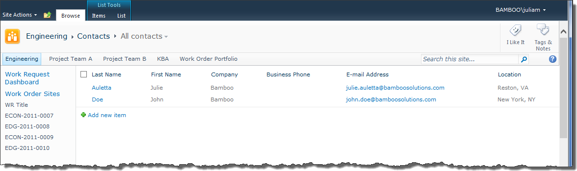
Because the All contacts view shown above doesn’t include the columns Full Name, Department, or Years of Service, the List Rotator can’t get the data to display. There are two ways to resolve this:
1. Modify the All contacts view so it includes all the columns you want to include in your custom layout.
2. Change the configuration to rotate a view that includes all the columns you want to display.
When the view looks like this:
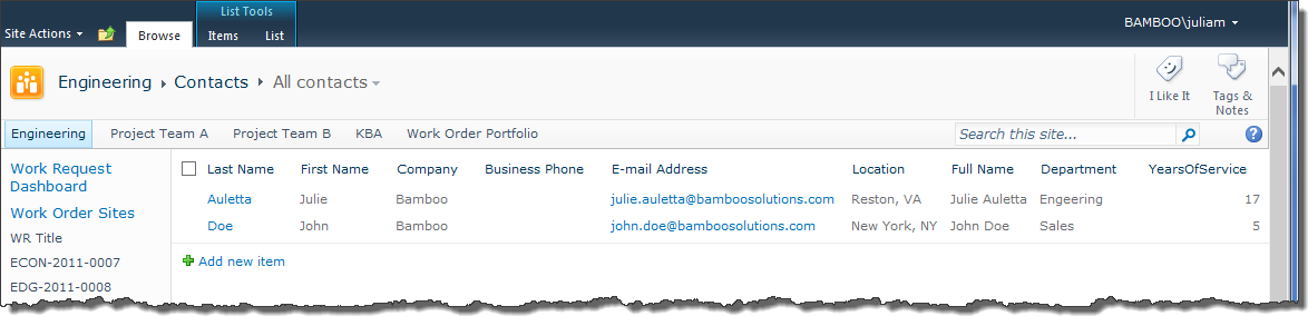
The custom layout will display all the data:

The Video Library lets you to play back files using an embedded media player, show video thumbnails, display media-specific metadata (duration, resolution, etc.) and even link to streaming servers.
Install
|
Permissions
|
License
|
Permissions
|
|
|
|
|
|
Configure
|
Permissions
|
Work With
|
Permissions
|
|
|
|
|
|
Click here if you would rather see a complete list
of all topics for this product. |
Click on the shopping bag or here to download a trial of the product or to purchase it. |
Value is Invalid Message Appears
Problem:
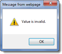 When you try to save the configuration of your List Rotator, you see this message. You click OK and things seem to work, but is everything really OK?
Resolution:
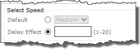 If you have selected Delay Effect in the Select Speed section of the tool pane, make sure you entered a value between 1-20.
If you forget to enter a value, the Value is Invalid message will appear when you click Apply or OK to save your configuration changes.
Using the Workflow Start Feature
Applies to
- Workflow Conductor R3.5 or newer
- SharePoint 2010 and SharePoint 2013
Overview
The Workflow Start Feature allows custom workflow start buttons to be added to the item ribbons within SharePoint lists/libraries. The workflow buttons will display configurable names and launch any desired workflow associated with the current item. Users simply highlight an item in the list and click the button to start the workflow on the selected item.
Configuring the Workflow Start Feature
| Step |
Action |
| 1. |
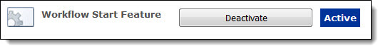 On the site where you wish to use the Workflow Start Feature, navigate to Site Actions > Site Settings > Site Actions: Manage Site Features. On the Features page, locate the Workflow Start Feature (it’s usually at the bottom of the list). On the site where you wish to use the Workflow Start Feature, navigate to Site Actions > Site Settings > Site Actions: Manage Site Features. On the Features page, locate the Workflow Start Feature (it’s usually at the bottom of the list).
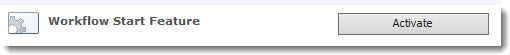
Click Activate to activate the Workflow Start Feature for the site.
NOTES:
- This is a site feature, not a site collection feature.
- If you don’t see the Workflow Start Feature listed on the Manage Site Features page, check to make sure that the Bamboo.StartWorkFlow.wsp solution is deployed to your web app and the Bamboo.StartWorkFlow.wsp site collection feature is activated for your site collection.
|
| 2. |
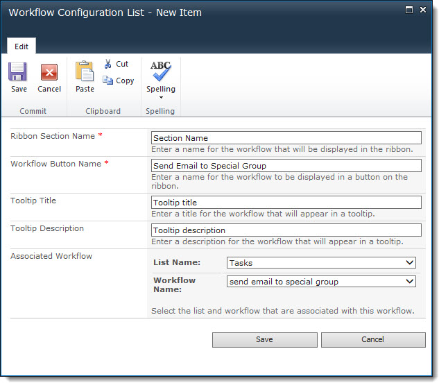
Activating the site feature creates a new list called Workflow Configuration List in the site. Configure a new item ribbon button by adding an item to this list. Find a description of the columns below:
- Ribbon Section Name: Enter a name for the section of the ribbon that will contain the workflow button. This is a required field.
- Workflow Button Name: Enter a name for the button that will be displayed in the ribbon. This is a required field.
- Tooltip Title: Enter the tooltip title that will appear when the end user hovers the cursor over the button. The Tooltip has a title that appears with bold text and a description that appears with normal text. See the screen shot shown in Step 3 below.
- Tooltip Description: Enter the text that will appear in a tooltip for the button. A tooltip appears when the end user hovers over the button with the cursor.
- Associated Workflow: Choose the list and the workflow that will be associated with the button for items in that list.
|
| 3. |
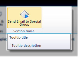 Once an item is added to the Workflow Configuration List, a button will appear in the item ribbon for the appropriate list. It will be grayed out unless an item is selected in the list. Once an item is added to the Workflow Configuration List, a button will appear in the item ribbon for the appropriate list. It will be grayed out unless an item is selected in the list.
The button shown here is the one configured in Step 2 above. Notice the tooltip that appears to end users when they hover over the button; the Tooltip Title and Tooltip Description is displayed.
NOTE: There is no configuration option for the icon that is displayed. It is the same for all workflow buttons.
|
| 4. |
To start the workflow, select an item in the list and click the button. |
Using the Workflow Initialization Form
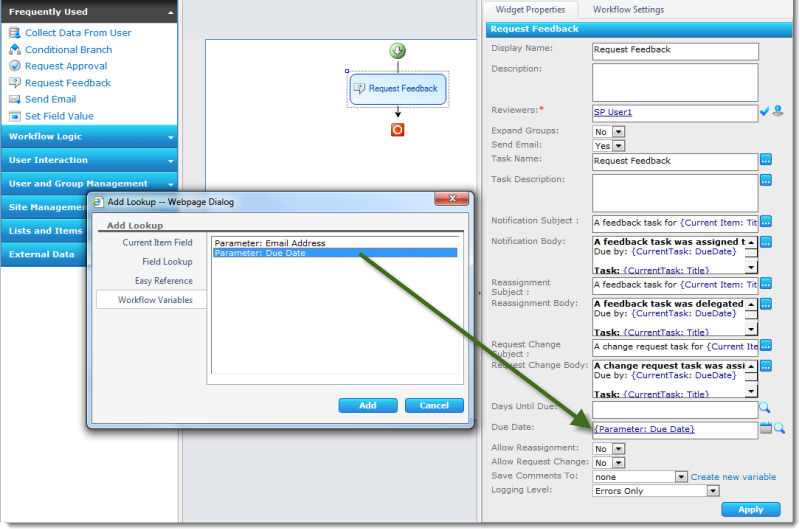
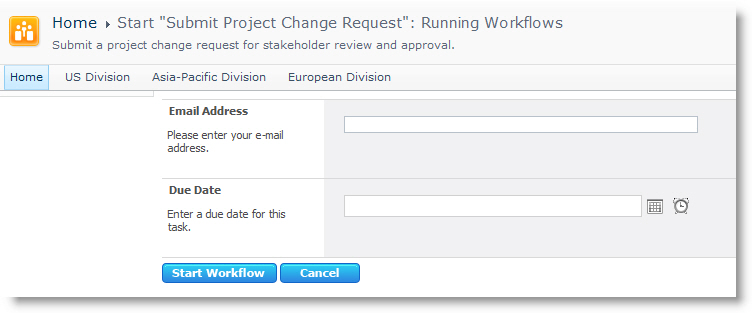 This screenshot shows an initialization form requesting two pieces of information from a workflow initiator. This form is displayed each time this workflow is run manually on an item in the list or library.
NOTE: Workflow initialization forms are shown only when a workflow starts manually.
When the workflow initiator completes the fields and clicks Start Workflow, the workflow will continue as long as all the required fields have values. Alternatively, if the workflow initiator clicks Cancel without completing the initialization form, the workflow will not run.
The information collected from the user in the form above is stored in two workflow parameters, which can be used by the widgets in the workflow. In this example, the Due Date initialization form field above is used to set the Due Date on a Request Feedback widget.
See: Create a new workflow Initialization Form or Modify a Workflow Initialization Form for more information.
Using Views in Discussion Board Plus
Discussion Board Plus (SharePoint 2010 only) provides a default view for the topic list (Forum view) and two different views (Flat and Thread) for discussion threads. Click on a view name for more details about each view.
| Step |
Action |
Result |
| 1. |
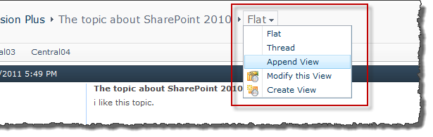
To switch between the two available discussion thread views, click on a discussion topic in the Forum view, and click Forum Settings in the List ribbon. |
 |
|
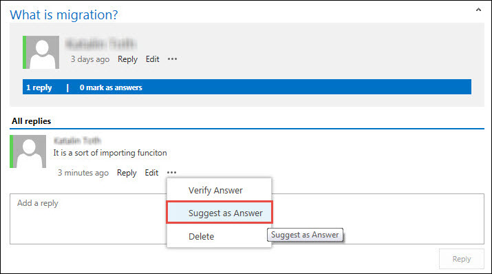
Verify an Answer or Suggest as Answer in Discussion Board Plus
Any reply can be marked as a Verified Answer, whether it was first marked as a Suggested Answer or not. There can be only one Verified Answer. The steps are slightly different depending on which version of SharePoint you are using.
|
SharePoint 2010:
|
| Decision |
Action |
Result |
| Mark a reply as the Verified Answer |
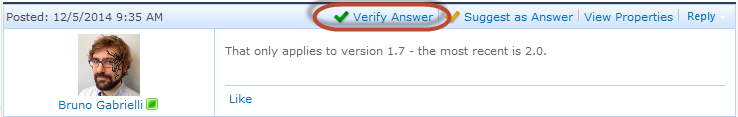
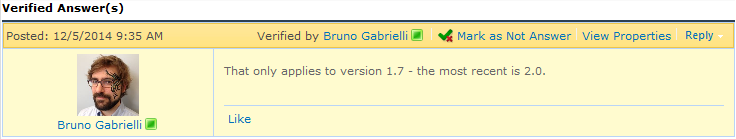
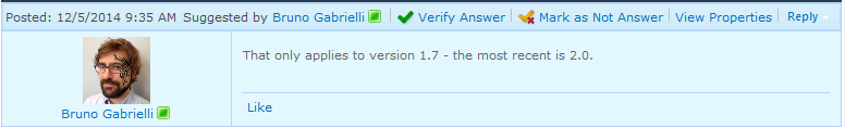
In the Forum view of the discussion board within the reply you want to verify, click on Verify Answer.
NOTE: If you do not have the required permissions to verify an answer or if the Verify Answer feature is not enabled in the Forum Settings, you will not see the option in the toolbar at the top of the post.
|
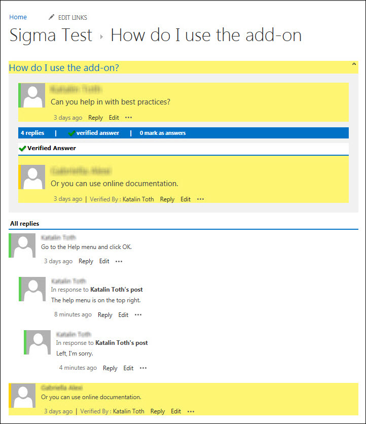
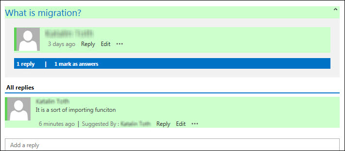
After you click Verify Answer, the post will be shaded yellow and your name will appear at the top of the replies to show that it was “Verified by [Your Name]”.
The reply will also be moved to the top of the list, directly under the original post.
If another post was previously marked as the Verified Answer, it will be unmarked and returned to its normal position in the thread.
 |
| Suggest as Answer |
To suggest a reply as an answer, in the Forum view of the discussion board within the reply, click on Suggest as Answer.
 |
After you click Suggest as Answer, the reply will be shaded green and your name will appear at the top of the post to show that it was “Suggested by [Your Name]”.
NOTE: If you do not have the required permissions to suggest an answer or if the Suggest as Answer feature is not enabled in the Forum Settings, you will not see the option in the toolbar at the top of the post.
|
| Undo Verify as Answer |
If you are the topic creator or a forum moderator and decide that the post is not really the answer, use Mark as Not Answer to remove the suggestion or click Verify Answer on a different post.
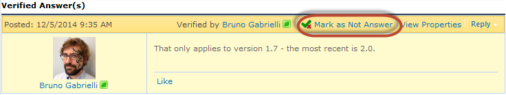 |
If the post had been a Verified Answer, it will be removed from the top of the list and returned to its normal position in the thread.
NOTE: Only the user who marked the post as Suggested or Verified, the topic creator, or a forum moderator can Mark as Not Answer. For more information, see Permissions in Discussion Board Plus.
|
| Delete an Answer |
Discussion Board Plus uses the built-in SharePoint permissions to determine what actions a user can perform in a Discussion Board Plus list. For a description of permissions required to perform actions in forums, see Permissions in Discussion Board Plus. In addition to the default permissions provided by Discussion Board Plus:
- Administrators and Moderators can add, update or delete any forum topic or post.
- Members can add topics and posts, but can only edit or delete their own topics/posts.
- If a read-only account is configured in the Forum Control Panel, anonymous users can read topics and posts but cannot add new topics or posts.
|
|
SharePoint 2013:
|
| Decision |
Action |
Result |
| Mark a reply as the Verified Answer |
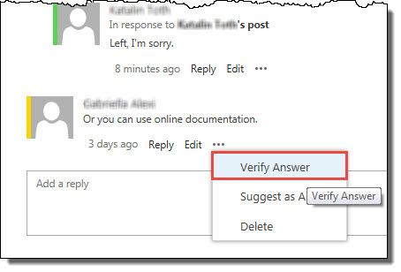
In the Forum view of the discussion board within the reply you want to verify, click on the ellipsis (…) and select the option Verify Answer in the Context Menu pop-up.
NOTE: If you do not have the required permissions to verify an answer or if the Verify Answer feature is not enabled in the Forum Settings, you will not see the option in the toolbar at the top of the post.
|
After you click Verify Answer, the post will be shaded yellow and your name will appear at the top of the replies to show that it was “Verified by [Your Name]”.
The reply will also be moved to the top of the list, directly under the original post.
If another post was previously marked as the Verified Answer, it will be unmarked and returned to its normal position in the thread.
 |
| Suggest as Answer |
To suggest a reply as an answer, in the Forum view of the discussion board within the reply, click on the ellipsis (…) and select the option Suggest as Answer in the Context Menu pop-up.
 |
After you click Suggest as Answer, the reply will be shaded green and your name will appear at the top of the post to show that it was “Suggested by [Your Name]”.
NOTE: If you do not have the required permissions to suggest an answer or if the Suggest as Answer feature is not enabled in the Forum Settings, you will not see the option in the toolbar at the top of the post.
|
| Undo Verify as Answer |
If you are the topic creator or a forum moderator and decide that the post is not really the answer, use Unmark Verified Answer. Click on the ellipsis (…) within the reply you want to change and select the option Unmark Verified Answer in the Context Menu pop-up. |
The post will no longer be highlighted yellow in the thread. |
| Delete an Answer |
Discussion Board Plus uses the built-in SharePoint permissions to determine what actions a user can perform in a Discussion Board Plus list. For a description of permissions required to perform actions in forums, see Permissions in Discussion Board Plus. In addition to the default permissions provided by Discussion Board Plus:
- Administrators and Moderators can add, update or delete any forum topic or post.
- Members can add topics and posts, but can only edit or delete their own topics/posts.
- If a read-only account is configured in the Forum Control Panel, anonymous users can read topics and posts but cannot add new topics or posts.
|
Using Value Comparison as a Validator
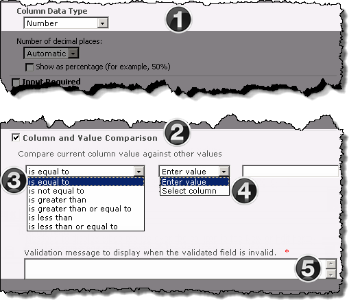
Value Comparison allows the Validator Column to compare a user-entered value with either a pre-defined value or a value contained in another column within the current list, via comparisons, such as greater than/less than for numeric values, and contains/begins with/ends with for text values.
The image has been edited to better represent the configuration options.
NOTE: The following steps require you to have accessed the New Column settings screen and selected Bamboo Validator as the column type.
|
|
Function |
| 1. |
Select the type of data to be entered into the column from the Column Data Type drop-down menu. The available choices are:
-
Single Line of Text
-
Number
-
Currency
NOTE: Additional formatting options may appear in the configuration screen based on your selection.
|
| 2. |
Check the Column and Value Comparison check box to expose the value comparison configuration options. |
| 3. |
Select the operator to be used in the value comparison:
NOTE:The options shown are associated with the Number column data types. The available choices will differ based on the currently assigned Column Data Type.
|
| 4. |
Select either Enter value to set a specific comparison value, or Select column to use a comparison value from another column in the List.
-
If you choose Enter value, provide the value in the blank field on the right.
-
If you choose Select column, choose the column from the drop-down menu on the right.
|
| 5. |
Enter the required message that will be displayed when an entered value is determined to be invalid in the Validation message field. |
Using Tokens in your Alert Plus Email Message
One of the great features of the Alert Plus Web Part is that it allows you to specifically format the email message for each alert you create. This way the Email recipients know exactly why they are getting the message.
You are not limited to static text in the subject or message body. The use of special tokens allows you to include references to dynamic objects such as Alert List columns, the alert item, or the site where the Alert List resides. As part of that formatting, you can use special tokens in the subject or the body of the HTML-based template. These special tokens are replaced with Alert List column values and other constructs when the message is created and sent.
Available Tokens in Alert Plus are described in the table below.
| Token |
Description |
Use in a Hyperlink tag? |
| {[Column Display Name]} |
Add the value of any Alert List column name to the Email message. For example, the token {Due Date} will insert the value of the item’s Due Date column into the subject or message (wherever you have placed the token).
 IMPORTANT: These tokens are case-sensitive! If the column name is Title and you use the token {title}, no values will appear in the email message. IMPORTANT: These tokens are case-sensitive! If the column name is Title and you use the token {title}, no values will appear in the email message.
IMPORTANT: In Alert Plus v4.x and higher, if you are alerting on a view of a list, each token must be included in the view. If its not in the view, it’s value wil not appear in the Email message.
|
Yes |
| {[Column Display Name]/Old} |
Add the previous value of any Alert List column name to have the old item value for that column inserted. For example: The token {Title/Old} will insert the value of the Title column BEFORE the change.
IMPORTANT: These tokens are available only if the alert Trigger Type is A specific column in the list changes.
|
No |
| {[Comment Column Display Name]/New} |
This applies only to multiline text fields that allow appended data. The /New switch will show only the most recently appended content.
IMPORTANT: These tokens are available only if the alert Trigger Type is A specific column in the list changes.
NOTE: This feature is only available in Alert Plus version 4.0 and later.
|
No |
| {ItemURL} |
Inserts a link to the item that generated the alert. |
Yes |
| {SiteURL} |
Inserts a link to the site where the item that generated the alert resides. |
Yes |
| {itemlink} |
Inserts a link to the item that generated the alert.
The link construction method is dictated by the contents of the External Host Path and Custom Item Link fields on the Mail Format – Options tab.
|
No |
| {sitelink} |
Inserts a link to the site containing the Alert List.
The link construction method is dictated by the contents of the External Host Path and Custom Item Link fields on the Mail Format – Options tab.
|
No |
| {FolderName} |
Inserts the name of the folder where the alert item resides. |
Yes |
| {FolderPathName} |
Inserts the names of nested folders where the alert item resides. In other words, if the item resides in a folder that is in another folder, the {FolderPathName} includes the names of all the folders in the path to reach the alert item.
Use this token when building a Custom Item Link on the Mail Format – Options tab.
|
Yes |
| Images |
Images can also be inserted into the e-mail Message Templates through the use of the HTML IMG element. Type in the image element and the source path to the image file to insert.
NOTE: The image file to be shown must exist at a location that can be resolved with a relative or fully-qualified URL path. On subsequent edits of the message template you will not see the IMG element, but rather the picture itself. If you desire to change the linked image, then you will first need to delete the existing picture.
|
No |
 With Bamboo’s Validator Column, you can control list content and validate column data by range, structure, or value, during entry, and do it programmatically using regular expressions for unlimited options.
Install
|
Permissions
|
License
|
Permissions
|
|
|
|
|
|
Configure
|
Permissions
|
Work With
|
Permissions
|
|
|
|
|
|
Click here if you would rather see a complete list
of all topics for this product. |
Click on the shopping bag or here to download a trial of the product or to purchase it. |
How to Work With the User Account Setup Web Part
User Account Setup is typically added to a blank Web Part page. When a user who is a Site Collection Administrator visits the page, s/he is presented with an interface to which new users can be added to both SharePoint and Active Directory or local NT, depending on how User Account Setup was configured.
| Step |
Action |
Result |
| 1. |
The Site Collection Administrator can click the Clear button to clear text in all the fields on the Web Part and enter the contents into each column. |
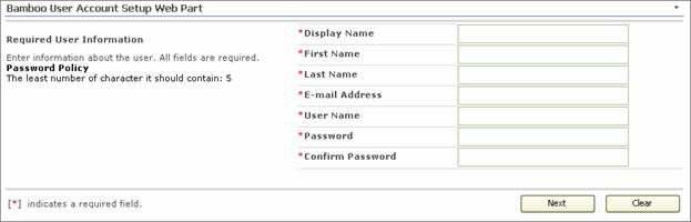
Columns marked with a red asterisk are required fields meaning they require content in them. |
|
See Configuration topics for further details.
Using the Template Gallery
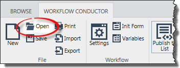 Access the Template Gallery by clicking Open on the Workflow Conductor Studio main menu.
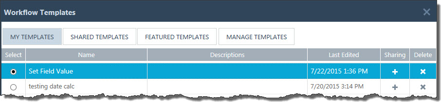
The Workflow Templates dialog appears. The contents of this dialog will vary for each logged in workflow designer.
For more information about each area of the gallery, see the table below:
| Area |
Description |
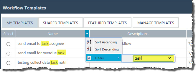
| Filtering/Sorting |
Access the menu associated with any of the header columns to sort or filter the list using the contents of that column. To filter on a particular string (i.e., task) enter the string in the Filters box as shown below. The list of templates will be filtered as you enter text.
 |
| Bottom Border |
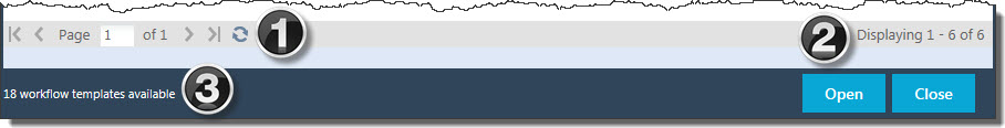
1. Use the Page Control to navigate from one page to the next in order to see all available templates. Click the Refresh icon ( ) to refresh the display. Refreshing is most useful on the Shared, Featured and Manage template tabs since content on those tabs can be updated by other users. ) to refresh the display. Refreshing is most useful on the Shared, Featured and Manage template tabs since content on those tabs can be updated by other users.
2. The note on the bottom right corner will show you how many templates are available on the current tab and displayed on the current page.
3. The note in the bottom band of the gallery tells you how many templates in total are available on the farm. For template managers, this is the number of templates displayed on the Manage Templates page. |
| My Templates |
This tab is displayed by default when the Template Gallery opens (see screen shot above). It lists all the templates created by the logged in user. Sometimes, several pages of templates can be displayed.
Click the + in the Sharing column to share the template.
Click the X in the Delete column to delete the template. Acknowledge the warning message (shown below), and the template will be deleted. 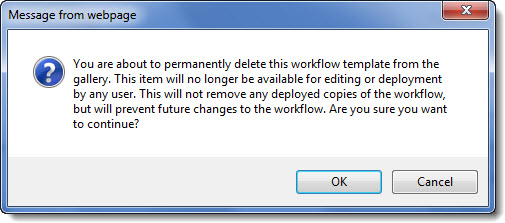
IMPORTANT: Once a template is deleted, it is gone for good.
|
| Shared Templates |
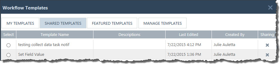
The Shared Templates tab shows all the templates that have been shared. The Created By column indicates who shared the template and the Last Edited columns shows when it was shared.
If you are the user who shared the template or a template manager, an X appears in the Sharing column. Clicking the X for a particular template will display a confirmation message (shown below). Clicking OK will delete the shared template. 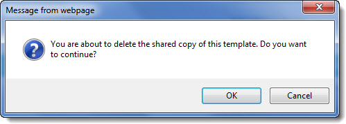
IMPORTANT: Once a shared template is deleted, it is gone for good. However, the original template may be in the original designers My Templates tab, although it may no longer be exactly the same as the deleted shared template.
|
| Featured Templates |
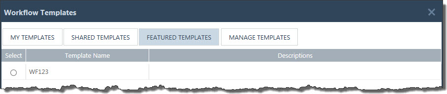
The Featured Templates tab shows all the templates that have been featured. No information about the original designer or the date last edited is shown, but it can be found by template managers from the Manage Templates tab (see below). It is not possible to remove any featured templates from this list through this interface.
Add or remove templates from the Featured Templates list via SharePoint Central Administration and the Template Management page of the Workflow Conductor Control Panel.
|
| Manage Templates |
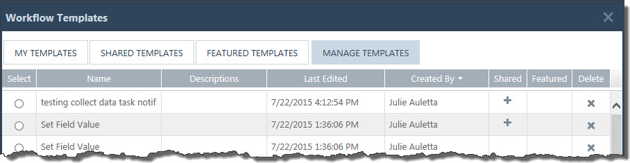
The Manage Templates tab is displayed only for template managers. It shows all the templates available on the farm.
Overview of symbols and collumns:
- A + will appear in The Shared column if the template is shared.
- A + will appear in the Featured column if the template is featured.
- The user shown in the Created By column is the user who created, shared, or featured the template.
- The date shown in the Last Edited column is the date and time the template was saved, shared, or featured.
|
Using the Setup program to Uninstall
IMPORTANT: As of April 2017, Bamboo no longer includes Setup progra, in product download packages. An updated uninstall script is included instead. Please seeOverview of the Updated Installation Process for Bamboo components and Uninstalling using the updated process for details.
Before uninstalling a Bamboo web part product, be sure to delete the web part from all pages where it was used. If you forget to do this, your users will see errors on those pages after you uninstall.
| Step |
Action |
| 1. |
Stop the World Wide Web Publishing Service (W3SVC) of you are not using Claims Based Authentication (CBA) or SP2013. This will ensure that files that need to be removed during the install are not locked.
From the Start menu on the SharePoint server desktop, click Administrative Tools > Services. Scroll down and right-click on World Wide Web Publishing Service and select Stop.
If you are using CBA or SP2013, stop the App Pool(s) to ensure that files are not locked.
|
| 2. |
Locate the installation files used to install the product. Double-click the Setup.bat program included in the main folder. Select the product in the Components section in the Setup program. Verify the installation location and required permissions and then click Install. |
| 3. |
Click Next to begin the uninstall. Verify that the system checks pass successfully and click Next. |
| 4. |
In the Repair, Remove or Install screen, select the Remove All option and click Next. Wait while the components are uninstalled. |
| 5. |
When uninstallation is complete, click Next to review the summary screen and confirm that the product removal was successful. Click Close. |
| 6. |
If there are additional components in the Components list in the Setup program, follow steps 2-5 above for each component. |
| 7. |
If you stopped the World Wide Web Publishing Service, restart it.
From the Start menu on the SharePoint server desktop, click Administrative Tools > Services. Scroll down and right-click on World Wide Web Publishing Service and select Start. |
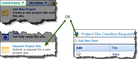
Using the Project Site Creation Request list
Project stakeholders who do not have the SharePoint permissions required to create sites, can submit requests for new project sites using the Project Site Creation Request list. Requests entered into the list are displayed under the portfolio site’s Overview tab.
Items entered into the list can then be approved using either:
Note: A sample workflow is included with the PM Central installation package. The approval workflow notifies a list of approvers that a new site has been requested. When the request is approved, the workflow notifies a list of people authorized to create project sites that a new site can be created. For more information about using the sample workflow included with PM Central, click here read KB.12789:
| Step |
Action |
Result |
| 1. |
From the Central Actions drop down menu, click the Request Project
OR
On the portfolio site’s Overview tab, click the
Add New Item link above Project Site Creation Requests
|
Keep in mind:
1.The Request Project Site link is available by default, but this Central Actions Enhanced Menu feature may have been disabled by your administrator.
2.Requests created using either the Request Project Site and/or the Request Project Site Lite will be displayed in the Project Site Creation Request data view found on the Overview tab of the portfolio site |
| 2. |
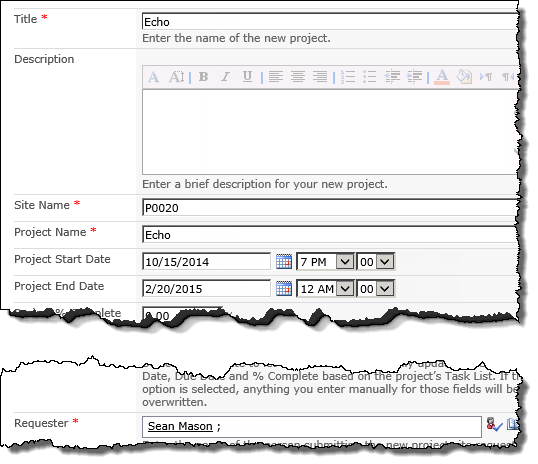
Enter a Title, Site Name and Project Name
Note: These fields are referenced by the sample workflow is included with the PM Central installation package.
|
 |
| 3. |
Identify the sites Requester |
| 4. |
Enter any other known information about the project, including Project Manager, Project Department, Project Type. |
| 5. |
Click Save |
The item will be displayed in the Project Site Creation Requests web part pending manual approval, or automatic approval and site creation if you are using Workflow Conductor. |
|
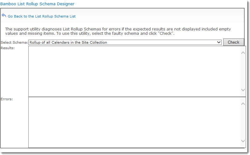
Using the List Rollup Schema Designer Support Page
The List Rollup Schema Designer Support page provides a useful utility to help troubleshoot issues with rollups.
To use the utility, follow these steps:
| Step |
Action |
| 1. |
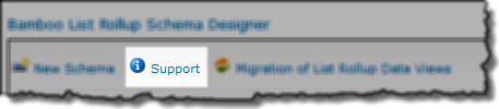 In the List Rollup Schema Designer Web Part, click Support from the main menu. In the List Rollup Schema Designer Web Part, click Support from the main menu. |
| 2. |
Select the schema you need to check in the Check Schema list and then click the Check button. All schemas that have been defined on the current site should be listed.
 |
| 3. |
The schema will be analyzed and the results shown in the Results area. Information shown in green text is just information, but if you see red text you should review the findings more carefully.
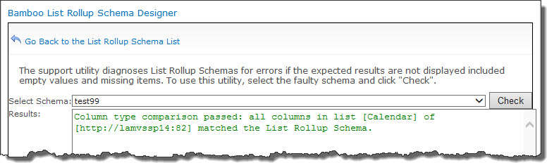 |
| 4. |
Examples of other issues you may encounter that you can troubleshoot with the Support Page:
If you encounter an issue that is not explained and you need help with it, please submit a ticket to our Support Team via the My Bamboo area of the Bamboo web site.
|
Using the Holiday List in Calendar Plus
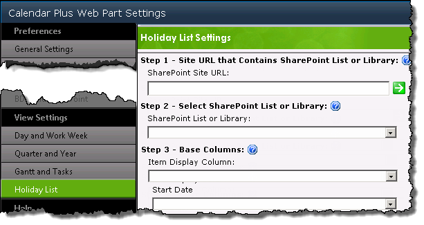
The Holiday list settings screen allows you to point to an existing SharePoint list that identifies holidays.
When Calendar Plus is configured to reference a Holiday List, items from the list will be displayed in all Calendar Plus views
Using the Drag & Drop Menu Editor
The Drag & Drop Menu Editor lets users easily build and customize mega menus and tabs strips. The browser-based designer allows adding and editing text, hyperlinks, and images with a simple drag and drop interface.
To get started, you need to begin by Configuring the List and List View for the Navigator Web Part.
NOTE: The Drag & Drop Menu Editor is only available for the Navigators Menu and Navigators TabStrip Web Parts. Show Mega Menu or Show Mega Content options must be selected in the Display and Navigation Web Part Settings to enable the editor.
Below is a screen shot of the editor that will appear after you select Edit Web Part to open the configuration tool pane. Each option is described below to help make sense of what you see in the editor to create menus.
Top
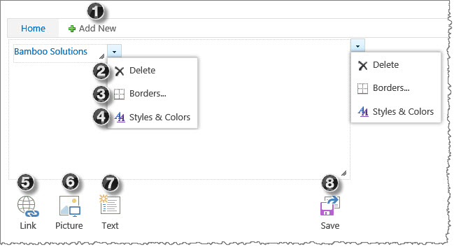
| No. |
Option |
Description |
| 1. |
Add New |
Select the Add New button to add menu tabs. |
|
| 2. |
Delete |
Remove an item by selecting Delete from the drop-down arrow menu. To remove all items under a tab, select the Delete button from the tab container’s drop-down menu. |
| 3. |
Borders |
Select Borders from the drop-down arrow menu to customize an item or tab container’s border properties. For additional information, see Configuring Border Options. |
| 4. |
Styles &
Colors |
Select Styles & Colors from the drop-down arrow menu to customize a Link or Text element’s font attributes. To apply styles to all items under a tab, select the Styles & Color option from the tab container’s drop-down menu. For additional information, see Configuring Styles & Colors Options. |
| 5. |
Link |
Drag & drop or select the Link button to insert a hyperlink. Enter an absolute or relative URL address and the display text. |
| 6. |
Picture |
Drag & drop or select the Picture button to insert an image. Enter an absolute or relative URL of the image location. |
| 7. |
Text |
Drag & drop or select the Text button to insert text elements. |
| 8. |
Save |
Select the Save button to save all changes. |
|
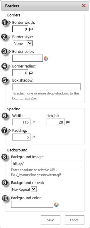
Border Options Top
 |
No. |
Option |
Description |
| 1. |
Border
Width |
Border Width sets the width of an items four borders. Expand this section to individually set the width for each border. |
| 2. |
Border
Style |
Border Style sets the style of an items four borders. Expand this section to individually style each border.
Available options: Dotted, Dashed, Solid, Double, Groove, Ridge, Inset, Outset. |
| 3. |
Border
Color |
Enter a color value or select from the color-piker to set the Border Color of an items four borders. Expand this section to individually color each border. |
| 4. |
Border
Radius |
Border Radius allows you to add rounded edges to an items four border corners. Expand this section to individually set a radius for each corner. |
| 5. |
Box
Shadow |
Box Shadow adds one or more shadows to an item. Specify each shadow, in pixels, separated by space key. |
| 6. |
Width &
Height |
This option allows you to set the Width and Height of an items or tabs container. Additionally, you can resize containers using drag and drop. |
| 7. |
Padding |
Padding allows you to set the space between the border and the items or tab containers content. Expand this section to individually add padding for each border. |
| 8. |
Background
Image |
This option sets a Background Image for an item or a tab container. The image size will adjust to fit the containers size and padding. |
| 9. |
Background
Repeat |
Background Repeat sets how a background image is repeated. By default, a background image will not be repeated (No-Repeat).
Available options: No-Repeat, Repeat (repeats both vertically and horizontally), Repeat-X (repeats only horizontally), or Repeat-Y (repeats only vertically). |
| 10. |
Background
Color |
Enter a color value or select from the color-piker to set the Background Color for an item or a tab container. |
|
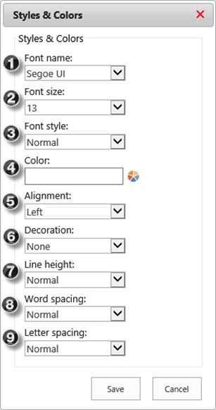
Styles & Color Options Top
 |
No. |
Option |
Description |
| 1. |
Font
Name |
Select a Font Name to specify the font for an item. To apply the same font to all items under a tab, specify the font from the tab container’s drop-down menu.
Available Options: Arial, Calibri, Comic Sans, Courier, Garamond, Georgia, Impact, Lucida Console, Palatino Linotype, Segoe UI (Default), Tahoma, Times New Roman, Trebuchet MS, Verdana. |
| 2. |
Font
Size |
Select the Font Size to set the size of the font. To apply the same font size to all items under a tab, specify the font size from the tab container’s drop-down menu. |
| 3. |
Font
Style |
Select a Font Style to specify the style for your text. To apply the same font style to all items under a tab, specify the font style from the tab container’s drop-down menu.
Available Options: Normal, Italic, Bold, Bold Italic. |
| 4. |
Color |
Specify Color by entering a color value or selecting from the color-piker to set the font color. To apply the same font color to all items under a tab, specify the color from the tab container’s drop-down menu. |
| 5. |
Alignment |
Select the horizontal Alignment for your text. To apply the same alignment to all items under a tab, specify alignment from the tab container’s drop-down menu.
Available Options: Left (aligns text to the left), Right (aligns text to the right), Center (center aligns text ), Justify (stretches text to fit line width). |
| 6. |
Decoration |
Specify the Decoration to add to the text. To apply the same decoration to all text elements under a tab, specify decoration from the tab container’s drop-down menu.
Available Options: None (Default), Underline, Overline, Line-Through. |
| 7. |
Line
Height |
Select the Line Height options to specify the amount of space above and below inline elements. To apply the same line height to all text elements under a tab, specify line height from the tab container’s drop-down menu.
Available Options: Normal (Default), Number (multiplied by the item’s font size), Length (fixed height, in pixels), % (percent of the item’s font size). |
| 8. |
Word
Spacing |
Specify the Word Spacing to adjust the space between words. To apply the same spacing to all text elements under a tab, specify spacing from the tab container’s drop-down menu.
Available Options: Normal (Default), Length (define the space, in pixels). |
| 9. |
Letter
Spacing |
Specify the Letter Spacing to adjust the space between letters. To apply the same spacing to all text elements under a tab, specify spacing from the tab container’s drop-down menu.
Available Options: Normal (Default), Length (define the space, in pixels). |
|
Also see:
Using the Collect Data from User Widget in a Workflow Published to a Site or Site Collection
When a workflow is published to a site or site collection, users can associate it with other lists/libraries in the site or site collection without opening the Workflow Conductor Studio. This is one of the main benefits of publishing workflows these ways.
However, a side effect of this practice is that the user can change things about the workflow, including the name of the workflow tasks list used for the workflow association.
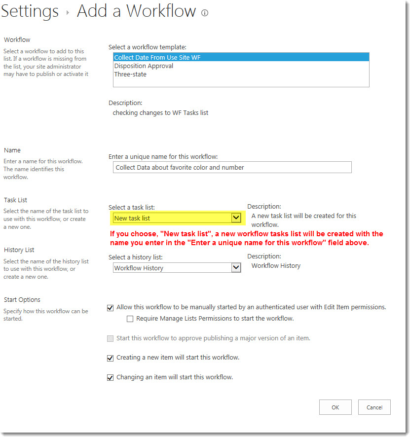
To ensure that a different workflow task list doesn’t impact your Collect Data from User widget, follow these practices when referencing values entered into the Collect Data form:
| Step |
Action |
| 1. |
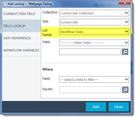 Don’t assume that the workflow tasks list will be the default list configured in Central Admin (typically Workflow Tasks, as shown here). Don’t assume that the workflow tasks list will be the default list configured in Central Admin (typically Workflow Tasks, as shown here). |
| 2. |
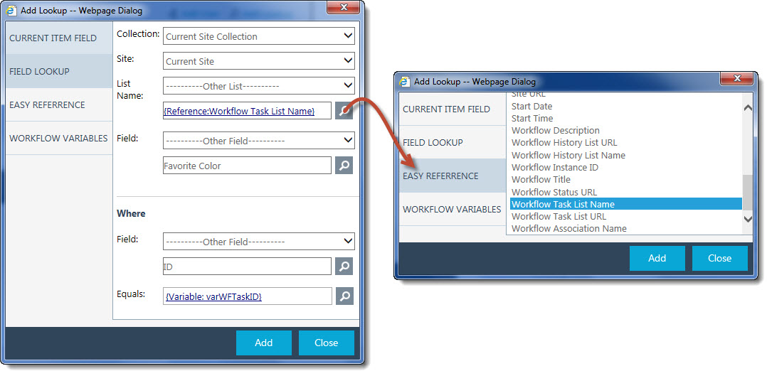
Instead, use the Easy Reference variable Workflow Task List Name.
 |
Using the Bamboo Feature Activation tool to activate features
The Bamboo Feature Activation tool can be run as the final installation step after the solutions are deployed to the selected web applications. If automatic activation features are not selected in the required installation steps, users can enter site collection URL(s) to activate all required features of SharePoint Project Management Central. This step does not install any new components. It simply finds, deactivates, then reactivates all required SharePoint Project Management Central’s specific features for the site collection(s).
It is also a useful tool if you create a new site collection for a new PM Central portfolio site. Rather than having to activate all the site collection features manually, use this tool to automate the activation. It will save you some time.
To run the tool, follow these steps:
| Step |
Action |
| 1. |
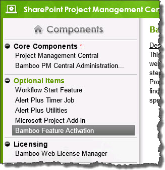 Run the PM Central installation/setup program on the WFE server where you installed originally. Highlight Bamboo Feature Activation in the Optional Items section of the Components. Run the PM Central installation/setup program on the WFE server where you installed originally. Highlight Bamboo Feature Activation in the Optional Items section of the Components.
If you don’t have the install files around anymore, you can download them again from the My Bamboo area of the Bamboo website.
NOTE: Be sure to run this tool as a user who is a Site Collection Administrator for the site collection where you want to activate the features.
|
| 2. |
Click the Install button in the lower right corner of the installation/setup interface.
|
| 3. |
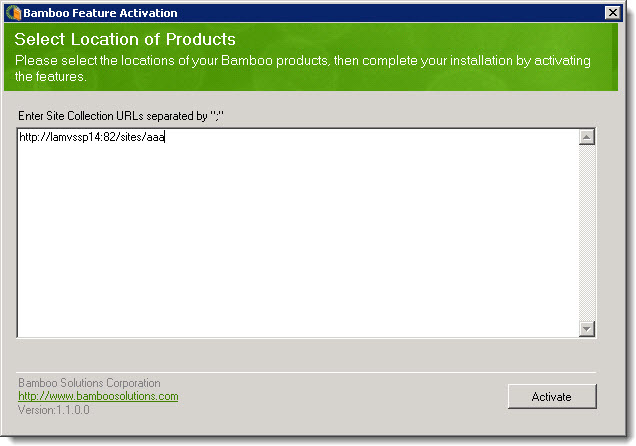 Enter the URL of the site collection where you want to activate the PM Central features. See the sample below. Enter the URL of the site collection where you want to activate the PM Central features. See the sample below.
NOTE: Don’t include the page name in the URL or you will get an error that the tool could not find the site collection.
|
| 4. |
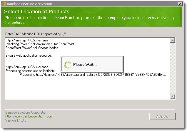 Watch as the process continues. Watch as the process continues. |
| 4. |
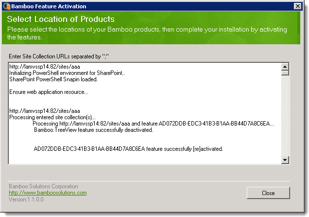 When all features are activated, the Close button is enabled. Check that all features were successfully deactivated and then reactivated before closing the tool. When all features are activated, the Close button is enabled. Check that all features were successfully deactivated and then reactivated before closing the tool. |
Using the Bamboo Color Picker
A number of Bamboo components give you the ability to modify the presentation of the display through color.
Drop down selector
Offers a selection of predefined colors
Bamboo Color Picker
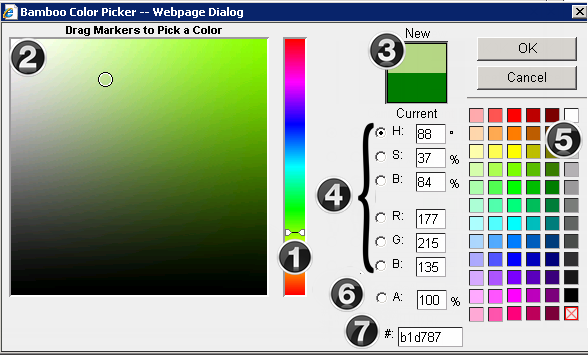
Change an items color using one or more of the following options:
1. Move the slider along the vertical color spectrum
2. Click in the color box to select the desired color. All values in the input fields will adjust based on the selection.
3. The New and Current (original) colors will be displayed in color rectangles. Clicking the Current color rectangle will revert all values back to the original settings.
4. Edit the HSB (Hue, Saturation, Brightness), RBG (Red, Blue, Green) fields. These edit boxes will show the HSB and RGB values for the color in the New color rectangle
5. CMYK colors are available on the right of the screen. All values in the color picker will adjust based on the selection
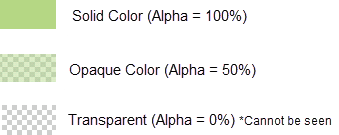
6. If an Alpha value (transparency) should be applied, enter this as a percentage. The Alpha (A) % is indicated by the cross hatching and color in the color swatch.
7. Enter a hex value
Using the Alert Plus Subscriber Web Part
Alert Plus Subscriber Web Part displays a list of Bamboo Alerts the current user is subscribed to, either directly or through membership in a SharePoint Group.
NOTE: This web part doesn’t show SharePoint alerts the user subscribed to, it shows alerts that are sent from the Bamboo Alert Plus Web Part. If you are interested in seeing or managing the SharePoint Alerts you or your team is subscribed to, see the Bamboo Alerts Administrator Web Part.
To use Alert Plus Subscriber Web Part, first add the web part to a page. see Configuring the Alert Plus Subscriber Web Part for details.
The Alert Plus Subscriber Web Part automatically displays the Bamboo Alerts for the current user. The main group heading, You are subscribed to these alerts, includes the alerts the logged in user is specifically identified as a recipient.
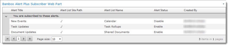
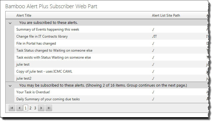 Some users may see a grouped view, as shown here. The group called You may be subscribed to these alerts appears if alerts are configured for items like Tasks where the alert is sent to the task assignee. In other words, the recipient is not specifically defined.
By default, Alert Plus Subscriber Web Part displays alerts in groups of 10. You can change the number of items displayed per page by making a selection in the Page size drop-down list at the bottom of the web part. Scroll between pages using the page navigation controls in the lower left corner.
NOTE: The Page size control is not available when using the web part in SharePoint 2013 environments.
Using Tab View
Tab View is a home page Web Part for the KB client site that displays and searches article lists. Read more about configuring Tab View.
The client site also offers another viewing mode, Tree View, which is located in the quick launch.
Viewing Articles
Clicking on an article title from tab view automatically opens the article in a pop-up window. The blue arrow icon next to the article title opens the article in a new browser tab.
Tabs
The Featured tab displays a dashboard of Popular, Top Rated, Recently Updated, and Recently added articles.
Categories displays articles by category grouping. Click “Next” in the bottom right corner of the web part to view additional categories.
All Articles lists articles by creation date.
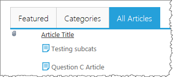
Categories & Breadcrumbs
While navigating through categories, Tab View will display a breadcrumb trail of your current location at the top of the display pane. Click on any of the hyperlinked categories in the trail to jump to that category. Clicking on the link icon will display a direct link to the category you are currently viewing, which you can send to other users.
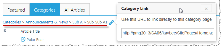
Search
The Search all articles search bar conducts a simple search across Article Title and Article Text and displays results in whatever list view you configured for the Tab View WP. For more robust search options, use the search option in the quick launch menu on the left.
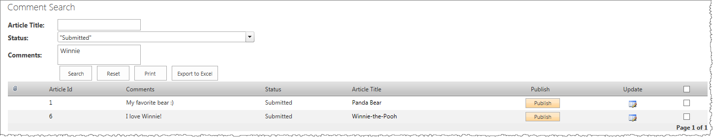
Using Relative Paths
Use the table below to determine how your relative paths will appear.
| Site |
Path |
Equivilent to |
| Top Site (Root Site) |
/SiteDirectory/KBAdmin/
or
~/SiteDirectory/KBAdmin/
|
http://servername/SiteDirectory/KBAdmin/_blank |
| Sub-site (Current Web Site) |
Lists/Discussion20Board/
or
./Lists/Discussion20Board/
|
http://servername/SiteDirectory/KBAdmin/Lists/Discussion20Board/_blank |
|
Use Rating Column with Video Library
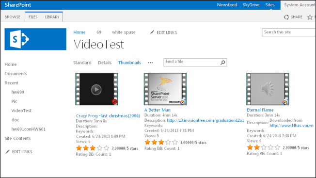
When Rating Column (sold separately) is installed on your SharePoint server, add Rating Column to your Video Library to allow visitors to rate media content.
See:
Using Range Comparison as a Validator
Range Comparison allows the Validator Column to compare a value entered by a user to a specific range of values, provided by the site administrator.
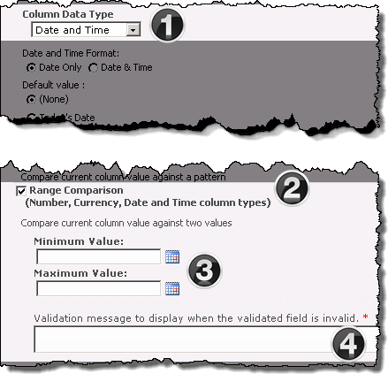
The image has been edited to better represent the configuration options.
The following steps require you to have accessed the New Column settings screen and selected Bamboo Validator as the column type.
|
|
Function |
| 1. |
Select the type of data to be entered into the column from the Column Data Type drop down menu. The available choices are:
-
Single Line of Text
-
Number
-
Currency
-
Date and Time
NOTE: Additional formatting options may appear in the configuration screen based on your selection.
|
| 2. |
Check the Range Comparison check box to expose the pattern comparison configuration options.
NOTE:This option will be grayed out if Single Line of Text was selected as the Column Data Type.
|
| 3. |
Enter the Minimum and Maximum values into the corresponding fields. |
| 4. |
Enter the required message that will be displayed when an entered value is determined to be invalid in the Validation message field. |
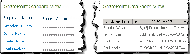
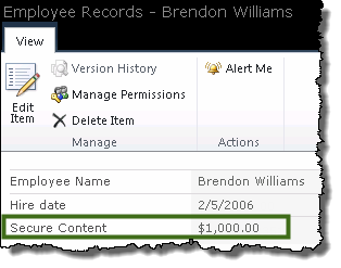
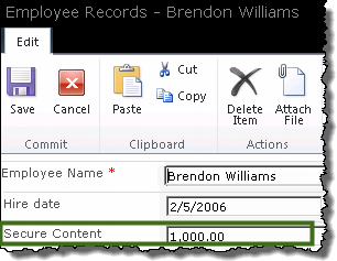
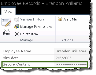
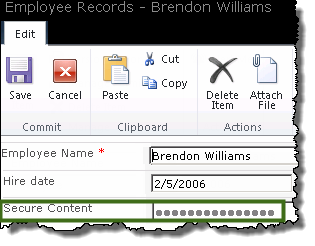
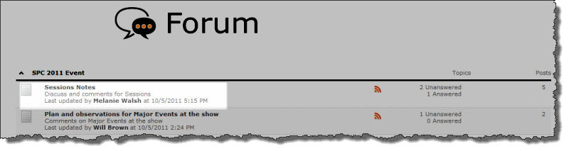 To view a Community Central forum, click on its name on the Forums Home page or on the forum site page in the site where the forum was created.