Sort Order is optional. You can sort data displayed in the Data-Viewer Web Part by up to two columns.
| Step | Action | Result |
| 1. | Select a column and choose whether to sort in ascending or descending order. |
|
Bamboo Solutions
Product Documentation
Document
Sort Order is optional. You can sort data displayed in the Data-Viewer Web Part by up to two columns.
| Step | Action | Result |
| 1. | Select a column and choose whether to sort in ascending or descending order. |
|
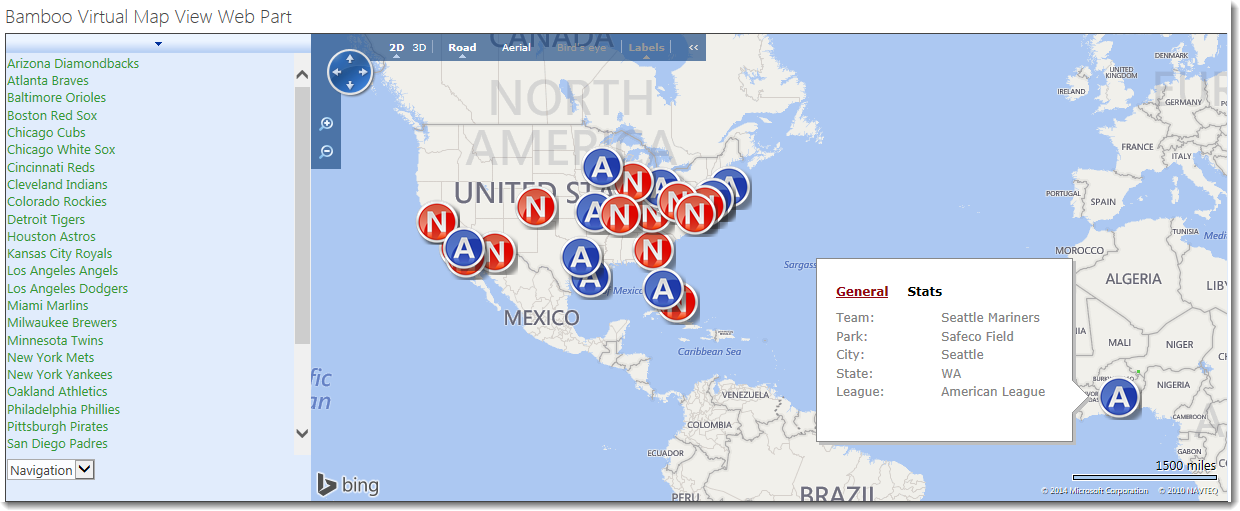
You are plotting locations based on Address information and one of the markers appears in the wrong place.
See the example below where we are using BingTM Maps to display baseball fields in the USA. The marker for the Seattle Mariners appears in Africa, but the City and State values are Seattle and WA respectively. Why doesn’t it show up in Washington state in the USA?
NOTE: Depending on the data you are trying to display, this may occur when using GoogleTM maps as well.
There are a few things you can try when you see an issue like this with the Virtual Map View:
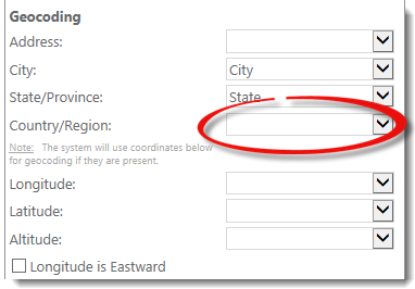 If we add Country and don’t change the map provider, the Seattle Mariners will appear where they should. In other words, in this scenario the BingTM mapping service needed a little more information in order to locate Safeco Field properly.
IMPORTANT: Unless all the geocoding parameters are mapped, only 20 locations will be mapped if using the BingTMmap provider. The GoogleTM map provider doesn’t have this limitation in SP2013. All locations will be plotted on the Google map with partial geocoding parameters.
NOTE: If you are using SP2010 with either the BingTM or GoogleTM map provider, ALL geocoding parameters are required in order for any data to be displayed.

If you have latitude and longitude information for your locations, the map providers can plot those rather than try to geocode the address information you provide. This will probably result in the most accurate display, regardless of the Map Provider. It will also result in the quickest display since the mapping provider doesn’t need to geocode first; this saves processing time.
Skip This Step skips the widget that caused the error in this workflow instance and continues with the next widget. A notification is sent to the list of people defined in the Workflow Error Reporting settings.
If the skipped step provides results or input to later steps in the workflow, additional errors may occur. Use Skip This Step only if the widget’s results are not critical to the rest of the workflow.
See Also:
| Configuration Infographic | Return to Look and Feel Settings |
|---|
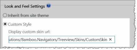 A variety of skins are available when configuring Look and Feel settings to change the appearance of the Data-Viewer display.
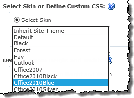 To select a skin, click the Look and Feel button under Preferences, then pick the desired skin from the available options.
NOTE:
This requires you to have accessed the Data-Viewer Settings screens by clicking the Data Viewer Web Part Settings button in the web parts configuration tool pane.
| Skin Name | Sample Display |
| Inherit Site Theme |
|
| Default | 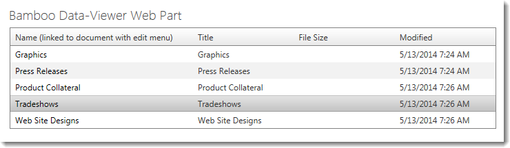 |
| Black | 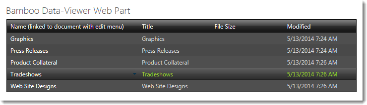 |
| Forest | 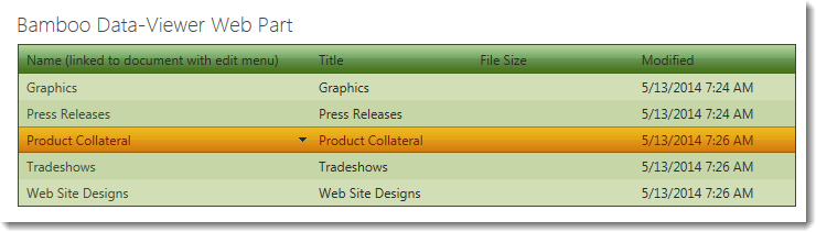 |
| Hay | 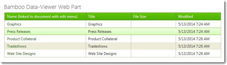 |
| Outlook |  |
| Office2010Black |  |
| Office2010Blue |  |
| Office2010Silver |  |
| Simple | 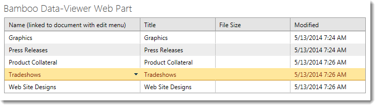 |
| Sitefinity |  |
| Sunset |  |
| Telerik |  |
| Transparent | 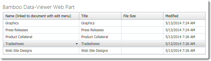 |
| Vista |  |
| Web20 |  |
| WebBlue |  |
| Windows7 | 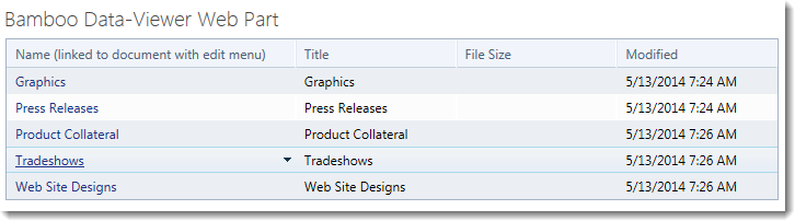 |
| Configuration Infographic | Return to Look and Feel Settings |
|---|
Below is a preview showing the skins that are available within the In/Out Schedule Board.
| Skin Name | Description |
| Default | This is the default look of In/Out Schedule Board if you do not change the skin. |
| Black |  This skin uses grey text on a black background and is not the easiest look for users to use. |
| Forest |  If your site is leveraging a green look and feel, this uses a nice gradient green. |
| Hay |  This skin uses a brighter green than the gradient one above and the lower bar in tan. |
| Office 2007 |  This skin uses the gradient blue bars seen in Office 2007. |
| Outlook |  This skin takes the look and feel of Outlook. |
| Simple |  The simple skin uses a variety of grey colors. |
| Sitefinity |  This skin removes color from the look but adds rounded pagination buttons as compared to the square buttons used in the skins above. |
| Sunset | 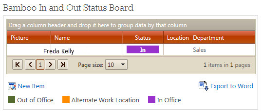 The sunset skin uses a brick-red gradient bar and a lighter version of that in the pagination bar. |
| Telerik |  The Telerik skin uses a gradient gray color scheme. |
| Vista |  Vista skin uses a gradient set of blues. |
| Web20 |  Web20 skin turns the column header background to a darker blue and the pagination bar background a lighter blue. |
| WebBlue |  The WebBlue skin uses a gradient gray/blue and grey bars. |
| Windows7 |  The Windows7 skin uses a very pale blue background. |
This is a high level overview of the types of Site Management Widgets available. Click on the name of the widget to get details and examples.
Return to About Workflow Conductor Widgets
See also an Alphabetical List of Workflow Conductor Widgets.
| Return to User Directory Configuration |
|---|
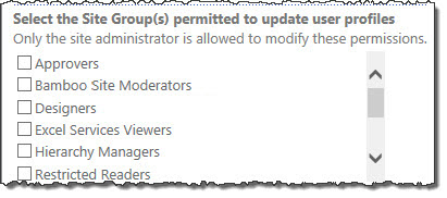 If you selected to read user profiles from Active Directory earlier in this configuration, then you have the option of selecting the user groups allowed to update to user profiles. The Web Part displays the site groups on SPS 2003 and SharePoint Groups on MOSS 2007 on the site where the Web Part is installed. You can choose from the default groups as well as any custom groups you may have created. Select a group that has permission to UPDATE the user accounts. Only the users in this site group can modify user profile information. Please read the Security Considerations section for additional information.
User Directory requires you to provide credentials for accounts that have read and write access to either the Active Directory or the SharePoint User Profile. In order to ensure User Directory is being used without compromising security in your domain, the following must be considered:
This domain account is used to read and update the Active Directory profile data. This account must belong to a group that has Read and Write permission to the Active Directory user profile. To check if the account has the appropriate permissions, do the following steps:
| Step | Action | Result |
| 1. | Open the Active Directory Users and Computer console application. | 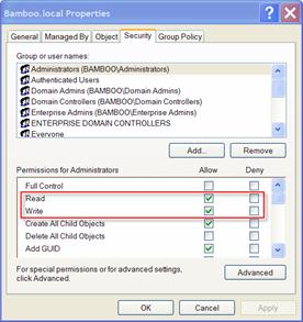 |
| 2. | Select View and check the Advanced Features. | |
| 3. | Select a Forest or Organization Unit, right click and select Properties. | |
| 4. | Select the Security tab. | |
| 5. | Make sure that the Access Account you are using has the Read and Write permissions to read and update the particular object. | |
Site Creation Plus Web Part simplifies the creation of a site for an end user by asking for only the Title, Description, and Site Permissions for the new site. The Web Part is configured so the site template, new user groups, URL, and Links list entry are consistent for all sites created through the Web Part. The end user interface is shown below.
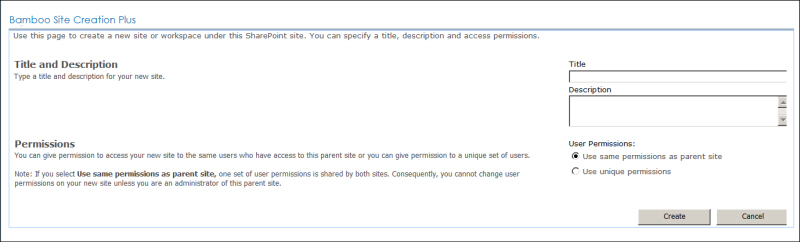
After attempting to create a new site, a success or failure message is displayed for the user. The failure message explains why the site creation action failed.
 Site Creation Plus allows SharePoint system administrators to maintain a certain level of control over the naming conventions and site templates used. It also can add the new site to a Links list automatically, simplifying this second step of site creation that many users forget.
| Highlights | Release Notes | Complementary Products |
|---|
Install |
Permissions |
License |
Permissions |
|---|---|---|---|
 |
|
||
Configure |
Permissions |
Work With |
Permissions |
 to configure this Bamboo product.") |
 |
| Click here if you would rather see a complete list of all topics for this product. |
 Click on the shopping bag or here to download a trial of the product or to purchase it. Click on the shopping bag or here to download a trial of the product or to purchase it. |
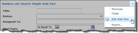 To perform a search with List Search Simple, simply enter search terms in one or more search criteria fields and click the Search button.
The example below shows a search for tasks in a task list that have not started or where a task status is in progress AND where the start date is before a selected date. Behind the scenes, the web part is using a CAML query to find results based on the search criteria.
See also:
| Return to My Bamboo |
|---|
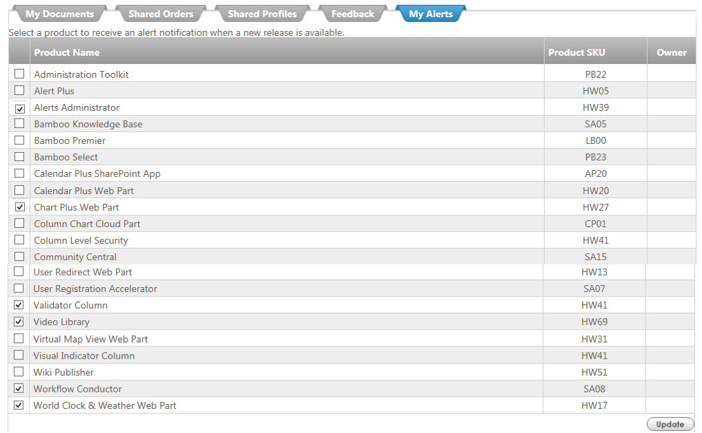
When you open this tab, a list of products appears; check the box next to a product to select to receive an alert notification when a new release is available.
In the example below, several products show a checkmark in the box to the left of the product name. When the Update button is pressed, the owner of that product will receive an alert when there is an update released for it. Be sure we have your contact Email listed in My Bamboo so that the right person receives the Email!
| Return to Configuration Overview |
|---|
| Step | Action | Result |
| 1. | In order to display the clock, you must first uncheck the Show Weather checkbox. | Now, you can select the Show Clocks checkbox to display current local time data. 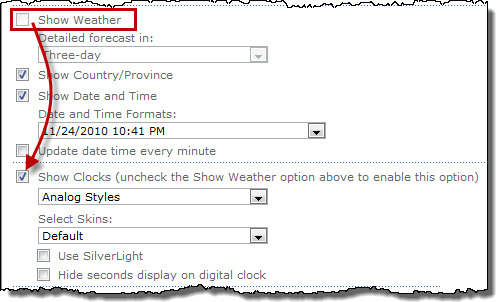 |
| 2. | Select the digital or analog clock. Customize the clock style using the Select Skins drop-down list. | |
| 3. | Check Hide seconds display on digital clock if you only want to display hours and minutes. | |
| 4. | Clocks are displayed using JavaScript by default. If you want to display the clock using Silverlight technology, check the Use Silverlight check box. | |
| 5. | Users must have the Silverlight client installed in order to view the clock. | 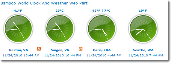 Clocks displayed using Silverlight will use an additional 10-20% of the available CPU resources to perform real-time updates. The JavaScript client will use fewer CPU resources. |
| Return to Configuration Overview |
|---|
 One of the great features in World Clock and Weather is the flexibility you have in showing weather, forecasts, locations, and/or date/time in the web part display. In this example, Bamboo is showing weather across six areas of the globe and we are also showing the date and time as well as the Country and/or Province for which the weather and date and time are being displayed. For globally diverse enterprises, this is such a useful way to let your users know at a glance the time and weather in another office of your company.
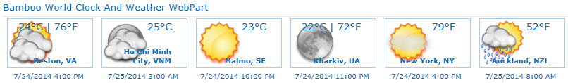
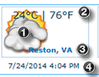 Each section of the weather has characteristics that can be set based on your preferences. We’ve enlarged one location’s weather to show the areas that you can configure.
| Step | Action | Result |
| 1. | Show Weather: | Click to set the checkmark on this box which will now display an icon representing the current weather in that location.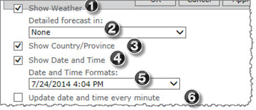 |
| 2. | Detailed forecast in: | Other than None, you also have a choice of forecasts for two, three or five days. 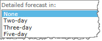 When you choose to show the forecasts, a plus symbol displays on the upper right of the location which will then provide the mechanism to see more days of weather based on your number of days in the forecast. |
| 3. | Show Country/Province: | Check this box to display the city and state or province. |
| 4. | Show Date and Time: | The date and time for that location will display based on the format you select next. |
| 5. | Date and Time Formats: | Because there are a variety of ways to display time, Bamboo provides a variety of choices in how you prefer to show the date and time in the web part.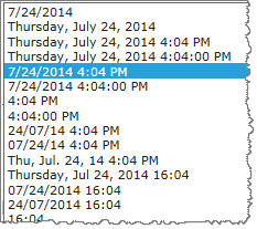 |
| 6. | Update date and time every minute | This does not appear in the web part; it is a setting on the tool pane you can configure. Just remember that it will use up server resources to update the web part every minute. |
| 7. | Cache Weather Data | This setting allows you to cache recently pulled weather data to reduce calls and speed up display of data when the same location is called again. |
| Return to Configuration Overview |
|---|
To display a link to the next five events in a SharePoint Calendar list at the top of the web part:
| Step | Action | Result |
| 1. | Check the Show Upcoming Events box. | 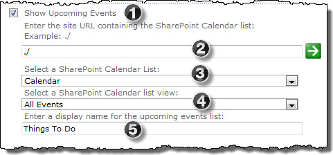 |
| 2. | Enter the URL for the site that contains the events calendar, and click the green arrow to retrieve the Calendar lists from that site. | |
| 3. | Select the events calendar from the drop-down list. | |
| 4. | Select a list view from which to show events. | |
| 5. | To change the display name for the Upcoming Events link in the web part, enter new text. | 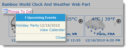 |
| Overview of Workflow Conductor Templates |
|---|
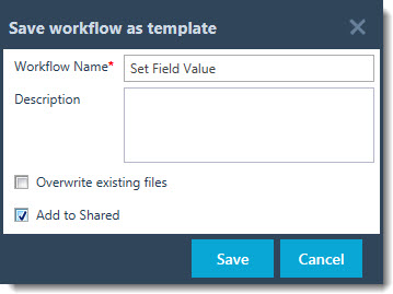 By default, a saved workflow template can only be accessed by the designer who saved it, or by a template manager.
To make a template available to other workflow designers, click Add to Shared in the Save workflow as a template dialog box and the click Save to save the template.
When you share a template, a copy of the template is added to the Shared Templates tab of the template gallery. Any workflow designer can open the shared copy of the template.
Any workflow designer can share a template, if a template with the same name hasn’t already been shared.
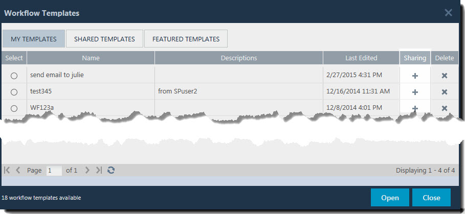 To share a template after it has been saved, open the template gallery and click the Sharing icon (
 ) for the template in the My Templates tab. A confirmation message is presented. Clicking OK on the message completes the copy.
Opening a template shared by another designer and modifying it, saves the updated copy of the template to your My Templates tab. The original shared template is not affected.
You must remove the shared template before sharing another with the same name from Workflow Templates.
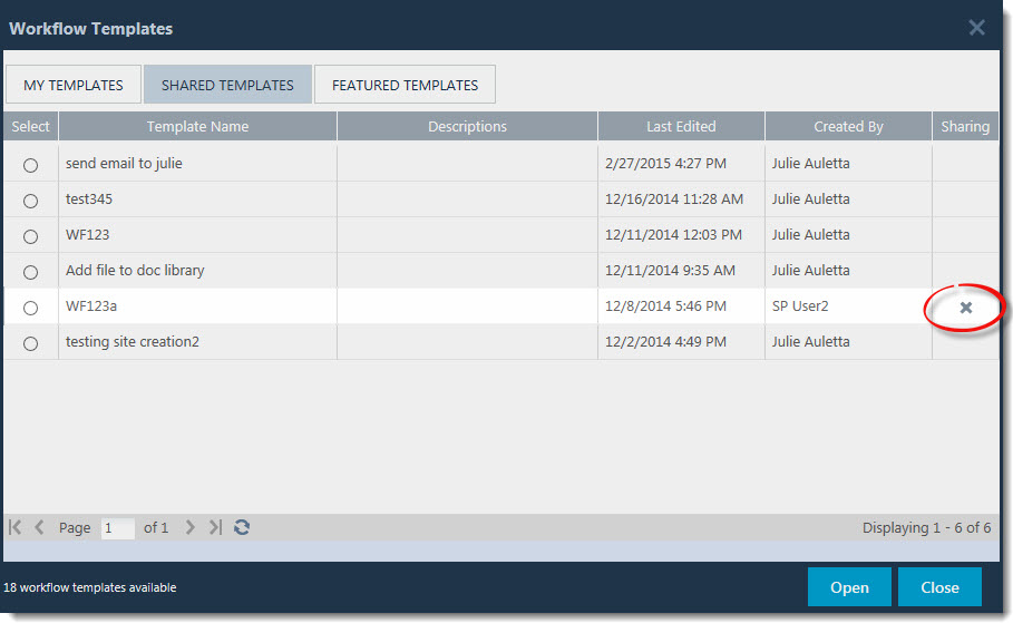 To remove a template from the Shared Templates list, click the Delete icon (
 ) for the template in the Shared Templates tab.
You can only delete a shared template if you are the designer who originally shared it, or if you are a template manager.
See Also:
Microsoft SharePoint is a platform for building and deploying collaborative solutions. It is a centralized Web portal that tracks content and documents as well as users, audiences, and teams. One of the major challenges for the SharePoint IT administrator is to understand and effectively manage SharePoint user access along with the multiple directory services that coexist within the corporate network, including numerous Web applications, sites, and multiple authentication servers. Since an increasing number of companies are deploying SharePoint on a global enterprise network, connecting a large number of users and, in the process, creating a structure of corporate hierarchy-based users as well as a formidable social network, user access must be regulated and managed effectively.
This article provides a detailed look at how users and security are managed and configured within SharePoint. It will give you a systematic overview of SharePoint architecture, user authentication configurations, and user security groups and permissions, and explain the differences between Microsoft SharePoint Server 2010 and Microsoft SharePoint Foundation 2010.
NOTE: You can also download this white paper for SharePoint 2010 User Management as a PDF.
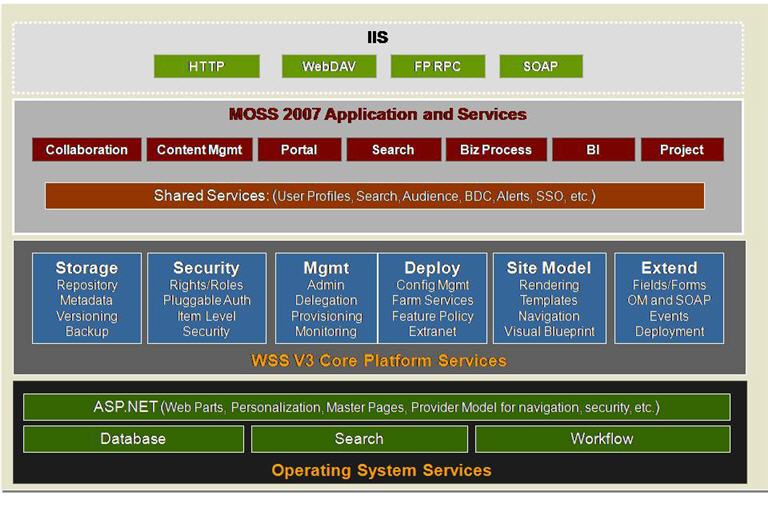
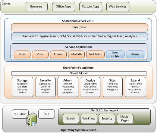 Given its architecture and the different options available, User Management in SharePoint is a very complex subject, and thus it will be worthwhile for us to discuss and understand the out-of-the-box SharePoint user management, security, and architecture. This diagram represents the logical SharePoint technologies architecture. SharePoint is now in its fourth major release and comprises the SharePoint Foundation 2010 (formerly Windows SharePoint Services version 3.0) and SharePoint Server 2010 (formerly Microsoft Office SharePoint Server 2007). SharePoint Foundation 2010 is a free add-on to the Windows 2008 server, running on top of SQL Server, Windows 2008 Server, and ASP.NET 3.x. SharePoint Server 2010 is a product that comes with different editions (Standard vs. Enterprise) and options (Excel Services, Content Management, etc.), and runs on top of SharePoint Foundation 2010.
Since SharePoint Server 2010 is built on Windows SharePoint Foundation 2010, they both share a lot of similarity in architecture and foundation. SharePoint Server 2010 provides more application-level features and services. It also has different and more extensive User Profile management features than SharePoint Foundation 2010. The important point about this architecture is that SharePoint relies on many user management and security principles from the Windows Network Operating system, IIS, and ASP.Net foundation. In the rest of this section we will take a look at:
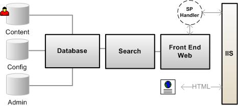
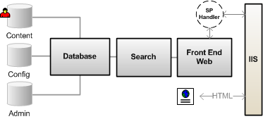 SharePoint Foundation 2010 contains the core platform services for SharePoint. SharePoint Foundation 2010 is a logical three-tiered architecture that contains a Front-end Web Server, the Search and Index server, and the Database Server.
SharePoint Foundation 2010 is basically a Web-based ASP.NET application that extends an IIS website that process HTML requests through a set of ASP.NET (.aspx) pages, .Net application programming interfaces (APIs), and XML Web services. It processes and executes the business logic using a combination of .NET and SharePoint object assemblies. The data is stored in the back-end SQL database. SharePoint then presents the information to the user in the standard HTML format compatible with most Web browsers. An IIS website that has been extended with SharePoint Foundation 2010 is called a Web Application (and was called a virtual server in SharePoint 2003), which uses an HttpModule and an HttpHandler to re-route incoming traffic to the SharePoint business logic, thus enabling the SharePoint Web Applications to coexist with other IIS Web applications.
NOTE: This architecture allows SharePoint and other Web applications to share the same user security infrastructures, mainly Windows Server and ASP.NET.
The Search and Index server is an executable (MsSearch.exe) that is installed as Web services in Windows Server. Its primary job is to index the content of the database to help with search operation on lists, documents, and files.
NOTE: SharePoint Server 2010 uses entirely different search architecture than that of SharePoint Foundation 2010.
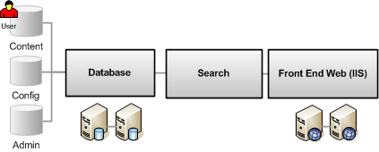 SharePoint Foundation 2010 uses Microsoft SQL Server to store both the configuration as well as the content in the databases. When SharePoint Foundation 2010 is installed, it creates a configuration database that stores the metadata, physical configurations, and information about every Web application that has been extended, as well as all the servers and their roles in the farm. SharePoint Foundation 2010 also creates an Admin database that stores the content of the Central Administrator toll. And for every extended virtual server, SharePoint Foundation 2010 creates a Content Database that stores the actual content of the sites.
NOTE: SharePoint Foundation 2010 stores the user information in its content database.
SharePoint Foundation 2010 is also designed to be scalable. In a large or medium farm provision, you can assign multiple cluster databases on the back-end and install a load balancing architecture for the front-end Web server as shown above.
NOTE: There is only one Configuration database for the entirety of the SharePoint servers in the farm.
 SharePoint Server 2010 runs on top of the SharePoint Foundation 2010 platform, so it shares a similar architecture. SharePoint Server 2010 provides a number of extended applications and feature sets, such as: advanced content management and publishing sites, the ability to search content in external databases, social networking, and more site templates and workspaces. SharePoint Server 2010 itself also provides two different levels: Standard vs. Enterprise options, where additional features, such as business data Web Parts and Microsoft Office Data services are available only at the Enterprise level.
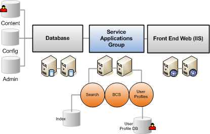
Instead of running Search and Index on the same box as SharePoint Foundation 2010, SharePoint Server 2010 uses another application server called SharePoint Service Applications (this is a new architecture similar to the Shared Service Provider in SharePoint 2007). This is a collection of application services that can be configured on one or more servers and shared across many different SharePoint Server 2010 and SharePoint Foundation 2010 sites. The services on these servers include enterprise level applications such as Search, Index, User Profile, My Sites, Business Connectivity Services, Form Services, Excel Services, Job Scheduling, and Usage Reporting.
The new and true application layer architecture of Service Applications provides scalability such that you can load-balance the servers where the applications are hosted. It also provides granularity where each Web application or farm can consume distinct services.
From the user management perspective, SharePoint Server 2010 also has several additional services that differentiate it from SharePoint Foundation 2010: User Profile Services (includes Audience), and Secure Store Services (Single-Sign-On, or SSO). Unlike SharePoint 2007, these services now manage information using their own databases which can be scaled independently.
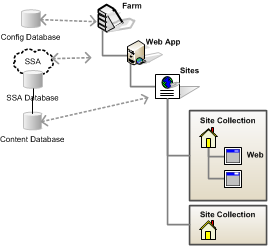 Another important topic that you need to understand in relation to SharePoint user management is the hierarchy, or scope, of the SharePoint architecture. The security and user permissions are applied based on the scope. SharePoint uses the following hierarchy:
SharePoint security consists of two main parts: Authentication and Authorization. This section will focus on the Authentication process, which determines how a user’s identity is verified before allowing access to SharePoint sites.
SharePoint itself does NOT handle user authentication, but relies on Windows, ASP.NET, and IIS to perform that function. Authentication in SharePoint Foundation 2010 has been redesigned on top of the new authentication provider infrastructure introduced with ASP.NET 2.0. SharePoint is shipped out of the box to work with Windows Authentication, but also allows users the capability to work with forms authentication based on SQL Server. The following identity management systems are supported:
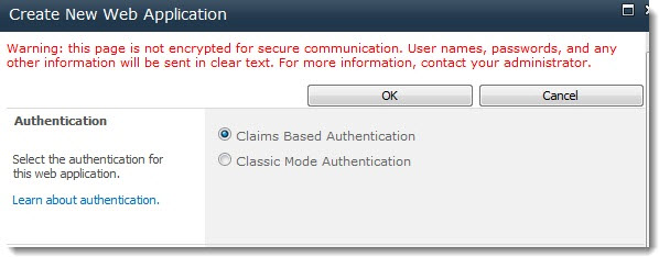
When you create a new Web application in SharePoint 2010, you can select either a “classic-mode” authentication, or a “claims-based” authentication method. Classic mode authentication only supports the Windows authentication, in which all user accounts are treated as Active Directory accounts.
If you select Claims-based authentication, SharePoint will convert all user accounts into claim token identities. Claims are more than just user security information. User accounts can be augmented with additional tokens (via the administration interface or programmatically) with claims such as Age, Sex, and Birth Date.
The following table summarizes the authentication types for each mode:
| Authentication Type | Classic-mode authentication | Claims-based authentication |
| Windows | ||
| Forms-based | ||
| SAML token-based | ||
Claims-based identity management is a big and complex topic. It is a feature, based on Windows Identify Foundation, that establishes the authentication foundation which allows SharePoint to move into cloud platforms such as Azure. As you can see from the table above, there is no practical reason to use classic mode authentication in SharePoint 2010, unless you are migrating from SharePoint 2007 and need some backward compatibility. When using claims-based authentication in SharePoint, you should be aware of the following considerations:
NOTE: In this article we use the terms Authentication Provider or Service (frequently used with Active Directory), User Identity Management (frequently used with a custom system), User Authentication System, and User Membership Provider (which frequently refer to the LDAP provider) to mean the same system depending on the context of the topic. It is the system that keeps the user information and also provides access permission to a SharePoint site.
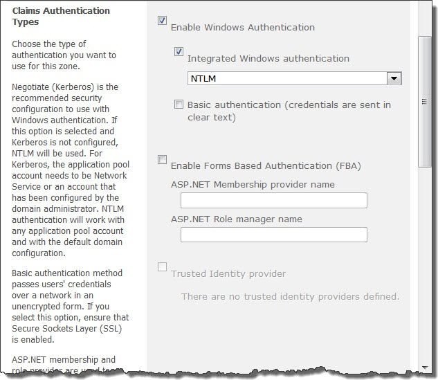
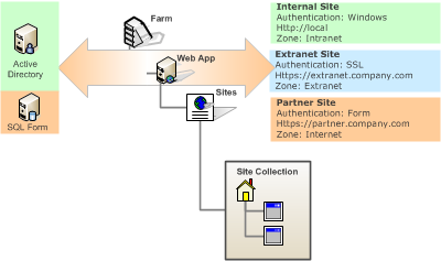 You can configure SharePoint Web Applications to be accessed by up to five different authentication methods, thus allowing content from the same websites to be accessed and authenticated by different target users. For example, employees can be authenticated using one of the standard Windows authentication methods, which can be Windows integrated login (NTLM) behind the firewall, and SSL outside of the firewall. Partners or customers can be authenticated against a simple Form Authentication against a SQL database or even their own identity management system.
To configure a SharePoint Web Application to be accessed by two or more different authentication systems, you configure additional zones by extending the Web Application in Central Administration. SharePoint Zones represent different logical paths to gaining access to the same physical application. After extending the Web application, you can configure a separate authentication method for the new zone. The available zones are: Default zone, Intranet zone, Internet zone, Custom zone, and Extranet zone.
The major change in SharePoint 2010 is that you are allowed to use different authentication methods in a single zone if you are using claims-based authentication in that Web application. When you use multiple authentication modes in a zone, keep in mind the following considerations:
Since SharePoint uses an external user identity provider, its user operation is very simple. The fact that SharePoint can be provisioned in many different ways, and the overlap between SharePoint Foundation 2010 and SharePoint Server 2010, tends to confuse most users as to how it actually works. Here are some of the important points to remember:
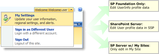
NOTE: SharePoint Server 2010 does NOT provide any user management functionality. SharePoint Server 2010 uses SharePoint Foundation 2010 to handle user management. SharePoint Server 2010 provides a User Profile database and has many people confused between User Management vs. User Profile Management, which we will review in next section.
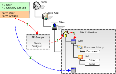
 When you are using just SharePoint Foundation 2010, the user management situation is pretty simple as shown in figure 7 below. SharePoint Foundation 2010 has a People and Groups feature that keeps track of user information. The user information is managed by:
SharePoint Server 2010, on the other hand, is a little confusing. SharePoint Server 2010 has a Profile Database that is stored in the User Profile Service Application database. It provides a much more extensive User Profile feature that allows for scheduled synchronization from one or more User Directory Services, which could be AD/LDAP/BCS/Custom, at regular intervals. You can define properties and set various policies on how data are imported from various user directory services.
 As you can see in this image, there are more complex conditions in SharePoint Server 2010 when dealing with user management. The user information is propagating between various databases as follows:
NOTE: Only the profile properties that are marked with the option “replicable” can be replicated. This is shown as path 3 above.
With a SharePoint Server 2010 installation, you also need to be aware of several differences from a SharePoint Foundation 2010-only installation:
NOTE: This info will get overridden every hour by what sits in the User Profile Services Application. There are ways to prevent this overriding.
To make it more confusing, if your SharePoint installation has enabled My Sites, things are more interesting. In SharePoint Server 2010, My Sites are special SharePoint site collections that surface the user profile information and are personalized for each user. My Sites are installed by default, but are not enabled. You will need to set up a My Site site collection under the User Profile Service Application in order to configure its various options. The reason that site personalization is stored in the service application is so that larger organizations that have multiple Web Applications and Portal sites can reference ONE personalization site.
 As soon as the My Site feature is activated, any user profiles from an existing installation of SharePoint Foundation 2010 are replaced by the public profiles that are part of My Site. A My Site link is added to the top menu bar for all sites in the site collection, along with the My Links menu. In other words:
Lastly, deleting a user profile also has several implications in SharePoint Server 2010. When you delete a User Profile in SharePoint Server 2010, the profile record is moved from the UserProfile table in SSP to the DeleteUsers table, and the deleted user’s My Site will become inaccessible. This way, if the user is re-imported back in at a later date, some information, such as Document Libraries and the new My Site can be reinstated.
Business Connectivity Service is a feature in SharePoint Server 2010 (formerly called BDC in SharePoint 2007) that allows users to create an interface to external information systems (databases) without writing any code. You can also import external user profile information from a BCS interface into the SharePoint Server 2010 user profile database. A real-world example is to set up a BCS interface to your company payroll or financial system to import employee Social Security Numbers into their user profile in SharePoint Server 2010. This capability also provides some misconceptions as to how BCS plays into the overall SharePoint user management capabilities:
Once a user has been authenticated to be able to access a SharePoint site, the SharePoint authorization process determines which objects in the system a user can access and perform actions on. With the latest release of SharePoint Server 2010, permissions are handled strictly at the SharePoint Foundation 2010 platform level.
In this section, we will describe several important concepts that make up the authorization process in SharePoint:
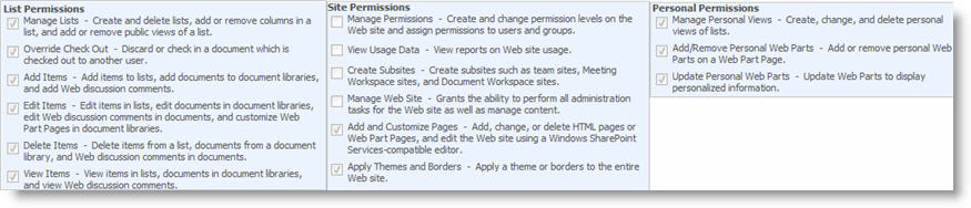
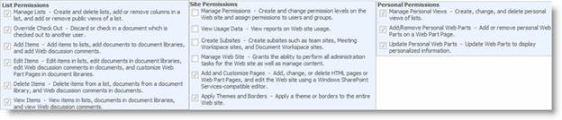 Permissions (which were called Rights in SharePoint Foundation 2010 v2) are the rights for a user to perform specific actions such as viewing pages, editing items, and creating sub-sites. SharePoint Foundation 2010 provides 33 pre-defined permissions that you can use to allow users to perform specific actions that are grouped into 3 main categories: List, Site, or Personal. SharePoint permissions are not assigned directly to users or SharePoint groups, but are assigned to one or more permission levels, which are in turn assigned to users and SharePoint groups.
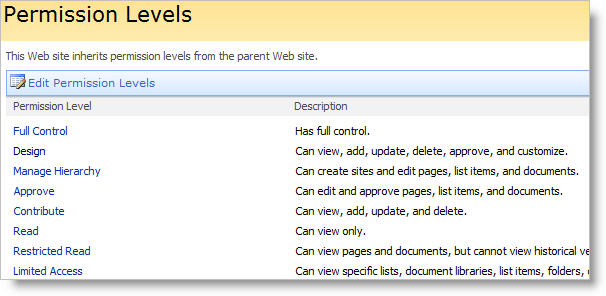
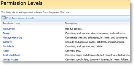 SharePoint Permission Level (which was called site groups in previous version) is a group of permissions that can be granted to users or SharePoint groups so that they can perform specific actions on securable objects such as a site, library, list, folder, item, or document on your site. Permission levels allow you to group permissions and apply them to users and SharePoint groups on the various sites in your SharePoint installation.
When you create a new SharePoint site, there are 5 permission levels which are provided by default:
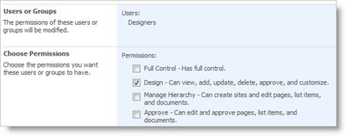
Full Control: The least restrictive permission level; allows full control over a site. You cannot modify or remove this permission level.
Design: Can view, add, update, delete, approve, and customize lists, libraries, and pages on your site, including themes and style sheets.
Contribute: Can view, add, update, and delete previously created list items and document libraries.
Read: The most restrictive permission level; allows users or groups to read pages on the site including the resource libraries.
Limited Access: A permission level that is automatically assigned to a user or group and therefore cannot be directly assigned by the administrator. It is used when you assign the users or groups to a child object without having access to the parent object. You cannot modify or remove this permission level.
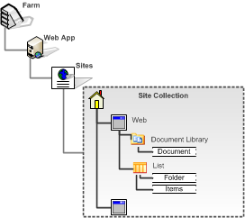 SharePoint provides the ability to manage item level permissions on individual objects (such as lists and libraries) even down to the individual folders, documents, and list items within those lists and libraries. These items, which you can apply permissions to, are called Securable Objects. Each site contains additional securable objects which have a particular position in the site hierarchy, as shown in the following figure.
In SharePoint, permissions on any securable objects, such as Web, lists, libraries, folders, and documents, are inherited from their parent object. However, you can break this inheritance for any securable object at a lower level in the hierarchy by creating a unique permission on that securable object.
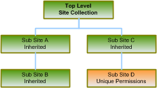 For example, you can create a sub-site (Web) and break the permission inheritance from the parent if you want to limit (or expand) the group of users who can have access permission to the site for security reasons. When you break the inheritance from the parent, the securable object from which you broke the inheritance receives a copy of the parent’s permissions. You can then edit those permissions to be unique — meaning that any changes you make to the permissions on that securable object do not affect the parent. In our example, sub-site A/B/C inherits permissions from the top-level Web site. This means that changes made to SharePoint groups and permission levels on the top-level site also affect all of those sub-sites.
When you make any change in sub-sites A, B or C, you are actually making changes at the parent site, since SharePoint does not allow you to manage permissions on a sub-site that is inheriting permissions from its parent site. Sub-site D has unique permissions, which are not inherited from its parent site. Therefore, any changes made to the permission levels and SharePoint groups on Sub-site D do not affect its parent site.
 You can add any user to SharePoint who has a valid account that has been authenticated as mentioned in the previous section. When a user is added to the system, you can assign direction permissions to a securable object (Web, list or library, etc.) or indirectly through a SharePoint group. Use a SharePoint Group, which is the recommended practice when managing security since it’s easier to manage changes, and apply the same group to different objects across your sites.
A SharePoint Group (which was cross-site group in the previous version) is a logical grouping of users that you can create to manage permissions to the site and to provide an e-mail distribution list for site members. All SharePoint groups are created at the site collection level and are available to all sub-sites in the site collection. You can also create groups that only have permissions on a particular sub-site.
SharePoint groups can contain Windows (Active Directory) security groups, ASP.NET Forms authentication groups (using the roles within the role membership provider), and individual users with a user account on the local server or a Windows domain.
 SharePoint provides three default SharePoint groups with default permissions on the top-level site, each with a Site name prefix:
Each of these SharePoint groups is associated with a default permission level, but you can change the permission level for any SharePoint group as needed.
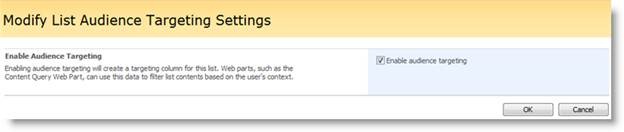
 A useful way to use user profiles out of the box is for audience targeting. Audience targeting refers to the ability to create an audience based on a specific set of rules and then target content to that specific audience. You can target specific contents such as a SharePoint list, library items, navigation links, and Web Parts to a specific group of people.
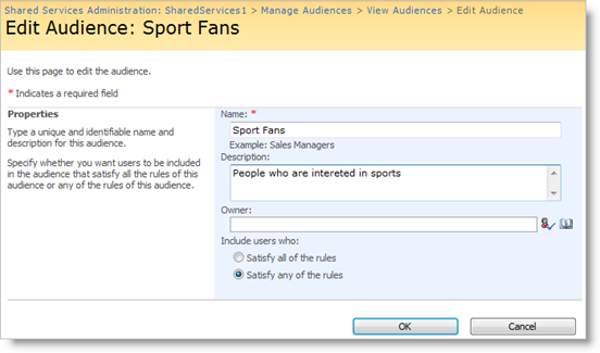
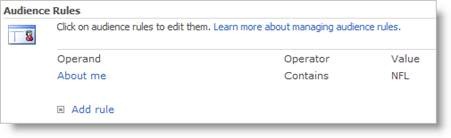 You can create an Audience in SharePoint Server 2010 using its Central Administration tool. Audiences are created based on a set of rules. The example below shows how a Sport Fan audience is created by looking for the world “NFL” in the About Me field in their user profile.
Once the Audiences rules have been created, you can then target different items by enabling the targeting, and then specifying who can be exposed to the content.
SharePoint Server 2010 provides another capability to help with user security management which is called Secure Store Service and is used to provide Single-Sign-On capability. This is a feature that does not affect the internal operation of SharePoint Server 2010, and is disabled by the default installation program. SSS is a database created in SharePoint Server 2010 to keep and manage a set of user names and passwords that can be used to access specific external systems that require access authentication.
An example is if you have a need to crawl and index a back-end office system, such as SAP or Oracle, to retrieve information that is then made available to the SharePoint enterprise search. These systems might need access to log in, and these accounts access information which can be retrieved for those purposes. There are several benefits to using SSS, such as the access information is encrypted and is more secure, and that the account information can be managed by an IT administrator while the Web Parts or code that uses the account does not to know the account, but just how to use it.
Hopefully, this article gave you a good basic understanding of how SharePoint 2010 manages its users. Additional information can be found in various books and online articles, some of which are listed in the reference section below. Given the complexity of managing users in SharePoint, Bamboo Solutions has provided several Web Parts that are very useful in helping you keep the situation under control and create a happy and productive work force. Check out these products on Bamboo Solutions’ website, each of which is available for a 30-day free trial:
This article was originally written for SharePoint 2007 which can be found here.
| Return to My Bamboo |
|---|
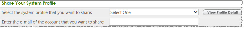
Just as in SharePoint, you have areas of your site that are restricted to those in the know. In order to protect your company, Bamboo only handles support calls for those customers who are registered with us. If you need to get support on someone else’s order, ask them share the order with you here and you will be able to submit support tickets for those products.
All they have to do is click into this tab and select the system profile they want to share (there could be multiple depending on products purchased or farms in your environment) and then they simply put in the Email address of the person with whom they want to share the order. After this is completed, you will be able to get support on an order placed by someone else.
There is more than one edition of SharePoint available. If you are not sure which SharePoint edition you are using and therefore which version of Bamboo product that you have, check with your systems, network or IT administrator. However, an easy way to determine which SharePoint edition you have is by what your sites looks like.
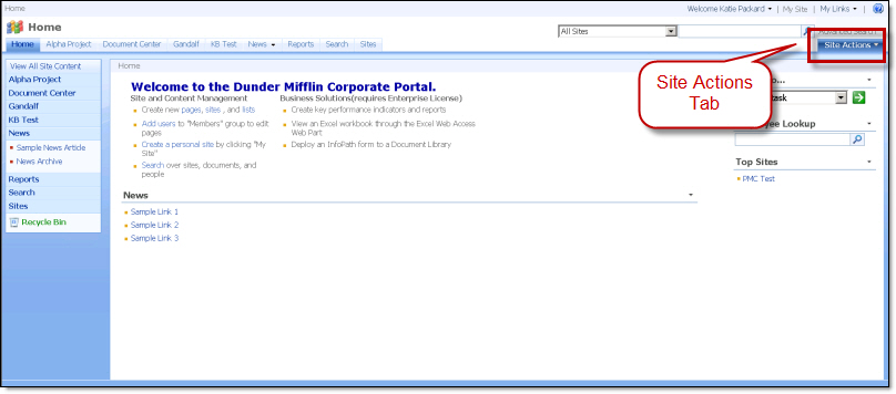 If your SharePoint sites look similar to the one shown here, with the Site Actions tab on the right side of the page, then you have an earlier version of SharePoint (Windows SharePoint Services 3.0, Microsoft Office SharePoint Server 2007 or MOSS, etc.), and you have the 2007 versions of Bamboo products.
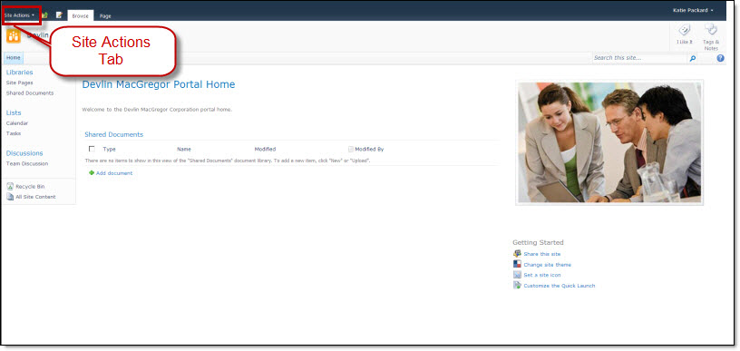 But if your SharePoint sites look similar to the one shown below, with the Site Actions menu on the left, then you have SharePoint 2010, and you have the SharePoint 2010 version of Bamboo product.
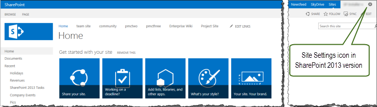 And finally, if you do not even see the Site Actions menu but a simple gear icon on the top right of your site, then you have SharePoint 2013, and you have the SharePoint 2013 versions of Bamboo products.
See also:
| Return to Configuration Overview |
|---|
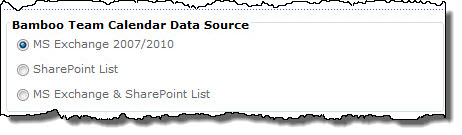
Team Calendar can display events from a SharePoint Calendar list or a Microsoft Exchange mailbox calendar, or both. Configuration options depend on the data source you select.
To configure an Exchange calendar instead, refer to the topic Configuring an Exchange Calendar.
This section cover the steps involved in setting up a calendar based on a SharePoint List.
To connect to a SharePoint List:
| Step | Action | Result |
| 1. | Select the SharePoint List or MS Exchange & SharePoint List option. Note: Selecting the MS Exchange & SharePoint List option will display events from a SharePoint list and events from the Exchange mailbox on two separate calendars. If you choose this option, you will need to configure the Exchange calendar after completing the configuration for your SharePoint list calendar. |
|
| 2. | Select a list in the current site from the Select SharePoint List drop-down list. | |
| 3. | In the Selected Columns list, select a column that contains the text you want to display as the event label (title) in the calendar. | |
| 4. | Select columns to display in a tooltip when users mouse-over an item in the calendar. Select columns in the Available Columns list and use the arrow buttons to move them to the Selected Columns list. Use the up and down arrow buttons to reorder selected columns. To select multiple columns at once, hold down the SHIFT or CTRL keys. | |
| 5. | Choose a column to base event color-coding on, and then select a color to use as the border color for each possible event type (determined by the column you just selected). For example, if you choose to color-code your events by “Category”, and you set the color for “Holiday” to blue, all events labeled as a holiday will be displayed with a blue border on the Calendar. Click Auto Select to automatically assign a unique color for each choice. | |
| 6. |
Select how to display the event duration on the calendar, and the date/time fields used to determine the event start and/or end time.
|
|
| 7. | If you would like to filter the events included on the Team Calendar using a list view, select it from the Select View list. If you do not select a specific list view, all items in the list will be displayed on the calendar. | |
Your SharePoint list-based calendar is now configured.
For SharePoint Web applications configured to use Claims Based Authentication, the Bamboo installation may fail if:
This issue occurs whether Windows Authentication or Forms Based Authentication (FBA) authentication type is configured.
To prevent the installation from failing, you can either leave the World Wide Web Publishing Service running during installation and stop the content web application and Central Administration web application pools instead, or you can choose NOT to automatically activate the features in the selected web apps during the installation/setup. If the features are not automatically activated, they can be manually activated at any time.
To stop the Application Pools Before Installation, follow these steps:
| Step | Action |
|---|---|
| 1. | Before installing the product, stop the application pools for content Web applications and the Central Administration Web application in IIS manager (see Start or Stop an Application Pool (IIS 7)). |
| 2. | Reset IIS on any farm server running the Microsoft SharePoint Foundation Web Application service. This will ensure that files that need to be updated are not locked by IIS or users. |
| 3. | On the same servers, restart the SharePoint 2010 Timer and SharePoint 2010 Administration services. This will ensure that files that need to be updated are not locked by these services. |
| 4. | Run the Bamboo installation/setup program. In the Deployment Targets screen, leave the option to Automatically Activate Features checked. When installation is complete, check the Summary screen to verify that the installation was successful. |
| 5. | Restart the SharePoint 2010 Timer service on any farm server running the Microsoft SharePoint Foundation Web Application service. |
| 6. | Start the application pools in IIS that were stopped in the first step. |
As an alternative, don’t automatically activate the site collection features during the installation process. Instead, manually activate them after the install. See Activating a Bamboo Site Collection Feature for more information.
Microsoft SharePoint is a platform for building and deploying collaborative solutions. It is a centralized web portal that tracks content and documents as well as users, audiences and teams. One of the major challenges for the SharePoint IT administrator is to understand and effectively manage SharePoint user access along with the multiple directory services that co-exist within the corporate network, including numerous web applications, sites, and multiple authentication servers. Since an increasing number of companies are deploying SharePoint on a global enterprise network, connecting a large number of users and in the process creating a structure of corporate hierarchy-based users as well as a formidable social network, user access must be regulated and managed effectively.
This article provides a detailed look at how users and security are managed and configured within SharePoint. It will give you a systematic overview of SharePoint architecture, user authentication configurations, and user security groups and permissions, and explain the differences between Microsoft Office SharePoint Server (MOSS) and Windows SharePoint Services (WSS). This article is written for the latest SharePoint version 3 release.
NOTE: You can also download this white paper for SharePoint 2007 User Management as a PDF.
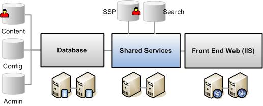
 User Management in SharePoint with different options and architecture is a very complex subject, and thus it will be worthwhile for us to discuss and understand the out-of-the-box SharePoint user management, security and architecture. The chart in Figure 1 represents the logical SharePoint technology architecture. SharePoint is in its third major release and is comprised of Windows SharePoint Services (WSS) version 3.0 and Microsoft Office SharePoint Server (MOSS) 2007. WSS v3 is a free add-on to the Windows 2003 Server, running on top of SQL Server, Windows 2003 Server and ASP.NET 2.0. MOSS is available in various editions (Standard vs. Enterprise) and options (Excel Services, Content Management, etc.), and runs on top of WSS.
Since MOSS is built on Windows SharePoint Services (WSS), they share similar architecture and foundations. MOSS provides more application level features and services. It also has different and more extensive User Profile management than WSS. The important point about this architecture is that SharePoint relies on many user management and security principles from the Network Operating system, Microsoft Internet Information Services (IIS) and ASP.Net foundation. In the rest of this section we will take a look at:
 WSS is the core platform for SharePoint services. WSS is a logical three-tier that contains a Front End Web Server, a Search and Index server and a Database Server.
WSS is essentially a web-based ASP.NET application that extends an IIS web site processing HTML requests through a set of ASP.NET (.aspx) pages, .Net application programming interface (API), and XML web services. It processes and executes the business logic using a combination of .Net and SharePoint objects assemblies. The data is stored in the backend SQL database. SharePoint presents the information to end users in the standard HTML format compatible with most web browsers. An IIS web site that has been extended with WSS is called a Web Application (virtual server in previous WSS versions). SharePoint Web Applications use an HttpModule and an HttpHandler to re-route incoming traffic to the SharePoint business logic, thus enabling the SharePoint Web Application to coexist with other IIS web applications. Note that this architecture also allows SharePoint and other web applications to share the same user security infrastructure, mainly Windows Server and ASP.NET.
The Search and Index server is an executable (MSSearch.exe) that is installed as web services in Windows Server. Its primary job is to index the content of the database to enable searching on SharePoint lists, documents, and files. Note that MOSS uses entirely different search architecture than WSS.
WSS uses Microsoft SQL Server to store both the configuration and the content in the databases.  When WSS is installed it creates a configuration database that stores the metadata, physical configuration and information about every web application that has been extended, as well as all the servers and their roles in the farm. WSS also creates an Admin database that stores the content of the Central Administrator tool. In addition, for every extended virtual server, WSS creates a Content Database that stores the actual site content.
NOTE: WSS stores the user information in its content database.
WSS is also designed to be scalable. In a large or medium server farm, you can assign a multiple cluster database backend and install load balanced architecture for the front end web server as shown above.
NOTE: There is only a single Configuration database for all SharePoint servers in the farm.
 Although MOSS runs on top of the WSS platform, MOSS provides a number of extended applications and features, such as: Advanced content management and publishing sites, the ability to search the contents of external databases, and more site templates and workspaces.
Instead of running the Search and Index on the same box as WSS, MOSS uses another application server called Shared Services. This is a collection of application servers (a set of services) that can be configured on one server and shared across many different MOSS portal sites and WSS sites. The services on these servers include enterprise level applications such as Search, Index, User Profile, Content Management, My Sites, Business Data Catalogue, Form Services, Excel Services, Job Scheduling and Usage Reporting.
Another important architectural difference from WSS is the Search database is created for each Shared Services Provider (SSP) database in the farm. The SSP Search database contains search related information such as crawl properties, document properties and propagation properties.
From the user management perspective, MOSS also has several additional services that differentiate it from WSS: Audience, User Profiles database, and Single-Sign-On (SSO). The SSP database contains important data such as the Business Data Catalogue, Site Usage data, BI information and several tables for user management:
•User Profile information that is imported from a directory service such as Active Directory.
•Audiences and organizational hierarchies.
•Security information.
Another important topic that you need to understand related to SharePoint user management is the hierarchy, or scope of the SharePoint architecture. 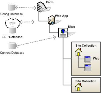 The security and user permissions are applied based on the scope. SharePoint uses the following hierarchy:
SharePoint security consists of two main parts: Authentication and Authorization. This section will focus on the Authentication process, which determines how user identity is verified before allowing access to SharePoint sites.
SharePoint itself does NOT handle user authentication, but relies on Windows, ASP.NET and IIS to perform that function. Authentication in WSS v3 has been redesigned on top of the new authentication provider infrastructure introduced with ASP.NET 2.0. SharePoint is shipped out of the box to work with Windows Authentication, but also allows users the capability to work with SQL Server based form authentication. The following identity management systems are supported:
NOTE: In this article we use the terms Authentication Provider or Service (frequently used with Active Directory), User Identity Management (frequently used with a custom system), User Authentication System, and User Membership Provider (frequently used to refer to the LDAP provider) interchangeably depending on the context of the topic. In all cases, the term refers to the system that keeps the user information and also provides access permission to SharePoint sites.
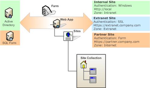 You can configure SharePoint Web Applications for access by up to five different authentication methods, thus allowing content of the same web sites to be accessed and authenticated by different target users. For example, employees can be authenticated by using one of the standard Windows authentication methods, which can be Windows integrated login (NTLM) behind the firewall and SSL outside of the firewall. Partners or customers can be authenticated against a simple SQL database Form Authentication or even their own identity management system.
To configure a SharePoint Web Application for access by two or more different authentication systems, you configure additional zones by extending the Web Application in the Central Administrator. SharePoint Zones represent different logical paths of gaining access to the same physical application. After extending the Web application, you can configure a separate authentication method for the new zone. The available zones are: Default, Intranet, Internet, Custom, and Extranet.
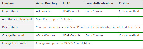
Since SharePoint uses an external user identity provider, its user operation is very simple. The fact that SharePoint can be provisioned in many different ways, and the overlap between WSS and MOSS tends to confuse most users on how it actually works. Here are some of the important points to remember:
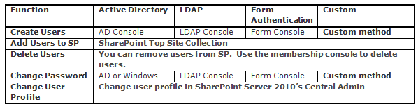
Creating users: You do NOT create a user in SharePoint. Users are created in a user directory provider. You can then add or invite a new user to SharePoint.
Adding new users: You can add or invite a new user from any zone and all authentication methods that are configured, if the membership provider and role manager are registered in the current Web.config file. When you add a new user, Windows SharePoint Services 3.0 resolves the user name against the following sources in the following order:
Deleting users: User accounts are marked as deleted in the WSS v3 database. However, the user record is not removed.
Managing users: Generally, users who are members of an authentication provider in one zone can manage accounts across all zones as long as they are granted permissions.
Some user authentication systems behave differently within WSS v3, depending on the authentication provider. The table below highlights several common user account tasks that differ depending on the authentication method that is implemented.
Note also that MOSS does NOT provide any user management functionality. Although MOSS provides a User Profile database, MOSS uses WSS to handle user management. We will address the differences between User Management and User Profile Management in the next section.
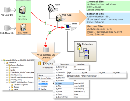
When you are using just WSS, the user management situation is pretty simple as shown below. WSS has a People and Groups feature that keeps track of user information. The user information is managed by:

When you add a user to WSS, the system adds a limited number of properties from the user authentication provider (e.g. Active Directory) to the WSS Content database’s User Info table. This is a one-time sync between the User Directory provider to the WSS database as shown in path 1 in Figure 8. WSS tries to map as much information from the User Directory Services to the UserInfo table as possible on the initial sync.
You can add extra columns to the user info list, but they must be updated manually and are not synced with the User Directory services as shown in path 2 above.
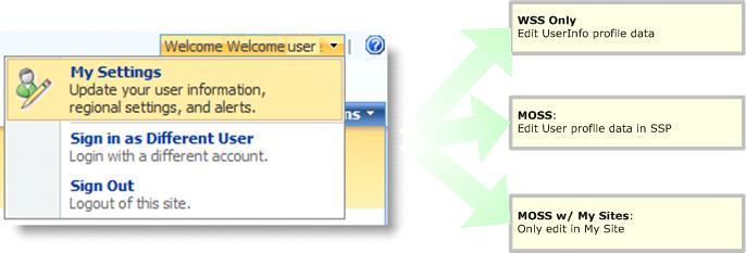
This user information is stored per site (remember, this is not per SharePoint Web, it is the top site collection). Clicking on the “My Settings” link takes you to a page where this information can be maintained.
MOSS, on the other hand, is a little confusing. MOSS has a User Profile database that is stored in the SSP database. It provides a much more extensive User Profile feature that allows for scheduled synchronization from one or more User Directory Services, which could be AD/LDAP/BDC/Custom, at regular intervals. You can also define properties and set various policies on how data is imported from various User Directory Services.
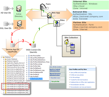
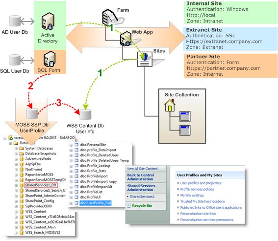 As you can see here, there are more complex conditions in MOSS when dealing with user management. The user information is propagated between various databases.
Since MOSS is based on WSS, it also lets WSS manage its own user information. When you add a user to a MOSS site, such as a Team Site, WSS still copies a subset of the user information from the User Directory Services (AD) to the UserInfo table in the content database, as shown in path 1.
At the same time, when you add a user to MOSS, it also checks to see if that user already has a record in its User Profile database. If a record does not exist, it creates a record in the User Profile table.
The User Profile table is stored in the Shared Services Provider (SSP) database. Remember that SSP is independent of any front-end Web Application, thus it can manage the users within a farm that has multiple Web Applications.
The SSP User Profile database is updated from the profile information in the User Directory services via a scheduled update. This is done in the Central Admin site of the SharePoint Farm. You can specify when this import runs, and what properties are imported to SSP. This is path 2.
MOSS replicates the profile information in the SSP database to the individual content database’s UserInfo table via a scheduled update. This timer runs every hour and copies properties, such as picture, department, etc. Note that only the profile properties that are marked with the option “replicable” are updated via the timer. This is path 3.
With a MOSS installation, you also need to be aware of several differences from a WSS-only installation:
The most confusing factor for some people is how MOSS displays user information. When you view an item’s CreatedBy and ModifiedBy, those fields came from the UserInfo table in the content database. But when you view information in My Site, that information comes directly from SSP’s User Profile database. If you update a user profile in MOSS, there might be some delay in propagating this information from the SSP database into the UserInfo table and thus create lots of confusion.
Since SSP-based User Profile information exists, if you edit MySettings at a SharePoint site collection, it actually edits the User Profile information in the SSP database. This is different from a normal WSS mode where My Settings updates the information in the UserInfo table.
Individual users can manage their information in the UserInfo table via the MySettings link, which is directed to the display form userdisp.aspx?ID=[userid], or to the edit form useredit.aspx?ID=[userid]. This information is overridden by the user profile information in the SSP database.
To make it even more confusing, if your SharePoint installation has My Sites enabled, things are more convoluted. In MOSS, My Sites are special SharePoint sites that are personalized for each user. My Sites are enabled by default, and every user in an organization has a unique My Site. The reason that site personalization is stored in SSP is so that larger organizations that have multiple Web Applications and Portal sites can reference ONE personalization site.
As soon as the My Site feature is activated, any User Profiles from an existing installation of WSS are replaced by the public profiles that are part of My Site. A My Site link is added to the top menu bar for all sites in the site collection, along with the My Links menu. In other words:
If My Sites is enabled, the user has to manage their profile information via their My Site link. The link at My Settings in this configuration is read-only.
If My Sites is NOT enabled, then administrators can and should manage User Profile information via the SSP profile database, or My Settings for the user being edited.
Lastly, deletion of a user profile also has implications in MOSS. When you delete a User Profile in MOSS, the profile record is moved from the UserProfile table in SSP to the DeleteUsers table, and the deleted user’s My Site becomes inaccessible. This way, if the user is re-imported in at a later date, some information such as Document Libraries and the My Site can be reactivated.
Business Data Catalog (BDC) is a feature in MOSS that allows users to create an interface to external information systems (databases) without writing any code. You can also import external User Profile information from a BDC interface into the MOSS User Profile database. A real world example is to set up a BDC interface to your company payroll or financial system to import employees’ Social Security Numbers into their MOSS User Profiles. This capability also provides some misconceptions on how BDC plays into the overall SharePoint user management capability.
Although you can import user information from a BDC interface into a MOSS User Profile, similar to how you import data from Active Directory, BDC can NOT act as an authentication provider.
Although you can import data from a BDC catalog, this can only act as a supplemental import. Another primary user authentication provider (i.e., Active Directory or LDAP) has to be configured as the primary source before you can use BDC. This has implications when you use SQL Forms as your primary authentication provider: you will not be able to set up the automatic import from that source and thus you will also not be able to import supplemental data from a BDC catalog.
Once a user has been authenticated for access to a SharePoint site, the SharePoint authorization process determines which objects in the system a user can access and perform actions on. With the latest release of MOSS 2007, permissions are handled strictly at the WSS platform level.
In this section, we will describe several important concepts that make up the authorization process in SharePoint:
· Permissions
· Permission Levels
· Securable Objects
· SharePoint Groups
Permissions (rights in previous WSS versions) are the rights for a user to perform specific actions such as viewing pages, editing items, and creating sub-sites. WSS provides 33 pre-defined permissions that you can use to allow users to perform specific actions that are grouped into three main categories: List, Site, or Personal. SharePoint permissions are not assigned directly to users or SharePoint groups, but are assigned to one or more permission levels, which are in turn assigned to users and SharePoint groups.
A SharePoint Permission Level (site groups in previous WSS versions) is a group of permissions that can be granted to users or SharePoint groups so that they can perform specific actions on securable objects such as a site, library, list, folder, item, or document on your site. Permission levels allow you to group permissions and apply them to users and SharePoint groups on various sites in your SharePoint installation.
 When you create a new SharePoint site, there are five permission levels provided by default:
Full Control: allows users or groups full control over a site. Full Control is the least restrictive permission level. You can not modify or remove this permission level.
Design: allows users or groups to view, add, update, delete, approve, and customize lists, libraries, and pages on your site, including themes and style sheets.
Contribute: allows users or groups to view, add, update, and delete previously created list items and document libraries.
Read: allows users or groups to read pages on the site including the resource libraries. Read is the most restrictive permission level.
Limited Access: is a permission level that is automatically assigned to a user or group and therefore cannot be directly assigned by the administrator. It is used when you assign the users or groups to a child object of a parent object to which they do not have access. You can not modify or remove this permission level.
SharePoint provides the ability to manage item level permissions on individual objects (such as lists and libraries), even down to the individual folders, documents, and list items within those lists and libraries. These items that you can apply permissions to are called Securable Objects. Each site contains additional securable objects which have a particular position in the site hierarchy, as shown here.
In SharePoint, permissions on any securable object, such as web sites, lists, libraries, folders and documents, are inherited from their parent object. However, you can break this inheritance for any securable object at a lower level in the hierarchy by creating a unique permission on that securable object. For example, you can create a sub-site (Web) and break the permission inheritance from the parent if you want to limit (or expand) the group of users who can have access permission to the site for security reasons. When you break the inheritance from the parent, the securable object to which you broke the inheritance receives a copy of the parent’s permissions. You can then edit those permissions to be unique — meaning that any changes you make to the permissions on that securable object do not affect the parent.
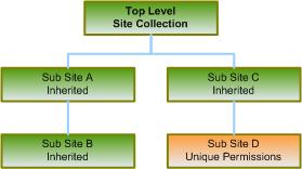 In our example, sub-sites A, B and C inherit permissions from the top-level Web site. This means that changes made to SharePoint groups and permission levels on the top-level site also affect all of those sub-sites. When you make any change in sub-sites A, B or C, you are actually making changes at the parent site, since SharePoint does not allow you to manage permission on a sub-site that is inheriting permissions from its parent site.
Sub-site D has unique permissions, which are not inherited from its parent site. Therefore, any changes made to the permission levels and SharePoint groups on Sub-site D do not affect its parent site.
You can add a user to SharePoint who has a valid account that has been authenticated as mentioned in SharePoint User Authentication. When a user is added to the system, you can assign permissions directly to a securable object (web, list, library, etc.) or indirectly through a SharePoint Group. Using SharePoint Groups is the recommended practice when managing security since it’s easier to manage changes for a group than for individual users, and apply the same group to different objects across your sites.
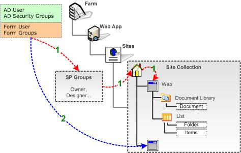 A SharePoint Group (cross site group in previous WSS versions) is a logical grouping of users that you can create to manage permissions to the site and to provide an e-mail distribution list for site members. All SharePoint groups are created at the site collection level and are available to all sub-sites in the site collection. You can also create groups that only have permissions to a particular sub-site as shown in path 1 in Figure 15.
SharePoint groups can contain Windows (Active Directory) security groups, ASP.NET Forms authentication groups (using the roles within the role membership provider), and individual users with a user account on the local server or a Windows domain as shown in path 2 in Figure 15.
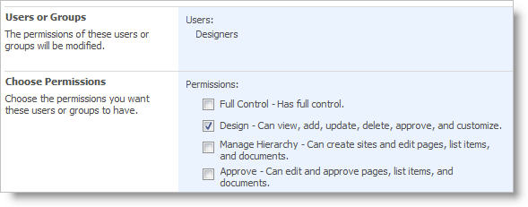 SharePoint provides three default SharePoint groups with permissions on the top-level site, each with a Site name prefix. These default groups are also provided when a new site with unique permissions is created.
Site Owners: have Full Control permissions in the site.
Site Members: have Contribute permissions.
Site Readers: have Read permissions.
Each of these SharePoint groups is associated with a default permission level, but you can change the permission level for any SharePoint group as needed.
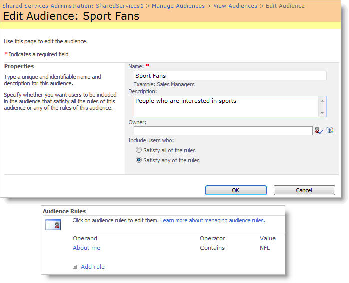 A practical way to apply user profiles out of the box is audience targeting. Audience targeting refers to the ability to create a group of users based on a specific set of rules and then target content to that specific audience. You can target specific content such as a SharePoint List, library items, navigation links, and Web Parts to a specific group of people.
You can create an audience in MOSS using its Central Administration tool. Audiences are created based on a set of rules. The example in Figure 17 shows how an audience of Sport Fans is created by looking for the world “NFL” in the About Me field in their User Profile.
Once the Audience is created, you can enable audience targeting. Select the securable objects for specific audiences using an Audience Targeting column for the library or list containing the items of interest.
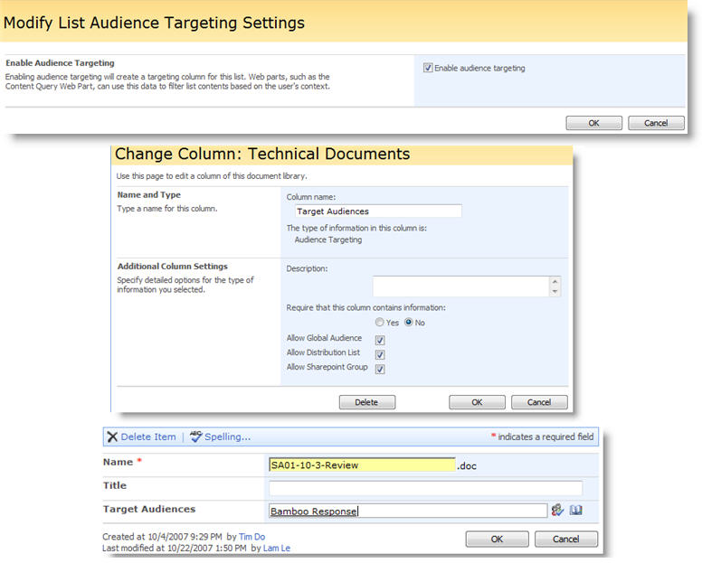
MOSS Single-Sign-On
MOSS provides another capability to help with user security management which is called Single-Sign-On (SSO). This is a feature that does not affect the internal operation of MOSS, and actually is not even installed by the default installation program. SSO is a database created in MOSS to keep and manage a set of user names and passwords that can be used to access specific external systems that require access authentication.
An example is if you have a need to crawl and index a backend office system (e.g. SAP or Oracle) to retrieve information that is then made available to the SharePoint enterprise search. These systems might require login accounts for access, and the accounts’ access information can be retrieved for those purposes. There are several benefits to using SSO; i.e., the access information is encrypted and is more secure, and the account information can be managed by an IT administrator while the Web Parts or code that use the account do not have to know the account details, but just how to use it.
Hopefully, this article provided you with a solid basic understanding of how SharePoint manages its users. Additional information can be found in various books and online articles; please see the Reference section for suggested reading. Given the complexity of managing users in SharePoint, Bamboo Solutions has provided several Web Parts and Solution Accelerators that are very useful to help you keep the situation under control and create a happy and productive work force. Check these products out on the Bamboo Solutions’ web site:
This article has been updated for SharePoint 2010 which can be found here.
This use case is another extension of Alert on a Tasks List, and send alerts for every task to the assigned person. You want to set up an escalation of notification process for a Tasks List. Rather than sending the normal notification e-mails when items change, you want to be able to send overdue alerts when items are overdue, and send reminder e-mails 5 days before the due date. This actually requires two alerts to be defined: one for the overdue alerts and one for the reminder e-mails. Let’s refer to these two alerts in our discussion that follows as the Overdue Alert and Reminder Alert. The general alert parameters are defined as follows:
| Alert List – What list contains the items to alert on? | Tasks List |
| Event Type – What triggers the alert? | An item exists. |
| E-mail Frequency – How often are e-mails sent? | As Soon As Possible |
| Item Criteria – What items in the list generate an alert? | Some Items (Advanced) |
| CAML Query | (see below) |
| Who should the alert e-mails be sent to? | Lookup an E-Mail Address in the Alert List |
| Where is the e-mail address to lookup stored? | In SharePoint User Profiles |
| Which user lookup column in the Alert List should be used to find the recipient? | Assigned To |
Overdue Alert – CAML Query
After setting the general alert parameters you will need to define the CAML Query that is used to filter for overdue items. The criteria for our query will be to get all Task items where the Due Date field is greater than today and the Status of the Task item is not complete. Let’s start by using the Alert Plus Web Part Criteria Builder to provide us with the base of our CAML query that we will modify later.
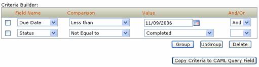
To enable the Criteria Builder, click on the Show Criteria Builder Tool checkbox below the CAML Query field in the “What items in the list generate an alert?” section of the UI. Use the UI controls to build the base query as show in Figure 16. You can pick any date value for the Due Date. We will need to change that value later manually to make comparisons to the constantly changing today’s date.
Click the “Copy Criteria to CAML Query Field” button.
Find the text shown in Figure 17 that has been copied to the CAML Query field. The text in bold is the text you need to edit manually. Change the date time value in bold to “
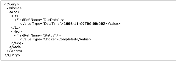
Figure 17: Overdue CAML Query Before
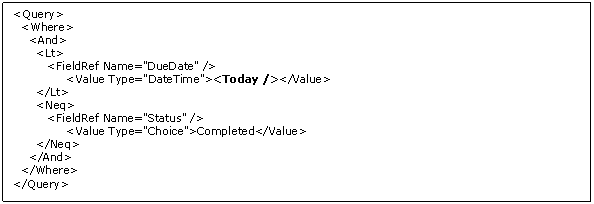
Figure 18: Overdue CAML Query After
Configuration of the Overdue Alert Event tab is then complete.
Reminder Alert – CAML Query
After setting the general alert parameters you will need to define the CAML Query that is used to filter for items that are approaching their due date. Our use case specified the requirement to notify users when their Tasks were within 5 days of their due date. The criteria for our query will be to get all Task items where the Due Date field is less than or equal to 5 days from today and the Status of the Task item is not complete. Let’s start by using the Alert Plus Web Part Criteria Builder to provide us with the base of our CAML query that we will modify later.
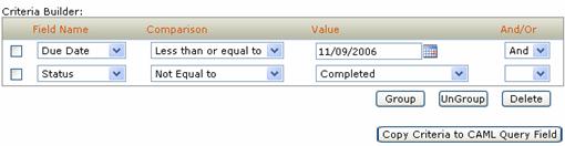
Figure 19: Criteria Builder Reminder
Use the UI controls to build the base query as show in Figure 19. You can pick any date value for the Due Date value. We will later need to change that value manually to make comparisons to the constantly changing today’s date.
Click the “Copy Criteria to CAML Query Field” button.
Find the text shown in Figure 20 that has been copied to the CAML Query field. The text in bold is the text you will need to edit manually. Change the date time value in bold to “
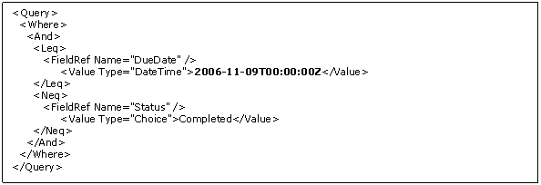
Figure 20: Reminder CAML Query Before
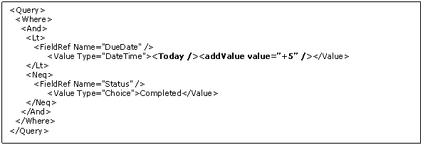
Figure 21: Reminder CAML Query After
Configuration of the Reminder Alert Event tab is then complete.
By default, anonymous access is not enabled in SharePoint 2010 nor SharePoint 2013. SharePoint administrators may want to enable anonymous users to have access to content without having to provide authentication credentials. Anonymous access is permitted or denied based on the permissions for the site. Additional configuration is needed for anonymous users to access content or web parts within a site.
For information about the SharePoint permissions given to the anonymous account, this article from Microsoft provides a good summary: Decide whether to allow access for anonymous users.
| Step | Action | Description |
| 1. | To configure anonymous access on one particular site in a Site Collection, you first access Central Administration > Application Management > Manage web applications |
|
| 2. | Select the Web Application containing the site you want to configure for anonymous access. | 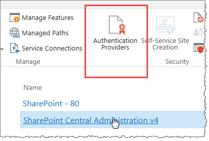 |
| 3. | Configure the Authentication Providers; in this example, the only choice is Default. |  |
| 4. | This opens the settings to Edit Authentication, where you can check the box to Enable anonymous access for that Web App zone. | 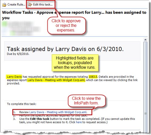 |
| 5. | Once this has been done, when you go back to the Web App Ribbon and select Anonymous Policy, you will be able to select the zone (or All Zones in this case, since Default was the only zone), and then choose any restrictions to anonymous access. |
|
| Up to this point, you have preconfigured where you want to allow anonymous access to be set. But now you need to set the final settings at a Site Collection or Site level or anonymous users will not have any access. | ||
| 6. | Navigate to the location where you want to allow anonymous access and go to Site Actions > Site Permissions | Notice now in the Ribbon, there is an option for Anonymous Access.  |
| 7. | To grant anonymous access only to a sub-site in a Site Collection, then nothing should be done with Anonymous Access at the Site Collection top-level. Instead, navigate to the sub-site and from there select Site Actions > Site Permissions. |
|
| 8. | The Anonymous Access button is now available on the sub-site Ribbon and when you open the option, you have some choices available. | 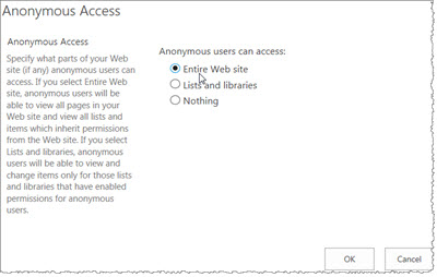 The default setting is “Nothing” but you can change it to allow anonymous access to the entire site or to Lists and Libraries only. |
| 9. | You will also note that the Anonymous Users has been added to the site permissions showing the permission level you selected. |
|
See also:
Variables store data while the workflow is running. They can be accessed and manipulated by widgets, and some widgets may require that a variable be created to store results. The contents of workflow variables are accessed using a lookup when the workflow runs.
To create a variable, click Add Variable to open the Workflow Variables form. Enter a Name for the variable, select a data Type, and optionally define a Default Value. Click Add to add the new variable to the workflow. If you later want to delete a variable, return to the Workflow Variables form and click the button next to the variable.
Workflow variables can also be added directly from widgets that use variables, using the Create new variable link. This link is a shortcut to the Workflow Variables form.
NOTE: After adding, updating, or deleting variables using the Workflow Variables Form, always click Save Changes.
The Set Variable widget sets the value of an existing workflow variable.
Widget Properties:
| Column | Description |
| Select Variable (Required) | Select an existing workflow variable from the list. Create variables in the Workflow Settings tab in the settings pane, or click the Create new variable link next to the variable list. |
| Set Value (Required) | Enter a Value for the variable by typing text in the property field or by clicking the Add Lookup icon ( ) to add a lookup. Some variable types will have additional ways to enter values. For example, a Date/Time variable will activate the Calendar icon ( ) to add a lookup. Some variable types will have additional ways to enter values. For example, a Date/Time variable will activate the Calendar icon ( ), which you can use to select a date. ), which you can use to select a date. |
| Click Apply to save the widget settings. | |
Example of Set Variable Widget
Return to Workflow Logic Widgets List
See also:
NOTE: To setup alerts on Data Views created by the Bamboo List Rollup Web Part, you must have the Alert Plus Web Part version 2.2.0 and the List Rollup Web Part version 2.0.1 or higher. To set up alerts on Schemas created with the List Rollup Schema Designer Web Part, you must have Alert Plus 3.0 or higher and List Rollup 5.0 or higher.
Please note that Alert Plus Web Part versions prior to version 2.2.0 are not compatible with List Rollup Web Part version 3.0.0 or higher. All products are sold separately unless purchased as part of a suite or toolkit.
| Step | Action |
|---|---|
| 1. | From the Alert Plus Web Part, click New Item.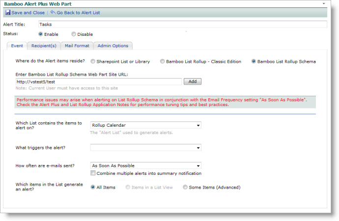 |
| 2. | Enter a Title for your alert. |
| 3. | On the Event Tab, select the check box labeled Bamboo List Rollup – Classic Edition or Bamboo List Rollup Schema depending on the version of List Rollup you used to create the rollup. Enter a page URL for List Rollup – Classic Edition or a site URL for the List Rollup Schema option. (Hint: The easiest way to get this entry is to navigate to the Data View or Schema location in another browser tab or window and copy the URL.) |
| 4. | Click Add to load the data views or schemas into the Which List contains the items to alert on? drop-down box for selection as the alert list. |
| 5. | In the Which list contains the items to alert on? drop-down box, select the Data View you want. |
| 6. | In the What triggers the alert? drop-down box, select whether the alert is sent when an item is created, modified, or exists. |
| 7. | In the How often are e-mails sent? drop-down box, select the frequency with which you would like to send the alerts: as soon as possible, every hour, every day, or every week. WARNING: Please keep in mind the number of lists that are included in the Data View you have selected. If you have rolled up more than 15 lists with a large amount of data in each list, you should consider setting your alerts to be sent every hour, day or week, rather than “as soon as possible”. See Alert Plus Performance Considerations for more information on performance tuning. |
| 8. | In the What Items in the list generate an alert? drop-down box, select All Items or Some Items (Advanced). See Event Tab for more information on these options. |
| 9. | Set up the Recipient(s) and Mail Format tabs as described in the respective sections above (see Recipient(s) Tab and Mail Format Tab for more information). |
| 10. | On the Admin tab, you can specify how often you want the alert to be sent for the same alert item in the E-mail Follow-up Wait Days box. The default is set to 1 day. If you want the alerts to be sent regardless of when the last one was sent, set this option to 0. See Admin Options Tab for more information. |
| 11. | In the Use Custom Schedule option, set the start time, end time, frequency value and unit. It is recommended that for rolled up data views with more than 15 lists with a large amount of data in each list that you set the service to check for updates to this list every 5, 8 or 10 minutes or more as needed to enhance maintain reasonable performance. See Alert Plus Performance Considerations for more information on performance tuning. |
| 12. | Click Save and Close. Your alerts will start processing according to your start time in the custom schedule. |
| Configuring Grants Management |
|---|

 You can edit the Quick Launch by adding, deleting, or changing the order of links. You can also show or hide links to sub-sites and pages on the Quick Launch, add links to pages outside of the site, and even hide the Quick Launch. The Quick Launch is displayed to the left side of most pages of a site.
The Quick Launch is also referred to as current navigation, because you primarily use it to navigate between the features of the current site. The options available to you for configuring the Quick Launch will vary depending on whether the publishing features are enabled for your site collection.
NOTE: You can quickly determine whether your site has publishing activated by looking at the Site Settings page under the Look and Feel section.
If you see a link titled Navigation, then you are working with a publishing site and you can configure your site using the Navigation Settings page.
If you see links titled Top link bar and Quick Launch, then you are working with a non-publishing site and you have a more limited set of navigation configuration options available to you.
Below are more details about each section of the Quick Launch bar that you would see in a typical Bamboo Grants Management site:
| No. | Setting | Description |
| 1. | Documents | Within the Documents section, you have the choice to display links to several types of libraries; you can show links to not only document libraries, but picture libraries or forms libraries. |
| 2. | Overall Grant Information | Within the Grants Management master site, you have an option to show a variety of links to summary information pertaining to your grants. Again, these links are customizable through the site settings navigation. |
| 3. | Site Management | Bamboo adds a section to the Grants Management master site whereby you can quickly create new Grant sites and manage your site settings. |
| 4. | Sites | Within any given site collection, you could have sub-sites and this section provides a quick way to get to a list of those sites. |
| 5. | Recycle Bin & All Site Content | Every site has a Recycle Bin so that if someone in your organization inadvertently deletes a list, it can easily be recovered from there. There is also a link to all of the content within your site to quickly navigate and at a glance see a page containing everything in your site. |
Read this article from Microsoft to learn how to hide or show links on the Quick Launch Bar
Area charts are great for comparing quantities over time or categories. An area chart requires an x-axis category and at least one y-axis data series.
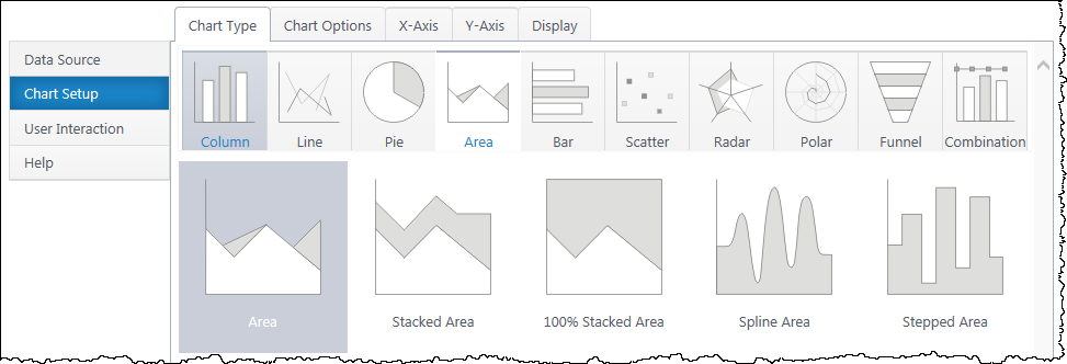
Multiple y-axis series will add an additional area piece to the canvas. Stacked area charts will add each series with the sum of the previous series. Spline & Stepped charts alter the visual style of the area pieces.
If you haven’t yet, select a data source.
As you’re building your chart, use the Preview button in the upper right to check your work in progress.
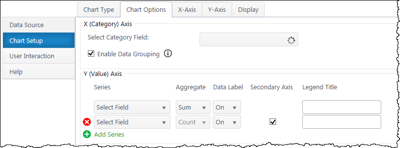
Select Category Axis – Select which column of categories you would like to compare. The dropdown list will auto-populate with columns from your data source.
Enable Data Grouping – Group x values of the same category. Typically, you want grouping enabled. If off, each individual data point will be a discreet point on the area chart.
Series – Specify what value you would like to compare between the categories. Add additional y-axis series to compare.
Aggregate – If you have enabled grouping on the x-axis, aggregate the y-axis data you are comparing (sum, first, min, max, average, count). By default, chart plus compares the sum of y values.
Data Label – Toggle data labels for each Y series.
Secondary Axis – If using more than one Y series, you can add a secondary axis on the right side of the chart. The secondary axis will automatically adjust it’s range to include the maximum Y value from the series mapped to it.
Legend Title – Customize legend titles for each y-axis series.
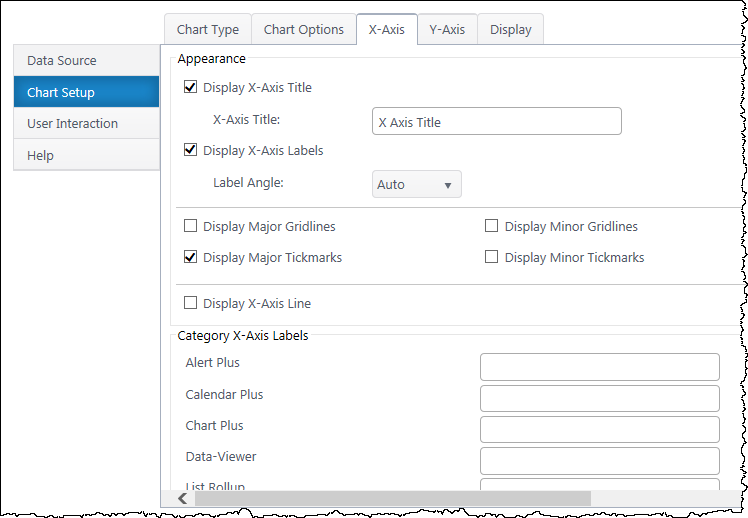
Data Type Settings – Appears if you select a Date/Time value for the x-axis. Configure how date categories display (date or time) and the scale of the x-axis. “Automatic” sizes the x-axis according to the scale of your dataset.
X Axis Title – Toggle title display at top of chart and customize title text.
X-Axis Labels – Toggle x-axis labels & their display angle.
Gridlines & Tickmarks – Customize which gridlines and tickmarks display along the x-axis.
Display X-Axis Line – Toggle the x-axis line that runs along the bottom of the chart between the canvas and x-axis labels.
Category X-Axis labels – Customize category names that appear on the x-axis.
Sort Axis – Specify an ascending or descending sort order for how categories display on the x-axis.
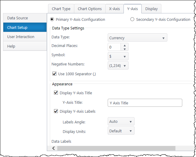
Secondary Axis – If you have a secondary y-axis, use the buttons at the top of the Y-Axis tab to switch between axis settings.
Data Type – Select a data type for y values (general, number, currency, date, time, percentage, scientific).
Format – Configure details on how Y values will display on the axis and labels. Date types also require you to select the date scale for the y-axis.
Y-Axis Title – Toggle title display at top of chart and customize title text.
Y-Axis Labels – Toggle y-axis labels and their display angle & position.
Gridlines & Tickmarks – Customize which gridlines and tickmarks display along the y-axis.
Y-Axis Range – Configure the minimum and maximum values visible on the y-axis. These default to “auto” and adjust to the range of your dataset. Not available for “Date” & “Time” data types or 100% stacked area.
Display Y-Axis Line – Toggle the y-axis line between the y-axis scale and the chart canvas.
Scatter charts are great for displaying the relationship between two numerical variables in a dataset. Scatter charts require a value x-axis and value y-axis. Both axes must be numerical and you cannot use categories in a scatter chart.
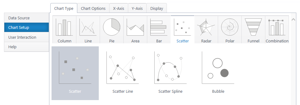
Multiple y-axis series will add an additional legend entry and another color of dots on the canvas. The scatter line/spline will connect points of the same color.
Bubble charts include an additional Z axis, which represents the z variable with the size of the bubble.
If you haven’t yet, select a data source.
As you’re building your chart, use the Preview button in the upper right to check your work in progress.
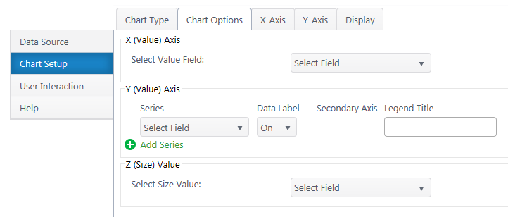
Select Value Axis – Select the numerical variable to measure on the x-axis. The dropdown list will auto-populate with only number & date/time columns from your dataset.
Enable Data Grouping – Group data points with the same X value. We do NOT recommend grouping in scatter plots, as typically you’re seeking trends between all data points, not sums of data points.
Series – Specify what numerical value you would like to measure on the y-axis. Add additional y-axis series to compare.
Aggregate – If you have enabled grouping on the x-axis, aggregate the y-axis data you are comparing (sum, first, min, max, average, count). By default, chart plus compares the sum of y values.
Data Label – Toggle data labels for each Y series.
Secondary Axis – If using more than one Y series, you can add a secondary axis on the right side of the chart. The secondary axis will plot a second set of data points with the same X value, but Y values from the second Y series.
Legend Title – Customize legend titles for each y-axis series.
Z (Size) Value – Available for bubble charts. Choose a third value series to display as bubble size.
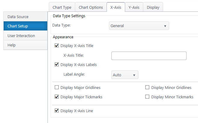
Data Type Settings – Configure the number type & format. If a date, configure the axis scale.
X Axis Title – Toggle title display at top of chart and customize title text.
X-Axis Labels – Toggle x-axis labels & their display angle. Configure numerical units display.
Gridlines & Tickmarks – Customize which gridlines and tickmarks display along the x-axis.
X-Axis Range – Configure the minimum and maximum values visible on the y-axis. These default to “auto” and adjust to the range of your dataset. Not available for “Date” & “Time” data types.
Display X-Axis Line – Toggle the x-axis line that runs along the bottom of the chart between the bars and x-axis labels.
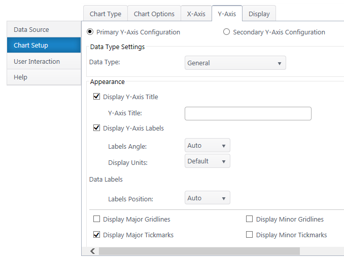
Secondary Axis – If you have a secondary y-axis, use the buttons at the top of the Y-Axis tab to switch between axis settings.
Data Type – Select a data type for y values (general, number, currency, date, time, percentage, scientific).
Format – Configure details on how Y values will display on the axis and labels. Date types also require you to select the date scale for the y-axis.
Y-Axis Title – Toggle title display at top of chart and customize title text.
Y-Axis Labels – Toggle y-axis labels and adjust their display angle & position.
Gridlines & Tickmarks – Customize which gridlines and tickmarks display along the y-axis.
Y-Axis Range – Configure the minimum and maximum values visible on the y-axis. These default to “auto” and adjust to the range of your dataset. Not available for “Date” & “Time” data types.
Display Y-Axis Line – Toggle the y-axis line between the y-axis scale and the chart canvas.
Radar charts display multivariate data across three or more quantitative variables. Radar charts require an X Category axis, which determines the names of the chart arms. The Y-axis determines the observations that get plotted across each category arm.
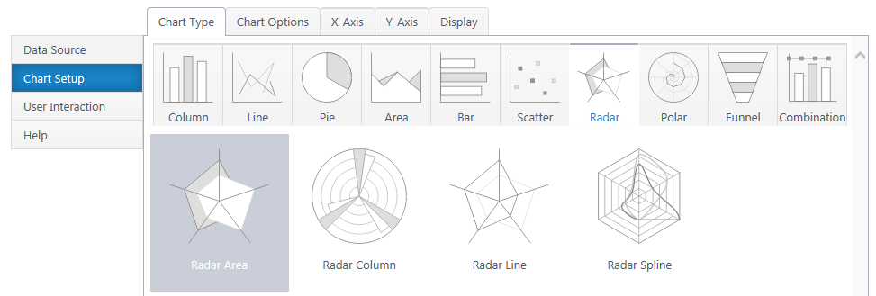
Radar Column, Line, and Spline plot the same radar chart with different visual approaches.
If you haven’t yet, select a data source.
As you’re building your chart, use the Preview button in the upper right to check your work in progress.

Select Category Axis – Select which column of categories you would like to compare. These will be the arms/axes of the chart. The dropdown list will auto-populate with columns from your data source.
Enable Data Grouping – Group x values of the same category. If off, each individual data point will be a separate column.
Series – Specify what numerical value you would like to measure on the each axis. An additional y-series will plot an additional, separate radar shape on the graph.
Aggregate – If you have enabled grouping on the x-axis, aggregate the y-axis data you are comparing (sum, first, min, max, average, count). By default, chart plus compares the sum of y values.
Data Label – Toggle data labels for each Y series.
Legend Title – Customize legend titles for each y-axis series.
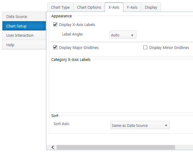
Data Type Settings – Available if you selected a quantitative x-axis series. Configure the type and format of the number.
X-Axis Labels – Toggle x-axis labels & their display angle. Configure numerical units display if number.
Gridlines – Customize which gridlines and display along the x-axis.
Category X-Axis labels – Customize category names that appear on the x-axis.
Sort Axis – Specify an ascending or descending sort order for how categories display on the x-axis.
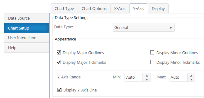
Data Type – Select a data type for y values (general, number, currency, date, time, percentage, scientific).
Format – Configure details on how Y values will display on the axis and labels. Date types also require you to select the date scale for the y-axis.
Gridlines & Tickmarks – Customize which gridlines and tickmarks display along the y-axis.
Y-Axis Range – Configure the minimum and maximum values visible on the y-axis. These default to “auto” and adjust to the range of your dataset. Not available for “Date” & “Time” data types.
Display Y-Axis Line – Toggle the y-axis line between the y-axis scale and the chart canvas.
Polar charts are great for displaying the relationship between two numerical variables in a dataset. Unlike traditional charts, the X value plots the angle of the data point on the polar plane and the Y value plots the distance from the center. Polar charts require a value (numerical) x-axis and value y-axis.

Multiple y-axis series will add an additional legend entry and polar shape on the canvas. Polar scatter plots the points, but doesn’t connect them, similar to a scatter plot.
If you haven’t yet, **select a data source.(http://bamboo.docfactory.com/ChartPlus_(holding/Create_a_New_Chart?go=data
As you’re building your chart, use the Preview button in the upper right to check your work in progress.
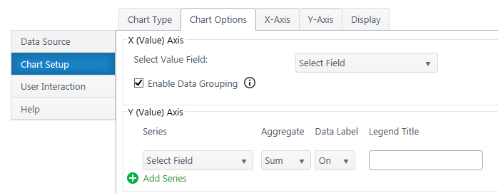
Select Value Axis – Select the numerical variable to measure on the x-axis. The dropdown list will auto-populate with only number & date/time columns from your dataset.
Enable Data Grouping – Group data points with the same X value.
Series – Specify what numerical value you would like to measure on the y-axis. Add additional y-axis series to compare.
Aggregate – If you have enabled grouping on the x-axis, aggregate the y-axis data you are comparing (sum, first, min, max, average, count). By default, chart plus compares the sum of y values.
Data Label – Toggle data labels for each Y series.
Legend Title – Customize legend titles for each y-axis series.
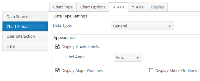
Data Type Settings – Configure the number type & format. If a date, configure the axis scale.
X-Axis Labels – Toggle x-axis labels & their display angle. Configure numerical units display.
Gridlines – Customize which gridlines display along the x-axis.
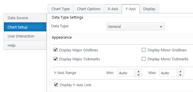
Data Type – Select a data type for y values (general, number, currency, date, time, percentage, scientific).
Format – Configure details on how Y values will display on the axis and labels. Date types also require you to select the date scale for the y-axis.
Y Axis Title – Toggle title display next to the y-axis and customize title text.
Y-Axis Labels – Toggle y-axis labels & their display angle. Configure numerical units display.
Gridlines & Tickmarks – Customize which gridlines and tickmarks display along the y-axis.
Y-Axis Range – Configure the minimum and maximum values visible on the y-axis. These default to “auto” and adjust to the range of your dataset. Not available for “Date” & “Time” data types.
Display Y-Axis Line – Toggle the y-axis line between the y-axis scale and the chart canvas.
Next: **Configure the Chart Display Settings**(http://bamboo.docfactory.com/ChartPlus_(holding/Create_a_New_Chart?go=display
Set Up Notification Reminder of Password Expiration
| Overview of Password Expiration settings |
|---|
To set up e-mail notification that a user’s password has or will expire, follow these steps:
| Step | Action | Result |
| 1. | Make sure the PasswordChangeNotification.ps1 file is installed in a folder on the SharePoint server. | |
| 2. | Open the ps1 file in Notepad or a ps1 editor of your choice. |  |
| 3. | Under the # Subject Setting:
For the $subject variable, enter the subject you want your outgoing emails to have. |
|
| 4. | Save and close the file. | |
| 5. | Go to Start > Control Panel > Administrative Tools. | |
| 6. | Double click Task Scheduler in the list. |  |
| 7. | In the Task Scheduler window, select Create Task in the pane on the right. |  |
| 8. | Type a name for the task and tick the Run with highest privileges box. | 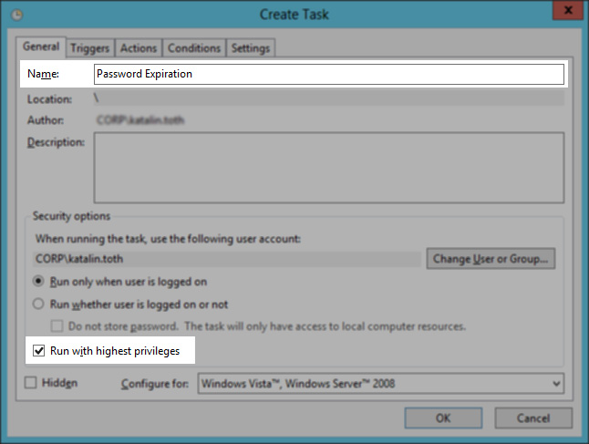 |
| 9. | Click the Actions tab, then click New. | 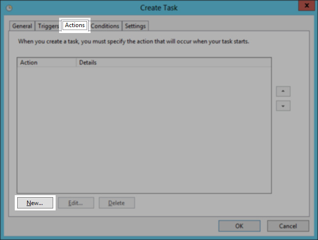 |
| 10. | From the PasswordChangeNotification.ps1 file, copy and paste either example (line 12 or 14) and fill in with your own information:
Template: PasswordChangeNotification.ps1 -smtpServer mail.domain.com -expireInDays 21 -from “IT Support <[email protected]>” -Logging -LogPath “c:\logFiles” -testing -testRecipient [email protected] |
 |
| 11. | Select the Triggers tab and then click New. | 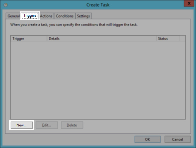 |
| 12. | Click, for example, the Daily radio button if you want to run the task daily, and give the date and time in the Start field, specifying when you first want the task to run. Click OK. | 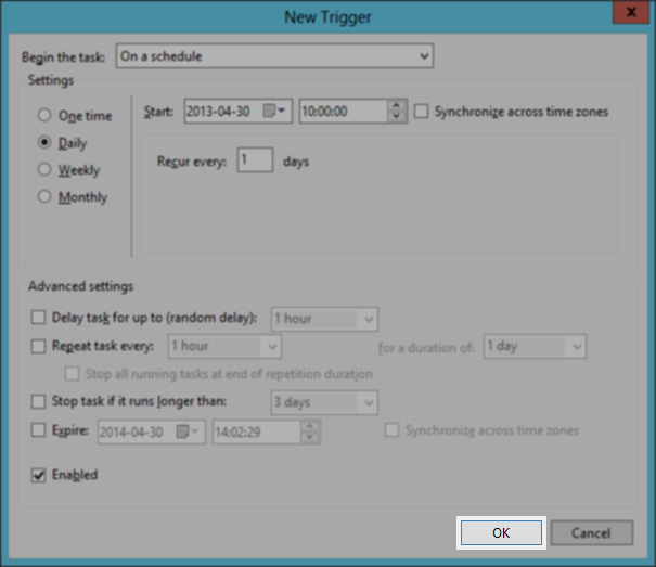 |
| 13. | The task’s frequency details are displayed. Click OK again. | 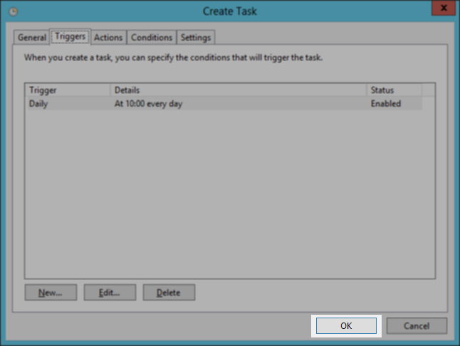 |
| 14. | The task appears in the Active Tasks list. | 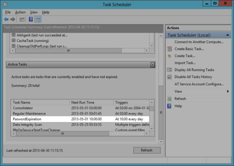 |
| 15. | Double click the task in the list to get to the Task Scheduler Library where you can see the task in the list. Wait until the task runs at the time it is configured to run. | 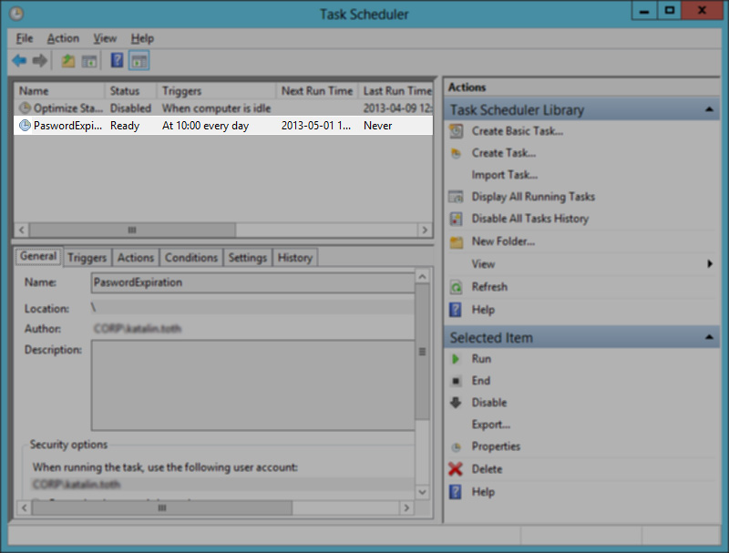 |
| 16. | On completion of the task, you can see the result in the pop-up Command Prompt window. | 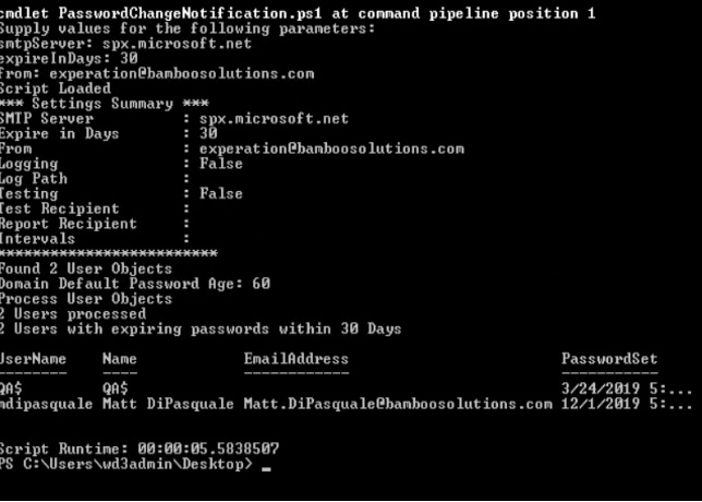 |
Pie charts are great for comparing multiple categories. Users have an option to use either the pie chart or dounut chart.
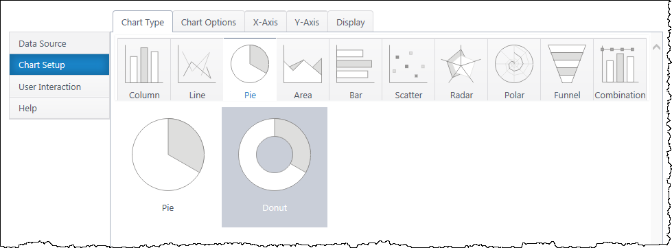
Both charts can compare an x-axis category by one y-axis value. Standard pie charts can also display a single (Category) Axis chart, which counts the occurrence of each category of items in the x-axis. No y-axis is needed for a single category axis chart.
Donut charts cannot display single category axis charts, but they can display two y-axis series as two donut rings. This is helpful for comparing the same category across two values.
If you haven’t yet, select a data source.
As you’re building your chart, use the Preview button in the upper right to check your work in progress.
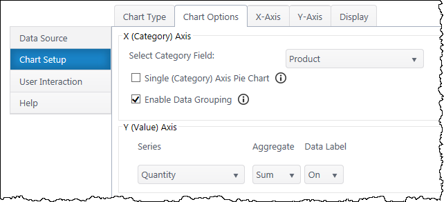
Select Category Field – Select which column of categories you would like to compare. The dropdown list will auto-populate with columns from your data source.
Single (Category) Axis – This toggles the option to count the number of items in each category in the x-axis data set. This precludes using a Y axis series. Only available for standard pie charts, not donut charts
Enable Data Grouping – Group x values of the same category. Typically, you want grouping enabled. If off, each individual data point will be a separate slice.
Series – Specify what value you would like to compare between the categories. If using a donut chart, you may add one additional y-axis series.
Aggregate – If you have enabled grouping on the x-axis, aggregate the y-axis data you are comparing (sum, first, min, max, average, count). By default, chart plus compares the sum of y values.
Data Label – Toggle data labels for each Y series.
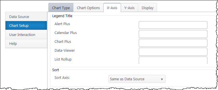
Data Type Settings – Appears if you select a Date/Time value for the x-axis. Configure how date categories display (date or time) and the scale of the x-axis. “Automatic” sizes the x-axis according to the scale of your dataset.
Legend Title – Customize the legend title text for each category in the x-axis.
Sort Axis – Specify an ascending or descending sort order for how categories display on the x-axis.
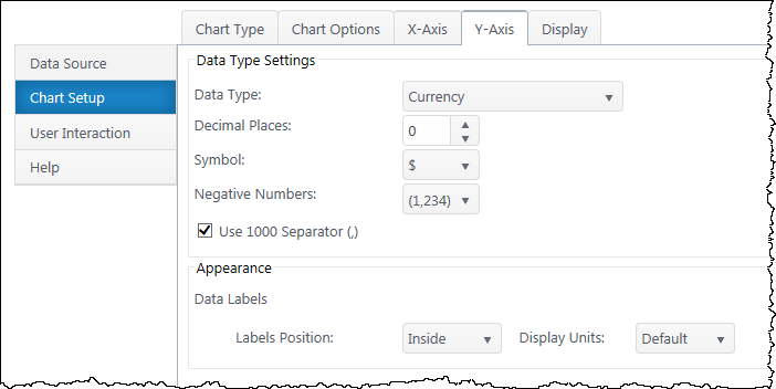
Secondary Axis – If you have a secondary y-axis, use the buttons at the top of the Y-Axis tab to switch between axis settings.
Data Type – Select a data type for y values (general, number, currency, date, time, percentage, scientific).
Format – Configure details on how Y values will display on the axis and labels. Date types also require you to select the date scale for the y-axis.
Data Labels – Customize the location and the display units of data labels.
Line Charts are great for tracking changes in a Y series over time. A line chart requires an x-axis (usually date/time or category) and at least one y-axis data series.
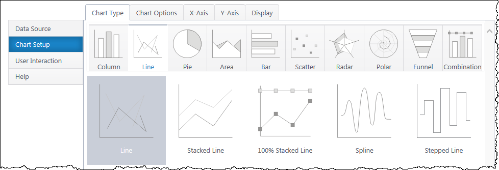
Multiple y-axis series will add additional lines on non-stacked charts. Stacked charts add each series to the sum of the previous series. Spline & Stepped Line alter the drawing style of the line.
If you haven’t yet, select a data source.
As you’re building your chart, use the Preview button in the upper right to check your work in progress.
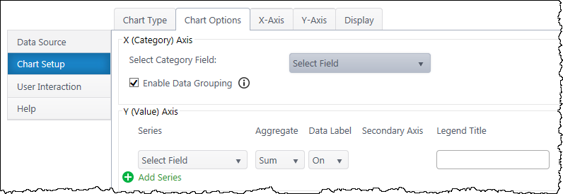
Select Category Axis – Select which column should display along the bottom x-axis. The dropdown list will auto-populate with columns from your data source.
Enable Data Grouping – Group x values of the same category. If off, each individual data point will be a point on the line graph.
Series – Specify what value you would like to compare between the categories. Add additional y-axis series to compare if desired.
Aggregate – If you have enabled grouping on the x-axis, aggregate the y-axis data you are comparing (sum, first, min, max, average, count). By default, chart plus compares the sum of y values.
Data Label – Toggle data labels for each Y series.
Secondary Axis – If using more than one Y series, you can add a secondary axis on the right side of the chart. The secondary axis will automatically adjust it’s range to include the maximum Y value from the series mapped to it.
If using a stacked line and a secondary axis, the secondary axis will reflect the stacked line value.
Legend Title – Customize legend titles for each y-axis series.
Data Type Settings – Appears if you select a Date/Time value for the x-axis. Configure how date categories display (date or time) and the scale of the x-axis. “Automatic” sizes the x-axis according to the scale of your dataset.
X Axis Title – Toggle title display at top of chart and customize title text.
X-Axis Labels – Toggle x-axis labels & their display angle.
Gridlines & Tickmarks – Customize which gridlines and tickmarks display along the x-axis.
Display X-Axis Line – Toggle the x-axis line that runs along the bottom of the chart between the bars and x-axis labels.
Category X-Axis labels – Customize category names that appear on the x-axis.
Sort Axis – Specify an ascending or descending sort order for how categories display on the x-axis.
Secondary Axis – If you have a secondary y-axis, use the buttons at the top of the Y-Axis tab to switch between axis settings.
Data Type – Select a data type for y values (general, number, currency, date, time, percentage, scientific).
Format – Configure details on how Y values will display on the axis and labels. Date types also require you to select the date scale for the y-axis.
Y-Axis Title – Toggle title display at top of chart and customize title text.
Y-Axis Labels – Toggle y-axis labels and their display angle & position.
Gridlines & Tickmarks – Customize which gridlines and tickmarks display along the y-axis.
Y-Axis Range – Configure the minimum and maximum values visible on the y-axis. These default to “auto” and adjust to the range of your dataset. Not available for “Date” & “Time” data types or 100% line column.
Display Y-Axis Line – Toggle the y-axis line between the y-axis scale and the chart canvas.
Funnel charts compare the count or sum of a y-axis number across several x-axis categories, usually stages of a process. A funnel chart requires an x-axis category and one y-axis data series.
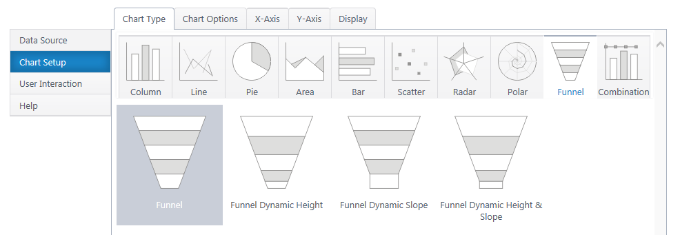
Dynamic height funnels adjust the height of the funnel segments to their percentage of the total funnel volume. The dynamic slope adjust the angle of each funnel segment depending on the ratio of the current and next value.
If you haven’t yet, **select a data source.(http://bamboo.docfactory.com/ChartPlus_(holding/Create_a_New_Chart?go=data
As you’re building your chart, use the Preview button in the upper right to check your work in progress.
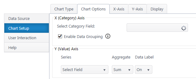
Select Category Axis – Select which column of categories you would like to compare. The dropdown list will auto-populate with columns from your data source. Date/time types are not available.
Enable Data Grouping – Group x values of the same category. Typically, you want grouping enabled. If off, each individual data point will be a separate funnel segment.
Series – Specify what value you would like to compare between the categories. Add additional y-axis series to compare.
Aggregate – If you have enabled grouping on the x-axis, aggregate the y-axis data you are comparing (sum, first, min, max, average, count). By default, chart plus compares the sum of y values.
Data Label – Toggle data labels for each Y series.
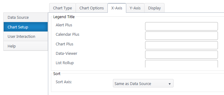
Legend Title – Specify custom text you would like to appear in the legend for each category.
Sort Axis – Specify an ascending or descending sort order for how categories display on the x-axis.
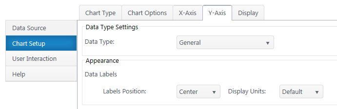
Data Type – Select a data type for y values (general, number, currency, date, time, percentage, scientific).
Format – Configure details on how Y values will display on the axis and labels. Date types also require you to select the date scale for the y-axis.
Y-Axis Labels – Toggle y-axis labels and their display angle & position.
Next: **Configure the Chart Display Settings**(http://bamboo.docfactory.com/ChartPlus_(holding/Create_a_New_Chart?go=display
Combination charts allow you to plot multiple chart types for an x-axis. Combination charts require one x-axis and at least one y-axis. All of the column, line, or area charts are available, with the exception of stepped & spline versions.
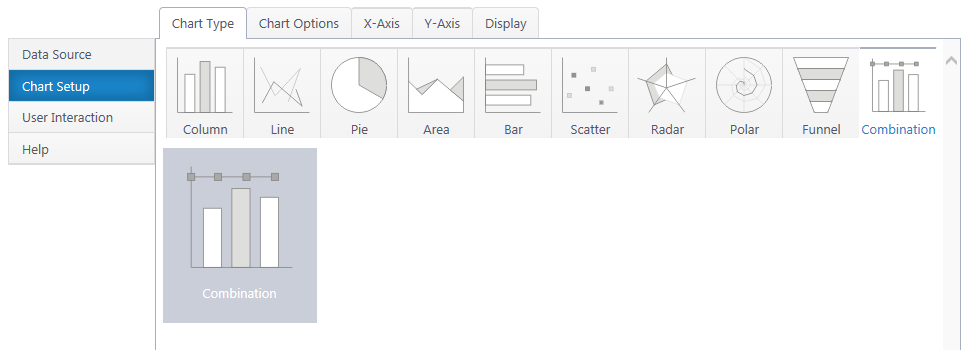
Additional y-axis series add another graph type to the canvas. You can configure many graphs, but only two axes. Putting two Y series with radically different scales on the same axis will result in a poor chart visual.
If you haven’t yet, select a data source.
As you’re building your chart, use the Preview button in the upper right to check your work in progress.
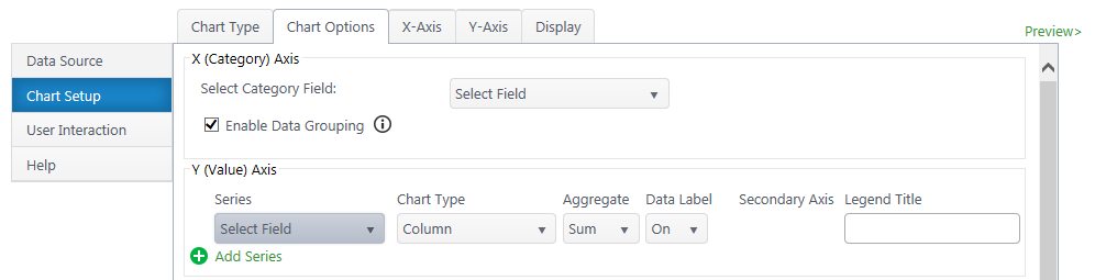
Select Category Axis – Select which column of categories you would like to compare. The dropdown list will auto-populate with columns from your data source.
Enable Data Grouping – Group x values of the same category. Typically, you want grouping enabled. If off, each individual data point will be separate.
Series – Specify what value you would like to compare between the categories. You may only select quantitative columns. Add additional y-axis series if desired.
Chart Type – Choose a chart type for each Y series.
Aggregate – If you have enabled grouping on the x-axis, aggregate the y-axis data you are comparing (sum, first, min, max, average, count). By default, chart plus compares the sum of y values.
Data Label – Toggle data labels for each Y series.
Secondary Axis – If using more than one Y series, you can add a secondary axis on the right side of the chart. The secondary axis will automatically adjust it’s range to include the maximum Y value from the series mapped to it.
Legend Title – Customize legend titles for each y-axis series.
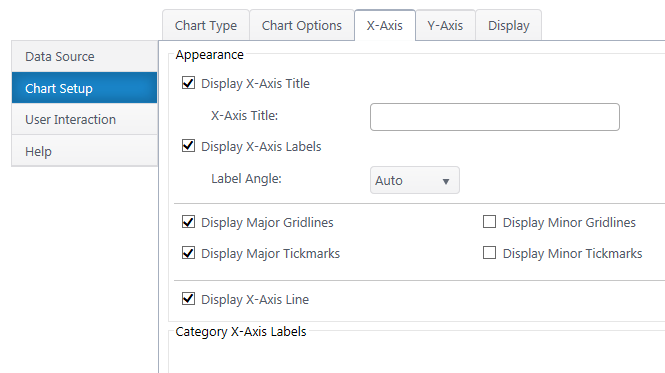
Data Type Settings – Appears if you select a Date/Time value for the x-axis. Configure how date categories display (date or time) and the scale of the x-axis. “Automatic” sizes the x-axis according to the scale of your dataset.
X Axis Title – Toggle title display at top of chart and customize title text.
X-Axis Labels – Toggle x-axis labels & their display angle.
Gridlines & Tickmarks – Customize which gridlines and tickmarks display along the x-axis.
Display X-Axis Line – Toggle the x-axis line that runs along the bottom of the chart between the canvas and x-axis labels.
Category X-Axis labels – Customize category names that appear on the x-axis.
Sort Axis – Specify an ascending or descending sort order for how categories display on the x-axis.
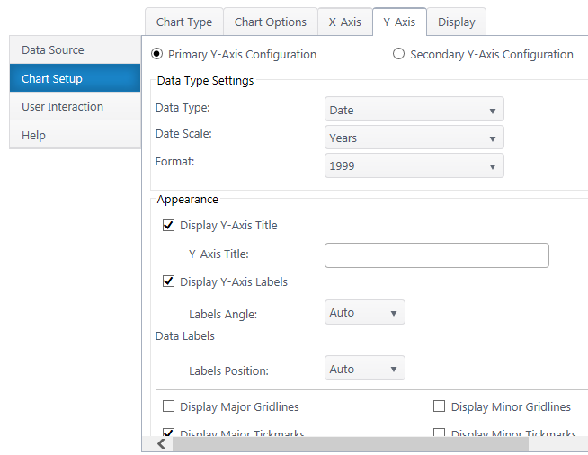

Secondary Axis – If you have a secondary y-axis, use the buttons at the top of the Y-Axis tab to switch between axis settings.
Data Type – Select a data type for y values (general, number, currency, date, time, percentage, scientific).
Format – Configure details on how Y values will display on the axis and labels. Date types also require you to select the date scale for the y-axis.
Y-Axis Title – Toggle title display at top of chart and customize title text.
Y-Axis Labels – Toggle y-axis labels and their display angle & position.
Gridlines & Tickmarks – Customize which gridlines and tickmarks display along the y-axis.
Y-Axis Range – Configure the minimum and maximum values visible on the y-axis. These default to “auto” and adjust to the range of your dataset. Not available for “Date” & “Time” data types or 100% chart types.
Display Y-Axis Line – Toggle the y-axis line between the y-axis scale and the chart canvas.
Bar charts are great for comparing multiple categories by one or more value. They are the horizontal version of column charts, but with the axes switched. A bar chart requires an y-axis category and at least one x-axis data series.
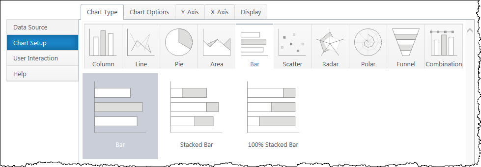
Multiple x-axis series will add an additional bar in each y-axis category. Stacked bar charts will stack the bars in each category.
If you haven’t yet, select a data source.
As you’re building your chart, use the Preview button in the upper right to check your work in progress.
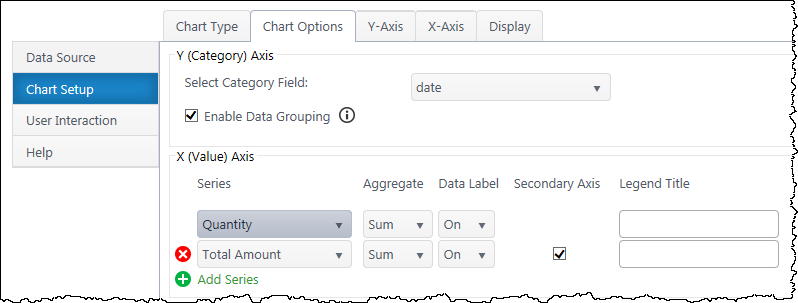
Select Category Axis – Select which column of categories you would like to compare. The dropdown list will auto-populate with columns from your data source.
Enable Data Grouping – Group y values of the same category. Typically, you want grouping enabled. If off, each individual data point will be a separate bar.
Series – Specify what value you would like to compare between the categories. Add additional X-axis series to compare.
Aggregate – If you have enabled grouping on the y-axis, aggregate the x-axis data you are comparing (sum, first, min, max, average, count). By default, chart plus compares the sum of x values.
Data Label – Toggle data labels for each X series.
Secondary Axis – If using more than one X series, you can add a secondary axis on the top of the chart. The secondary axis will automatically adjust it’s range to include the maximum X value from the series mapped to it.
Legend Title – Customize legend titles for each x-axis series.
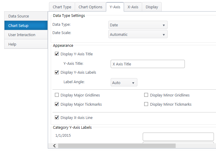
Data Type Settings – Appears if you select a Date/Time value for the y-axis. Configure how date categories display (date or time) and the scale of the y-axis. “Automatic” sizes the y-axis according to the scale of your dataset.
Y-Axis Title – Toggle title display at top of chart and customize title text.
Y-Axis Labels – Toggle y-axis labels & their display angle.
Gridlines & Tickmarks – Customize which gridlines and tickmarks display along the y-axis.
Display Y-Axis Line – Toggle the y-axis line that runs along the left of the chart between the bars and y-axis labels.
Category Y-Axis labels – Customize category names that appear along the y-axis.
Sort Axis – Specify an ascending or descending sort order for how categories display on the y-axis.
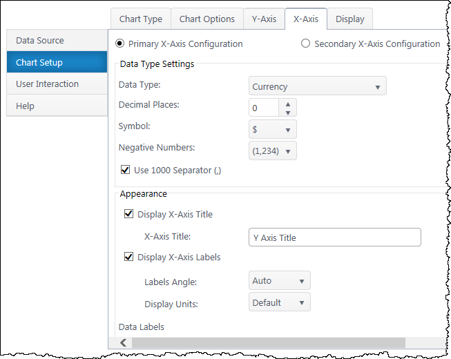
Secondary Axis – If you have a secondary x-axis, use the buttons at the top of the x-axis tab to switch between axis settings.
Data Type – Select a data type for x values (general, number, currency, date, time, percentage, scientific).
Format – Configure details on how X values will display on the axis and labels. Date types also require you to select the date scale for the x-axis.
X-Axis Title – Toggle title display at top of chart and customize title text.
X-Axis Labels – Toggle x-axis labels and their display angle & position.
Gridlines & Tickmarks – Customize which gridlines and tickmarks display along the x-axis.
Y-Axis Range – Configure the minimum and maximum values visible on the x-axis. These default to “auto” and adjust to the range of your dataset. Not available for “Date” & “Time” data types or 100% stacked bar.
Display X-Axis Line – Toggle the y-axis line between the x-axis scale and the chart canvas.
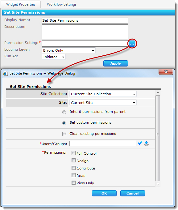
The Set Site Permissions widget changes user permissions for any site in any site collection in the Web application. The widget has the following features and options:
Return to Site Management Widgets
See Also:
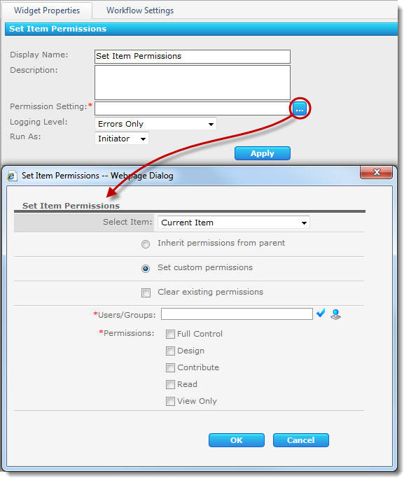
The Set Item Permissions widget sets or changes permissions for an item in a SharePoint list or library. The widget has the following features and options:
Return to Lists and Items Widgets
See Also:
The Set Field Value widget sets the value of a single field in the current item or an item in another list or library in the current site.
Widget Properties:
| Column | Description |
| Field and Value (Required) |
Click to open the Set Field Value form where you can select a field to update.
|
| Click Apply to save the widget settings. | |
Example Using Set Field Value Widget
Return to Lists and Items Widgets
See Also:
| Create a new alert |
|---|
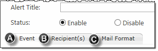 Alert Plus has three tabs where parameters for an alert need to be configured.
We will discuss the Event Tab here. For information on the other tabs, click the links below.
B – Recipients Tab
C – Mail Format Tab
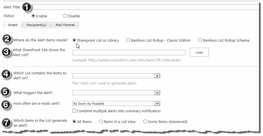 Alert Plus is very flexible and has a variety of ways you can set up alerts. Configure the Alert Plus Event Tab following the steps below.
| Step | Action | Result |
|---|---|---|
| 1. | Give your Alert a title and set its status (e.g., Enable or Disable). |
The information you type into the Title box is saved into the web part. The default status is Enable. If you switch to Disable, the alert will not be triggered, but all configurations will be saved.
|
| 2. | Decide where the items that trigger the alert reside. Choose a SharePoint List or Library or a Bamboo List Rollup. | Your selection dictates the source of the data for your alert. |
| 3. | Enter the URL of the site where your list/library resides or where your List Rollup is defined. Click the “Load” button to load the available lists/libraries or List Rollups. |
|
| 4. |
Pick the list that stores the items that you want to alert on.
|
|
| 5. | Select the alert trigger type. 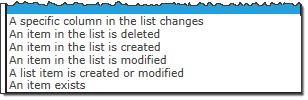 |
Your selection dictates how the alert will be processed. See Which Trigger Type Should You Use for more information about trigger types and some examples. |
| 6. | Decide how frequently an email will be sent.
|
In addition to the frequency of the alerts, you also have the option to combine multiple alerts into a summary notification. See How often should E-mails be Sent and Combine Alerts into a Summary Alert for more information. |
| 7. |
Pick which items in the list can generate the alert. Depending on your choice, the interface may change.
|
|
The Set Approval Status widget sets the Approval Status field in a list or library to one of a pre-defined set of choices. If the Approval Status field does not exist, the widget will create it.
NOTE: This widget must run as a user with the Design level or above on the list. If the workflow initiator does not have this permission level, configure the Run As property to use an account that does.
Widget Properties:
| Column | Description |
| Item (Required) |
Click the
|
| Approval Status |
Select the new value for the Approval Status field. Select the value from the choices Approved, Rejected, Pending, Draft, or Scheduled. If the Approval Status field does not exist, it is created when the widget runs.
|
| Comments | Enter text or a combination of text and lookups to write a comment to the Approver Comments field for the Item. If the Approver Comments field does not exist, it is created when the widget runs. |
| Click Apply to save the widget settings. | |
Example Using Set Approval Status Widget
Return to Lists and Items Widgets
See Also:
| Return to My Bamboo |
|---|
On this tab, you will find a complete history on all product purchases and trials under your account.
Ultimately, the people in your organization will determine whether your SharePoint deployment is successful — so why not give them the knowledge they need to make it work? Bamboo Services offers a wide variety of online training options for end users and administrators, empowering the people who use SharePoint every day. Packed full of indispensable tips and useful tricks, our training sessions will get you started or restarted in the right direction.
We can help you build a custom Services package specifically for your organization so you can optimize your success with Bamboo Solutions.
Contact us for additional information and see how Bamboo Technical Services could be your key to realizing the true potential of SharePoint.
| Return to Connecting to an Exchange Calendar |
|---|
In the Server Topology section, choose the location of your Microsoft Exchange Server. If you are connecting to an Exchange Server hosted on Microsoft Office 365, select the Exchange and SharePoint on different domains option.
| Exchange and SharePoint in the same domain |
You must select at least one mailbox to display in Team Calendar. The first calendar you configure is the primary mailbox.
|
|
|
| Exchange and SharePoint in the different domains (Exchange 2010 only) | To connect to an Exchange server on a different domain, the server must be running Microsoft Exchange 2010. You will also need to select which authentication type to use to connect to the Exchange server on the other domain. Select an authentication type from the Client Credential Type list. If you are not sure which type to use, contact your server administrator. 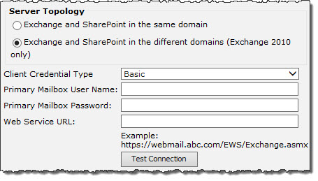 Client Credential Type 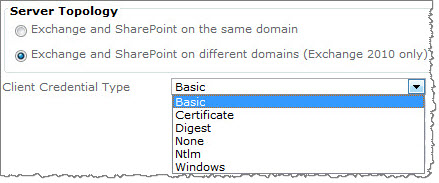  If you select the wrong authentication type, testing the connection will usually tell you which authentication type should be used instead. See How to Test E-mail AutoConfiguration. If you select the wrong authentication type, testing the connection will usually tell you which authentication type should be used instead. See How to Test E-mail AutoConfiguration. |
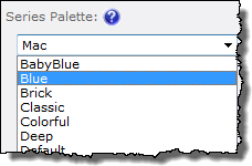 The Series Palette determines the colors of series bars, lines, pie chart areas, etc.
Use it in combination with the Chart Skin.
If you want to define specific colors for series items, use the Chart Data Settings instead.
See also:

Send Message is a simple way to allow SharePoint users to send a custom messages directly from a list item to any number of users, and include a link back to that item for reference. The recipients can be pre-populated based on any combination of user and group fields found in the list. Administrators can control who the message appears to come from, including the user initiating the message, a default SharePoint address, a custom admin-defined address, or they can even allow user-defined addresses.
Users can access Send Message directly from an item’s SharePoint ribbon, through an item’s context menu, or by using an included custom column that provides a simple icon the user can click. Depending on the site settings and list settings, the user may be able to change the “To” and “From” address of the message, in addition to changing the content of the message itself.
| Highlights | Release Notes | Complementary Products |
|---|
Install |
Permissions |
License |
Permissions |
|---|---|---|---|
|
|
||
Configure |
Permissions |
Work With |
Permissions |
|
|
| Click here if you would rather see a complete list of all topics for this product. |
Click on the shopping bag or here to download a trial of the product or to purchase it. |
This use case is similar to Alert on a Tasks List and send alerts for every task to the assigned person, but instead of sending the alerts to the assigned individual we will send messages to the entire project team. This use case uses the standard SharePoint Tasks List and assumes that there is a Contact List with a predefined view named “Project Managers”. We will also take off the training wheels, so to speak, and provide the list of values to be entered without accompanying screen shots. Refer to the Alert Plus Web Part User Guide section for a refresher on how the UI works if necessary.
The Alert field selections for Use Case 2 are:
| Alert List – What list contains the items to alert on? | Tasks List |
| Event Type – What triggers the alert? | An item is created or modified |
| E-mail Frequency – How often are e-mails sent? | As Soon As Possible |
| Item Criteria – What items in the list generate an alert? | All Items |
| Who should the alert e-mails be sent to? | Send to members of a Contacts List |
| Contact List | Contacts |
| Contact List View | Project Managers |
The Send Email widget sends a custom e-mail to a user or group of users. Lookups are supported in all message properties.
Widget Properties:
| Column | Description |
| From | Enter a single From address, using any of the methods listed below. This property defines the e-mail account that the e-mail appears to have come from and where replies are sent. If you do not enter a From address in the widget, the From address configured in Central Administration > Workflow Conductor Control Panel > System Settings will be used instead. |
| To (Required) | Enter one or more To recipients, using any of the methods listed below. This property defines the user or users in the To field of an e-mail message. |
| CC | Enter one or more recipients, using any of the methods listed below. This property defines users in the CC (carbon copy) field of an e-mail message. Addresses in the CC field of an e-mail are visible to recipients. |
| BCC |
Enter one or more recipients, using any of the methods listed below. This property defines users in the BCC (blind carbon copy) field of an e-mail message. Addresses in the BCC field of an e-mail are not visible to recipients.
|
| Subject (Required) | Enter a Subject line for the e-mail by typing text in the property field or by clicking the  button to open the text editor. Add lookups to the Subject using the Add Lookup button in the text editor. button to open the text editor. Add lookups to the Subject using the Add Lookup button in the text editor. |
| Body | Enter text for the Body of the e-mail by typing text in the property field or by clicking the button to open the rich text editor. Add lookups and text formatting to the Body text using the rich text editor. To add a hyperlink in the e-mail body that has a display name different from the URL (e.g., Bamboo instead of http://www.bamboosolutions.com), enter the hyperlink in the following format, including the surrounding brackets ([]): [URL(http://url.com) ,_Text(Text to display)]See Lookups and Variables for more information. |
| Priority | Select a priority setting for the message. Available options are Normal (default), Low, and Urgent, or Set Using Lookup, which can lookup to a field containing a value of “Normal”, “Low”, or “Urgent”. |
| Allow Attachment |
Select Yes to add an attachment to the e-mail message. In the Attach Items box, click the
|
| Click Apply to save the widget settings. | |
Return to User Interaction Widgets List
See Also:
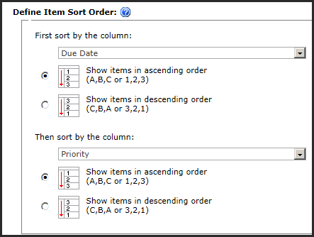
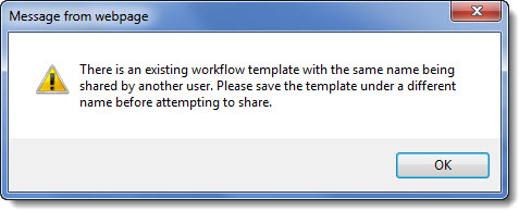
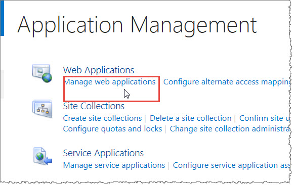
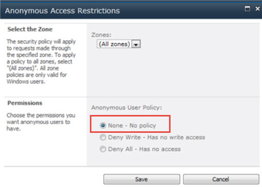
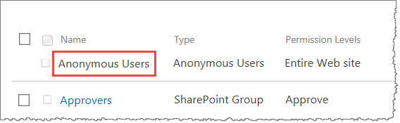
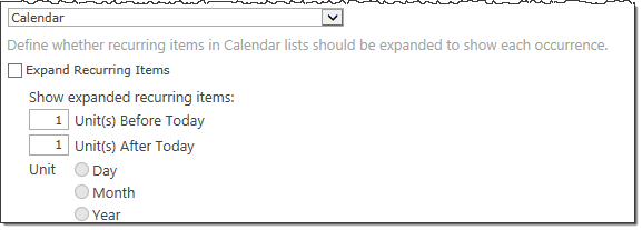
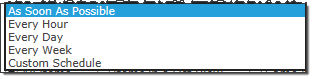
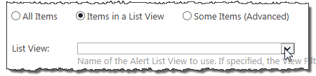
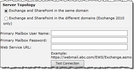
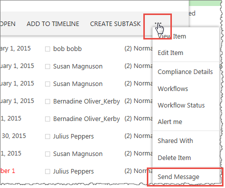 The Send Message feature can be accessed through any of the following methods.
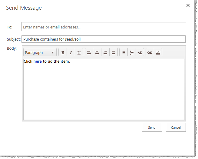
 ).
). ) to search for a SharePoint or Active Directory user or SharePoint group* in the User Lookup form.